3 Ways to Wow Stakeholders with Figma
When it comes to demonstrations, it goes without saying that you want your stakeholders to walk away “wowed.” But what is the best way to accomplish that? In truth, there are many tools and methods out there, but Figma is a powerful UI/UX tool used to create stunning visuals and interactive prototypes, which has quickly become the go-to tool for our design team due to its versatility and ease of use. Figma’s fluidity and ability to not only design user interfaces but also visually organize documentation have left our clients curious about its capabilities.
Tip #1: Include stakeholder collaboration in the design process
One of the advantages of using Figma is that it allows for real-time collaboration. Although Figma has features where guests can enter the design file, at Playfair Data we typically just screen share our file during a client call. The benefit is that stakeholders don’t need to learn Figma to be involved in the design process, yet they can still provide feedback and suggestions as the project progresses.
3 Innovative Ways to Use Figma in Your Visual Analytics Projects
According to Playfair Data’s Director of Information Design, Jason Penrod, this is a powerful way to get clients invested in the project and to ensure that the final product meets their needs. “When you can get the client to actually see what’s happening, to see what the design looks like, to see how it functions, to actually be in there and use it, that’s where you start to get their buy-in,” says Penrod. “They start to feel like they’re part of the process. They start to feel like they have some ownership over it.”
It’s important to create a sense of collaboration and investment around the work you’re doing together. One way to do this is by asking questions and encouraging feedback. Additionally, showing several options for one use case can help stakeholders visualize different possibilities. Demonstrating interactivity through prototyping is also a handy feature in Figma (We will touch on this a bit more later). As our Information Design Associate, Luke Lewis, has said, “When you’re able to show clients how you’re designing in real-time, it creates a certain level of excitement and engagement. It’s not just like they’re seeing some static pictures.”
By involving and engaging stakeholders in the design process, we can build a stronger relationship with them and increase the chances of a successful project outcome.
Continue reading with a free account, or login.
Unlock this tutorial and hundreds of other free visual analytics resources from our expert team.
Already have an account? Sign In
By continuing, you agree to our Terms of Use and Privacy Policy.
Tip #2: Interactive prototyping
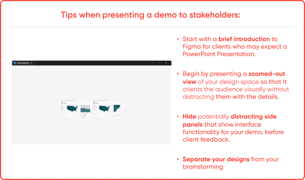
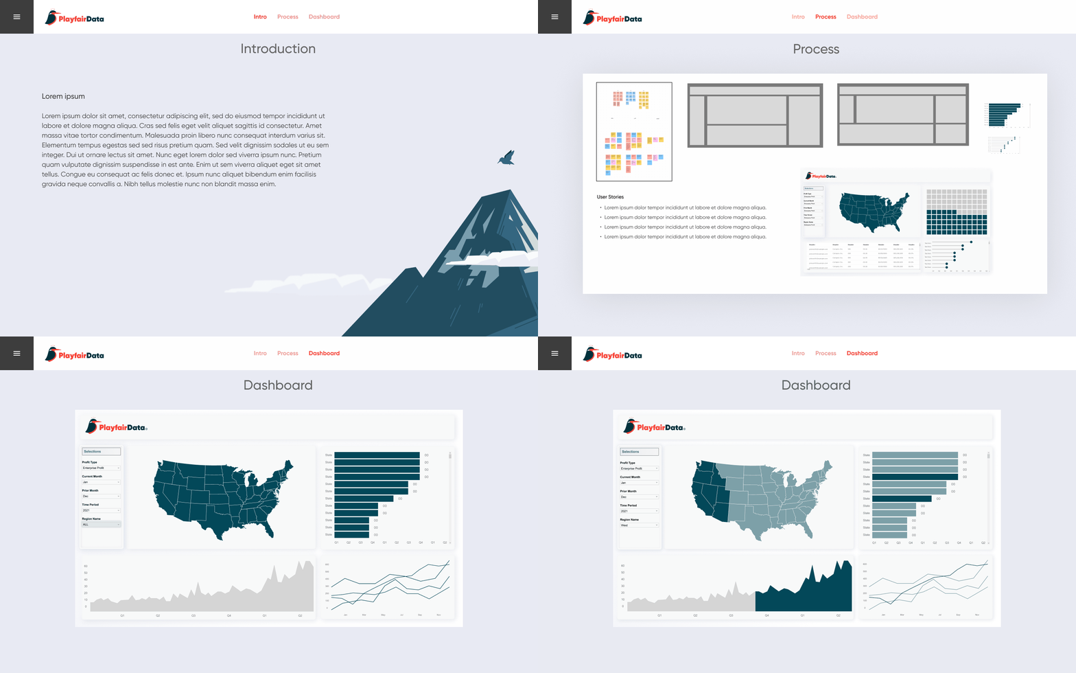
Figma’s prototyping feature is a powerful tool when presenting to stakeholders. It has the ability to mimic web and mobile applications. It allows us to create functioning prototypes that showcase our work in an engaging way. At Playfair Data, we use prototyping for more complex interactions and extend them to presentation decks for more engaging meetings with clients. Interactions such as hover effects and clickable buttons polish the presentation making it a step up from the average PowerPoint.
The engaging value of a prototype over a static image can be a game-changer during a presentation. For example, you could showcase a prototype that allows you to toggle between two different chart types. This would allow stakeholders to see how the data would look in different visualizations and make more informed decisions about their needs.
Guests can also easily access prototypes through share functions, making it easy for them to explore the designs and understand how a user would interact with them.
Tip #3: Documenting stakeholder feedback
- Annotations and comments for transparent communication
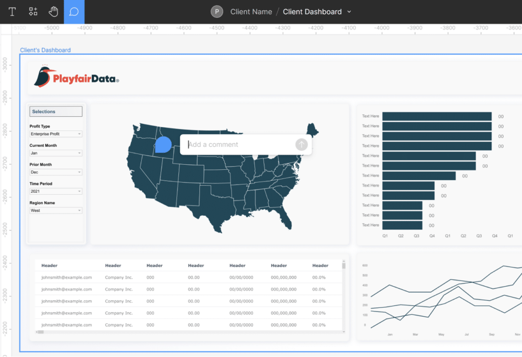
Transparency is key when it comes to working with stakeholders, and Figma’s annotation feature is ideal for providing instant feedback and ensuring everyone is on the same page. Especially in remote work, tools like annotations help us collaborate and communicate effectively. During presentations with stakeholders, designers can use annotations to offer clarity and help confirm notes, making it easier to ensure that we’re all on the same page.
- Annotations and comments for transparent communication
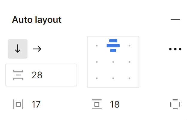
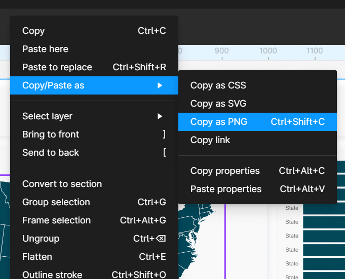
When presenting, there are times when we need to make quick changes to the UI of a dashboard. Figma’s auto layout feature allows us to make changes on the fly and get them approved by stakeholders in real-time during a meeting. However, we also know that changing a complicated auto layout piece can sometimes look messy. That’s where other features like “Copy as a PNG” (which allows you to edit over a PNG version instead of messing with the original element’s format) and widgets help us keep visualizations organized and ensure that changes are efficiently documented and approved.
Bonus tip: Fluidity and organization
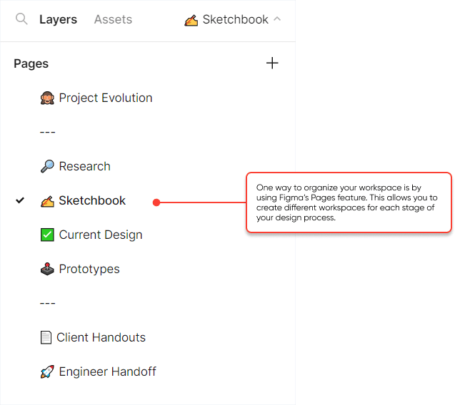
Figma’s fluid organization features provide a seamless and intuitive experience for designers of all skill levels. With its minimalist art board-like interface and handy tools for managing design assets, Figma offers a flexible and efficient way to create and manage design elements.
You can easily organize all kinds of documents like screenshots, notes, and designs in a visually appealing way that stakeholders really appreciate. Figma’s flexibility and malleability allow for creative freedom, which can be intriguing to stakeholders who want to see a variety of design options.
When it’s time to demo the final version, you can easily keep your creative mess separate from the final designs by either creating a new page or separating a section on the same workspace. It’s like having a clean canvas to present to stakeholders.
But here’s the thing – with great freedom comes great responsibility. Since Figma doesn’t impose a rigid structure, it’s up to us designers to keep things organized to avoid any hiccups in collaboration and ensure a positive experience with stakeholders.
- Design system and components
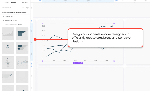
Design systems are collections of reusable components, styles, and guidelines that enable designers to create consistent and scalable designs. By using design systems, designers can ensure that their designs are consistent across different screens and devices, which is essential for creating a cohesive user experience.
“Figma’s design components have been a huge time-saver for me. Creating reusable elements and updating them across multiple design files not only saves time, but also helps in creating consistent designs that impress clients with the level of attention to detail.”
– Rafael Simancas, Sr. Visual Analytics Architect

Figma has become an essential tool for our design work. By involving clients in the design process, using interactive prototyping, and easily documenting their feedback, we can wow stakeholders in Figma by creating meaningful interactions and collaborating seamlessly.
Thanks for reading,
Zoya
Related Content
3 Innovative Ways to Use Figma in Your Visual Analytics Projects
What does design software have to do with visual analytics software like Tableau? At Playfair Data, we approach our visual…
How to Create Better Dashboard Layout Designs with Figma
Being able to apply some basics of dashboard layout design to your visual analytics projects in Figma can bring a…
How to Create Light Mode and Dark Mode Dashboards in Tableau
Over the years, Playfair Data has been honored to receive and be nominated for several design awards for our products.…

