Avoiding Common Pitfalls in Chart Design

Choosing and designing charts is a deceptively challenging aspect of data visualization. It can seem obvious when someone else made a poor design choice, but it’s much harder when you’re the one making decisions. But what can you do to try to avoid making mistakes? In this post, we’ll discuss common pitfalls in chart design, starting with chart selection, then moving to decisions on chart elements, such as labels, legends, and color. Each section will include ways to avoid the pitfalls in each step of the design process. By the end of this post, I hope you’ll feel more confident in your chart design skills.
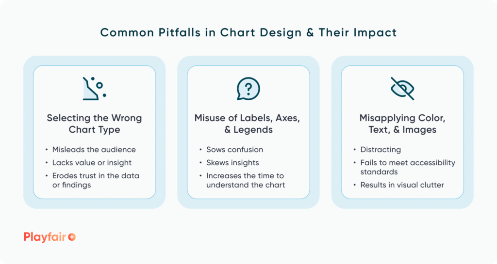
Pitfalls in chart selection
The first pitfall in chart design is selecting the wrong chart type to begin with. How do you know when you’ve picked the best option? I believe there are two key categories to consider: choosing charts that suit the data and those that suit your audience.
Continue reading with a free account, or login.
Unlock this tutorial and hundreds of other free visual analytics resources from our expert team.
Already have an account? Sign In
By continuing, you agree to our Terms of Use and Privacy Policy.
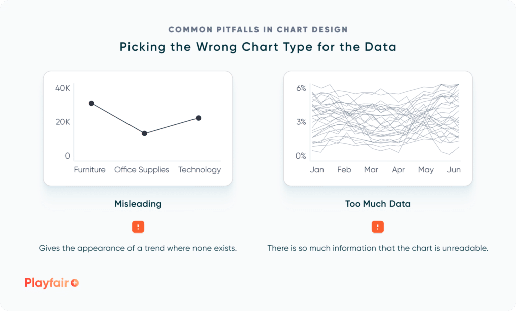
Picking the Wrong Chart Type for the Data
There are instances when a chart type and the data are simply a mismatch. This can result in misleading the viewer by giving the appearance of a connection or trend where none exists. Examples include displaying categorical data as a line graph, positioning two unrelated charts side by side so that it appears that they are connected when they are not, or using an inconsistent scale on your axes. Before you select any chart types for your design, consider the questions you aim to address and the role the chart should fulfill. Are you answering questions about a trend? Or is it more important to highlight relationships between parts and a whole? A visual vocabulary can help you in making informed choices. Check out Atlas from Playfair+ for some ideas.
![]()
Another pitfall to avoid is having either too much or too little data for a chart to provide meaningful insights. Sometimes, a chart type filled with dummy data may look great in the design phase, but when we use real data, there might not be enough data points for the visual to be meaningful. In a similar manner, too much data can prove ineffective. This might result in a pie chart with more than 20 slices or what some refer to as a “spaghetti chart” – a line chart with many lines that appear tangled like spaghetti. Ideally, you should have a good idea of the scope of the data before you start designing, but always be prepared to pivot to a new and more suitable chart type.
Lastly, be careful that you aren’t manipulating the data to fit the chosen chart type or the overall dashboard design. It’s important to remain objective, so avoid filtering or selectively picking data solely to support a desired narrative or conclusion. Not only will this mislead the audience, but it also fosters mistrust when the data manipulation is discovered. Without trust, the effectiveness of a visualization or a dashboard is compromised.
Applying Gestalt Principles to Dashboard Design
Picking the Wrong Chart Type for the Audience
The second category in picking the wrong chart type comes down to the audience. I recommend starting by assessing the audience’s familiarity with data interpretation. Users can have varying levels of data literacy – this concept helps us better understand how capable someone is in comprehending, exploring, and drawing insights from our data. Refrain from using complex or unusual charts for an audience with little experience viewing data visualizations. Examples of simple charts that are appropriate for a range of data literacy levels include bar and line charts, donut or pie charts, unit charts, or choropleth maps (filled maps).
Consider factors like your dashboard interactivity when assessing your audience. The use of tooltips, dynamic filtering, and highlight actions are some examples of ways that you can add complexity to your chart. For example, a scatter plot may be best suited for an interactive dashboard that includes user interactions with tooltips and filters, while a set of sparklines may best suit a static report that is emailed to a stakeholder group.
Vital Question 1: Who is the Audience?
Additionally, it’s important to consider the context within which a chart will appear. By this I mean that when designing a dashboard with multiple charts, you must consider how all of your chart selections will be viewed together. A dashboard with varied chart types is much more engaging compared to one that only utilizes bar charts for every visualization. You may need to get creative to avoid chart repetition, so don’t be afraid to brainstorm several options for each visual before you land on your decision.
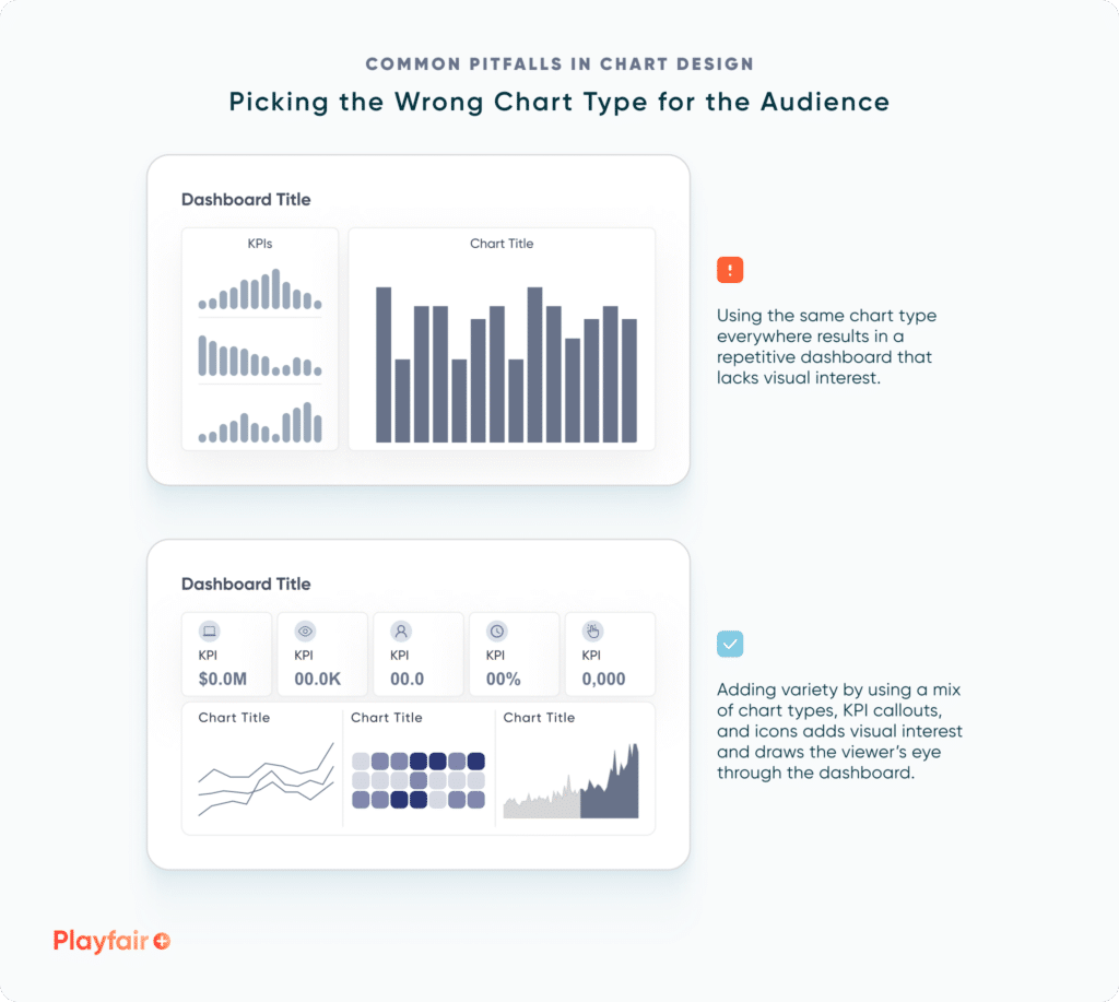
Lastly, it can be tempting to try to wow users with a visually appealing or innovative chart. I can understand the desire to create something new and beautiful, but make sure the chart actually tells a compelling story or highlights valuable insights. I think we’ve all seen data visualizations that, while beautiful, don’t actually tell you much of anything and fail at being actionable.
Pitfalls in labels, axes, and legends
The next pitfall in chart design includes making mistakes in designing and including labels, axes, and legends for a chart. These mistakes include:
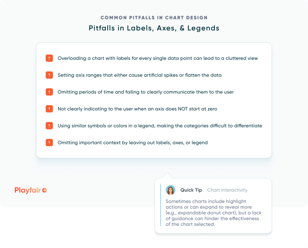
How can you avoid these mistakes? One of the best ways is to seek a peer review of your design. What conclusions can they draw from the visuals? Do they find any aspects confusing? Does the design draw them in, or does it feel overwhelming? Based on the answers to these questions, you can refine your design. If you aren’t able to receive feedback from someone, I recommend placing yourself in your audience’s shoes. As best you can, approach the visuals as if you are seeing them for the first time. Walk through the questions you would ask a peer and make adjustments accordingly.
![]()
Pitfalls in color, text, and supporting images/icons
The final piece of the puzzle for pitfalls in chart design include the aspects of color, text, and supporting images and/or icons. Mistakes in this category can include:
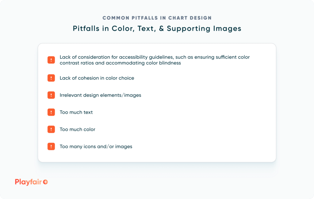
How can you avoid these mistakes? When approaching this aspect of the design process, I often think of a quote from Antoine de Saint-Exupery: “A designer knows he has achieved perfection not when there is nothing left to add, but when there is nothing left to take away.” While I could argue that we never really achieve perfection with a design, I do find it valuable to ask whether or not an element truly adds to a design. Does it contribute to the user’s understanding of the data, guide them through a story, or indicate interactivity? If not, it’s likely unnecessary and can be safely removed from the design.
Streamlining Dashboards: Minimizing Chartjunk with Icon Design
Conclusion
While chart design can be a challenging endeavor, careful consideration of the data, audience, and elements such as labels and color will go a long way to help you avoid common pitfalls in chart design.
Happy designing,
Alyssa

Written By
Alyssa Huff

Peer Review
Rafael Simancas
Sr. Manager, Brand Strategy
Related Content
Applying Gestalt Principles to Dashboard Design
Have you ever heard the Gestalt Principles referenced when people are talking about data visualization or design? The Gestalt Principles…
Streamlining Dashboards: Minimizing Chartjunk with Icon Design
Whether you use icons within or around your data visualizations, it’s crucial to be mindful of the value they add…
3 Storytelling with Color Tips to Improve Your Data Visualization

Color is one of the easiest ways to control the style of your data visualization. A good use of color…