How to do Anomaly Detection in Tableau
I think we’ve all been there… we are sharing a meaningful story we found in the data, only to have our end users get hung up on a previous peak or valley in our visualization. This often derails the conversation at hand and/or prevents our audience from hearing the rest of our message and/or reduces our chances of causing action.
One of the biggest challenges we face as data visualization practitioners is helping our end users avoid distraction. When our end users get distracted, it makes it more challenging to communicate the story in the data and our recommended actions. Ironically, one of the reasons users get distracted is because visualizing data makes it much easier to spot points of interest. Unfortunately, just because something may pique interest, it is not always relevant to the conversation.
This post shares an approach with the accompanying formula to do anomaly detection in Tableau. With anomaly detection, you’re able to focus in on the data points that matter and have a statistical explanation for your end users to help avoid distracting conversations.
How to do Automatic Anomaly Detection in Tableau
Using table calculations to do statistical anomaly detection in Tableau
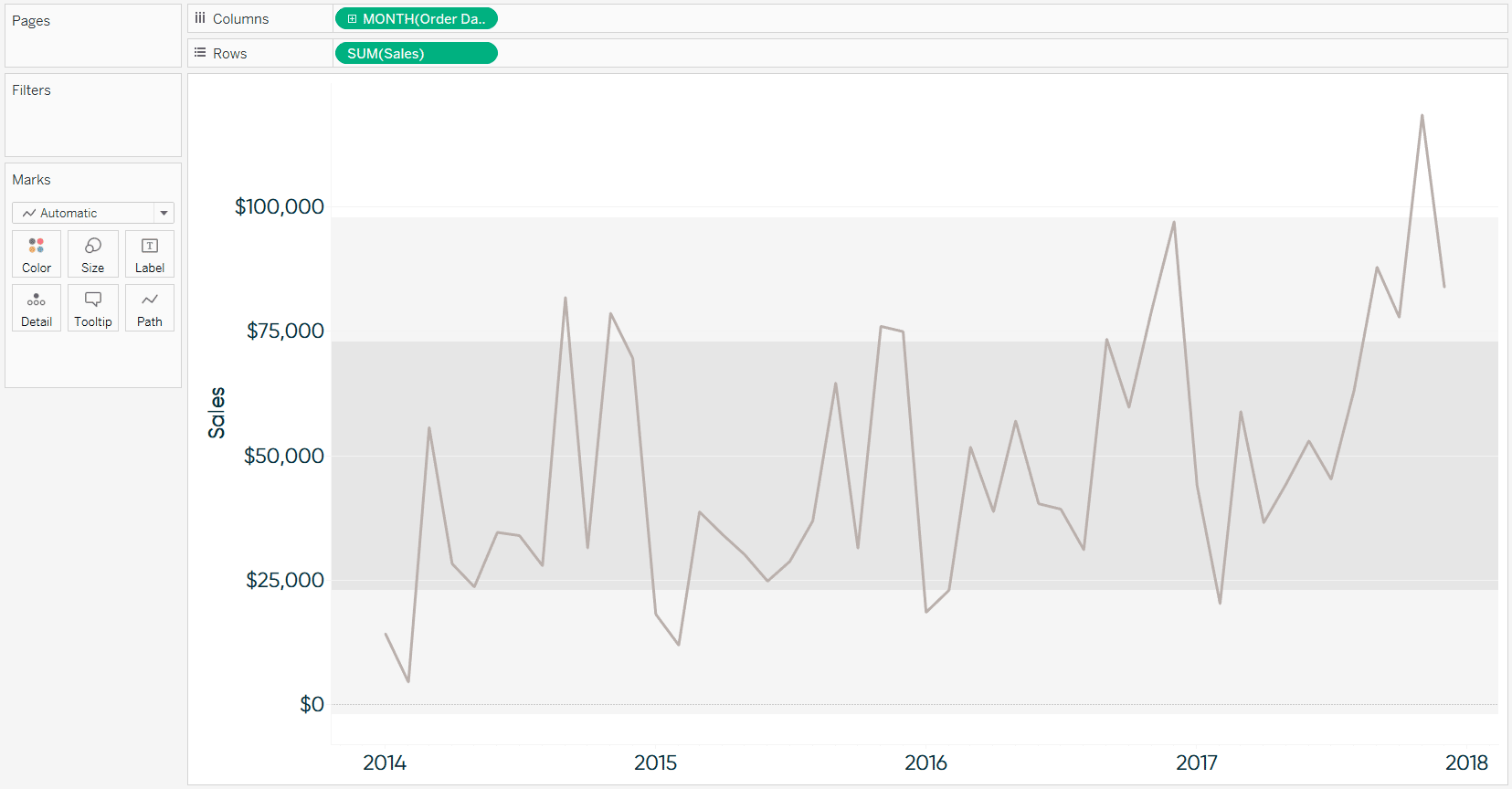
To help illustrate an approach for doing anomaly detection in Tableau, we will be recreating this sales by month trend using the Sample – Superstore dataset. Note that the reference distributions show whether each data point is within one or two standard deviations from the mean and the circles are colored based on whether or not they are an anomaly. For the purposes of this exercise, anomalies are defined as being at least one standard deviation from the mean.

To start, create a line graph with your measure of interest.

Next, add reference lines to shade the distribution between -2 to 2 standard deviations and/or -1 to 1 standard deviations. Note that if you want to display more than one distribution, it is best to start with the widest distribution first so your overlapping colors work.
![]()
Continue reading with a free account, or login.
Unlock this tutorial and hundreds of other free visual analytics resources from our expert team.
Already have an account? Sign In
By continuing, you agree to our Terms of Use and Privacy Policy.
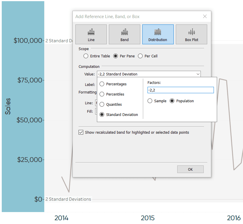
To add a reference distribution, I like to right-click on the axis, choose “Add Reference Line”, click the “Distribution” tab, change the value to “Standard Deviation”, and put in my factors (in this first case -2,2).
Optionally, use a different reference distribution, add a second range, and/or format the reference distributions to your liking. Here’s how my view looks after adding a reference distribution for -2 / 2 standard deviations, adding a reference distribution for -1 / 1 standard deviations, and cleaning up the formatting.
At this point, we have a basic control chart. To create the colored anomaly indicators, we will leverage a dual-axis and a table calculation to color the circles. To start the dual-axis combination chart, put the measure of interest onto the Rows Shelf for a second time and change the mark type to circle.
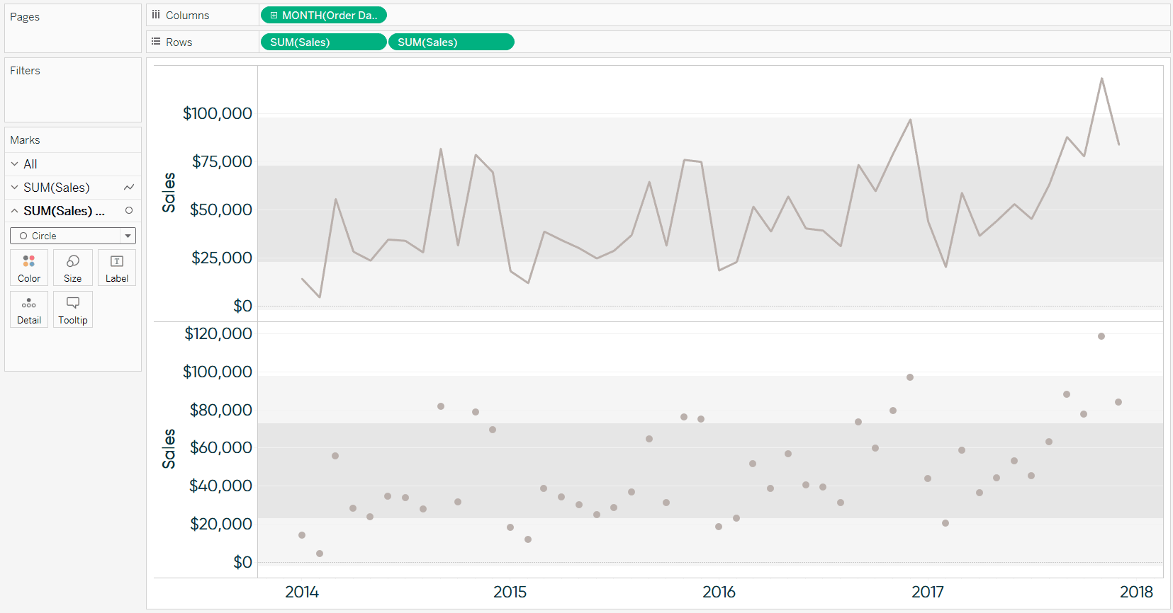
Next, convert the view into a dual-axis chart by right-clicking on the second occurrence of the pill on the Rows Shelf and choosing “Dual Axis”. Also, ensure the axes are lined up by right-clicking on either axis and choosing “Synchronize Axis”. At this point, I also like to hide the right axis by right-clicking on it and deselecting “Show Header”.
Now that there are two pills on the Rows Shelf, they each have their own set of Marks Cards that can be edited independently of each other. That means we can leave the line as is, but color the circles by whether or not they are considered an anomaly.
As I mentioned earlier, I’m defining anomalies as any data point outside of one standard deviation from the mean. The formula for this definition is as follows:
IF SUM([Sales]) < (WINDOW_AVG(SUM([Sales])) – WINDOW_STDEV(SUM([Sales]))) THEN “Bad Anomaly”
ELSEIF SUM([Sales]) > (WINDOW_AVG(SUM([Sales])) + WINDOW_STDEV(SUM([Sales]))) THEN “Good Anomaly”
ELSE “Expected”
END
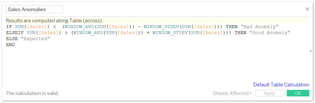
This formula looks a little intimidating, but all it’s doing is looking at each data point at the most granular level of detail (i.e. month), and comparing that number to the mean across the view plus or minus one standard deviation. If the value is not greater than one standard deviation from the mean or less than one standard deviation from the mean, it is classified as “Expected”.
I’m using sales as my measure, but simply replace sales with the measure of your choice if you want to use something different. Also, if you’d prefer to use 2, 3 – or even 1.5, etc. – standard deviations, just multiply “WINDOW_STDEV(SUM([Sales])))” by 2,3, or 1.5, respectively.
Once you have the calculated field for anomaly detection, place that on the Color Marks Card for the circles.
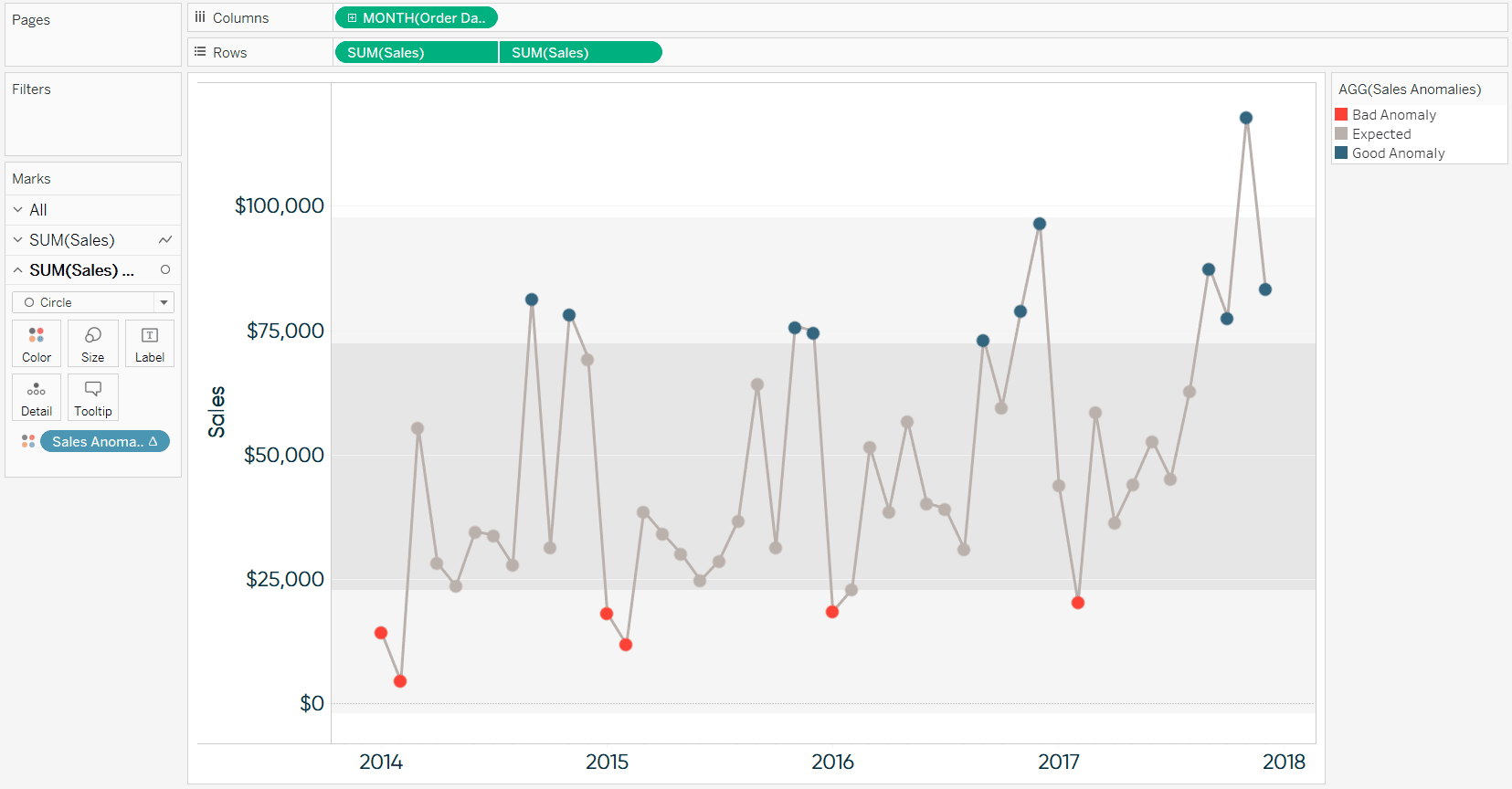
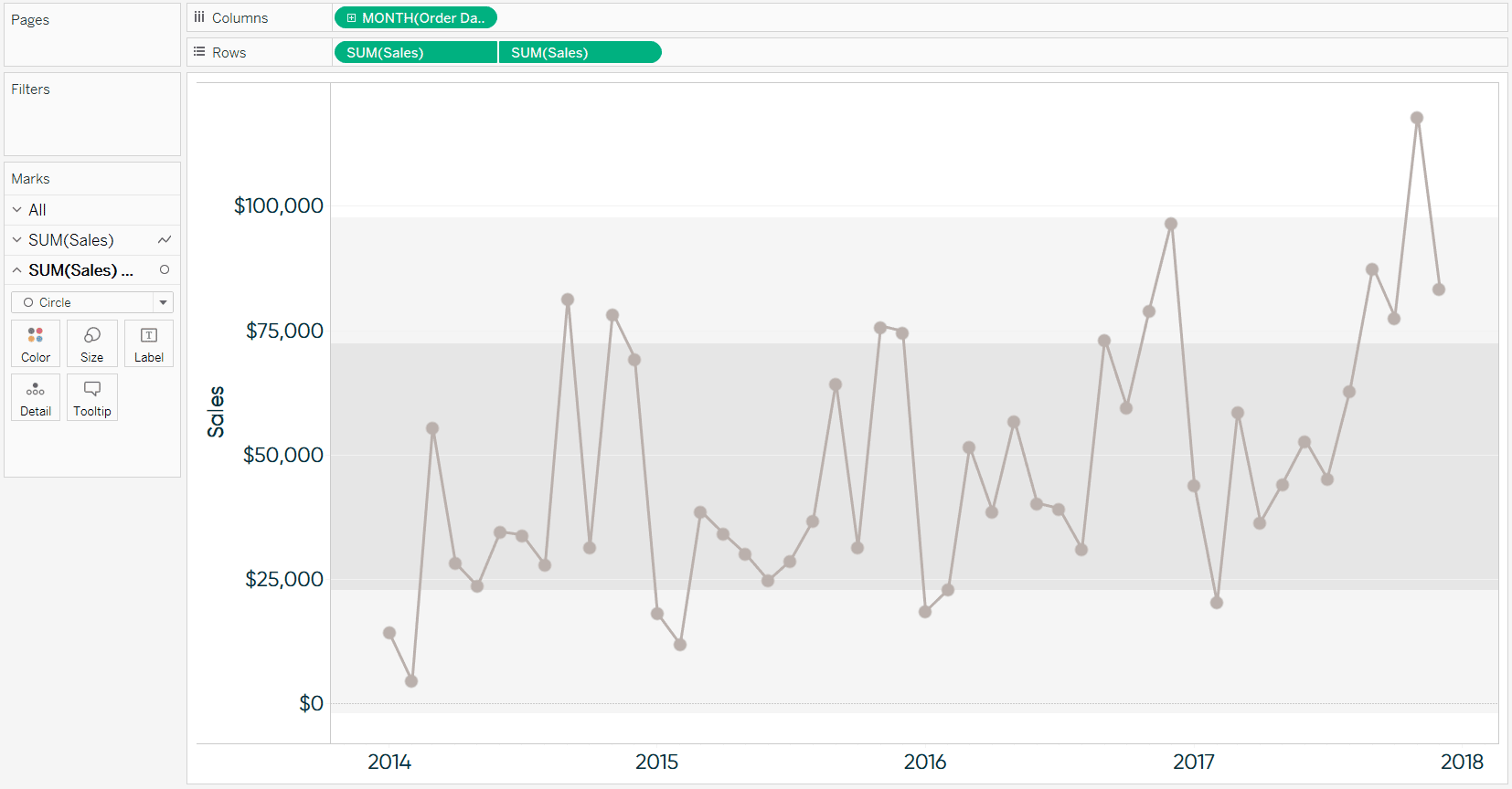
Now I can (1) see meaningful insights very efficiently and accurately (2) know when I shouldn’t get too excited about a spike (and when I should) and (3) help my end users avoid getting distracted when dips are not significant.
![]()
For example, in this view built with the Sample – Superstore dataset, I can see that the last four months in a row have been positive anomalies. Also, I see that even though the last drop looks pretty steep compared to the previous month, it is still greater than one standard deviation than the four-year mean displayed. So we’ve taken a potential negative distraction, and positioned it as the positive story that it is.
Thanks for reading,
– Ryan


Written By
Ryan Sleeper
Related Content
3 Creative Ways to Visualize Outliers in Tableau

There are many ways to detect outliers in your data, but flagging them for your end users may present some…

Ryan Sleeper
Two ideas for bringing attention to minimum and maximum values Make Tableau answer business questions for you automatically using a…
Statistical Tableau: Using MAD to Detect Outliers in Non-Normalized Data
I recently wrote a tutorial on 3 ways to visualize outliers in Tableau. This tutorial assumes a normal distribution of…