How to Highlight the Highest and Lowest Points in Tableau
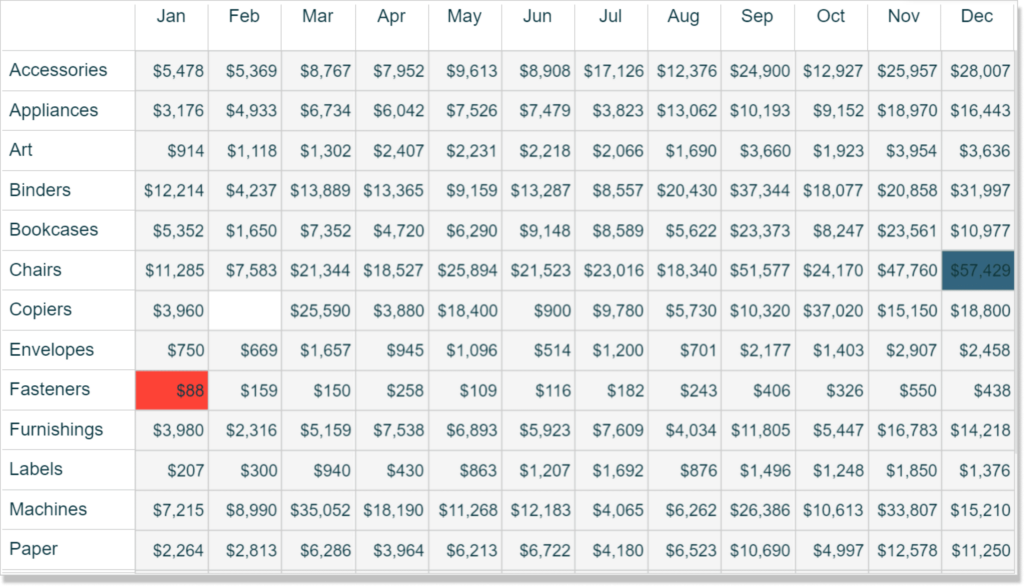
In my post, Why do you visualize data?, I share my personal exercise for illustrating the benefits of data visualization. I first show a raw crosstab of data – similar to what most corporate reports still look like today – and ask the audience to answer the basic business question of identifying the highest or lowest number in the table. I then convert the crosstab to a highlight table, highlighting points in Tableau, by introducing the preattentive attribute of color, which reduces the time to insight, increases the accuracy of insights, and improves engagement.
In the exercise, I take the highlight table a step further by only coloring the highest and lowest number in the view, further reducing the time to insight and increasing the accuracy of insights. This post shows you how to highlight the highest data point and lowest data point on a view using table calculations. This is as much about sharing some technical know how as it is about introducing the important concept of using Tableau to answer business questions automatically for you.
This content is excerpted from my book, Innovative Tableau: 100 More Tips, Tutorials, and Strategies, published by O’Reilly Media Inc., 2020, ISBN: 978-1492075653. Get the book at Amazon.
How to Automatically Highlight Highs and Lows in Tableau
Create the foundational crosstab
To illustrate how to highlight the maximum and minimum vales on a visualization built in Tableau, let’s start with this crosstab showing sales broken down by the Sub-Category and Month of Order Date dimensions.
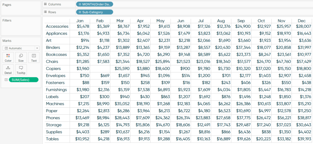
As you can see, without the preattentive attribute of color, it is challenging to quickly and accurately answer the question at hand: What is the highest and lowest value in the table? To help us, we will create a calculated field with the following code which will answer the question for us automatically.
IF SUM([Sales]) = WINDOW_MAX(SUM([Sales])) THEN “Max”
ELSEIF SUM([Sales]) = WINDOW_MIN(SUM([Sales])) THEN “Min”
ELSE “Neither”
END
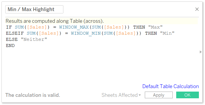
What this calculation will eventually do is look at the value of each cell and if that value matches the maximum value in the table, it will be labeled “Max”; if the value matches the minimum value in the table, it will be labeled “Min”. To have Tableau help us answer the business question, we are using two table calculations: WINDOW_MAX and WINDOW_MIN. By default, Tableau table calculations are computed from left to right across the table. This means that by default, the highest and lowest numbers will be labeled for every row in the table.
Tableau Fundamentals: An Introduction to Table Calculations
Continue reading with a free account, or login.
Unlock this tutorial and hundreds of other free visual analytics resources from our expert team.
Already have an account? Sign In
By continuing, you agree to our Terms of Use and Privacy Policy.
Understanding Tableau’s table calculations
Here’s how the view looks when adding our new Min / Max Highlight calculated field to the Color Marks Card:
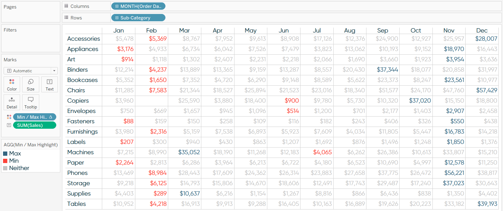
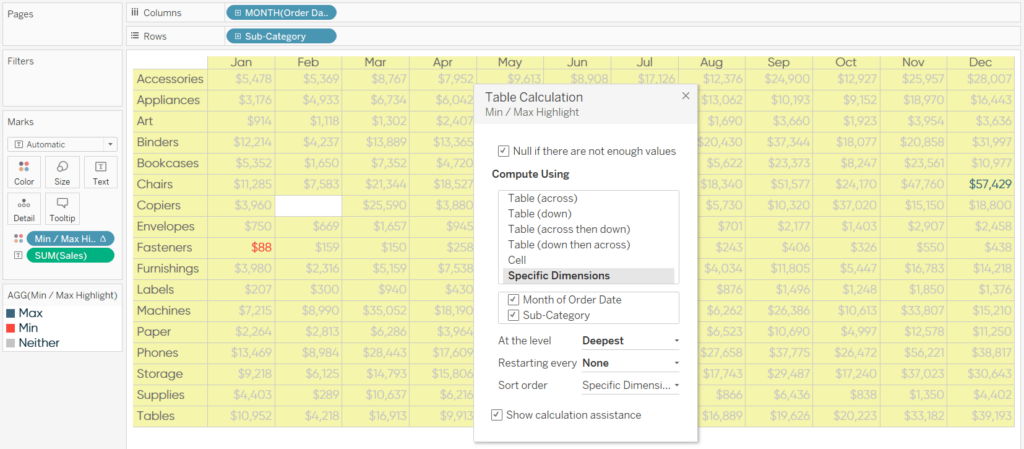
To get the effect we are hoping for, we will need to change the addressing of the table calculation. Currently, the highlighter is being computed with Table (Across), or Month of Order Date, only. To highlight the highest and lowest values for the entire table, we need to change the addressing to Month of Order Data and Sub-Category.
There are at least two ways we can change this. First, from within the view, you can click into the pill with the table calculation (identified with a delta symbol), and click “Edit Table Calculation…”. On the interface that pops up, choose “Specific Dimensions” and choose both Month of Order Data and Sub-Category.
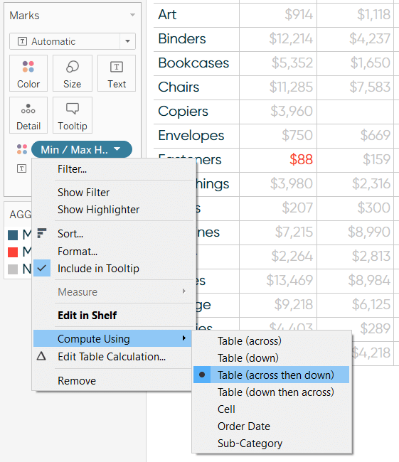
You can get to the same answer by clicking into the pill with the table calculation, hovering over “Compute Using”, and choosing “Table (across then down)”.
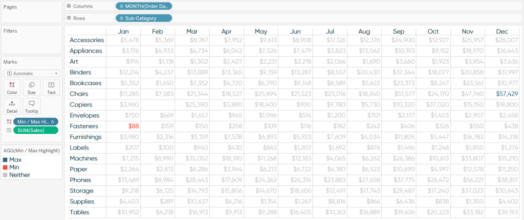
In both cases, the highest number in the entire table is colored one color, the lowest number in the entire table is colored a second color, and everything else is colored a third color.
A trick for creating highlight tables with discrete dimensions
To conclude, I’ll share a little hack to create a highlight table, even when the coloring is being created by a discrete dimension (like the MIN / MAX highlighter created in this post) instead of a continuous measure (like you would see on a traditional highlight table with a measure like Sales). Start by changing the mark type to Square and maximizing the size of the squares using the Size Marks Card.
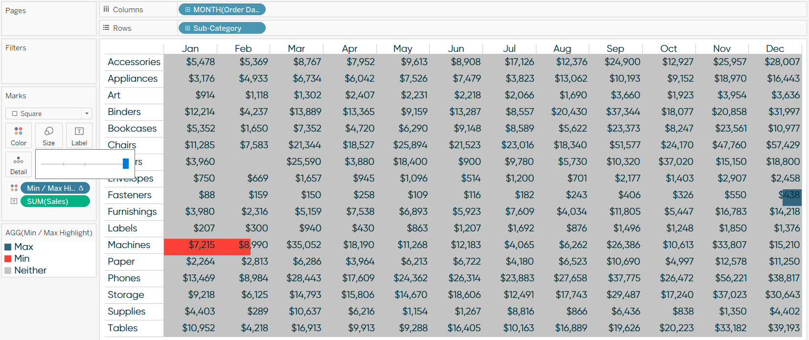
This view is not ideal because the squares are bleeding over into multiple cells. The trick to containing the highlighted squares in the correct cells is to add a “Blank” dimension to both the Columns Shelf and Rows Shelf. This can be accomplished by double-clicking to the right of each dimension that is currently on the Columns Shelf and Rows Shelf, typing two quotation marks, and hitting the Enter key.

If the extra space that the blank headers are creating bothers you, just right-click on each header and deselect “Show Header”.
Note that I used this highlight table example to illustrate that the logic was working properly, but this type of effect can be used for any chart type. We have created a calculated field that answers a business question for us automatically! This approach has reduced the time to insight and increased the accuracy of those insights even further than the preattentive attribute of color could do on its own.
Thanks for reading,
– Ryan
Related Content
The Beginner’s Guide to Tableau Table Calculations
Tableau table calculations, while very powerful, can be both tricky and confusing to work with. There are some great benefits…
Ryan Sleeper
Improve on the ‘gateway’ chart to data visualization Highlight tables help smooth the Excel transition by introducing the preattentive attribute…
3 Creative Ways to Visualize Outliers in Tableau
There are many ways to detect outliers in your data, but flagging them for your end users may present some…

