Practical Tableau: Why and How to Make Customizable Jitter Plots
‘Jittering’ is a technique for separating overlapping marks on a view. By giving marks some extra room by separating them into different columns, hidden data is often revealed and it is easier to visualize how the data points are distributed. The bad news is that Tableau does not provide an out-of-the-box option to jitter data points. The good news is that Tableau has an amazing community of very smart people who are willing to share their ideas. At least three Tableau Zen Masters that I know of—Steve Wexler, Mark Jackson, and Jeffrey Shaffer—have written about jitter plots.
If it’s good enough for them, it’s good enough for me. This post shares my favorite technique for creating jitter plots in Tableau, and also shows you how to put the intensity of the jitter into the hands of your end users.
Why and How to Make Jitter Plots in Tableau
Why jitter plots
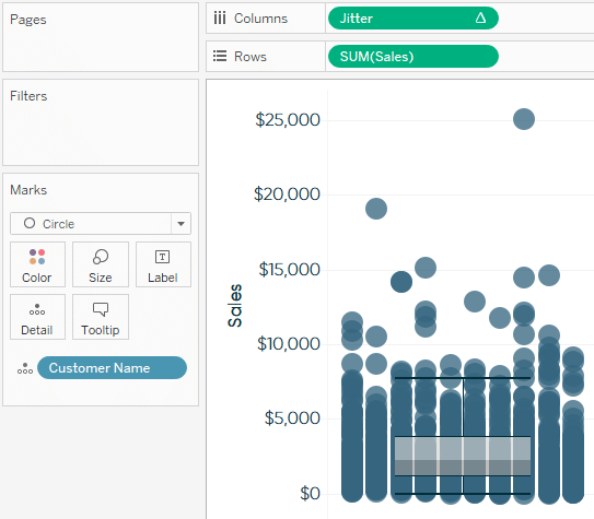
Consider the following box-and-whiskers plot, which shows the sales distribution of all of the customers in the Sample – Superstore data source:
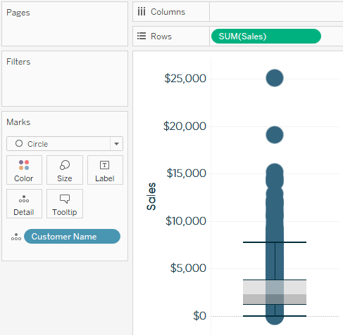
While the box and whiskers themselves are providing some valuable information about the distribution of the customers, it is impossible to get a good sense of how many customers are at each Sales value on the y-axis. We are able to see a couple of outliers at the very top, but the view summary in the bottom left corner of the authoring interface is telling me that there are 793 marks (i.e., customers) on the view. I cannot tell what is happening with the other 791 customers because they are all overlapping on a single column in the chart.
Continue reading with a free account, or login.
Unlock this tutorial and hundreds of other free visual analytics resources from our expert team.
Already have an account? Sign In
By continuing, you agree to our Terms of Use and Privacy Policy.
Using the INDEX() function to create a jitter effect
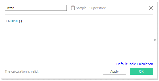
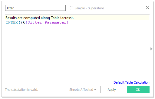
Jitter plots are created using the INDEX() function and changing the addressing to the most granular level of detail—which in our case is Customer Name. To get started with jitter plots, create a calculated field named Jitter that includes only the INDEX() function:
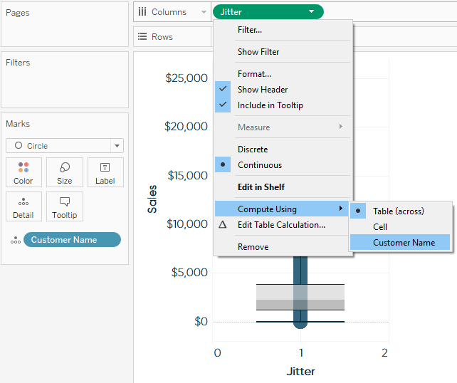
When this newly created calculated field is placed on the Columns Shelf, a new axis will appear, but all of the marks will still be lined up in one column. To apply the jitter, click on the calculated field, hover over “Compute Using” and choose the most granular level of detail—Customer Name:
For more on addressing, see An Introduction to Tableau Table Calculations.
After changing the transparency and size of the marks, hiding the Jitter axis, and bringing the right side of the view in to make the chart skinnier, I am left with this jitter plot:
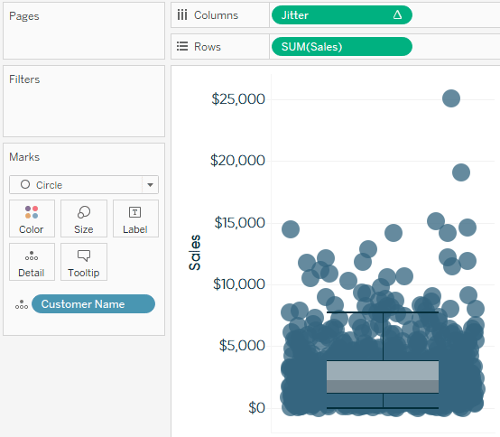
As you can see, it is now much easier to see how our customers are distributed on the y-axis. The horizontal position of each mark does not mean anything to the analysis, but it separates the marks so they are not all lying on top of each other.
How to control the intensity of the jitter
This is a perfectly usable jitter plot, but there may be times when you want to control the intensity of the jitter, or how many columns there are on the x-axis. To hardcode the number of columns used to jitter the marks, simply edit the Jitter calculated field and add ‘%X’, where X represents the number of desired columns, immediately after the INDEX() function. Here’s how the same analysis from above looks when I edit the underlying formula to be “INDEX()%10”:
This technique works particularly well if additional dimensions are going to be added to the Columns Shelf for the analysis because all the columns will have the same jitter intensity specified in the previous step.
Instead of picking just one number to specify the jitter intensity, you can even replace the number in the Jitter calculated field with an Integer parameter to allow the end user to quickly change it. Here’s how my jitter calculated field looks after building a parameter and replacing the “10” with the new parameter:
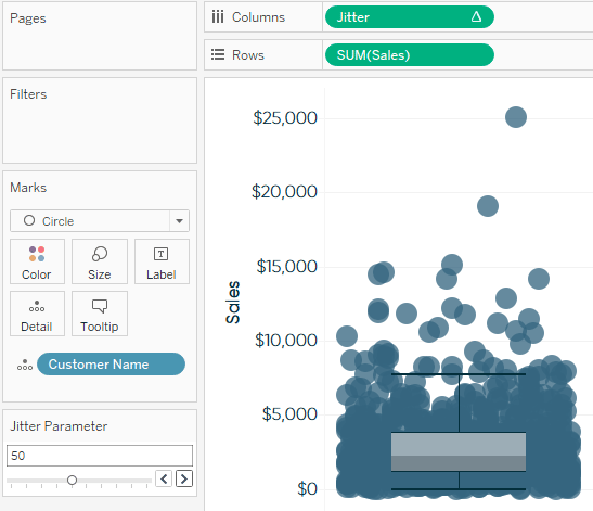
For this example, I set up my parameter to include integers from 10 to 100 with a step size of 10. After showing the parameter control, my end users can change the intensity of the jitter plot, picking any multiple of 10 between 10 and 100. Here’s how my final view looks after some formatting to remove the vertical zero line and changing the jitter intensity to 50:
For more on parameter allowable values and data types, see An Introduction to Tableau Parameters.
Thanks for reading,
– Ryan
This content is excerpted from my book Practical Tableau: 100 Tips, Tutorials, and Strategies from a Tableau Zen Master published by O’Reilly Media Inc., 2018, ISBN: 978-1491977316. Get the book at Amazon.
Related Content
The Beginner’s Guide to Tableau Table Calculations
Tableau table calculations, while very powerful, can be both tricky and confusing to work with. There are some great benefits…
Ryan Sleeper
Add context and discover new insights by separating overlapping marks Timelines are a great option for adding context to visualizations…
How and Why to Make Box Plots in Tableau
Box plots, sometimes called box-and-whisker plots, can give your dashboard users an easy introduction into the world of statistical analysis…

