Tableau Tip: How to Highlight Data Points in a Custom Date Range
This tutorial will illustrate how to add a highlighter to a custom date range selected by an end user. The highlighter will lay over the data points corresponding with the selected range of dates. This technique will help you and your dashboard’s users see the marks in the selected date range in context of the other marks on the view and is an easy way to enhance the design of a line graph. One of the best parts about the following approach is that it will not require you to use the dual-axis, leaving some flexibility to add even more context or aesthetic improvements to the graph.
This is the second in a series of five “you are here” Tableau tutorials. These tips will help improve the user experience of your Tableau dashboards by helping guide your end users. Subscribe here to receive new updates.
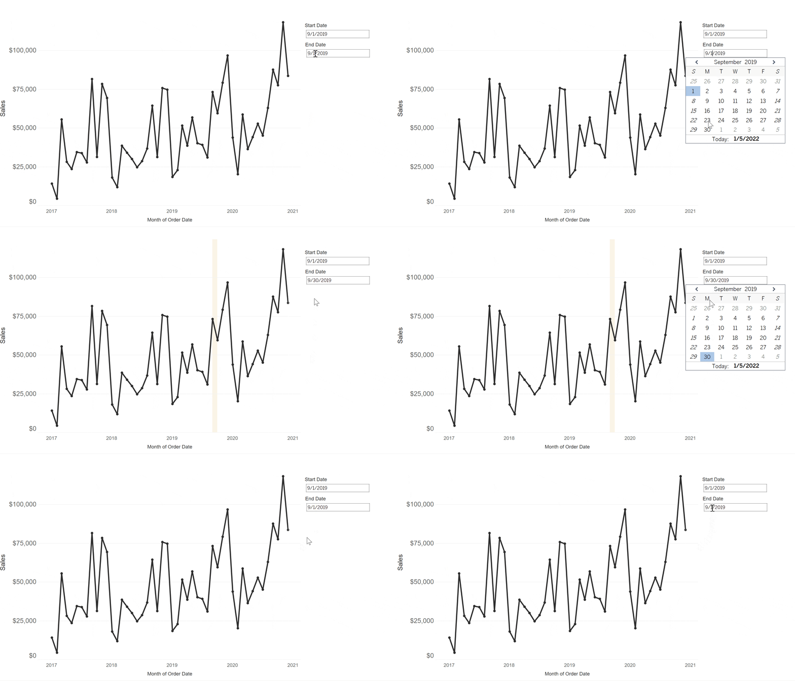
In order to highlight the data points in a custom date range, we will use a combination of Tableau parameters and reference lines.
Continue reading with a free account, or login.
Unlock this tutorial and hundreds of other free visual analytics resources from our expert team.
Already have an account? Sign In
By continuing, you agree to our Terms of Use and Privacy Policy.
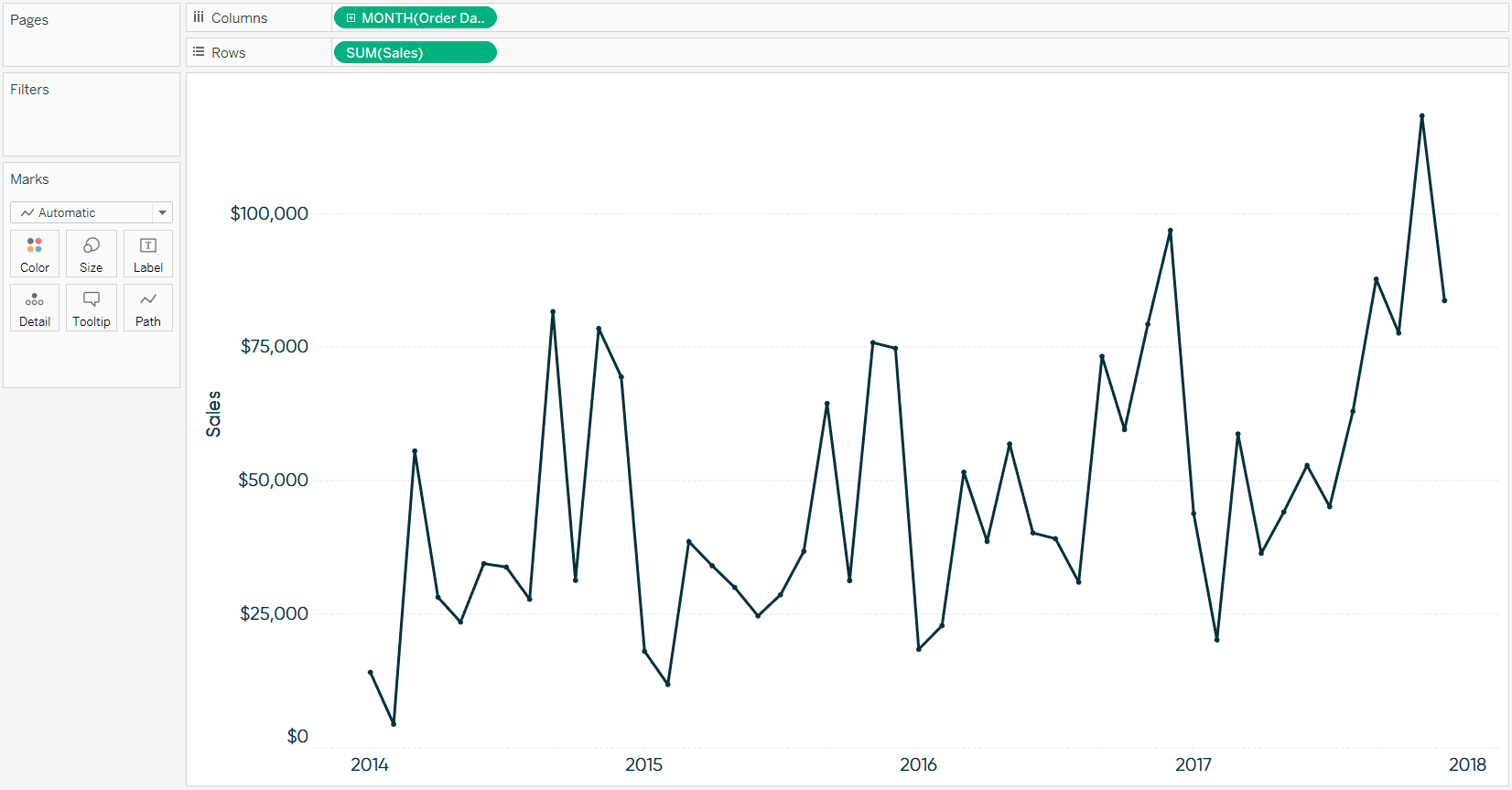
As we did with the first tip in this series, How to Automatically Highlight the Latest Trends in Tableau, I’m going to create a sales by continuous month line graph using the Sample – Superstore dataset as our foundation.
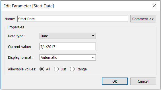
Next, set up a parameter with a data type of Date. This first parameter will eventually be used to select the beginning of the highlighted range. Here’s how mine looks after setting it up and choosing 7/1/2017 as the date.
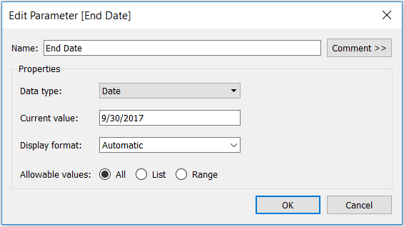
We also need to create a parameter that will be used to select the end of the highlighted date range. Since we already made a parameter with a data type of Date, you can either create a new parameter from scratch, or simply right-click on the Start Date parameter created in the previous step and choose “Duplicate”. Either way, after editing the name of the parameter to “End Date” and choosing a different date (9/30/2017), my second parameter looks like this:
After creating both parameters, we are able to create a highlighter that will surround the data points in the specified date range. This is accomplished through a reference line, or more specifically, a reference band. To add a reference line, you can either use the analytics pane or just right-click on the axis and choose “Add Reference Line”.
There are just three keys to get this to work properly: (1) choose the icon for “Band” at the top of the reference line dialog box (2) change the “Band From” Value dropdown to the newly created Start Date parameter and (3) change the “Brand To” Value dropdown to the newly created End Date parameter.
Here is where you may also choose to format the band and its enclosing lines or customize the line labels (I like to change them to “None”). Here’s how my parameter looks after setting it up and tweaking the format.
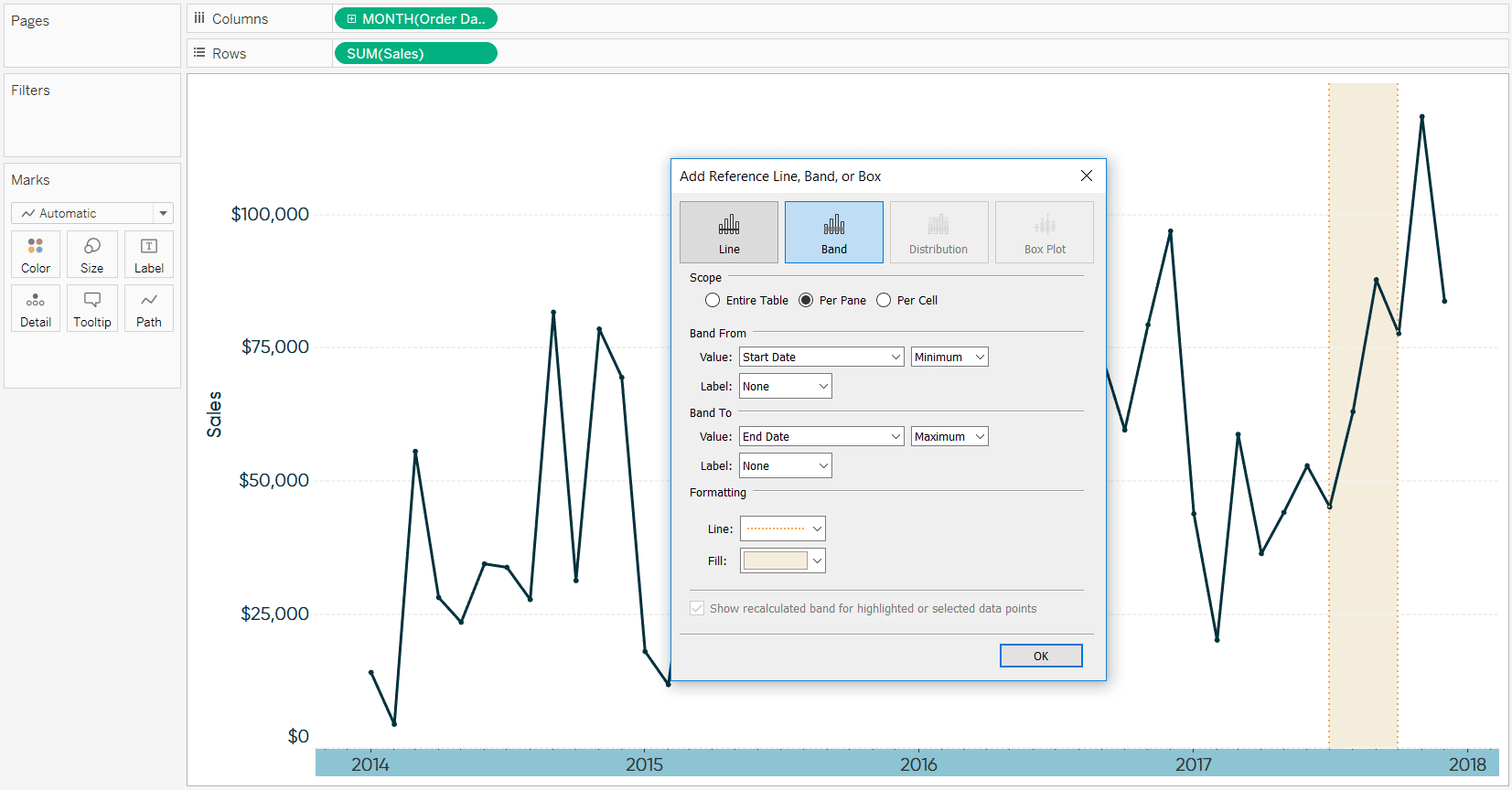
You can already see the reference band working in the background as its highlighting the dates set up in the parameters (July 1 – September 30). Click “OK” to close the reference line dialog box.
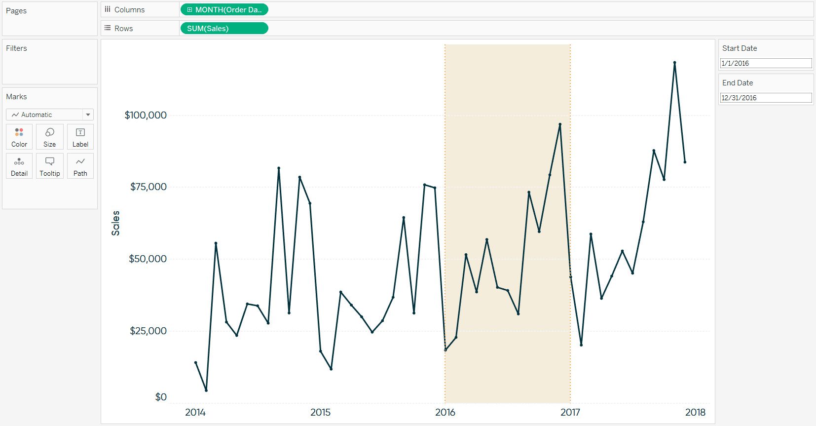
Lastly, show both the Start Date and End Date parameter controls by right-clicking on each parameter and choosing “Show Parameter Control”. This will allow you and your end users one-click access to changing either the start date and/or end date of the highlighter. Here’s how my final view looks after highlighting the year 2016.
For more tips on designing line graphs, see 3 Ways to Make Lovely Line Graphs in Tableau.
Thanks for reading,
– Ryan
Related Content
3 Innovative Ways to Highlight Selections in Tableau
In this tutorial I will demonstrate three ways to use different mark types with transparent sheets to highlight a selection…
Ethan Lang
Benchmarking, Modeling, Forecasting, and More In this live webinar on the Analytics pane in Tableau, join Ethan as he does…
Ryan Sleeper
Comparing Dates with Tableau’s DATETRUNC, DATEADD, and LOD Functions Get more from dates in Tableau by learning how to: (1)…
