Dashboard Gauge 5: How to Make Indicators with Custom Shape Palettes
Like the stock ticker gauge, most shapes are not the best choice for visualizing magnitude, but just like sometimes when you need something other than a bar chart, sometimes you need a gauge other than a bullet graph. I like the custom Tableau shape indicators I’m sharing because they: (1) immediately and intuitively convey performance, (2) have a minimalist design, and (3) provide a starting point that can be linked to deeper analysis.
This post will show you how to: (1) find and format custom shapes for your dashboard, (2) install those shapes in your Tableau Repository so you can map them to your data, (3) write a calculation to dynamically change the shape being displayed based on performance, and (4) use dashboard actions and/or the Viz in Tooltip feature to link to deeper analysis.
This is the fifth and final post in a series on dashboard gauges in Tableau. To this point, we’ve covered bullet graphs, rounded gauges, custom background images, and ‘stock ticker’ gauges. For this final installment, we’ll have some fun and use custom shapes that dynamically change based on performance.
How to Make Indicators with Custom Shape Palettes in Tableau
Where to find images for your custom indicators in Tableau
By the end of this post, you will be able to make indicators using custom shapes of your choosing that change based on performance.
In my example, the indicators turn to a green smiley face if the month-over-month change for a KPI was positive, a yellow neutral face if the month-over-month change was negative but within 10%, and a red upset face if the month-over-month change was worse than 10%. You can use any images and performance thresholds that you want.
The first thing we need are the images used to indicate the change in performance. Here are just a few ideas for obtaining the images:
- Make them. I personally use Adobe Photoshop and Illustrator, but often Microsoft PowerPoint will suffice.
- Buy them. The images in my example are a stock Illustrator file I purchased from iStock for $12. If that’s too rich for your blood, I also like the selection of icons available at The Noun Project, which can be purchased for $1.99 each and support the artists. There are countless others, but these are the two I primarily use.
- Search them. To keep your positive karma in the universe, I recommend using Google Image Search, click “Settings” in the bottom right corner of the screen, and click “Advanced search”. At the bottom of the advanced settings is a place to choose the appropriate “usage rights” for your use.
For best results when using images in Tableau, in general, create the image or search for images in a .PNG (Portable Network Graphics) format. This format can be saved, and is often created, with transparent backgrounds so the image can be used in Tableau on different background colors or to reveal underlaying marks (like you may need on a scatter plot). Here is one of my indicators in PhotoShop before I saved the image as a PNG file; the checkered background indicates the portion of the image that will be transparent.

Once you have all the images you want to use in your visualization, you have to place the files in the Shapes folder within the Tableau Repository on your computer. This can be found at Documents > My Tableau Repository > Shapes. Each folder within the Shapes folder corresponds with a shapes palette within Tableau Desktop that can be used to map shapes to dimension members.
Continue reading with a free account, or login.
Unlock this tutorial and hundreds of other free visual analytics resources from our expert team.
Already have an account? Sign In
By continuing, you agree to our Terms of Use and Privacy Policy.
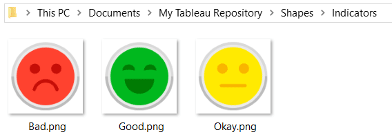
You can copy and paste the image files into an existing Shapes folder, or you can create your own. I like to create new folders which will generate a separate palette that I can eventually access when I’m using Shape as my mark type in Tableau. Here’s how my folder for “Indicators” looks on a PC.
Build the custom indicator gauges in Tableau
We’re now ready to open Tableau and build the indicator gauges. To create gauges that represent month over month performance or performance compared to a goal, you need two calculated fields for each measure: the first to compute the comparison, and the second to compute the ‘Good’ / ‘Okay’ / ‘Bad’ thresholds (or whatever you are using).
For ease of illustration, I’ll pretend we’re comparing entire months to each other across all four years of data in the Sample – Superstore dataset, and we want to compute the percent change between the month of March and February. You will need to adjust this calculation to include your two comparison points, but the formula for percent change is:
([Current Performance] / [Comparison Performance])-1
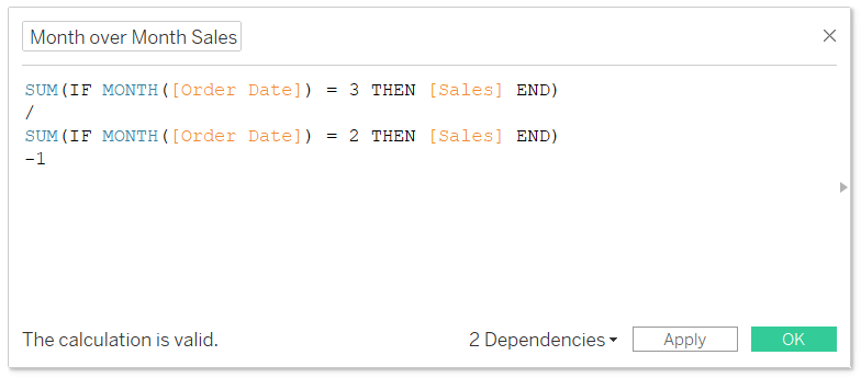
If I’m comparing March to February, the formula is:
SUM(IF MONTH([Order Date]) = 3 THEN [Sales] END)
/
SUM(IF MONTH([Order Date]) = 2 THEN [Sales] END)
-1
For a tutorial on how to compare any date range to the date range preceding it, see How to Normalize Current Dates and Prior Dates on the Same Axis in Tableau.
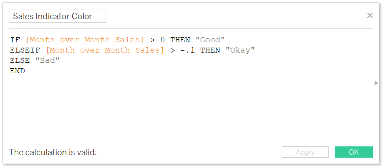
For the second calculated field, I will use IF / THEN logic to create three different scores that will eventually be mapped to my custom shapes. We’ll say that if the current performance outperformed the comparison, we’ll call that “Good”; under-performance within 10% will be described as “Okay”, and under-performance of greater than 10% is “Bad”. The formula is:
IF [Month over Month Sales] > 0 THEN “Good”
ELSEIF [Month over Month Sales] > -.1 THEN “Okay”
ELSE “Bad”
END
To make the gauge, start a new worksheet, change the mark type to Shape, and put the calculated field that is computing the performance thresholds onto the Shape Marks Card.
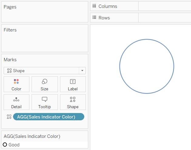
In this example, March has outperformed February so the indicator has been classified as “Good”. So far so good, but now we need to map our custom shapes to each of the three performance scores. The first one is easy because it is already on the view. Just click on the Shape Marks Card to access your available shape palettes and use the dropdown to find the custom shape palette installed in your Tableau Repository.
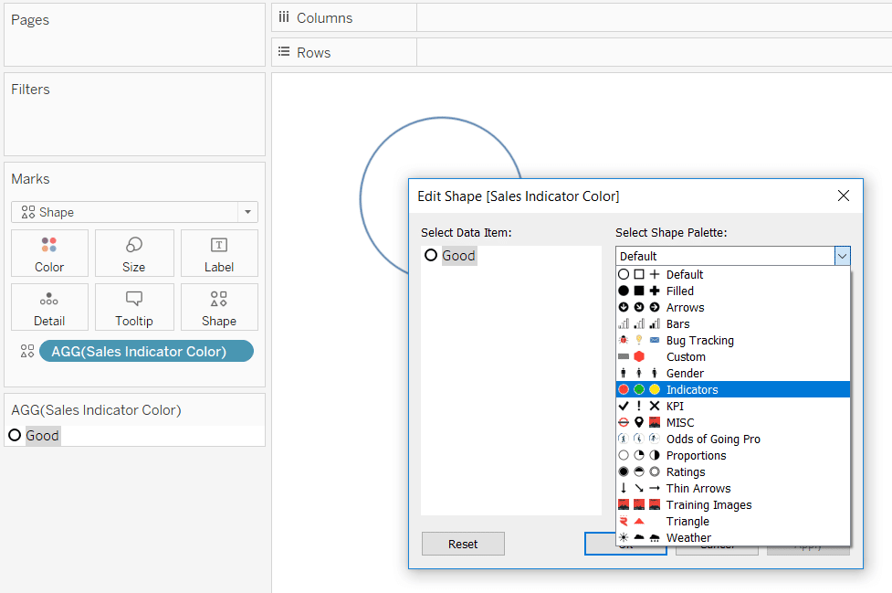
If you installed the custom palette while Tableau was open, you will need to click the “Reload Shapes” button in the bottom right-corner of this interface before the new palette will appear.
Mapping custom images to outcomes
To map a performance score to a specific shape, ensure the dimension member is selected from within this interface, then click on the shape you want assigned to the dimension member.
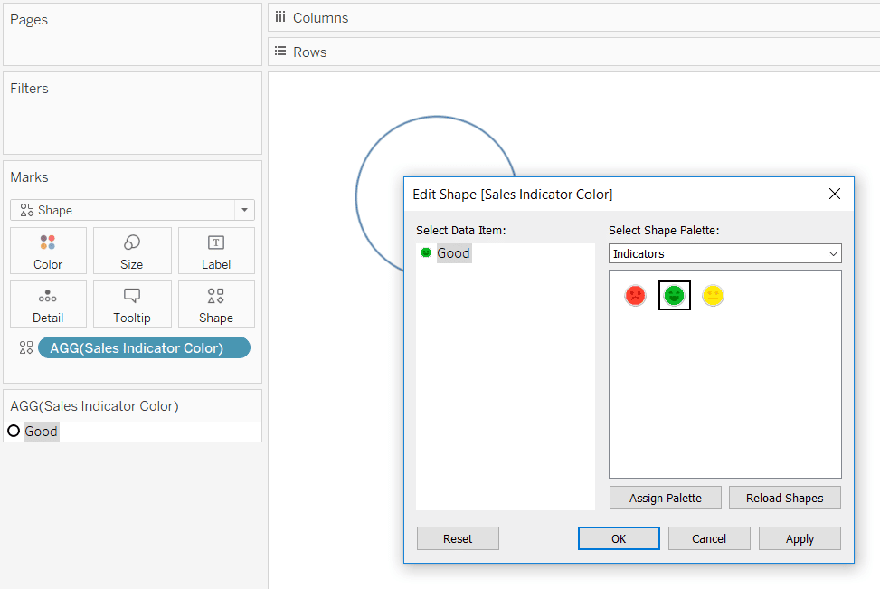
After clicking the “OK” button, I have my first indicator mapped. I’ll see a green smiley face any time my current performance outperformed the comparison.
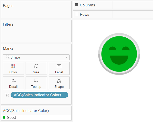
We have only mapped one of the three outcomes, so should the performance change to Okay or Bad in the future, at this point, we would only see default shapes. So, how do you map the other two outcomes if they’re not on the view? You could manipulate the dates in the month-over-month calculated field to attempt to find months that match the other scoring thresholds, but I have an easier way.
To map discrete scoring scenarios (like we have here) that are not on the view or have yet to appear in your data, temporarily hardcode numbers that match the unseen scenarios in the underlying calculated field. I like to do this by using the aggregation MIN and typing in numbers that match the additional outcomes. For example, to create the “Okay” scenario, I will edit the calculated field that is computing the comparison, and overwrite what is there with “MIN(-.01)”. Just make sure you copy and paste the original formula back into the calculated field after you have mapped all the outcomes.
-.01 is an under-performance of 1%, which in this example, results in a scoring outcome of “Okay”. I can now map the neutral yellow face to this scenario.
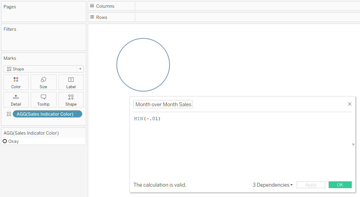
Repeat this step for as many outcomes as you have, then paste your original formula back into the calculated field. The mapping now works for every scenario, even if it hasn’t appeared in your data yet!
Add value with Tableau’s Viz in Tooltip feature and/or dashboard actions
This type of gauge is extremely descriptive in nature, providing only a very high-level overview on which areas of the business are healthy or need attention. One way to add value to this custom shape gauge is to use Tableau’s Viz in Tooltip feature. To display a trend when the end user hovers over one of my custom indicators, I’ll first make a trend that looks at Sales by Month of Order Date.
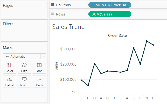
This graph can be added to the tooltip of the Sales indicator by navigating back to the sheet for the indicator, clicking on the Tooltip Marks Card, clicking the “Insert” button in the top right-corner of the Tooltip interface, and hovering over Sheets.
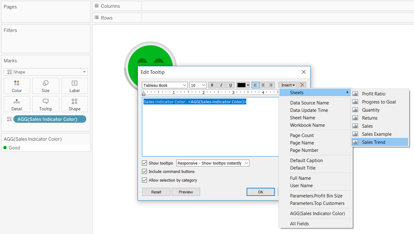
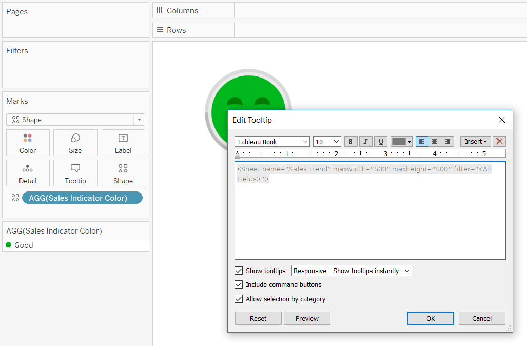
After choosing the Sales Trend sheet, it will appear in my tooltip. You may have to adjust the height and width defaults to ensure the graph does not get cut off when being viewed within the tooltip. Here are my settings after changing the height and width to 500 pixels each.
After clicking the “OK” button, the user will see the 12-month trend when they hover over the indicator!
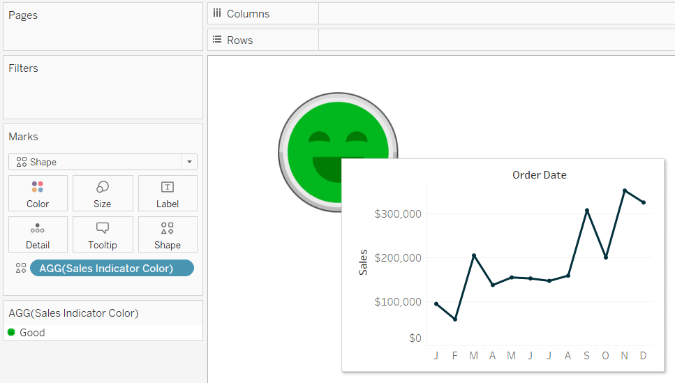
Of course, you can customize this Viz in Tooltip with whatever is relevant for your business and/or add additional fields to the tooltip such as current performance and comparison performance.
Another idea for adding value to these descriptive indicators is to use Tableau dashboard actions to link to deeper analyses. To do so, add the indicator to a dashboard and navigate to Dashboard > Actions… in the top navigation. To navigate the user to a sheet within the same workbook, add a “Go to Sheet…” action; to navigate the user to a view that lives on Tableau Server, Tableau Online, or Tableau Public, add a “Go to URL…” action. This is a great technique for keeping your workbooks and dashboards uncluttered and only linking your audience to deeper views when relevant.
One last thing, this approach to building gauges with custom shapes can also be used to create custom workbook navigations or custom dashboard filters.
Thanks for reading,
– Ryan
Related Content
How to do “Button Swapping” in Tableau
You’ve likely heard of sheet swapping in Tableau; a well-known tactic that allows your users to choose what type of…
3 Innovative Ways to Highlight Selections in Tableau
In this tutorial I will demonstrate three ways to use different mark types with transparent sheets to highlight a selection…
Ryan Sleeper
Leverage color to improve your designs and help communicate insights Color tips include reducing the saturation of marks, keeping color…


