Data vs. Analytics vs. Visual Analytics

As tradition holds, Playfair Data shares our analytics trends and predictions going into each new year and recaps it by sharing the Playfair+ tutorials the community found most useful. As expected, last year saw the rise of everything AI, including not only using data to train AI models but AI applications created specifically for data analysis. Using data to support decision making is good, but in my observation, the overreliance on AI and data alone caused the general practice of data analysis to take a step backward in 2025.
So this year, I thought I would clarify the differences and value between data, analytics, and visual analytics. According to Gartner’s most recent Hype Cycle for Analytics and Business Intelligence, the AI-resistant skillset with the longest predicted shelf life – over 10 years – was decision engineering. My belief is that decision makers will not act on findings unless they see potential outcomes for themselves. My hope is that this post will show you how to combine these three complementary aspects of data analysis: data, analytics, and visual analytics, to make this year your best yet.
A data source is not a deliverable.
Are you doing visual analytics, or just analytics, or (gasp)… just data? Everything Playfair Data does, whether deciding how to structure a team for our clients or creating a training program for the Playfair+ training platform, revolves around a strategic framework called the Playfair Venn. The Playfair Venn is a mashup of two data visualization pioneers: our namesake, William Playfair, and John Venn, of Venn diagram fame. The framework includes what we consider to be the four tenets of visual analytics: Strategy, Data, Design, and Engineering. These four are equally weighted, and skipping even a single skillset guarantees an analytics project will fall short of its potential.

Notice how data accounts for only a fourth of the framework? Focusing exclusively on data is like trying to build a four-legged chair with only one leg – someone is bound to get hurt, embarrassed, or both. If you think of each of the four skills making up 25% of a total grade, and if you then add 25% each time one of them is included in an analytics-related project, it is uncanny how closely the results align with the academic A – F letter grading system. Include just one (25%) or two (25% + 25% = 50%), you receive a failing grade and are left with an unusable solution. Any combination of the three (25% + 25% + 25% = 75%) will get you an average C grade, which typically results in a product that provides value in some way despite a nagging feeling that something isn’t quite right. The only way to earn the A+ and give your project the best chance for success is to consider all four tenets.
Create a free account, or login.
Unlock this tutorial and hundreds of other free visual analytics resources from our expert team.
Already have an account? Sign In
The most-common combination I come across outside of Playfair is strategy and data. These are good-intentioned projects that at least include a subject matter expert (SME) and attempt to tie the data output to an audience and/or company objective. However, these types of projects fall short of allowing the user to ask the inevitable question after the question, engaging stakeholders to improve engagement and drive adoption, and creating sustainable return on investment (ROI) by automating value-adding insights.
That’s why I always tell my team that “a data source is not a deliverable.” A data source alone, even those thoughtfully tied to strategy and including (perceived) perfect data, fails our customers by not supporting their decision-making process. This reminds me of the classic exercise I’ve been doing for over a decade, where I show the following text table (i.e., data source) without design or engineering applied and ask the audience to answer the simplest business question I can think of, “What is the highest number?” Give it a try and see how long it takes you to come up with the correct answer!
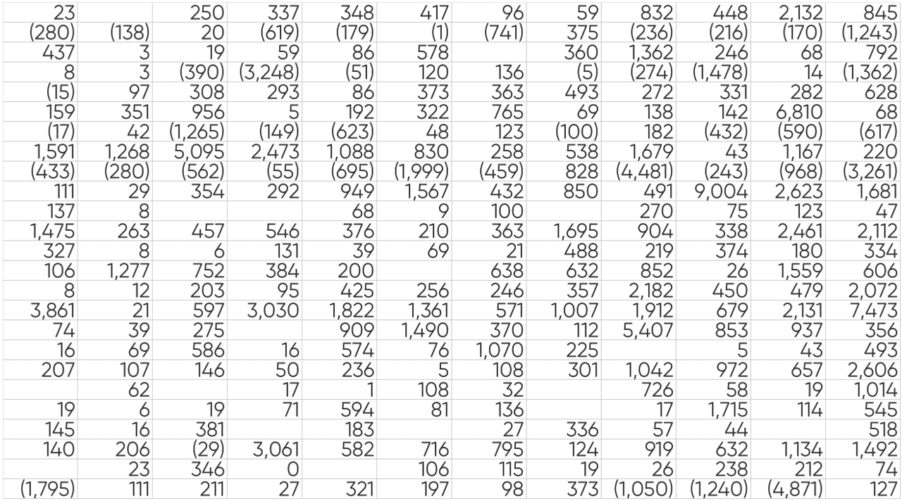
Took you a little while, right? Maybe thought you had the correct number, but had to keep looking before coming across a higher number? If you’re honest with yourself, you likely agree that this data source alone is not the best way to communicate insights for ourselves, much less our stakeholders. Also, let’s unanimously agree that “what is the highest number” is a lame business question. If a data source alone wasn’t even good at answering that question, how is it going to help us answer things that actually matter?
I’ll show you how to transform this data source into a decision-making machine through design and pre-attentive attributes later in this post. For now, just know that data alone doesn’t take advantage of any of the major benefits of visual analytics, including reduced time to insight, increased accuracy of insight, and improved engagement.
Data is the fuel. Analytics is the car that moves you somewhere.
Analytics is the process of analyzing data to reveal patterns and meaningful insights that will support decision making. Where data is the source of the value, you can’t unlock data’s potential value until you apply analytics. It’s like how gas is a valuable resource on its own, but its value isn’t realized until we put it in our car so we can go somewhere. In this metaphor, data is the fuel, but the car is the analytics that we apply to make progress.
Analytics should be the minimum bar for you and your stakeholders when using data to make decisions. It’s a huge step forward compared to data alone because it seeks to transform that data into insights and provides confidence by ensuring those insights are meaningful.
One of the reasons I wanted to document my thoughts on the differences between data, analytics, and visual analytics is that people seem to use these terms interchangeably when there are distinct differences between these three aspects of data analysis. The challenge becomes even harder when you do a deeper dive on analytics itself, and harder still when you consider the rapidly evolving landscape of data analysis, including AI. So let’s align on the definitions of some key analytics concepts you may have heard so we can better understand how they work together to turn data into decisions.
Scientific method. The tried-and-true process for gaining knowledge by stating a hypothesis, conducting experiments, collecting data, analyzing data, and drawing conclusions that can inform future hypotheses and further experimentation.
Statistics. A branch of mathematics that combines algebra, calculus, and probability theory to infer conclusions. When applied to the data analysis step of the scientific approach, statistics act as a form of checks and balances that reduces bias.
Advanced analytics. I describe any time statistics is being applied to increase the chances that results are meaningful as advanced analytics. Let’s say we are analyzing the results of a test on which discount rate leads to the most new orders. One might use explanatory analytics to read a bar chart and see that the discount of 20% resulted in X more orders when compared to the discount of 10%. The analysis would become advanced if the analyst used a combination of sample size and z-score testing to determine if the result was statistically significant.
Algorithm. A procedure or set of instructions with a predetermined number of steps. In our daily lives, we are technically executing an algorithm any time we go through a sequence of common steps (think getting ready in the morning, brushing your teeth, or buttoning a shirt). Within computer science and AI, the procedure is run by a computer. As I type this, an algorithm is running a set of specific steps that includes gathering the input based on the key I strike, storing that data, conforming each character to the font styles I’ve previously selected, and, eventually, displaying the character on the screen as an output.
Machine learning. The jump to machine learning happens when algorithms and advanced analytics are not only automated, but the results compound to the point where explicit programming is not required to ask the question after the question. Instead, after the original program has been set in motion, the program can predict the next need and improve over time as it gathers and evaluates more data.
Deep learning. A subset of machine learning that uses artificial neural networks, inspired and designed to mimic the human brain, that can handle ever-increasingly large and complex data.
Artificial intelligence. AI encompasses machine learning, deep learning, and natural language processing to mimic decision making associated with human behavior. Its applications are as broad as data itself – including a role in data-driven decision making.
There’s no doubt that applying these techniques is a step in the right direction when it comes to using data to make decisions, but they often fall short of communicating findings in a way that are understandable, actionable, and scalable. To revisit the A-F grading system comparison outlined earlier, the most-common combination of skills I see when analytics are being applied are strategy (25%), data (25%), and now the introduction of engineering (25%) which may be used to incorporate statistical modeling, allowing the users to change factors on the fly, and/or automating results as new data is ingested. Stacking the 25% of the Playfair Venn, each of these three skills yields results in a decent C-grade, but falls short of our data reaching its full potential.
Visual analytics: data’s Rosetta Stone.
Technology is rapidly improving in such a way that we can track, store, and analyze more data than ever before. The problem is humans are not wired to read hundreds of rows of raw data, much less billions of potential data records. We need a translator to make sense of data, in turn translating it into valuable applications. Well, much like the side of the Rosetta Stone in Ancient Greek language was used to translate Egyptian Hieroglyphs, preattentive attributes, data visualization, and visual analytics can be used to effectively understand data in a matter of milliseconds.
To introduce the power of visual analytics, consider the table of numbers above, where we attempted to find the highest number. This time, I will “encode” the numbers so that higher numbers are blue and lower numbers are red. This time, I bet you can find the five highest and the five lowest numbers faster and more accurately than you answered a single question before.
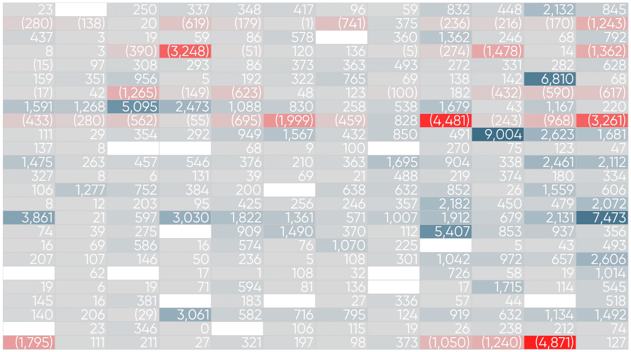
Along with form and motion, color is one of three categories of preattentive attributes, which are visual properties that, when applied to data, allow us to almost subconsciously find insights. Preattentive attributes are a survival mechanism that have been with us since the inception of humankind to help us identify threats, but were formally applied to data by our company’s namesake, William Playfair, at the turn of the 19th century. The crazy thing to me is that Playfair’s first bar chart and line graphs were introduced in 1786, 13 years prior to the discovery of the Rosetta Stone. Maybe I should stop saying that visual analytics is data’s Rosetta Stone and start saying that the Rosetta Stone is Egyptian Hieroglyphs’ data visualization!
Playfair Data Presents: Preattentive Attributes
These preattentive attributes, which are really what make visual analytics “go”, can be applied to data and/or analytics to uncover meaningful patterns, communicate valuable insights, and ultimately support the decision-making process. As just one example, see how color can be applied to the following analytical view to detect outliers and tell us whether the results are statistically significant.

What I like best about this application of visual analytics is that it not only draws our attention to positive or negative outliers, but it also tells us instantly whether findings are statistically significant. This allows us to avoid unnecessary celebration or despair at every spike or dip on the trend line, leaving us to focus on the actions that will actually move our business forward.
The Benefits of Data Visualization for Data Scientists
In modern terms, visual analytics is ancient, but I still encounter business users falling back on the familiarity of table-based data in software like Excel, in turn neglecting the competitive advantage that’s been hiding under their nose for over two centuries. That’s why I encourage you to stay connected to Playfair Data, learn more about the powerful medium of visual analytics on our what is visual analytics page, or if so inclined, tell us how we can support you.
Thanks for reading,
Ryan

Written By
Ryan Sleeper
Related Content
Definitive Guide: Tableau vs. Power BI vs. Oracle Analytics Cloud
Okay, I get it. Searching for “Tableau vs. Power BI” leads to over 25 million results in Google, and that…
Data democratization is dead. Long live data democratization.
This year, I had the opportunity to attend my first Gartner Data & Analytics Summit, one of the leading community…
The Parallels Between Storytelling and Data Visualization
Think of the lyrics from your favorite song – or any song for that matter. I guarantee it contains the…