Tableau vs. Power BI vs. Oracle Analytics Cloud: 2026 Comparison Guide

Okay, I get it. Searching for “Tableau vs. Power BI” leads to over 25 million results in Google, and that is if you can even get past the ‘no-click’ AI response. The Tableau versus Power BI debate has been covered ad nauseam, so you may be wondering why I’m choosing to provide my own take on the evaluation. Well, the fact is that existing clients and new prospects still consistently ask for Playfair’s professional consulting opinion on the matter. There are other reasons too, including:
- Playfair innovations and unique strategic applications require us to have certain grading criteria that simply don’t exist in other resources – which I’ll provide below!
- As of this writing, AI responses don’t include screenshots that can be used as shareable snippets you can use to circulate within your organization. As the visual analytics consultancy, not providing visuals is something we just can’t stand for.
- What are considered the “best” business intelligence solutions are constantly evolving to meet the related, and constantly evolving, use cases in a dynamic, real-world business environment. Those 25 million Google results are old. The AI response is usually even older.
- Most importantly, you still stumbled on this post, so that tells me there’s an audience still looking for guidance.
This post evaluates Tableau, Power BI, and Oracle Analytics Cloud in the context of a dozen different evaluation criteria: 1. Engineering’s Big 3, 2. Ease of Use / Learning Curve / Continuous Education Resources, 3. License Cost and Total Cost of Ownership, 4. Integration / Holistic Ecosystem, 5. Flexibility, 6. Data Integration, 7. Data Visualization, 8. Scalability / Performance, 9. Security and Compliance, 10. Transparency, 11. Infrastructure Compatibility, and 12. Change Management. Along the way, I’ll share several simple, straightforward visuals that can be copied into emails or PowerPoint presentations as you consider which option is best for your own requirements.
The aim of this post isn’t to make a single be-all and end-all recommendation. Rather, I hope you find the twelve scoring criteria to be thoughtful factors that you can use to make a selection based on the combination of criteria that you personally value the most. Playfair+ members can read the full 5,426 words in the post by signing in, or if you can get started by becoming a Free member with no strings attached (except one or two emails with innovations from our expert team sent to you each month).
Executive Summary: This comprehensive guide evaluates Tableau, Power BI, and Oracle Analytics Cloud across 12 critical criteria for B2B decision-makers. Whether you’re a Microsoft shop, Oracle user, or seeking best-in-class flexibility, you’ll find data-driven insights to inform your BI platform selection. Book a strategy call to discuss your specific requirements.
Jump to:
- Engineering’s Big 3
- Ease of Use / Learning Curve / Continuous Education Resources
- License Cost and Total Cost of Ownership
- Integration / Holistic Ecosystem
- Flexibility
- Data Integration
- Data Visualization
- Scalability / Performance
- Security and Compliance
- Transparency
- Infrastructure Compatibility
- Change Management
Why Tableau vs. Power BI vs. Oracle Analytics Cloud
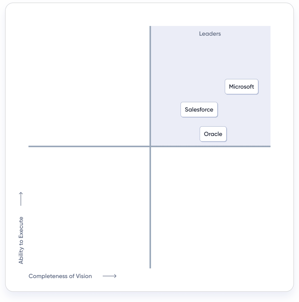
Before we jump into the various evaluation variables, let’s touch on why Tableau vs. Power BI remains a valid debate in 2026, and why I’ve chosen to include Oracle Analytics Cloud (OAC) in the consideration set. Earlier this year, Playfair made a strategic decision to align our expertise with Tableau, Power BI, and OAC because those are the three “leaders” (based on ability to execute and completeness of vision) that are the furthest along in the completeness of vision within Gartner’s well-regarded Magic Quadrant for Analytics and Business Intelligence Platforms.
Having written four of the leading books on the software, Playfair Data has always been deeply aligned with Tableau’s set of solutions, including Tableau Desktop, Tableau Server, Tableau Cloud, Tableau Prep, Tableau Public, and more. About five years ago, due largely to the perception (covered in the Cost and Total Cost of Ownership section below) that Power BI is cheaper than Tableau and fits better with their existing software stack, including Excel (covered in the Infrastructure Compatibility section), many companies chose to switch from Tableau to Power BI. Or, more realistically, they now use multiple BI tools. So, after realizing about half of our customers were using Tableau or Power BI (or both), we built an expert Power BI consulting team and have translated our most popular training courses to Power BI as well.
Then Oracle’s own BI solution splashed onto the scene. Oracle was already a leading software company, but last year saw them emerge as a leader in the AI space, their stock price explode – up 66% in the last 12 months as of this writing, competing as a finalist in the Gartner Data & Analytics Summit BI Bake Off, and landing a spot firmly in the Magic Quadrant for Analytics and Business Intelligence Platforms. After comparing its capabilities to our existing capabilities in both Tableau and Power BI, we believed in Oracle Analytics Cloud’s future prospects to the point that we started an OAC practice, won their first data visualization challenge, and even became an Oracle Healthcare partner.
Again, this post is not meant to share my vote on which tool you should use. Playfair has equal, cross-functional expertise in Tableau, Power BI, and Oracle Analytics Cloud. Instead, I’m hoping the following twelve sections help you consider what you value the most within the context of selecting a BI tool and provide background on how each tool performs within each to help you make a decision.
Engineering’s Big 3
The first ‘North Star’ that you won’t find in other Tableau vs. Power BI vs. OAC comparisons is Engineering’s Big 3. I know you won’t find them elsewhere because it’s something I came up with myself over a decade ago. Engineering’s Big 3 are the three technical features that I believe unlock the most flexibility in a BI tool and are critical to the success of the engineering phase of the Playfair Venn (Strategy, Data Prep, Design, and Engineering). I may also argue that the engineering phase is the most important role within visual analytics for a BI software to serve as it’s this step that ultimately combines the strategy, data preparation, and design together to bring interactive analytics tools to life.
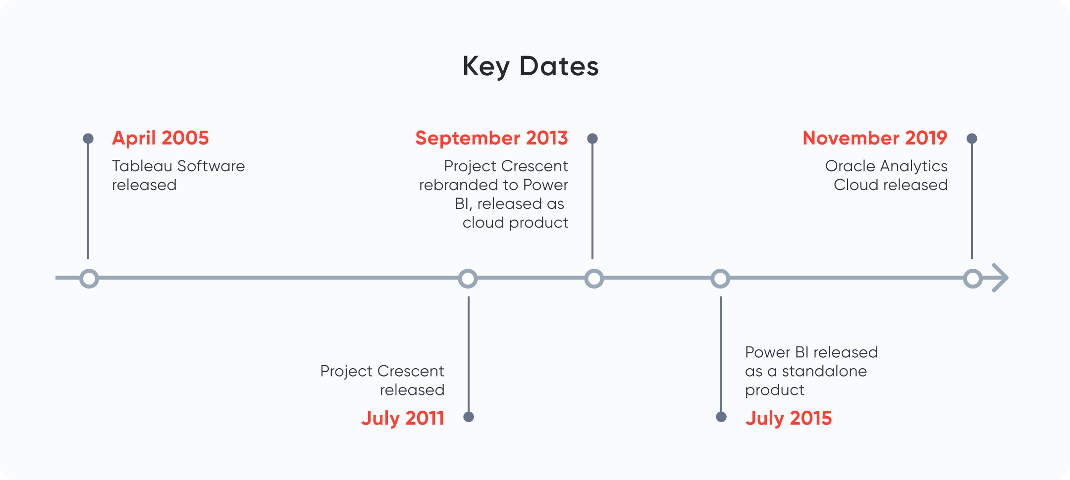
The three technical features are calculated fields, parameters, and layers, including dual-axis combination charts. Tableau has a first-mover advantage on all three of these features, having been launched in April 2005, a full ten years before Power BI was released as a standalone product (an early version of Power BI named Project Crescent was released in July 2011), and OAC’s release four years after that in November 2019.
Power BI provides the ability to create custom calculations, but it requires knowledge of a proprietary language called Data Analysis Expressions (“DAX”, covered more in the next section). They also introduced their own parameters feature in 2016, but still do not provide the ability to create layered visualizations. Tableau, on the other hand, allows you not only to create dual-axis combination charts, they have a feature called map layers to layer more than two charts on top of each other. If that wasn’t enough, you can also make sheets transparent and floating, theoretically allowing you to layer as many charts on top of each other as you wish. This unlocks a great deal of flexibility to identify correlations and even invent new chart types.
Similar to Tableau, today Oracle Analytics Cloud allows you to create custom calculations, has a parameters feature allowing for user-generated values, contains its own version of dual-axis combination charts called Overlay Charts, and lets you make sheets transparent. While not so subtly copying many of Tableau’s strongest features, Oracle provides the same level of flexibility as its predecessor.
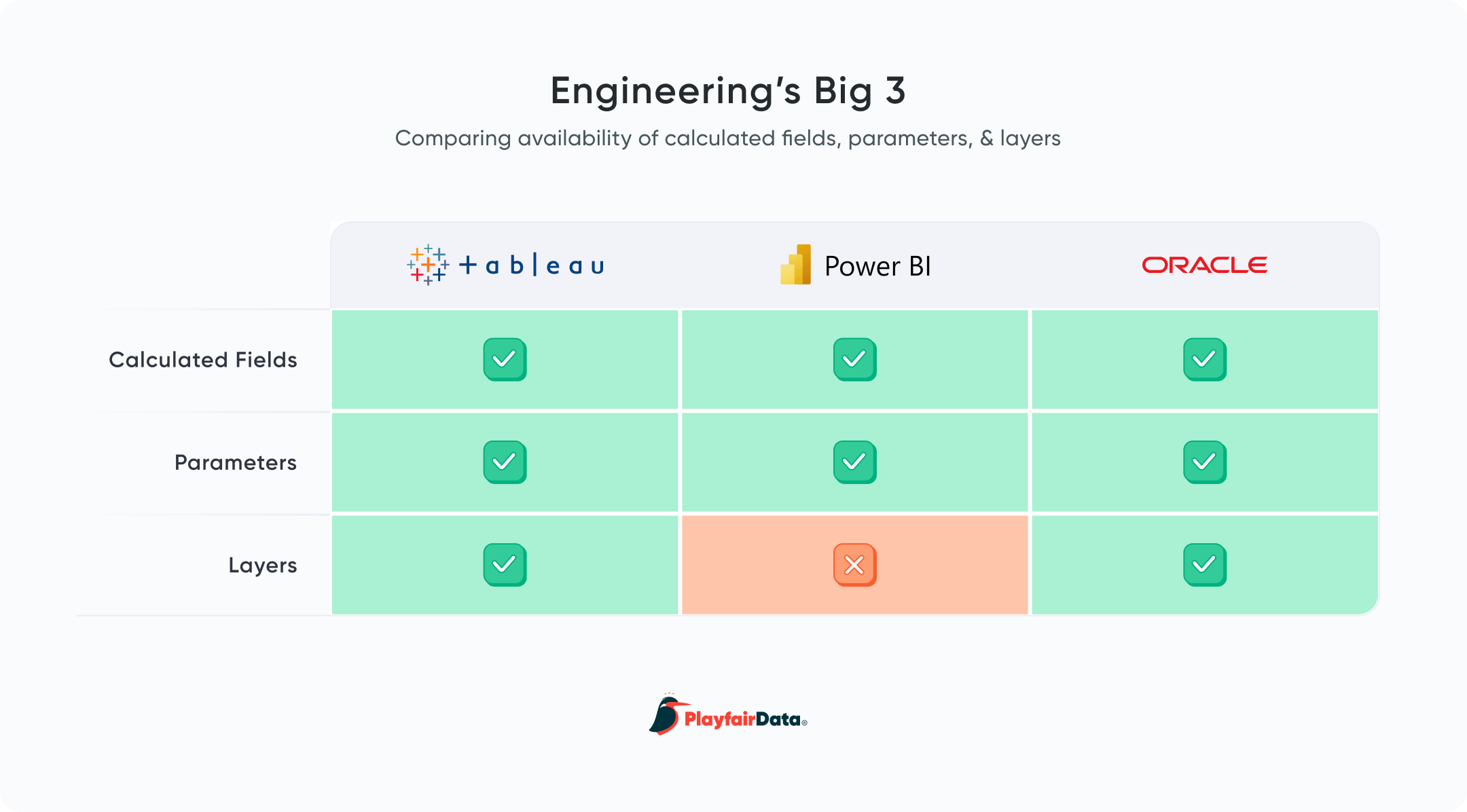
Advantage: Tableau and OAC
Ease of Use / Learning Curve / Continuous Education Resources – Bonus (Community)
About as close as we can get to an objective criterion when evaluating Tableau, Power BI, and OAC, is their respective ease of use among your user base. Taking time to learn a new software program can substantially impact both the costs of development and limit the potential value that can be realized when the software is being used to its fullest capability. For the purposes of this review, I’ll segment initial developer adoption into three categories: natural ease of use / intuitiveness of each out of the box, learning curve, and available training resources to continue enablement.
All three BI programs reviewed here are described as “low code”, meaning you do not need to be proficient in any coding language to get some basic value out of visual analytics using them and all three do a good job of allowing someone with no experience to get something right out of the box. For all three, it is imperative to understand how data should be shaped so the tools can interpret the dataset, categorize fields, and allow you to start creating visualizations.
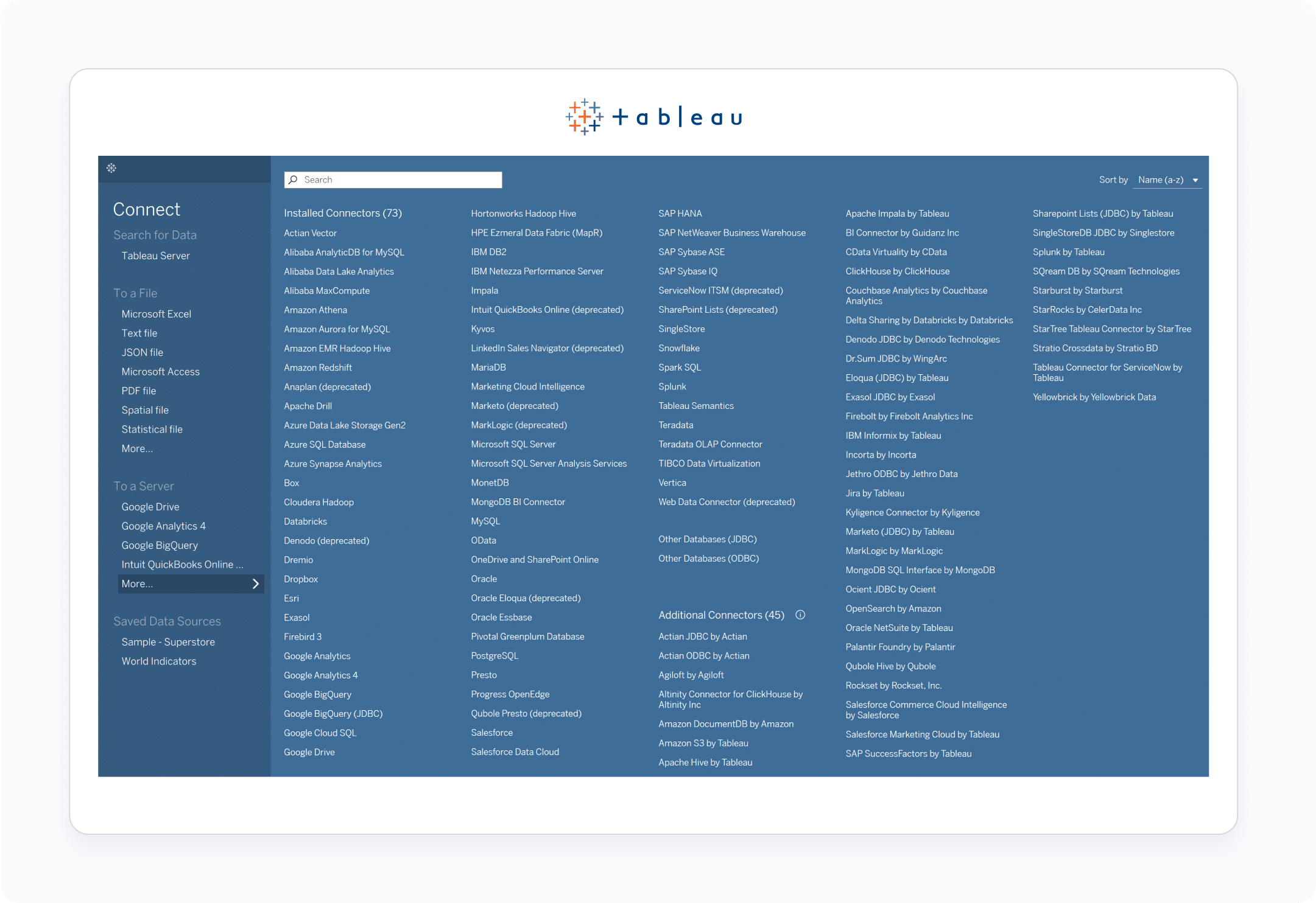
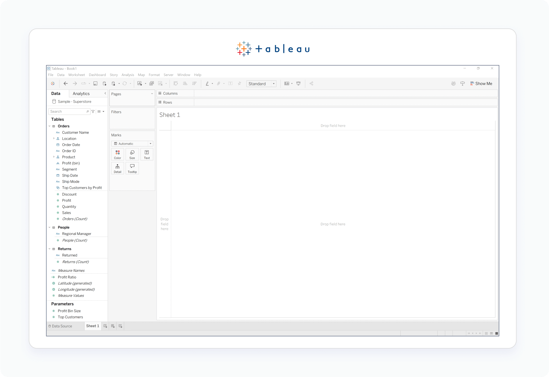
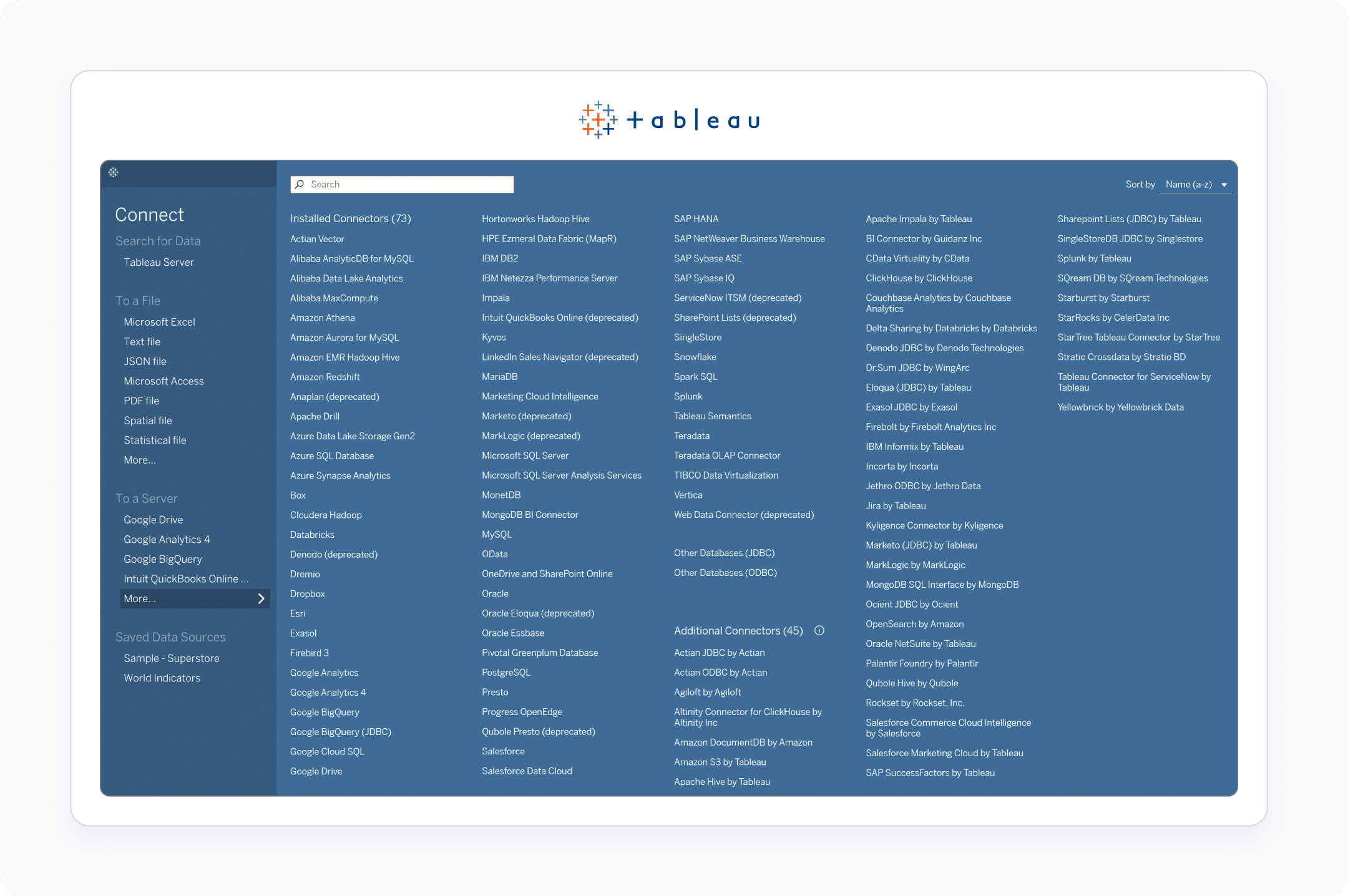
Connecting to data in Tableau Desktop
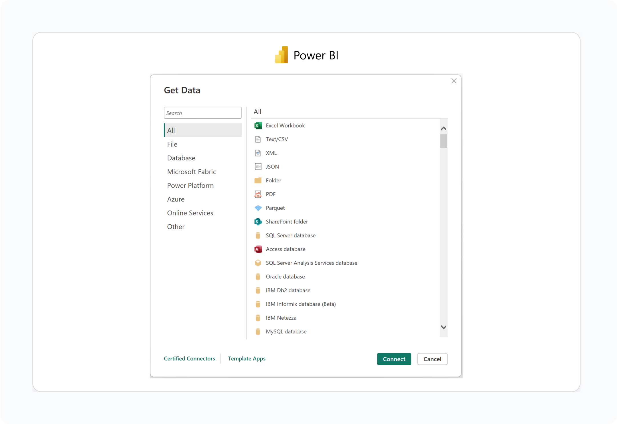
Connecting to data in Power BI
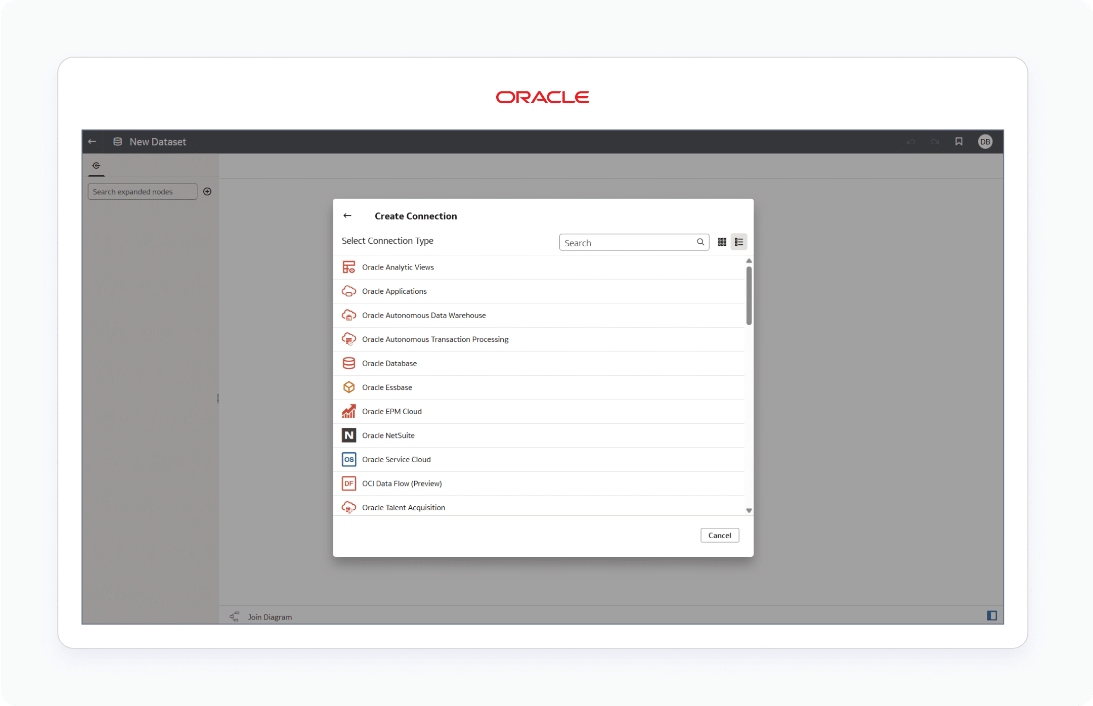
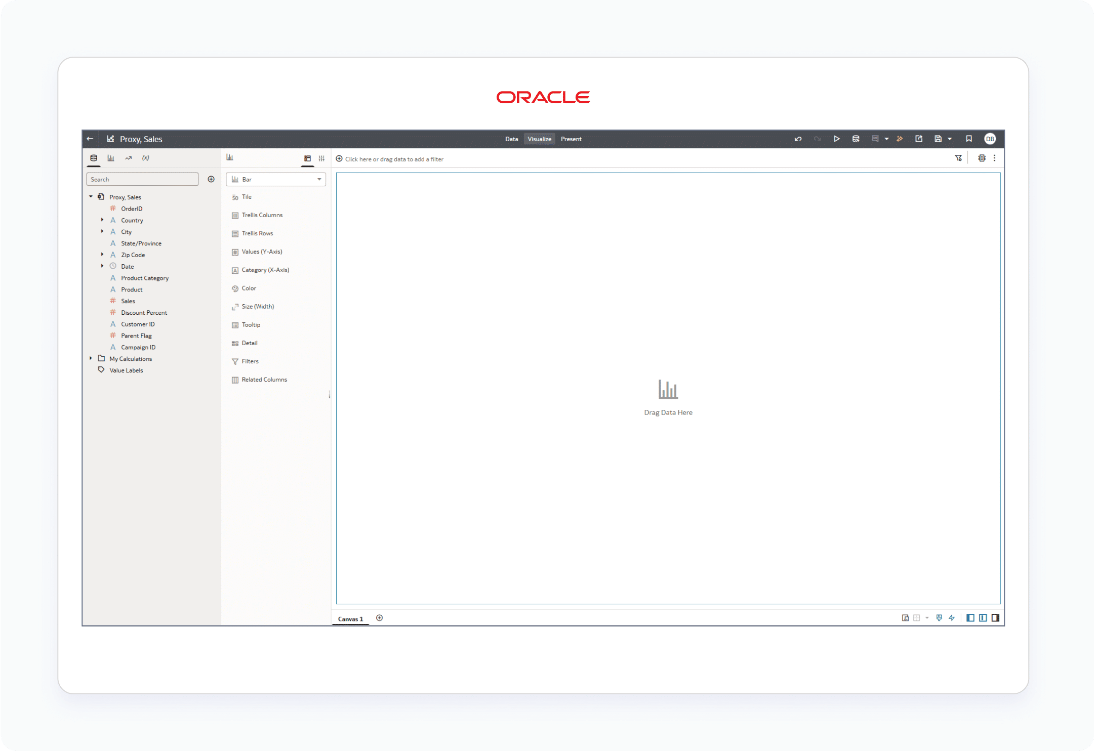
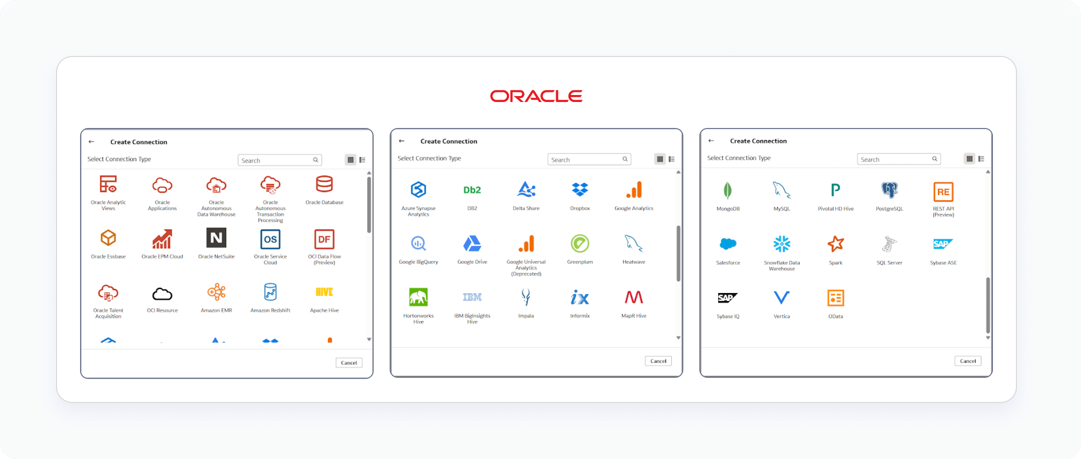
Connecting to data in Oracle Analytics Cloud
I will give a slight bump to Tableau in this first category because it pioneered many of the best user experiences that are prevalent in many leading BI programs today, including their drag and drop chart creation and VizQL language. VizQL allows you to do SQL-like queries by just adding fields and filters to a view, and while they haven’t specifically named their similar functionality, Oracle Analytics Cloud seemed to take strong inspiration from Tableau’s UX. I’m also going to give a slight ding to Power BI’s score here because while people who have used SQL in the past will have no problem picking up Tableau’s calculated fields, Power BI’s equivalent is a proprietary language called DAX, which will require some explanation before jumping right in.
Tableau's "Authoring interface"
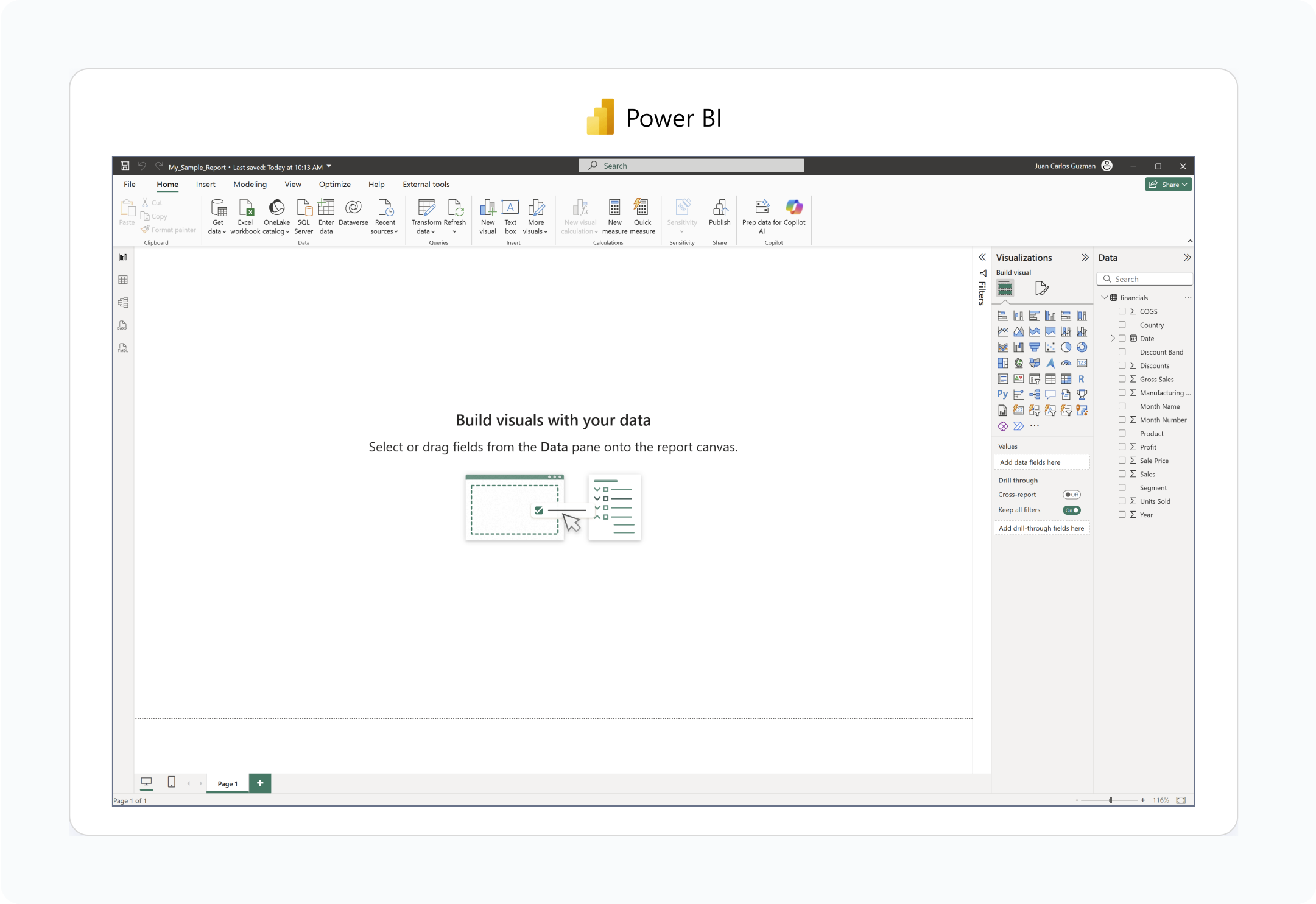
Power BI's "Report view"
Oracle Analytics Cloud's "Workbook Editor"
One way to expediate developer adoption and reduce the learning curve is through continuous education resources. Both Tableau and Power BI resources are pervasive, with thousands of videos, technical O’Reilly books, instructor-led training options, and just generally many published workbooks that can be used for learning. Our own Playfair+ platform was built to teach you all three of these programs – in addition to tool-agnostic visual analytics strategy, data engineering, and design – but I admit OAC has the longest way to go. While OAC has a robust knowledge base that addresses just about any topic you search for, it is challenging to find perspectives from outside Oracle themselves and thus, the posts can be somewhat sanitary and technically dry.
One bonus factor to consider is the scope, power, and magnanimity of the communities surrounding each of these software programs / companies. As of this writing, Oracle, the company themselves, is having huge financial success which is sure to get attention and attract members to their community. However, I’ve seen firsthand that some of their conference events are invite-only, do not include any natural community, and are primarily geared for the corporate sales reps to sell to other companies. Nothing against B2B sales, I’m pretty sure that’s part of why they’re having huge financial success, but that community isn’t going to help you learn the software. Conversely, Tableau has had an enormously popular annual conference that, to my surprise, outlived the Salesforce acquisition in 2019. While all in-person events have seen better days, Tableau’s “DataFam” community continues to be a force of inspiration, teaching, and even comradery.
Advantage: Tableau
License Cost and Total Cost of Ownership
All three of these software programs are worth their weight in gold (or perhaps Martian rock) and I don’t advise trying to split hairs in this area. If you want to try, know that license cost and total cost of ownership are nuanced based on your requirements and other values from within this post. For example, Tableau has the perception of being more expensive than Power BI, but if you’re wanting to use it for evaluation, your own analyses, practice, or to create public-facing dashboards, it’s literally free with Tableau Public. I encourage you to review the pricing pages of each program individually, linked to in the paragraph headers below, as features and pricing evolve rapidly.
To make this as much of an apples-to-apples comparison as possible, each pricing breakdown will cover at least two personas of software users. Power users will require full development and publishing capabilities of the respective software; you can think of these as being synonymous with your developers or data analysts. Stakeholders will need the ability to view and possibly interact with reports, but don’t need developer capabilities; you can think of these as being synonymous with management and executives using the reports that power users create.
Roughly speaking, Tableau pricing is relatively straightforward. Power users will need a Creator license, priced at $900 per year, and stakeholders will need an Explorer license, priced at $180 per year. Now, as software companies do, Tableau is going through a phase of introducing features and experimenting with packaging these features in different ways, with different pricing options. For example, the “Enterprise” offering introduces additional features like e-learning passes, automation, and AI. They also have a “Tableau+” offering, with its utterly black opaqueness discussed in the Transparency section below, which requires you to contact their sales team for more information.
Power BI also offers straightforward pricing including a free license of Power BI Desktop for individual creation, Power BI Pro for $14/mo which allows you to publish and share reports, and Power BI Premium Per User at $24/mo which offers features like more frequent data refreshes, access to larger data models, and the ability to publish content in custom workspaces. However, as with any Microsoft product, the total cost of ownership is probably directly tied to your organization’s current level of integration in the Microsoft ecosystem. Power BI Pro licenses are included in Office 365 and Microsoft 365 bundles, so you may already be set up to jump into Power BI. At the enterprise level, Power BI Embedded is a scalable option with pricing upon request.
Oracle Analytics Cloud offers two pricing tiers, including Professional and Enterprise. The Professional edition features all the essentials that most analysts require such as workbooks and self-service analytics, data preparation flows, etc. The Enterprise edition offers a more complex suite of features, including enterprise semantic modeling, usage tracking, customer managed data encryption keys, and more.
Both tiers offer flexible or flat-rate pricing structures. The flexible pricing is charged by the number of OCPUs (compute power) per hour of utilization per analytics instance. This option is best suited for organizations that use OAC mostly on an ad hoc, infrequent basis, as the compute can be easily spun up, down, or paused entirely. At the time of this writing, Professional is priced at $1.0753/OCPU/Hour or $0.3226/OCPU/Hour for the Bring Your Own License (BYOL) option and Enterprise is priced at $2.1506/OCPU/Hour or $0.3226/OCPU/Hour for BYOL. The flat rate option is, in most cases, more economical, which is priced by the number of users per month per analytics instance for a minimum of 10 users. At the time of this writing, Professional is priced at $16/User/Month (minimum $160/Month) and Enterprise priced at $80/User/Month (minimum $960/Month).
If you find yourself unable to find enough value to justify the cost of any of these licenses, look into Playfair+ membership, and we can show you how.
Advantage: It depends.
Integration / Holistic Ecosystem
The most important thing I will point out when it comes to integrating these three BI tools with the rest of your ecosystem is that the Gartner Magic Quadrant for Analytics and Business Intelligence Platforms – the very reason we’re aligned with these three leading programs – doesn’t technically list Power BI or Oracle Analytics Cloud at all. Instead, these two tools are included in the popular technology evaluation as Microsoft and Oracle, respectively. By its nature, Power BI is designed to be included as part of a larger ecosystem that includes pervasive software such as Microsoft Office and Microsoft SQL Server.
Similarly, Oracle will better integrate into existing tools if your company relies heavily on other Oracle products like Oracle Database and Oracle NetSuite. In contrast, Tableau was designed to be a standalone visual analytics product that could point to data sources, including those from Microsoft (i.e. Excel, Access, SQL Server) and Oracle (i.e. Eloqua, Essbase, NetSuite). Tableau has made strides in recent years to integrate with communication platforms such as Slack and Microsoft Teams, but it is the lone wolf, pure BI platform of these three.
It’s arguable, particularly in the next value of flexibility, that Tableau’s nature is an advantage, but when it comes to integration, Power BI and Oracle will always have the advantage of being natively embedded within their larger product ecosystems. This is a big consideration should your company be a “Microsoft shop” or “Oracle shop”. Both Microsoft and Oracle share the advantage of being truly embedded among their respective holistic environments, but due to Microsoft’s longer track record and current market leadership, I give the nod to them in this category.
Advantage: Power BI
Flexibility
While the ability to write custom calculations and use conditional logic makes it relatively flexible to achieve your analysis objectives within all three tools, I’m going to give Tableau another nod here for three reasons. First, and as discussed in the Integration section above, Tableau is the only one of the three designed from the start to be flexible enough to connect to any data source, regardless of whether it’s part of the BI tool’s larger brand umbrella. In addition to the 70+ possible connections discussed in the Data Integration section below, Tableau also lets you connect to other databases (i.e. ODBC, JDBC) or custom web connectors.
Next, Tableau was a pioneer in the technical features I call Engineering’s Big 3, and I include calculated fields, parameters, and layers in this exclusive group because they are the very features that unlock the most flexibility. OAC is equally strong in this area and Power BI is slightly behind.
Third, there are several more technical and user experience features that really allow you to build just about any visual analytics tool imaginable directly in Tableau. These include dashboard actions like URL actions that allow you to send data to other applications, the VizQL language that makes it much easier for non-coders and SQL experts to adopt the software, and layout settings that allow you to design dashboards down to the pixel.
I wrote a post over ten years ago about Tableau’s flexibility, before OAC even existed, so they have another first-movers’ advantage in this category. That’s why I also want to be clear that the other tools have caught up significantly in this area, whether it’s Power BI introducing parameters or OAC mimicking some of the best user experiences in Tableau. Nevertheless, these are not enough to match the flexibility that the combination of Tableau’s connectivity, proprietary VizQL language, and native designer-focused features provides.
Advantage: Tableau
Data Integration
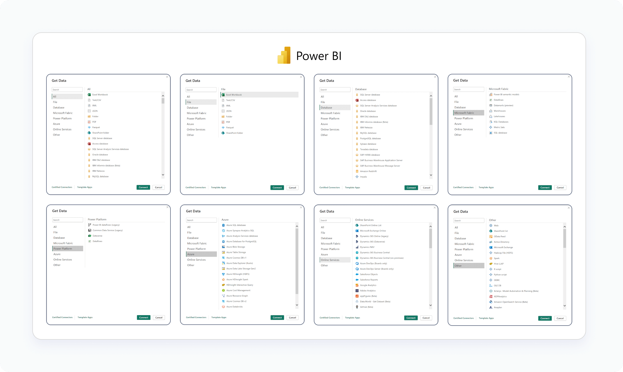
These three leading BI programs categorize their vast data connections in different ways, but as of this writing, Power BI leads the way with 204 possible data connections, Tableau has 126, and OAC comes in with 55. There is some nuance to this count with some data connections being grouped and having subcategories (i.e. “Text file” may allow you to connect to .txt or .csv files), but these counts are directionally accurate. For this section, it will be best to show you the connection options or let you explore the respective Knowledge Bases of Power BI, Tableau, and Oracle so you can confirm they offer the data connections you need.
Advantage: Power BI
Data Visualization Capabilities Comparison
We’re named after the inventor of data visualization, William Playfair, so I admit this section is important to us. While the functionality between the three varies, Tableau, Power BI, and Oracle Analytics Cloud all allow you to create a multitude of data visualizations with little or no expertise. Tableau allows you to either build various chart types manually by adding fields to the view and encoding data points via the “Marks Card” or use the “Show Me” button to build charts with a single click. Power BI and OAC require you to choose the visual you want to build upfront before drawing anything on the view, but these can be changed easily once on the view if you change your mind.
Continue reading with a free account, or login.
Unlock this tutorial and hundreds of other free visual analytics resources from our expert team.
Already have an account? Sign In
By continuing, you agree to our Terms of Use and Privacy Policy.
As all three tools provide enough data visualizations to meet most business needs, including what I describe as “the staples” of bar chart, line graph, and scatter plot, this portion of the evaluation will be based on the quantity of predefined data visualizations available in each and their respective data visualization aesthetics / formatting options. As of this post, Tableau has twenty-four possible data visualizations within their Show Me functionality. In late 2024, they also introduced a native option to tap into additional chart types using an extension functionality.
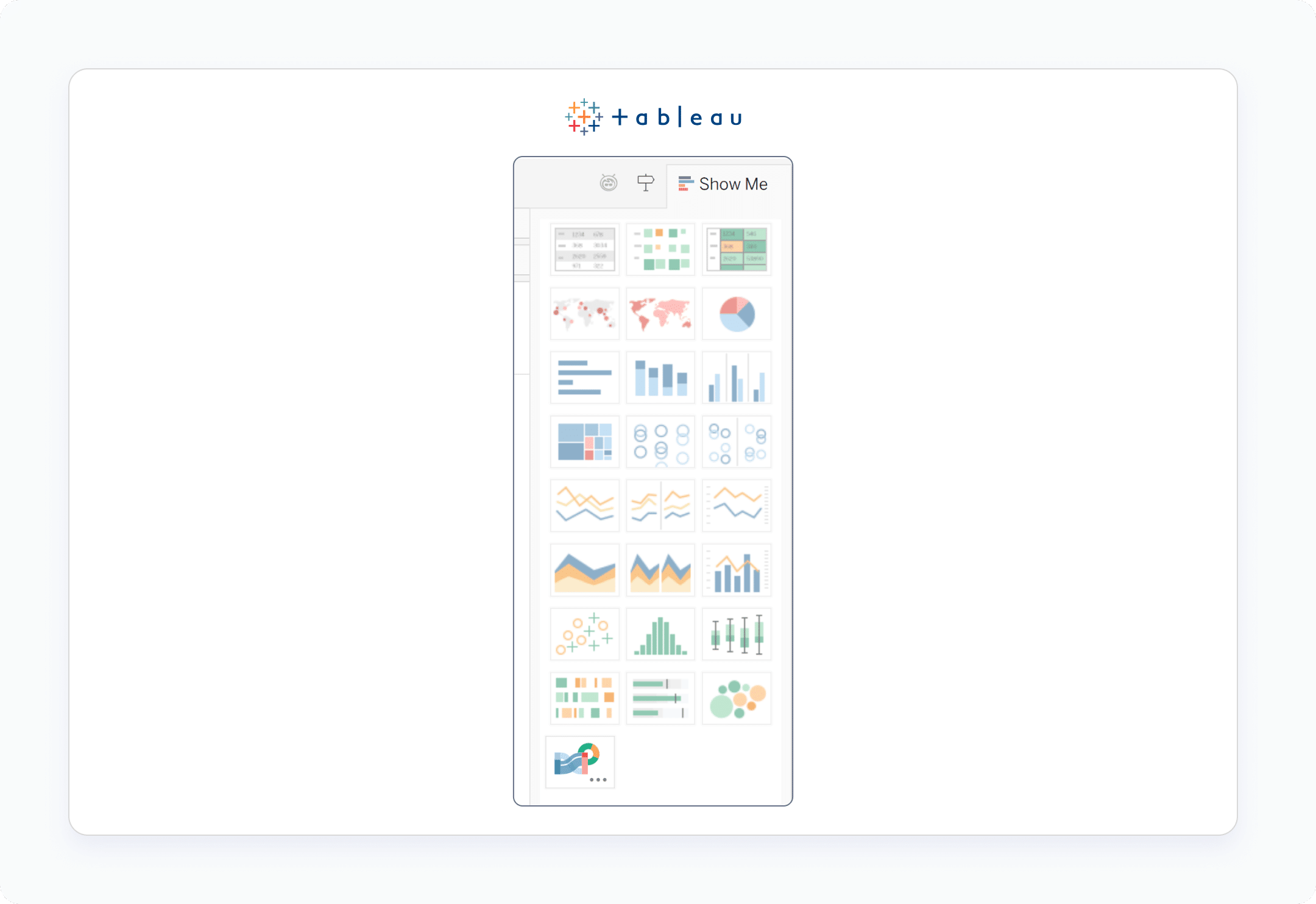
Tableau's Show Me feature
Power BI has a similar functionality that allows you to choose 37 distinct chart types or access additional visualizations through an IDE (Integrated Development Environment) or Microsoft’s proprietary VS (Visual Studio) Code.
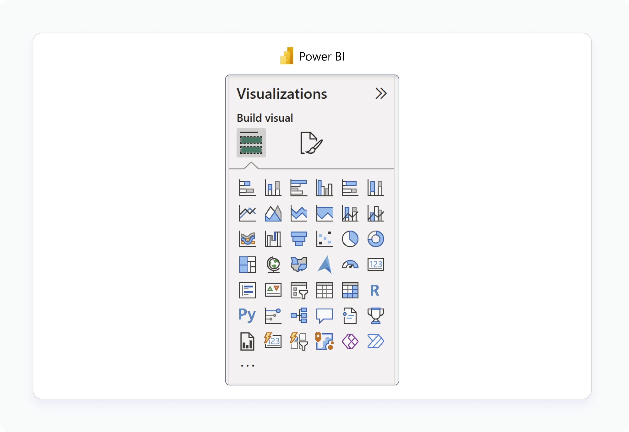
Power BI's native data visualization options
Oracle Analytics Cloud contains the most out-of-the-box data visualization options with 47 different options!
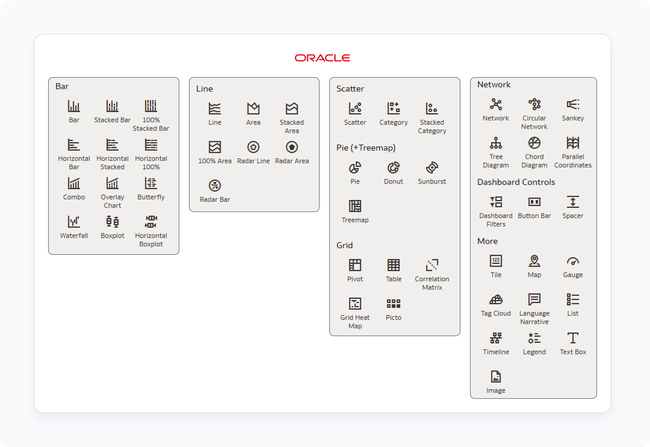
OAC's native data visualization options
I’d be remiss if I didn’t mention that because of the way Tableau allows you to manually encode marks, you can create many more than 24 visuals, including powerful analysis tools like Pareto charts or even invent entirely new data visualizations like Pilula charts.
Regarding aesthetics and formatting options, like any aspect of design, there is a certain degree of subjectivity and personal preference. Tableau has a strong reputation for data visualization design, but I believe Oracle has caught and passed them in this category. Not only does OAC provide the most single-click data visualization options, but they also look very modern and smooth.
As just one example, OAC allows you to curve lines within a line graph. While the data visualization police may fine you for not being pixel-precise when using curved lines, you may find them more aesthetically pleasing. Microsoft, having pioneered other software programs long before the recent visual analytics renaissance, has stayed true to their brand. Again, subjective, some may appreciate the familiarity of the tried and true branding; others may not want to relive the 1990s with every analysis.
Advantage: OAC (unless you need to invent something; Tableau)
Scalability / Performance
In the context of visual analytics, performance refers to how quickly views load initially and after queries are kicked off to load data for analysis. With any of the leading BI tools today, you’ll find they are going to be built to meet the needs of an enterprise in terms of the number of data sources to which they can connect, how many records the querying can be scaled up to load, and how quickly stakeholders receive a response when clicking around. Further, efficiency can be a subjective term when it comes to performance. Some stakeholders will get frustrated waiting three seconds for a business-changing insight to load. Others may find it reasonable to wait even sixty minutes if it means that the hour will pay for itself exponentially in the insight the tool is delivering.
The reality of this category is also that many factors contribute to the performance of all three tools including, but not limited to, the power of the hardware being used, size of the data being analyzed, complexity of calculations that need to be executed, number of people competing for the same resources, type of data being queried, etc., etc., etc.. Since Tableau, Power BI, and Oracle Analytics Cloud all offer similar performance, and some of the factors influencing performance are outside of the control of the BI program itself, I’m not going to offer a perspective on this criterion. Instead, here are some experiences with each tool from our engineers.
Advantage: N/A
Security and Compliance
Like performance and scalability, you can expect all three of these programs to provide a reasonable set of security features that meet the demands of almost any enterprise by default. Salesforce, Microsoft, and Oracle are all mature enough companies to be on the cutting edge of cybersecurity related threats and, in many ways, really defining what good security protocols should look like. As Tableau, Power BI, and OAC are all similar in their minimum degree of security, this section will evaluate the three on the intuitiveness of security settings, the existence of row-level security, and the existence of column-level security.
When it comes to the intuitiveness of security settings, remember that for your own protection, settings are going to err on the side of caution so that a user will not see data unless all settings align. For example, if a user has been given security access at the user-level within a workbook, but that same user is included in a group on a server that has been denied access to the same workbook, the more stringent security setting will supersede the conflicting setting and the user will not have access.
This can come across as counterintuitive, but it is a tradeoff for stronger security and compliance. In this regard, I’d say that OAC is the least intuitive, but that also may mean that once you figure it out, it has the strongest security of the three. The major difference is that while security for Tableau and Power BI are handled at the workbook level, Oracle Analytics Cloud handles security at the data model level, making the settings relatively more embedded upstream.
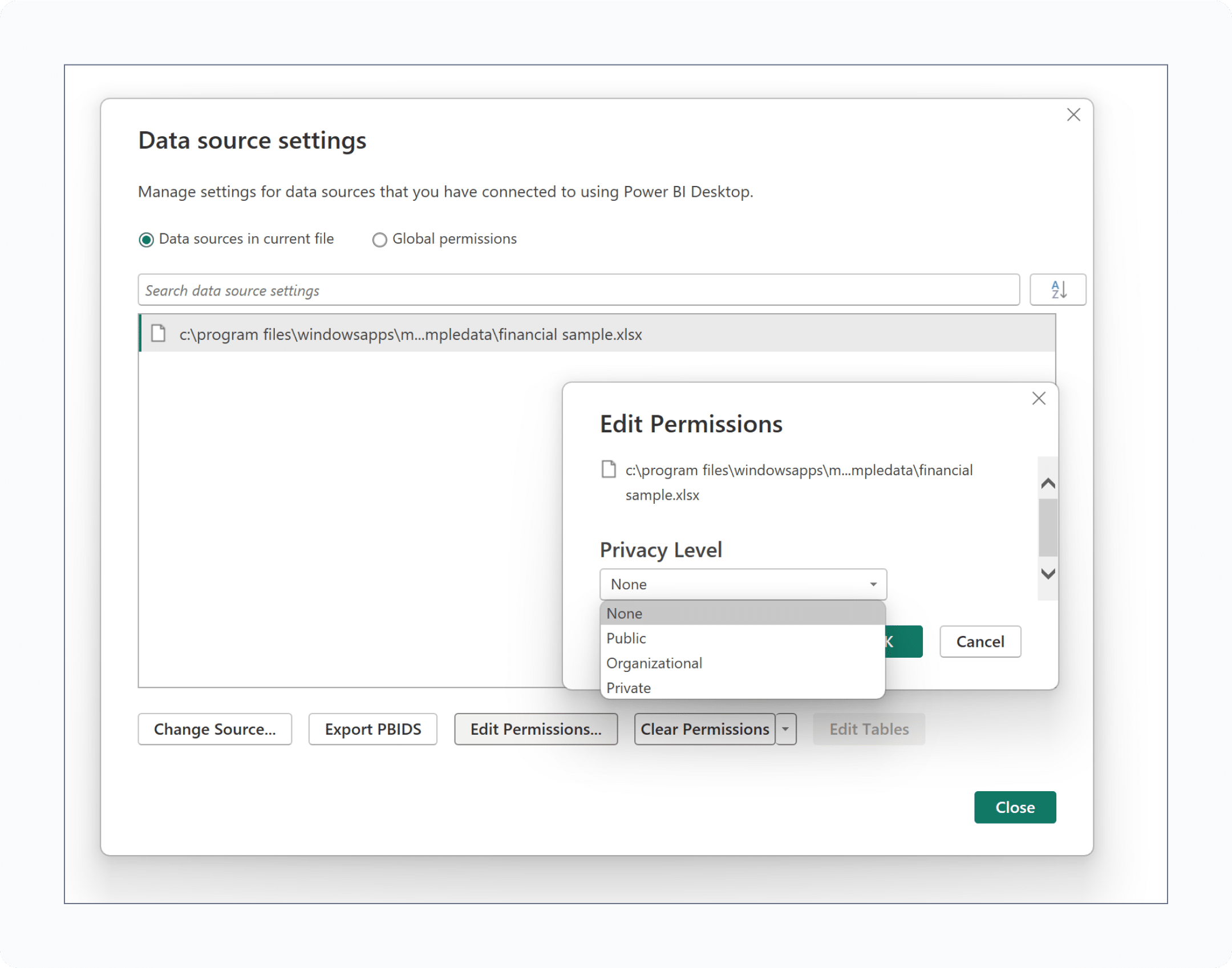
Setting up security at the workbook level in Power BI
Row-level security is the ability to grant or deny access to specific rows in a table based on filters. For example, you may want managers of a specific region in your business to only see rows of data containing references to the one region that they manage. This is easily accomplished in all three programs with intuitive mapping that identifies who is accessing the data and delivers only the rows relevant to them. All of the data still exists, but stakeholders are automatically delivered a tailored and secure experience that not only improves their quality of life as analysts but also protects the company from oversharing data.
Column-level security means granting or denying access to columns, or the equivalent of fields in a well-designed data model. For example, you may want to limit more confidential finance related clients to certain seniority levels within an organization. With column-level security, you can use a single dataset that contains a combination of confidential and non-confidential data but only show the confidential data to approved users. While row-level security is a default functionality in all three programs, column-level security is trickier to implement. We have found a way to hack column-level security in Tableau, it can be accomplished in Power BI through third-party apps, and OAC takes the advantage here by allowing simple column-level security at the data model layer.
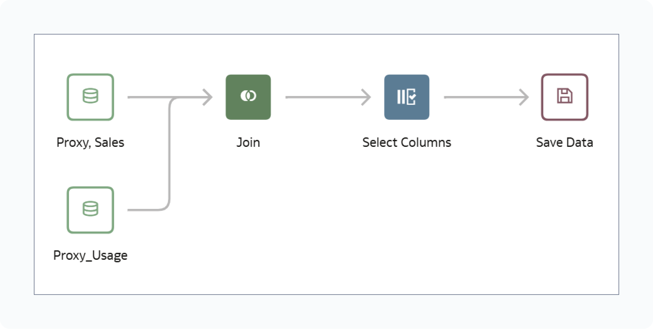
Security in Oracle Analytics Cloud can be set up at the data source
level by using a workflow like this and adding custom SQL.
Advantage: OAC
Transparency
For massive technology companies, I find Salesforce, Microsoft, and Oracle to be relatively straightforward when it comes to telling you what you’re going to get and for what price, at least with their respective business intelligence software. In fact, all three of them offer a free trial with almost complete functionality through a Tableau trial based on an individual email address (or Tableau Public), a trial of Microsoft Fabric, or Oracle’s Free Cloud tier with (currently) $300 in credits, respectively. These trials allow you to test the full functionality to ensure it aligns with your own technology stack, discussed in the next section, and other values listed in this post.
That being said, both Tableau, with their Tableau Next offering, and Microsoft, with their Fabric offering, are going through some growing pains at the moment communicating the evolution of their product offerings, how they’re priced, what you get for them, and how they vary from current offerings. I witnessed one snafu firsthand earlier this year with the rollout of Tableau Next at the Tableau Conference. This was the second consecutive year of promoting the same features that were announced at the same conference last year and, when pressed, sales associates couldn’t really explain what you’re even buying with the next iteration. It’s understandable for these companies to want to repackage features to maximize shareholder value and to always have something big to announce at public events. Nevertheless, I have to ding them in the transparency category for not being prepared to answer these obvious questions.

“AI robot" at the most recent Tableau Conference.
This could be a positive or negative, but I also have to ding Oracle for having ‘pricing calculators’ on their pricing page. This is kind of like the equivalent of not having prices on a restaurant menu and I get a little nervous anytime I see them. On one hand, it’s arguable that OAC offers the most transparency and precise pricing estimate, that is if you are very technical and understand exactly what you’re buying. I must admit that even as a relatively technology savvy user of the software, I’ll still have to look up “OCPU per hour streaming with Apache Kafka”. This is probably great for seasoned IT professionals but doesn’t exactly align with the concept of democratizing data and insights for the greater good.
Advantage: N/A – equally good (or bad, depending on how you look at it)
Infrastructure Compatibility
Some of the discussion about infrastructure compatibility should center around the points that have already been covered in the Data Integration section above. In addition to those considerations, and generally speaking, Power BI and OAC are going to work more seamlessly when integrated within an existing Microsoft or Oracle environment, respectively. Tableau is the only one of the three that was designed from the beginning to complement any technology stack, which may be a pro or con depending on the variety and scope of software already embedded at your company.
One additional point I’ll address is the need for on premise server-based solutions versus cloud-native applications. Technology is improving in a way where data can be stored in a secure way, with incredible efficiency, and with the bonus of allowing you to scale resources up or down to meet needs and optimize costs. For these reasons, everything is seemingly moving to the cloud, removing the need for literal hardware on a company’s property to be purchased, maintained, and secured. Nevertheless, some company policies prevent data from being stored anywhere but on premises and arduous migration processes can take years to complete. Fortunately, Tableau, Power BI, and OAC (through their Oracle Analytics Server product) all offer full versions of their respective software that can be hosted either in the cloud or on premise.
Advantage: N/A – equally flexible
Change Management
Ever heard the expression, “we’ve always done it this way”? Even though this has been described as the most dangerous phrase in business, and one of our core values at Playfair Data is continuous improvement, you have to be aware that this is a common culture and legitimate consideration with software selection. OAC has the most ground to make up in this area because, among these three, they were the last to get to market and have the lowest market share. Conversely, although Tableau was the pioneer in the visual analytics space, Microsoft was really the pioneer in office software, in general, and their products are pervasive. Since Power BI fits into the most common business ecosystem and, for better or worse, their user experience and aesthetics are familiar, I give Power BI the advantage in this category.
I’ve seen firsthand how challenging it is to get stakeholders to move out of their spreadsheet mentality despite the objective benefits visual analytics has to offer. I believe wholeheartedly in the transformative power of data visualization to translate raw, tabular data into value and have personally seen it deliver billions of dollars in value. Regardless, don’t be surprised if you have a similar challenge getting stakeholders to evolve outside of their familiarity with Microsoft products, even when there are options better suited for the business needs at hand.
Advantage: Power BI
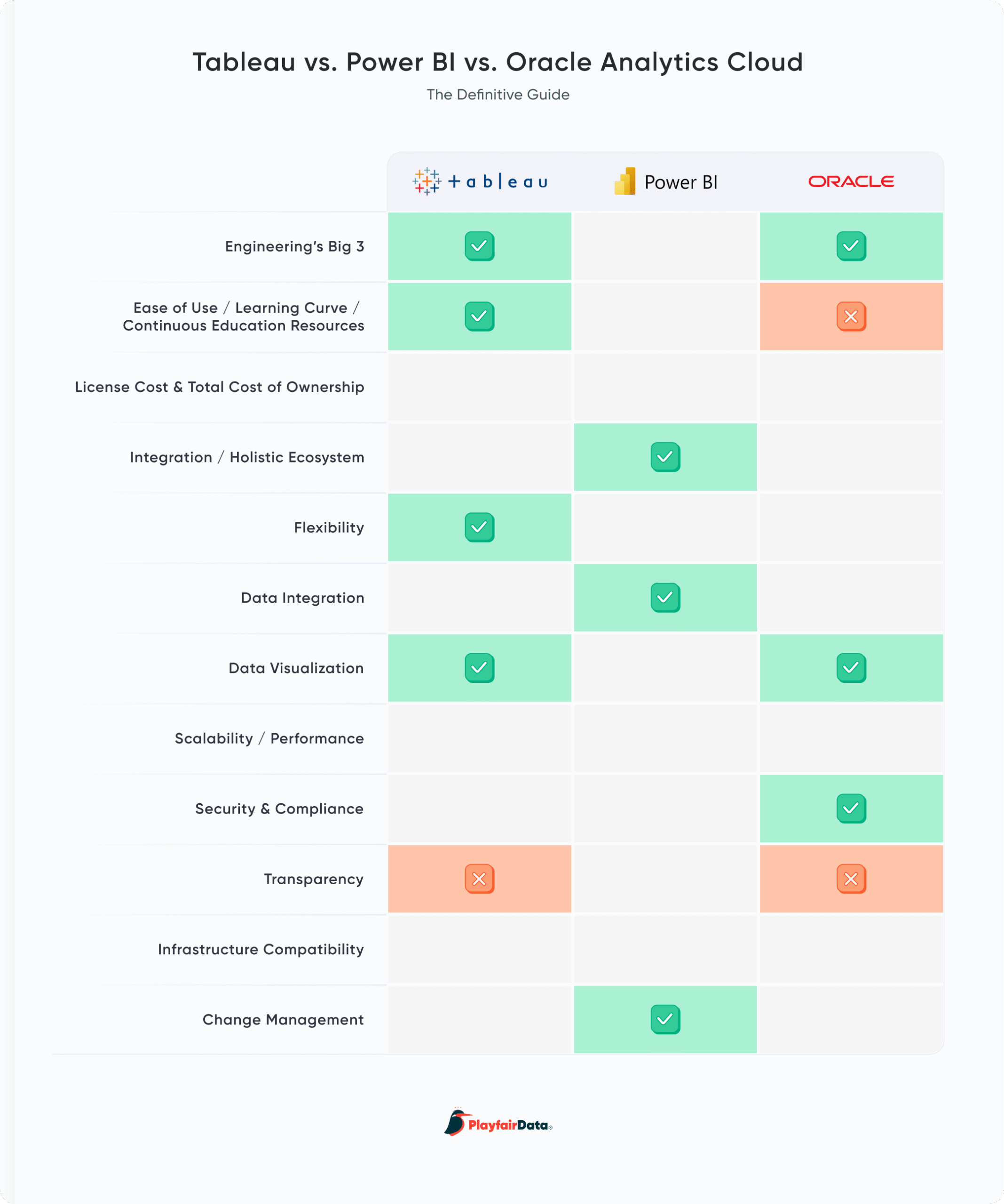
Here is our final grading of Tableau, Power BI, and Oracle Analytics Cloud across all twelve criteria.
Ultimately, all three of these programs are very strong and the best choice comes down to which combination of these considerations your company values the most. Playfair Data has experts in Tableau, Power BI, and OAC, so we’re always here to support if you are looking for a professional services or training partner to maximize your return on investment in any of the three.
Thanks for reading,
– Ryan

Written By
Ryan Sleeper

Graphics
Alyssa Huff
Assoc. Director, Information Design

Peer Review (Tableau)
Ethan Lang
Director, Analytics Engineering

Peer Review (PBI)
Matt Snively
Sr. Manager, Analytics Engineering

Peer Review (OAC)
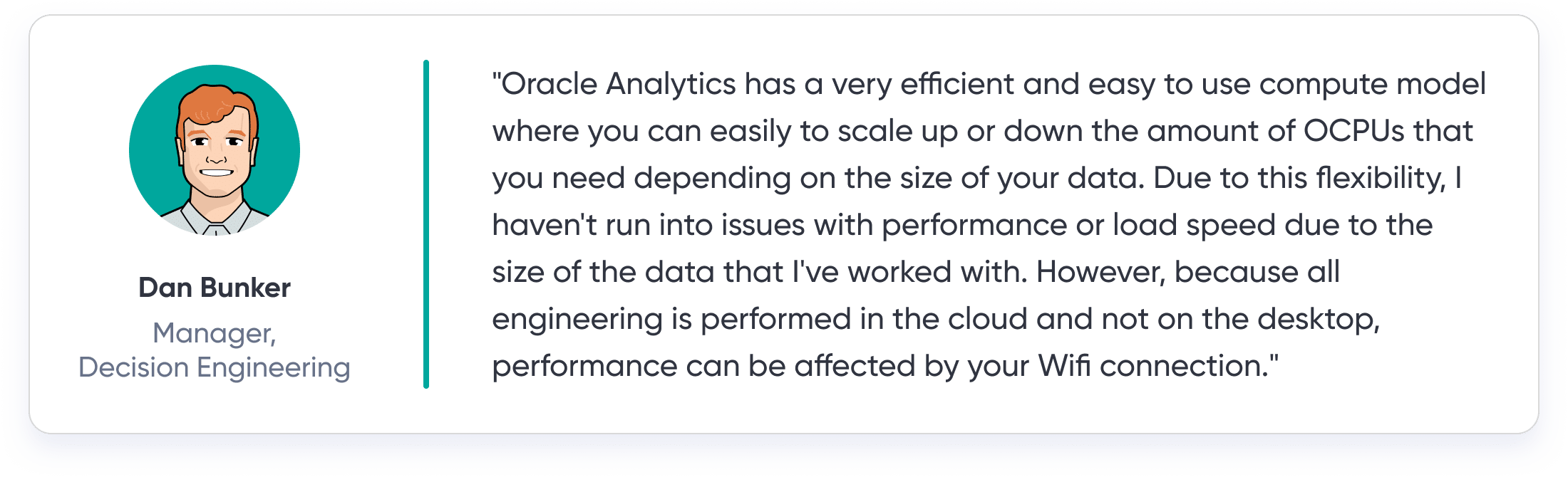
Dan Bunker
Manager, Decision Engineering

Editor
Amy Leonard
Sr. Director, Operations
Related Content
Tableau vs. Power BI: A Quick Start Guide Comparison

As someone who is relatively new to both Tableau and Power BI, having to navigate either platform can feel overwhelming…
Winning the Oracle Analytics Cloud Data Visualization Challenge

What better way to start the year than for the Playfair Data team to have won yet another award! Our…
Data democratization is dead. Long live data democratization.
This year, I had the opportunity to attend my first Gartner Data & Analytics Summit, one of the leading community…