Enhancing UX with Interactive User Guides in Tableau

An effective user guide is a powerful tool when it comes to helping any user get the most out of the tools you build for them. But what makes a user guide effective? It needs to be accessible, logically organized, and easy to understand. I’m excited to share a technique for an interactive user guide in Tableau that not only fits these criteria but also engages the audience. As a use case, I’ll walk you through how I created a user guide for one of our template dashboards, Tableau Cloud Usage Swift. I’ll equip you with the tools you need to map out a logical and concise user guide, build the creative assets, and implement the guide in Tableau. Let’s get to it.
Mapping out the user guide in Tableau
First, let’s outline the information that we’d like to include in our user guide. During this initial step, I like to go through and list every feature within the tool, big or small. What are the filters, interactivity, chart details, insight sections, etc.? This can serve as our brain dump that is consolidated later in the process. I typically use Figma to do this, but you can also use another tool like Microsoft Word or Google Slides.
Continue reading with a free account, or login.
Unlock this tutorial and hundreds of other free visual analytics resources from our expert team.
Already have an account? Sign In
By continuing, you agree to our Terms of Use and Privacy Policy.
💡 Pro tip: To make this list easier, I like to annotate a dashboard either first or in tandem with making my list.
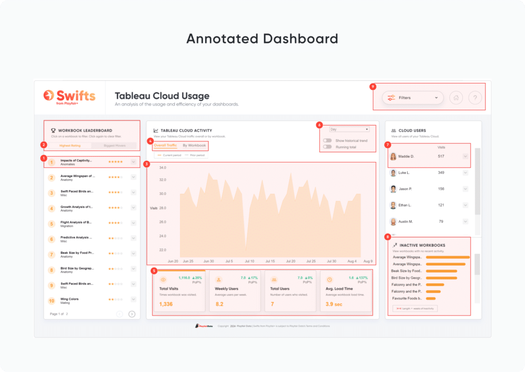
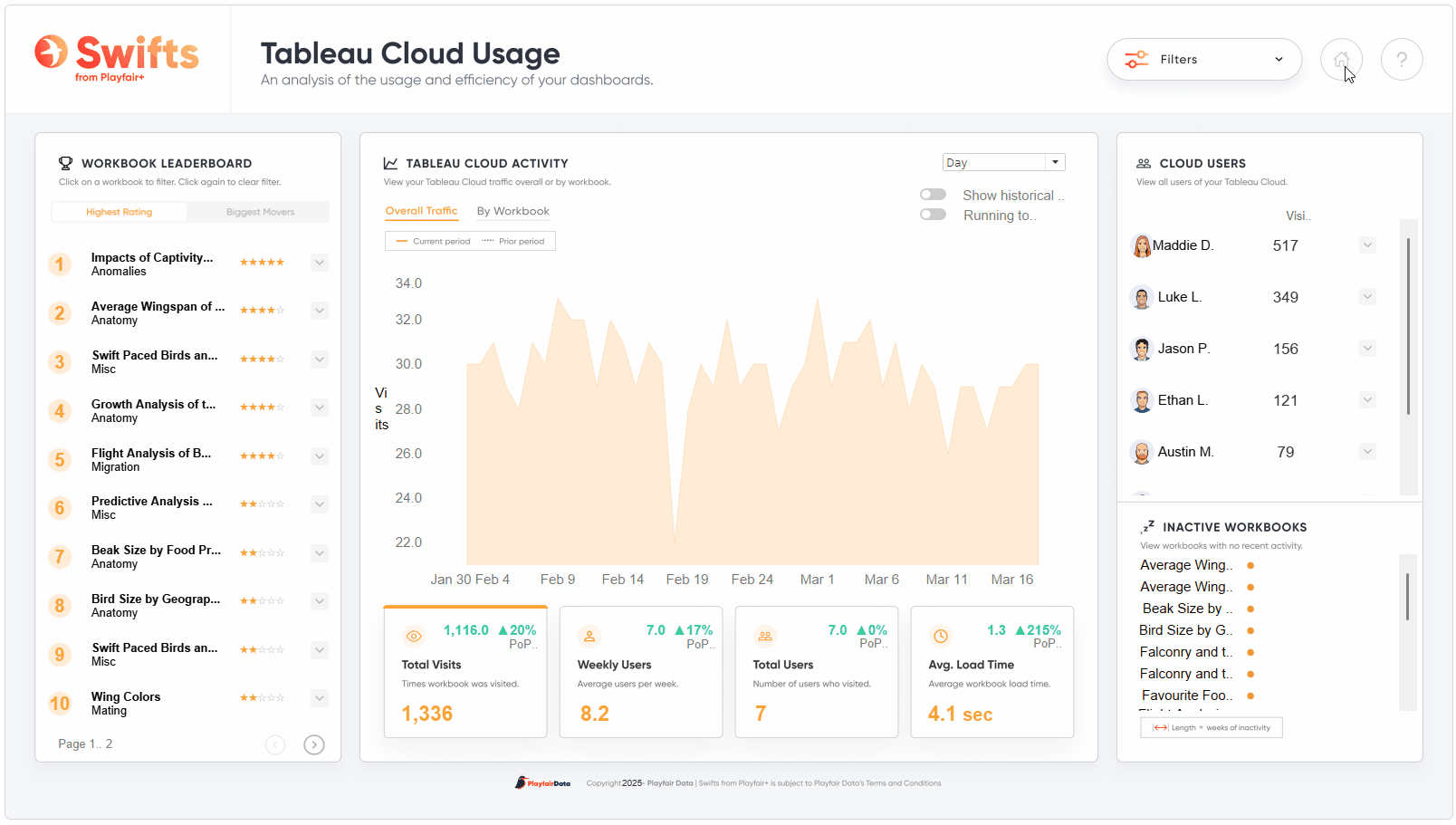
In the next image, you’ll see how I start breaking down the key features for my user guide—what they are, what they do, and the order that makes the most sense for someone new to the tool:
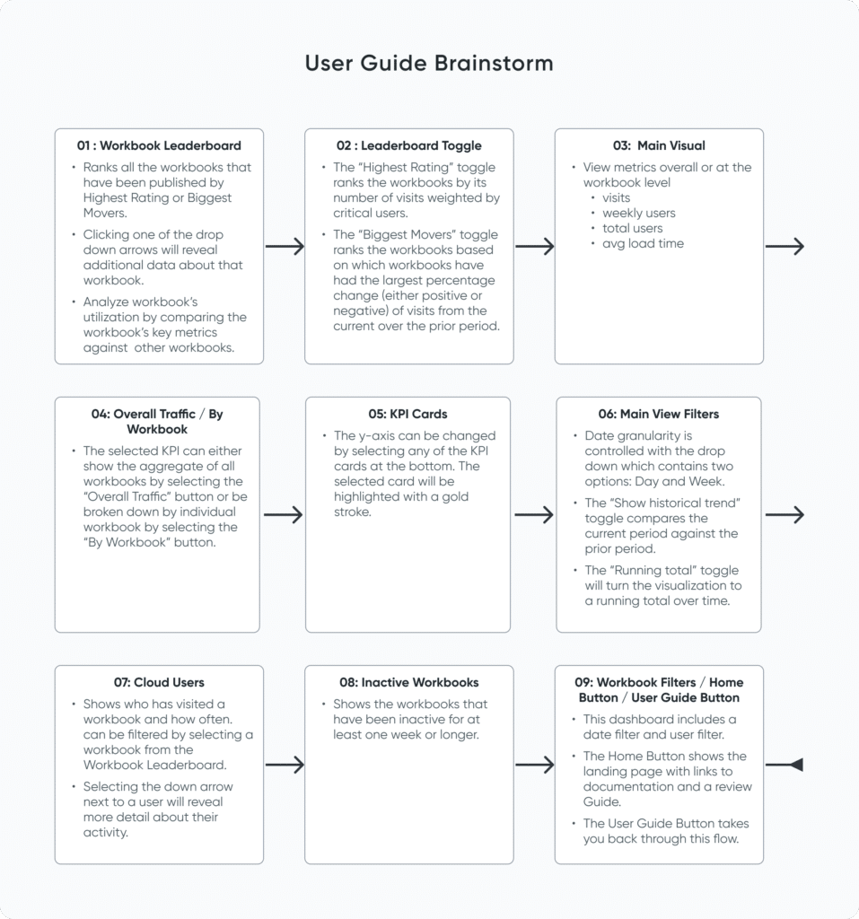
There is one thing that is also important to note here. Consider whether any feature requires the user to act in a certain order. For instance, a user may need to select a geographic region and then a state in order to drill down into city data. They may need to apply filters before they download an image of a chart to include in a printed report. At this stage, I would note these dependencies in my list of features. In my case, there are no dependencies to note for the Tableau Cloud Usage Swift.
Don’t worry about having a perfect list. In the next section, we will cover how and why to narrow down your initial features list.
User experience (UX) considerations
Now, let’s shift our focus to polishing our user guide in order to provide the best user experience possible. The three main points to consider here are the user guide’s length, order, and clarity. Users will be much more likely to complete a user guide if it is short and to the point. Think of this as the TL;DR (too long; didn’t read) version of a full-fledged user manual. Moreover, ensure that your guide follows an intuitive order as you walk through the tool’s features. If parts of the interactivity must be performed in a certain order, follow that same order in the user guide. Finally, keep your descriptions clear and concise. Our goal is to make sure users feel comfortable and confident using the tool effectively.
![]()
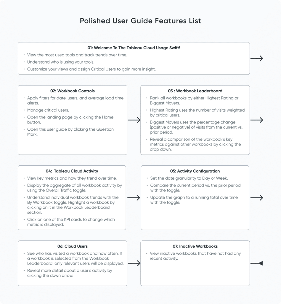
In the next image, you’ll see how I refined my brainstorming into a more structured and practical guide by grouping related actions and features, refining the language, and organizing information logically.
So what updates did I make, and why?
- You might notice that I’ve reduced the number of steps from nine to six (excluding the welcome message). This goes back to my points on length and clarity—I read through the brainstorm and edited it accordingly. My rule of thumb is to keep user guides to 10 steps or fewer, depending on the complexity of the workbook.
- I added a welcome message that will serve as an explainer for the guide.
- I reordered the steps to show the global workbook filters and access to the landing page and user guide first. Since these buttons control the entire workbook or give the user access to important information, I wanted to make it more likely that the user would see this information versus placing it at the end of the guide.
- The remaining steps in the guide flow more or less in the same order that a user’s eye would naturally travel within the workbook – from left to right and top to bottom. This ensures that the guide is intuitive for the user.
- I updated the text so that each bullet point began with a verb or key term. In the guide images, I recommend bolding the actions and key terms so that the most important information stands out. Two to three bullet points per step are ideal. Remember that you don’t need a detailed explanation of the tool here, but rather just enough information to engage the user and help them successfully explore it.
Implementing the user guide in Tableau
Image Assets
Now that we have our user guide outline, it’s time to integrate it into your workbook. For this, we will need an image for each step. Each image should contain the following:
- Title and explainer text
- A close button: this allows the user to exit the user guide at any time
- A back button: this allows the user to return to the previous step
- A next button: this allows the user to continue through the guide
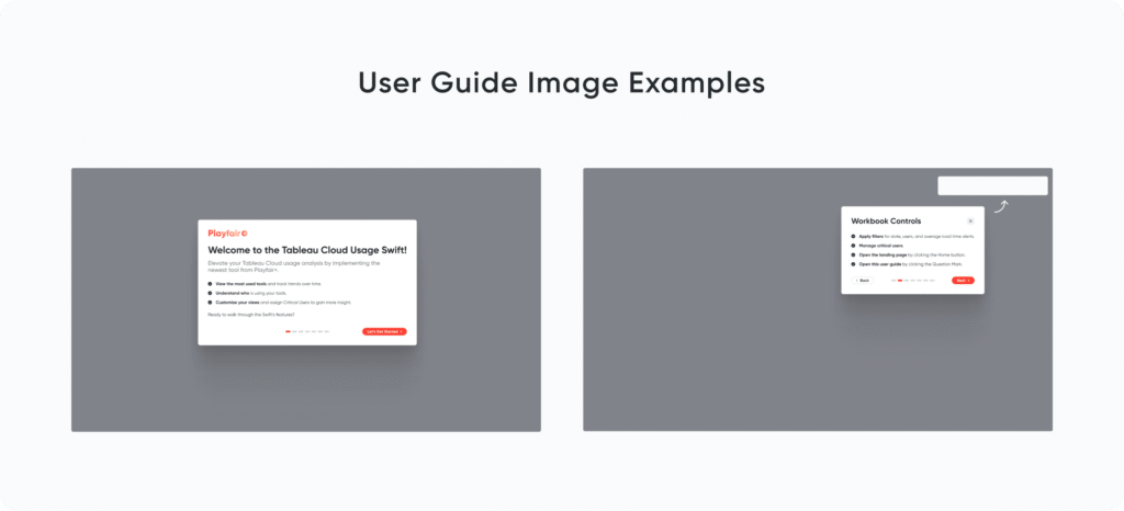
I have also chosen to include a visual indicator at the top of each card that lets the user know which step of the user guide they are on and how many more steps they have to go. I find that this improves the UX; not to mention it’s a mini data visualization! Additionally, you can pair the user guide steps with a transparent overlay. I like to do this and cut out the section of the overlay over the dashboard that relates to the user guide step.
3 Creative Ways to Add Instructions for Your Users in Tableau
Parameter and Calculated Fields
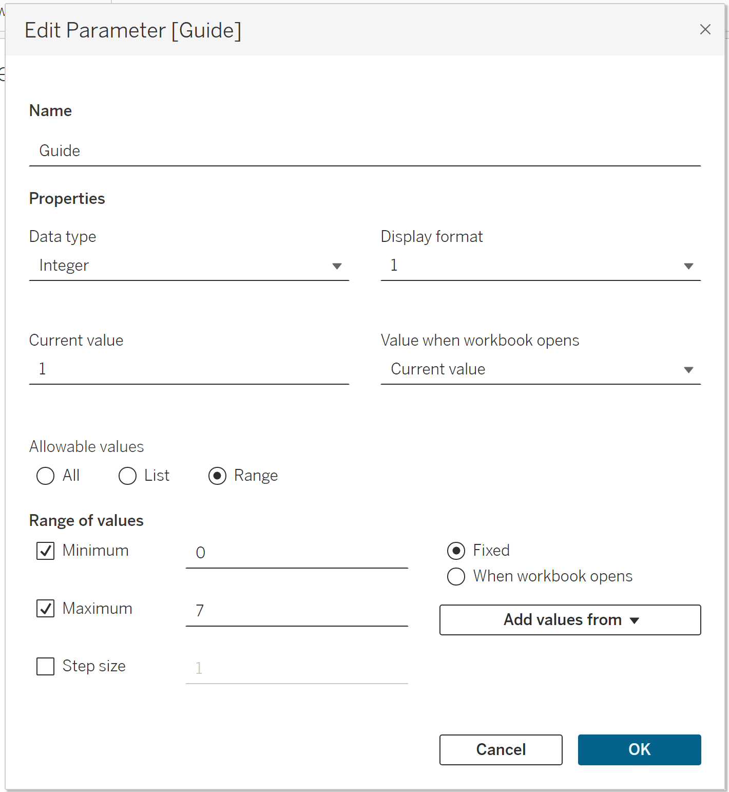
To achieve the interactivity of this guide, we will use a combination of a parameter, parameter actions, and dynamic zone visibility to get it into Tableau. First, create a parameter, set the data type to Integer, allowable values to Range, and the minimum value to 0. Set the maximum value to the total number of steps in your user guide, which, in my case, is 7. This parameter is vital, because it is used to control which step of the guide is shown. For example, the first step is shown when the parameter equals 1. When the parameter equals 2, the second step is shown, and so on.
3 Ways to Implement Dynamic Pagination in Tableau
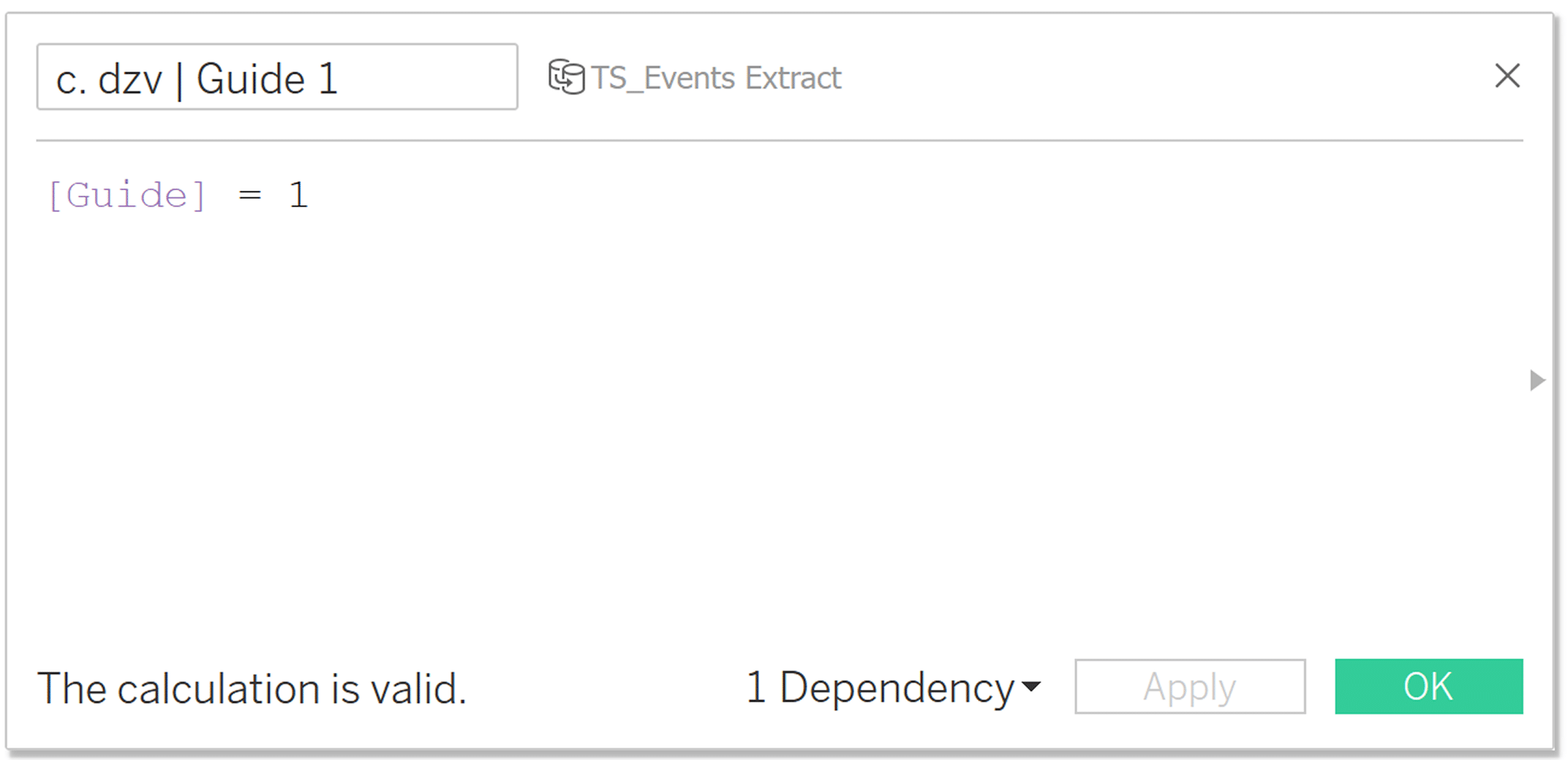
Now, we will create the calculated fields that control the dynamic zone visibility that moves the user through the guide. The formula is [Guide] = N, where N represents the step in your guide. You will need a calculation for each step. In my case, I will have [Guide] = 1 through [Guide] = 7.
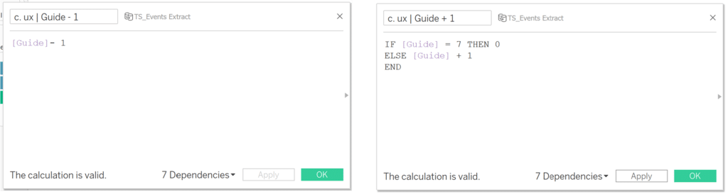
Next, we need calculations that control the “Back” and “Next” buttons. Since we set this up with an integer parameter, we can simply subtract one to go to the previous step, or add one to go to the next step. The “Back” formula is [Guide] – 1. The “Next” formula is [Guide] + 1.
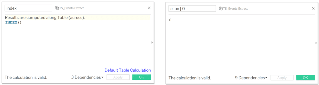
The last two calculations help us open and close the guide. Create a calculated field, call it “Index”, and add the INDEX() function. You can leave it set to the Default Table Calculation. Create another calculated field, call it “ux | 0”, and type 0 as your calculation.
Sheet Creation
First, create a sheet to open the guide. Add the “Index” calculation to the Details Marks Card. Leave the Rows and Columns shelves empty. Turn off tooltips and format your sheet to remove any background shading. This sheet will be placed on top of your open guide button.
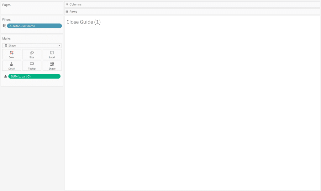
Next, we will create a sheet that will give the user the ability to close the guide at each step. Add the “ux | 0” calculation to the Details Marks Card. The “ux | 0” aggregation can be left as SUM. Leave the Columns and Rows shelves empty. Set the Mark Type to “Shape,” move the size slider all the way to the right, and make sure your sheet is set to fit “Entire View.” Finally, turn off tooltips and format your sheet to remove any background shading. The sheet should appear blank, but you will have a clickable shape mark for dashboard actions. Duplicate this sheet until you have one more than the total number of steps in your guide, which in my case is eight.
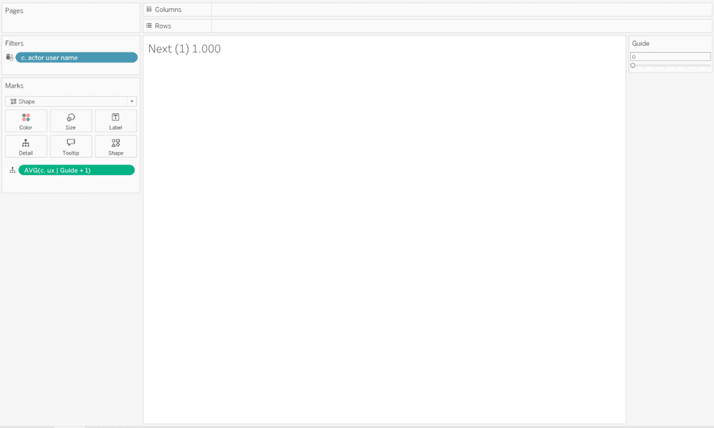
Next, let’s create the sheets to go to the next step in the guide. Add the “Guide + 1” calculation to the Details Marks Card. Leave the Rows and Columns shelves empty. Set the Mark Type to “Shape,” move the size slider all the way to the right, and make sure your sheet is set to fit “Entire View.” Turn off tooltips and format your sheet to remove any background shading. Duplicate this sheet until you have one fewer step than the total number of steps in your guide, which in my case is six (the last step won’t have a next button).
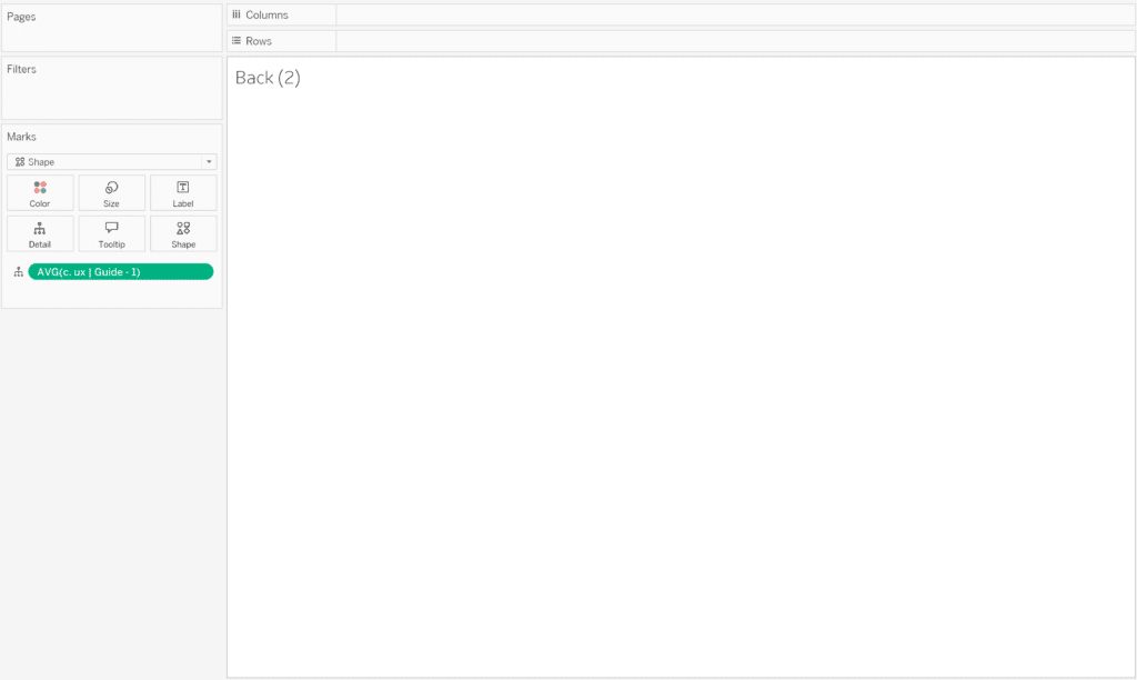
Finally, create the sheets that go to the previous step in the guide. Add the “Guide – 1” calculation to the Details Marks Card. Leave the Rows and Columns shelves empty. Set the Mark Type to “Shape,” move the size slider all the way to the right, and make sure your sheet is set to fit “Entire View.” Turn off tooltips and format your sheet to remove any background shading. Duplicate this sheet until you have one less than the total number of steps in your guide, which in my case is six (the first step won’t have a back button).
Final Implementation
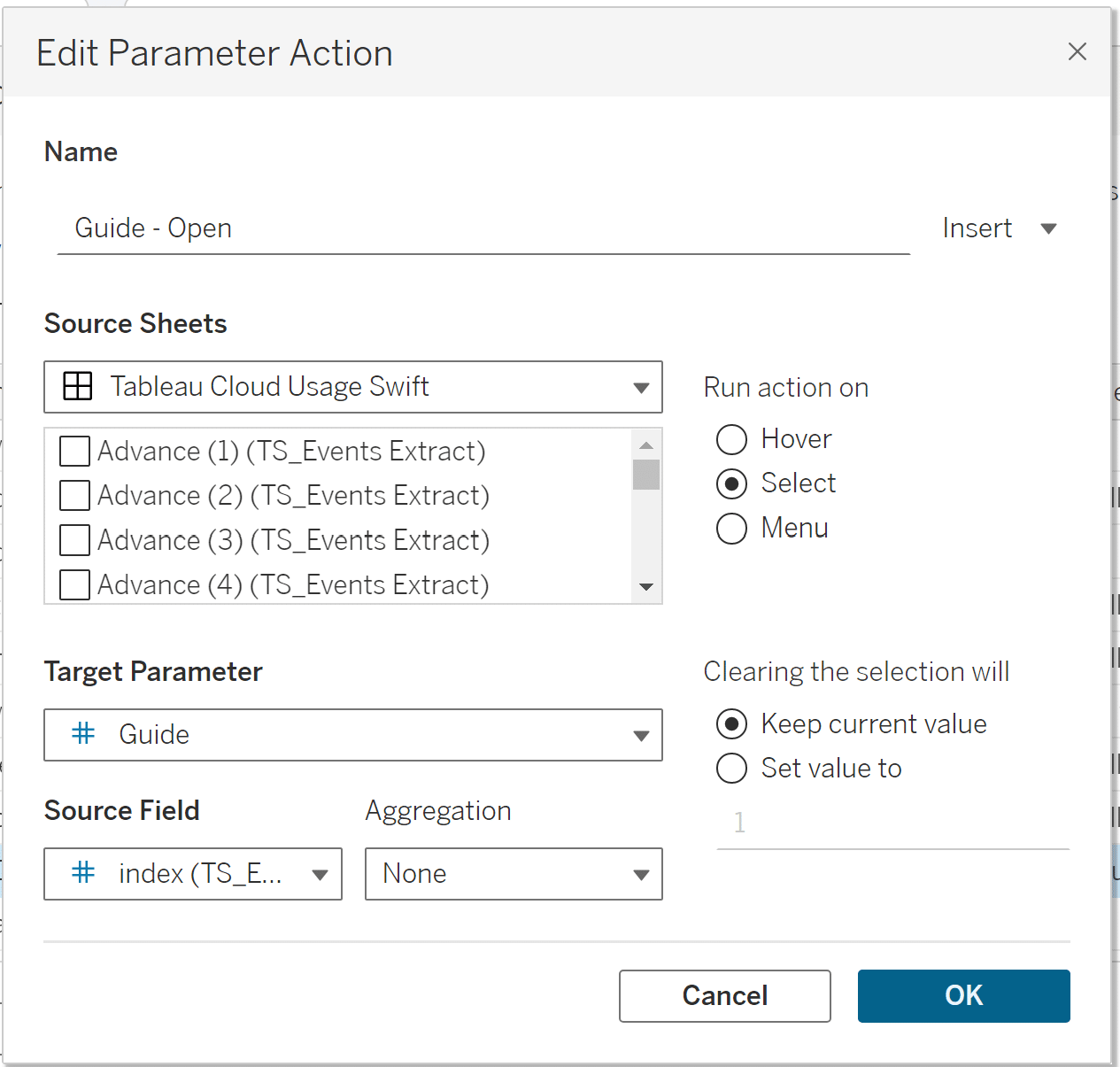
Now that we have created the image assets, parameters, calculations, and sheets we need, we can implement the guide. First, add your Open Guide sheet to your dashboard and place it on top of your Open Guide button (My button lives in the dashboard background image.). Create a dashboard parameter action. Set the source sheet as your Open Guide sheet, the target parameter as “Guide”, and the Source Field as the “Index” calculation.
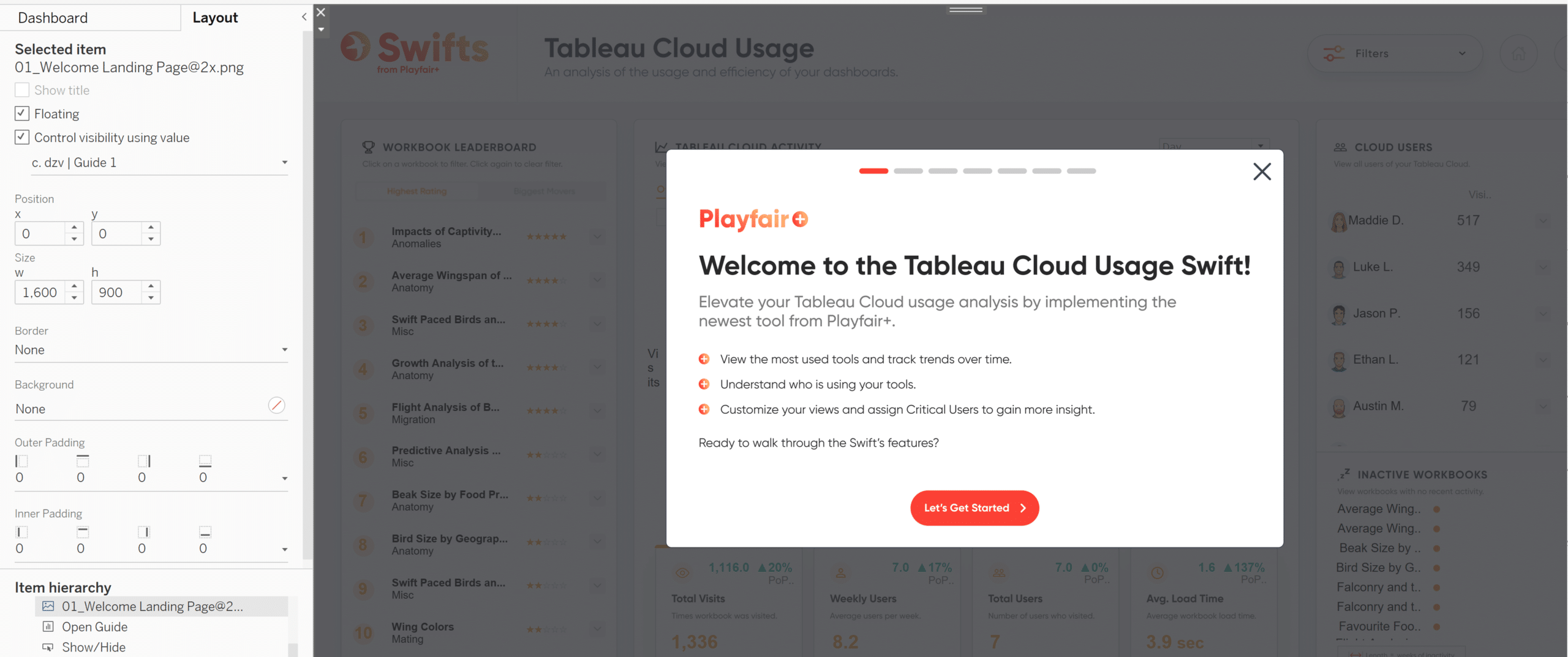
Add your user guide’s welcome message as a floating image that fills the entire view in Tableau. Check “Control visibility using value” and use the drop-down to select your first dynamic zone visibility calculation ([Guide] =1). Then add your first “close” sheet and your first “next” sheet on top of their associated buttons. Resize them accordingly.
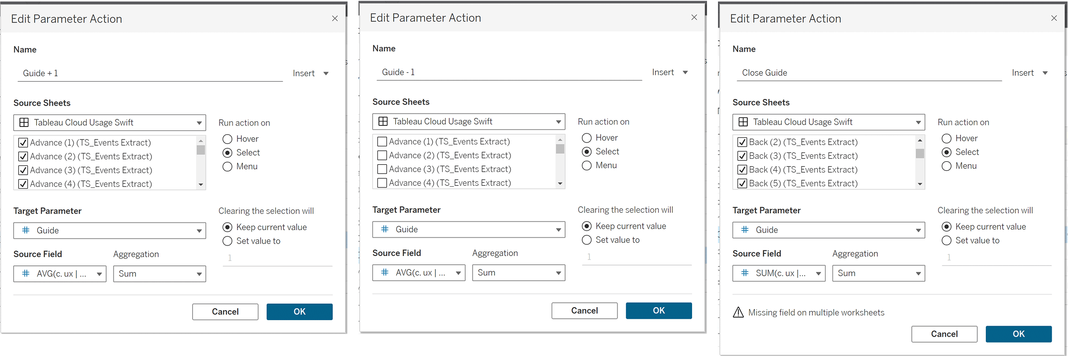
To achieve interactivity, we need a parameter action for the next, back, and close buttons. Create a dashboard parameter action to close the guide. Set the source sheet as your Close Guide sheet, the target parameter as “Guide”, and the Source Field as the “ux | 0” calculation.
Create a second dashboard parameter action to advance the guide to the next step. Set the source sheet as your Next sheet, the target parameter as “Guide”, and the Source Field as the “AVG(Guide + 1)” calculation. Set up the back parameter action the same way, but use your Back sheet as the source sheet and the “AVG(Guide – 1)” calculation as your Source Field.
3 Creative Ways to Use Tableau Parameter Actions
Follow the same steps to add your subsequent guide images. Note that you can simply add the additional next, back, and close sheets as source sheets in your parameter actions rather than creating a new parameter action for each. Once you’ve ensured that your guide is working as intended, you’re done!
I hope you’ve enjoyed this tutorial on creating an interactive user guide. It’s an engaging yet effective way to help users understand our tools. The guide is simple and intuitive and provides information about the tool in manageable chunks. Thanks for reading!
Happy creating,
Alyssa

Written By
Alyssa Huff

Peer Review
Rafael Simancas
Sr. Manager, Brand Strategy

Technical Review
Felicia Styer
Assoc. Director, Analytics Solutions

Technical Review
Megan Spengler
Sr. Visual Analytics Associate
Related Content
3 Creative Ways to Add Instructions for Your Users in Tableau


When you publish a Tableau dashboard, you want to ensure that every user, regardless of their data literacy, can easily…

Dan Bunker
Enhance Dashboard UX with Dynamic Zone Visibility In this tutorial, Dan explains Tableau’s dynamic zone visibility feature and how it…
3 Simple Ways to Improve the UX of Your Dashboards

At Playfair Data, we pride ourselves in improving the UX of dashboards to transform raw data into powerful insights. To…