How to Benchmark in Tableau Using Viz in Tooltip and Data Blending

The most common question I get from analysts is, “How do I get better at Tableau?”. It’s not easy being new to Tableau and seeing some of the amazing and impressive data viz examples on Tableau Public and trying to recreate them in your work. One of the best things about the platform is the ability for a complete beginner to pick up the tool and rapidly build valuable, insightful dashboards that used to take weeks or months to complete. The time it takes to go from installing the software to becoming an advanced-beginner is fast! But eventually, most people hit a bump in the road. You seek out expert blogs, thumb through Tableau Public, or worse, Google search things like “Tableau Hello Kitty pie chart best practice”. That’s why I’m sharing two of my biggest recommendations for “leveling up” in Tableau: comparisons and the Viz in Tooltip feature. This post walks you through how to use the latter to create benchmarks within Tableau views while saving valuable dashboard real estate.
How to Show Top N Lists in Tableau Tooltips
Use Viz in Tooltip to benchmark in Tableau
Introduced in version 10.5, Viz in Tooltip is an easy way to create details in your viz that allow you to answer multiple questions for your stakeholders at once.
If you’ve built out KPI dashboards or operational reports, this probably sounds familiar. “I want to see last month’s profitability to target”. My first instinct would likely be to make bullet graphs in Tableau. It’s a common request, so let’s see how to make it more valuable and pop!
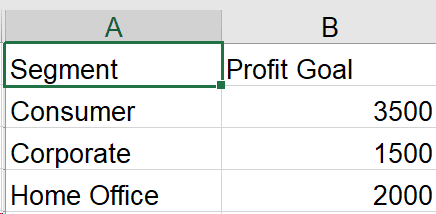
In the following example, I’ve created a simple goal Excel file that stores our hypothetical monthly goals by Segment:
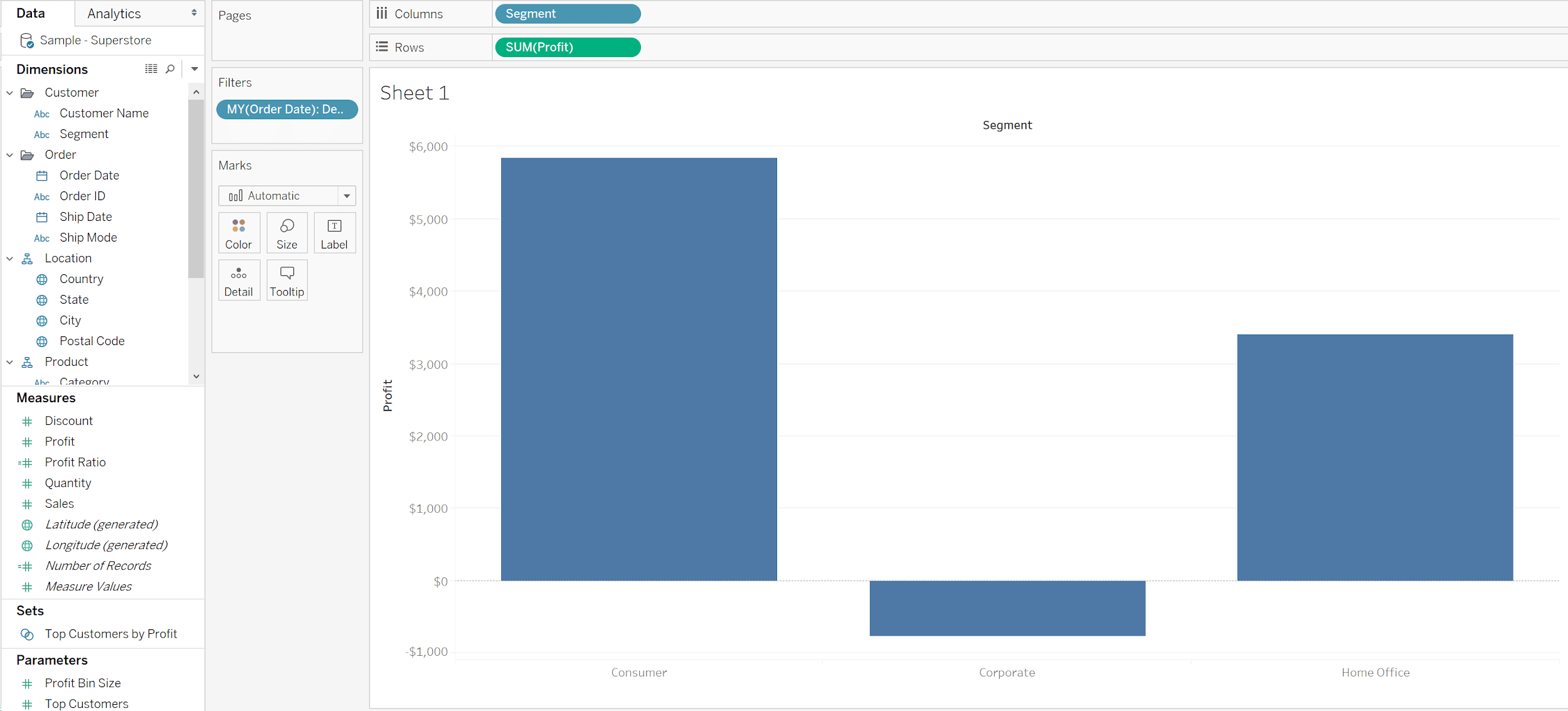
Let’s go into Tableau and create a quick viz that shows SUM([Profit]) by Segment. Then add Order Date to the Filters Shelf, select Month / Year (Discrete), and choose “December 2018”.
At this point, the view should look like this:
Next, let’s add the file as a data source for our goals. Go to Data – > New Data Source, click on Connect to a File – > Microsoft Excel and navigate to your file.
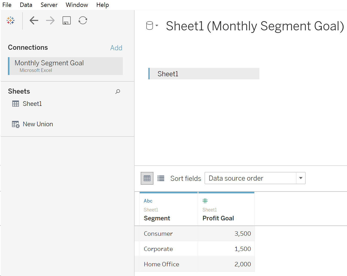
Click back to your Profit by Segment sheet and you should see the new Monthly Goal file with Segment automatically selected as a linking field. Drag it to the Detail Marks Card. For extra credit, change the number formatting to currency by navigating to Default Properties -> Number Format and change it to Currency (Custom) with 0 decimal places.
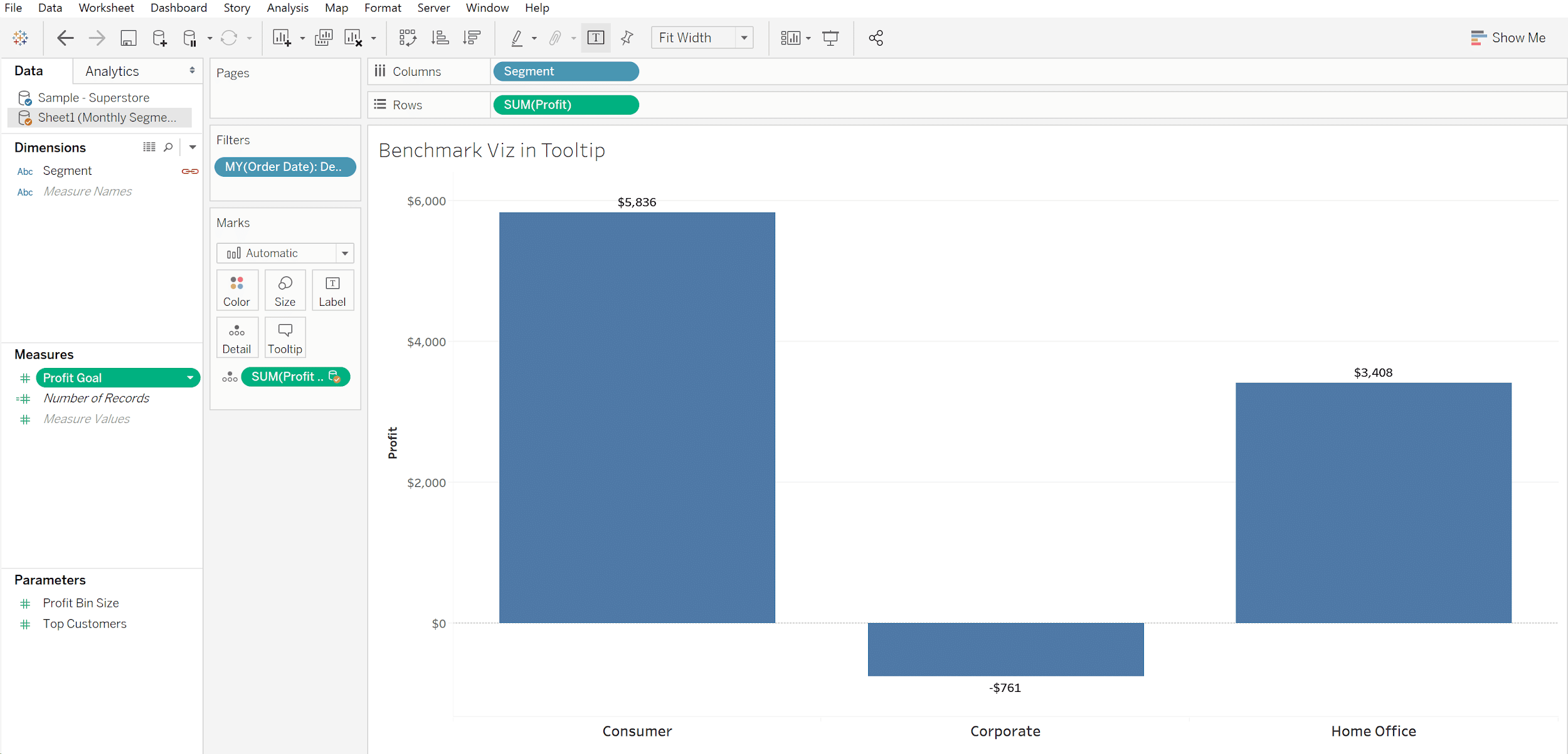
Let’s show the goal next. Right-click on the Profit axis and choose “Add Reference Line”. Change the Scope to Per Cell, Value to the linked SUM(Profit Goal), Label to None (make sure your users know it’s the goal line). Finally, make the line red and fill below a shade of gray:
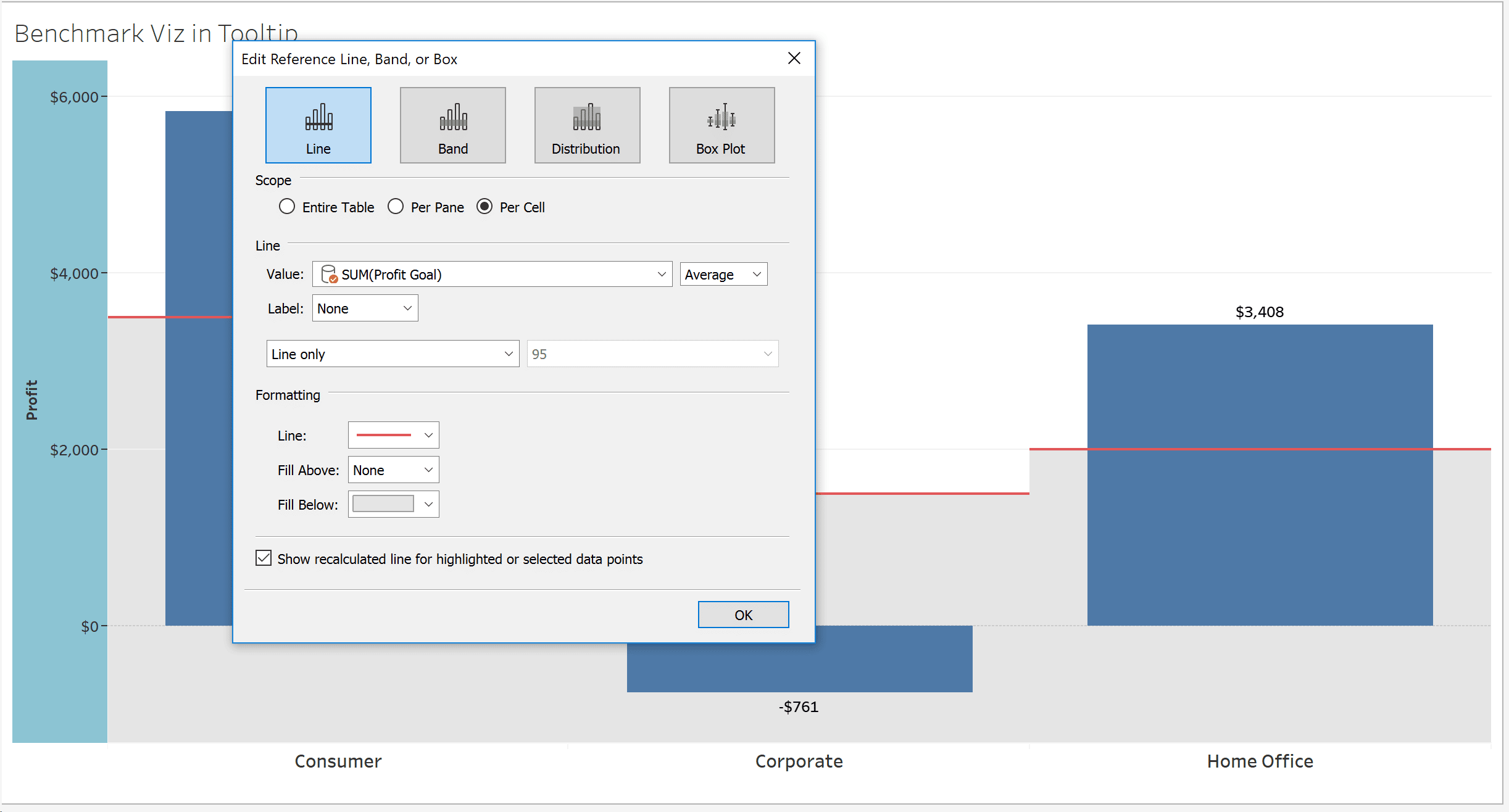
Let’s add one more nice feature and create a calculated field to color the bars by whether or not they hit the goal.
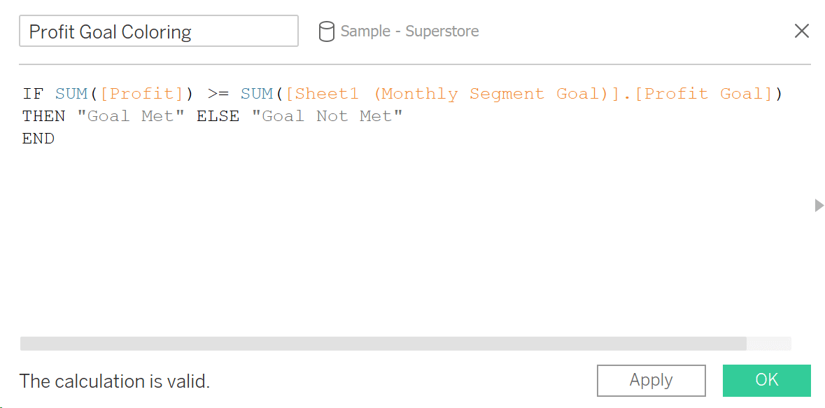
After placing this newly created calculated field on the Color Marks Card, the view looks like this:
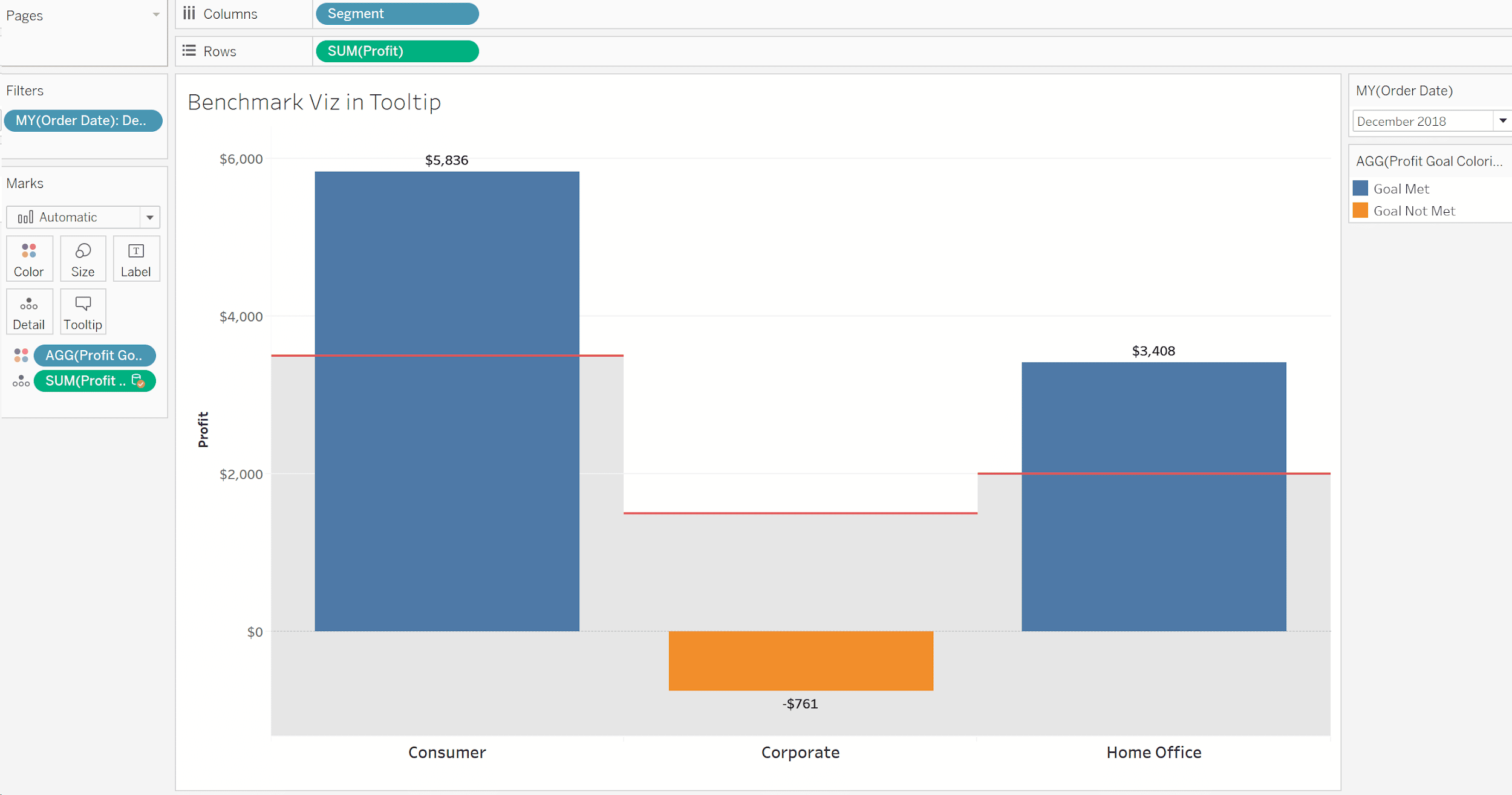
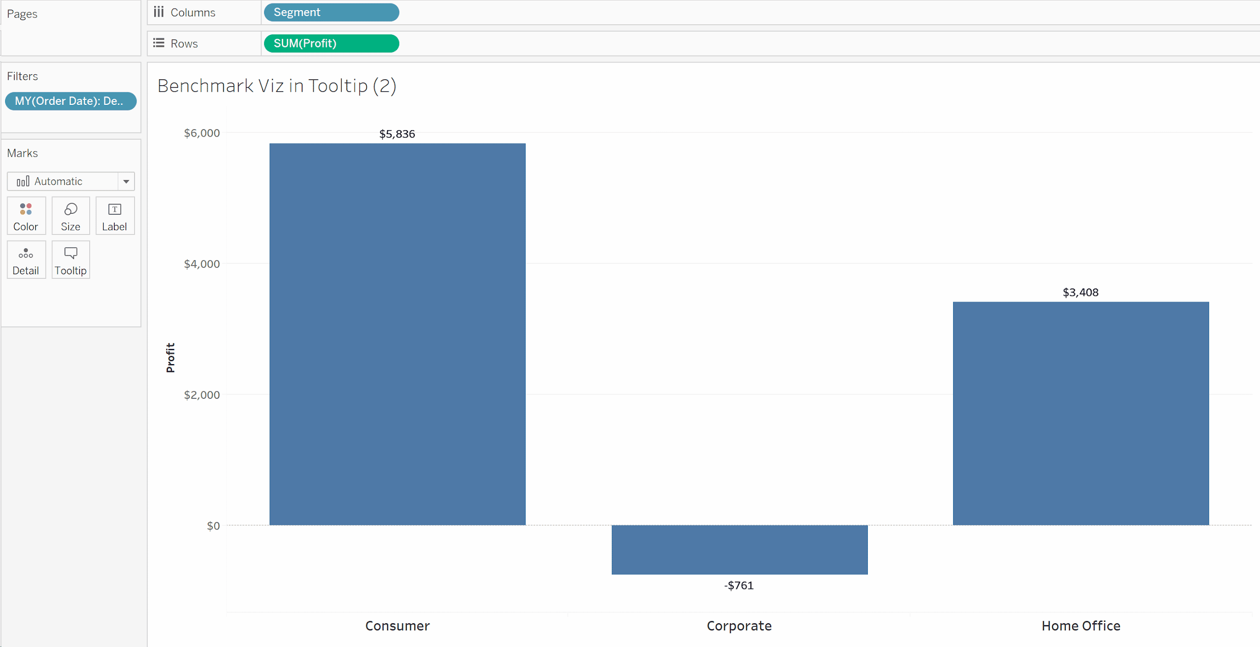
Now we have a pretty good example of our actual profitability to a benchmark. It’s easy to see that both Consumer and Home Office outperformed, while Corporate was nowhere close (actually went negative!).
What’s the next logical question? “How am I trending compared to other months and my monthly average? Is Corporate always this bad?”
![]()
Continue reading with a free account, or login.
Unlock this tutorial and hundreds of other free visual analytics resources from our expert team.
Already have an account? Sign In
By continuing, you agree to our Terms of Use and Privacy Policy.
How to benchmark in Tableau
Instead of having your users navigate to another sheet, or clutter up a dashboard, you can create something to answer this all at once. Let’s take this boring tooltip and make it a star.
First step, we’ll use Tableau’s ability to duplicate a sheet. Let’s make a second one now by right-clicking on the name of the tab and choosing “Duplicate Sheet”. This will be a little messy, but is the easiest way to keep the same settings and right measures together. Not as useful in this example, but it will be handy when you use it down the road.
Let’s remove the Profit Goal and Coloring from the Marks card, so your second view looks like this:
Now, replace Segment on the Columns Shelf with the Order Date dimension and let’s make it continuous by month:
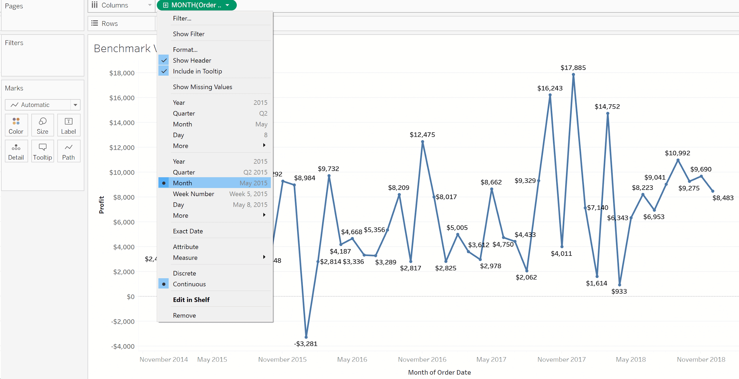
I’m also going to add a filter on Order Date by Year and set it to 2018 – we just want to see the trend for 2018.
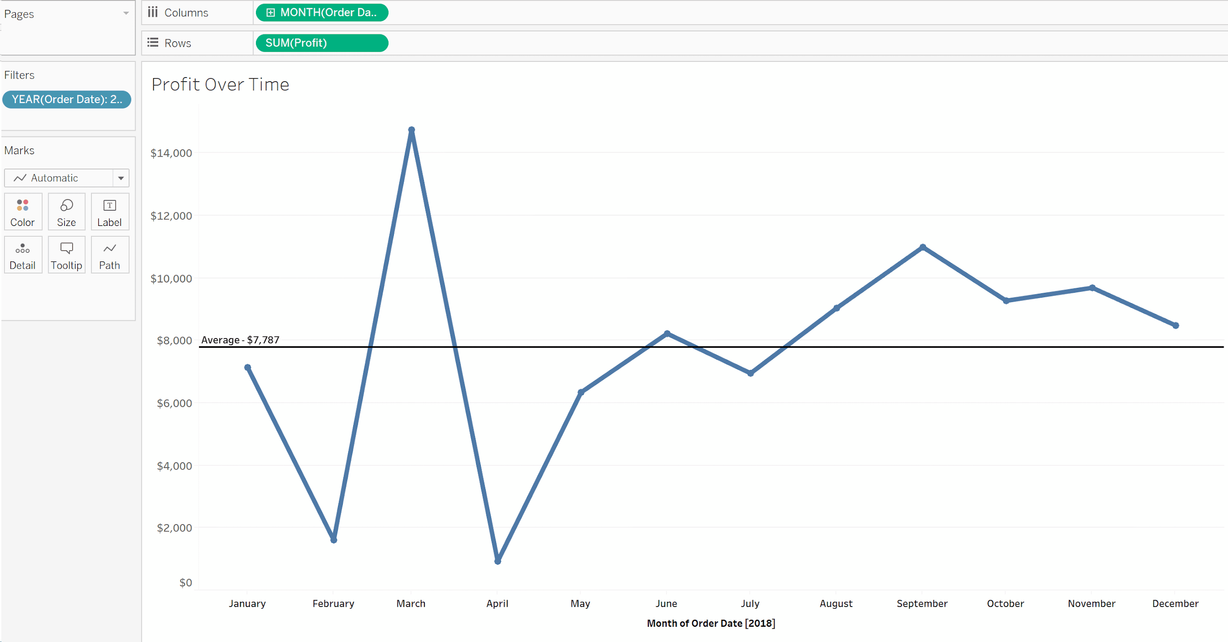
I’m going to add another reference line on Profit; this time with the average profit and then make the chart look a little nicer. Your final chart may look something like this:
Now for some Tableau magic. Let’s go back to our original sheet and click on the Tooltip Marks Card:
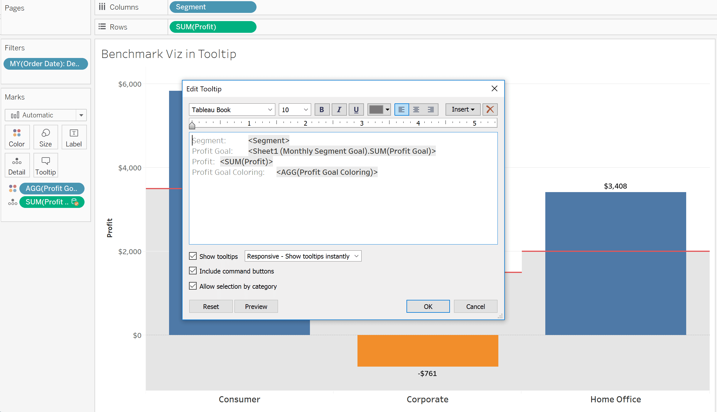
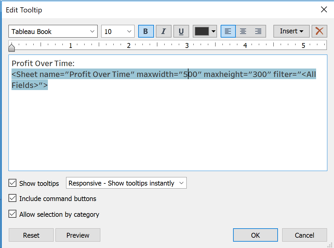
Let’s replace this tooltip with some text describing the viz in tooltip. Next, click on Insert – > Sheets – > Profit Over Time.
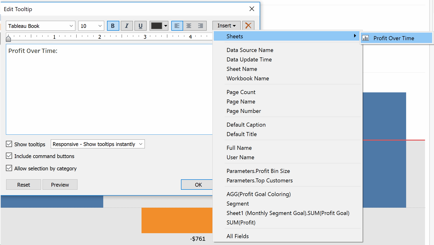
I like to change the width on time series charts because I think it makes the visualization look a little better. Your final tooltip could look like this:
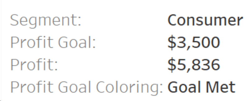
Click on OK and get ready for some magic. Try hovering over your bar charts now and take a look at the Consumer segment:
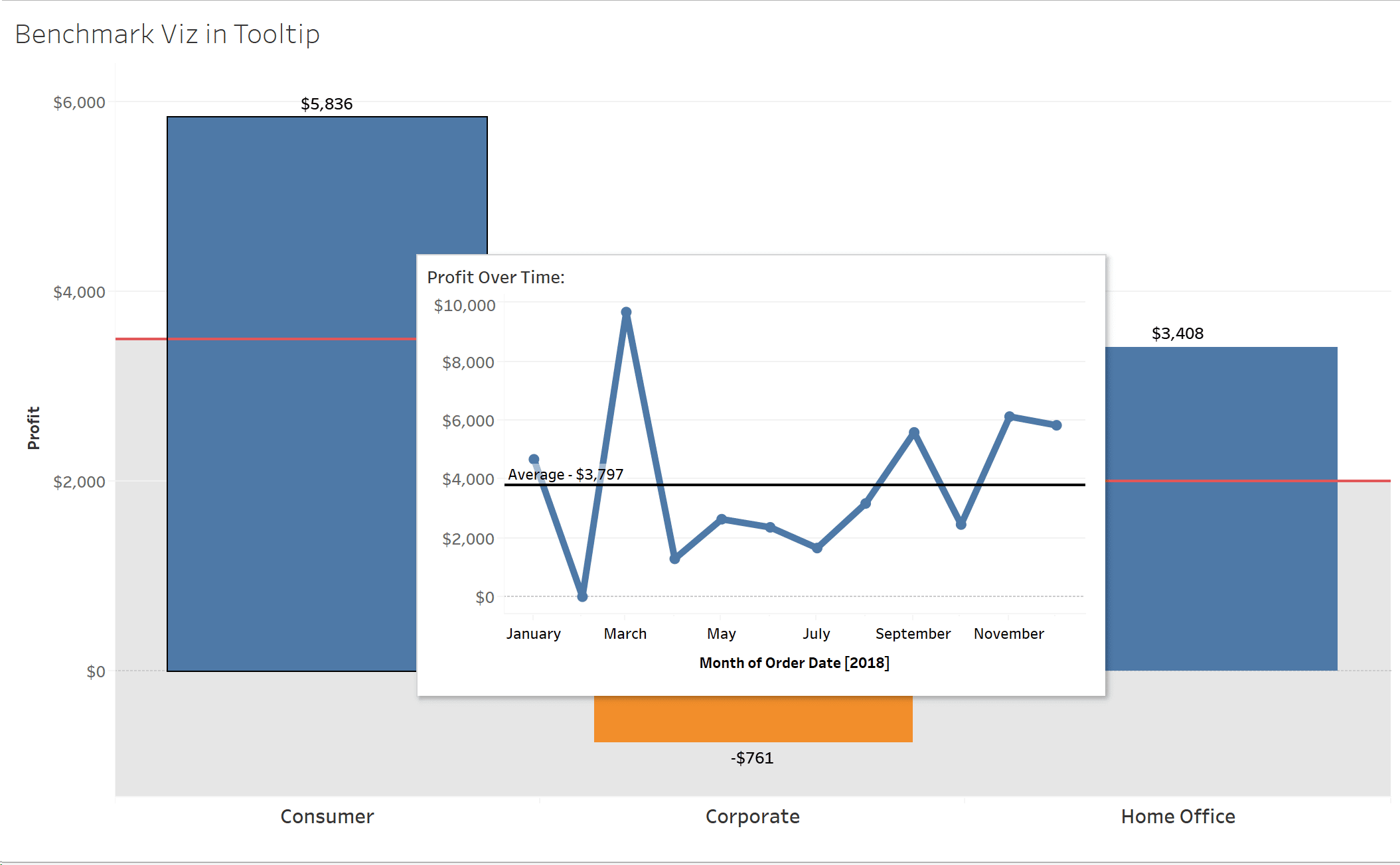
You’ve just added a lot of great additional information to your users. On average, Consumer generates a profit of around $3,800 per month. December outperformed the average by about $2,000!
Let’s add one last visual element to really drive this home. Comparing to an average is great, but we really want to see performance against our benchmark in Tableau. Corporate did terrible this month, but how is it doing overall?
![]()
Go back to your sheet with the line chart and let’s add in the Profit Goal as an additional reference line. Drag your Profit Goal measure to the Detail Marks Card.
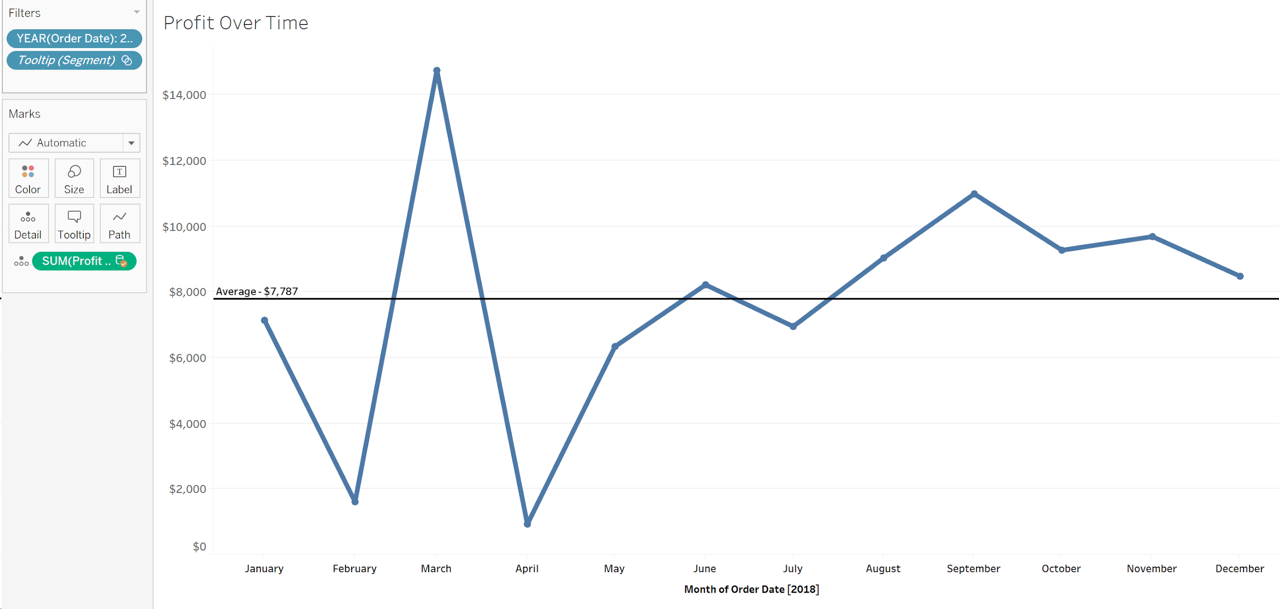
Next, add a new reference line. As a refresher, I like to do this by right clicking on the y-axis values, then Add Reference Line. Select SUM(Profit Goal), change the line to red and select None for Label:

Finally, go back to your main sheet and hover over Corporate.
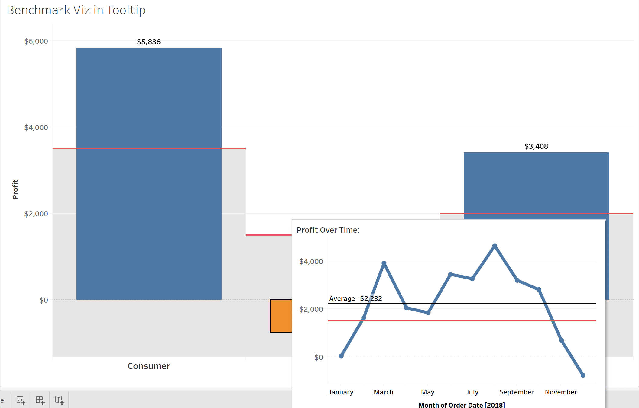
Looks like December was a terrible outlier, but when you compare to Consumer and Home Office, Corporate is on average, outperforming their Profit Goal for the year! These are insights that we would not have visibility into without adding context through the Viz in Tooltip feature.
This demonstrates an easy way for you to benchmark using data blending and the Viz in Tooltip feature. Both can be used in extremely powerful ways, giving your users additional information and comparisons without adding extra sheets to your dashboard.
For more ideas on using the Viz in Tooltip feature, see:
How to Show Top 10 Lists in Tableau Tooltips
How to Add an Image to a Tableau Tooltip
3 More Ways to Overcome the Excel Barrier to Tableau Adoption
For more advanced benchmarking, watch How to Use LOD Expressions to Create Benchmarks at Playfair+.


Written By
Jim Donahue
Related Content
3 Ways to Make Brilliant Bullet Graphs in Tableau

Setting goals and measuring progress is a common activity for many people. Maybe someone wants to read 25 books, travel…
How to Color Goal Surpluses / Budget Excesses in Tableau Bar Charts
Great visualizations answer the question – “Compared to what?” – without making users expend much effort uncovering their next actionable…

Ryan Sleeper
Blurring the line between explanatory and actionable analytics Ryan shares one of his favorite tactics for helping users evolve from…