How to Build a Semi-Sunburst Chart in Tableau

A Semi-Sunburst chart in Tableau creates a visually striking effect that catches the viewer’s attention. If you need to add a secret weapon to a dashboard full of tables and bar charts, this is a great element to incorporate. The compact layout displays the detailed distribution of a positive measure across two dimensions within a small space. While it isn’t the best tool for accurate estimation, it pairs well with a simple list or table. Together, they provide a high-impact summary of the data along with a straightforward list of exact values.
How the Semi-Sunburst chart in Tableau works
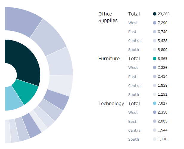
This dashboard uses four worksheets. The first worksheet holds the innermost donut chart, which is built on a ‘placeholder’ axis manually set to show just half of the donut. This sheet is layered over the second worksheet, which holds a larger donut chart. Together, these two worksheets are assembled into a semi-sunburst chart in Tableau. A third worksheet next to the half pie lists exact totals. Finally, a fourth hidden sheet is used as a viz in tooltip.
Continue reading with a free account, or login.
Unlock this tutorial and hundreds of other free visual analytics resources from our expert team.
Already have an account? Sign In
By continuing, you agree to our Terms of Use and Privacy Policy.
Creating a Donut chart
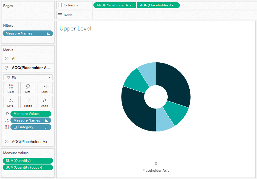
Start with a standard pie chart, using the dimension you’ll want in the inner layer. In this example, I’ve used Category for color and Quantity for angle.
Donut charts require two Marks cards, so we’ll need a placeholder axis. I used the calculation MIN(0) and named it “Placeholder Axis”.
3 Innovative Ways to Use Tableau Scaffolding
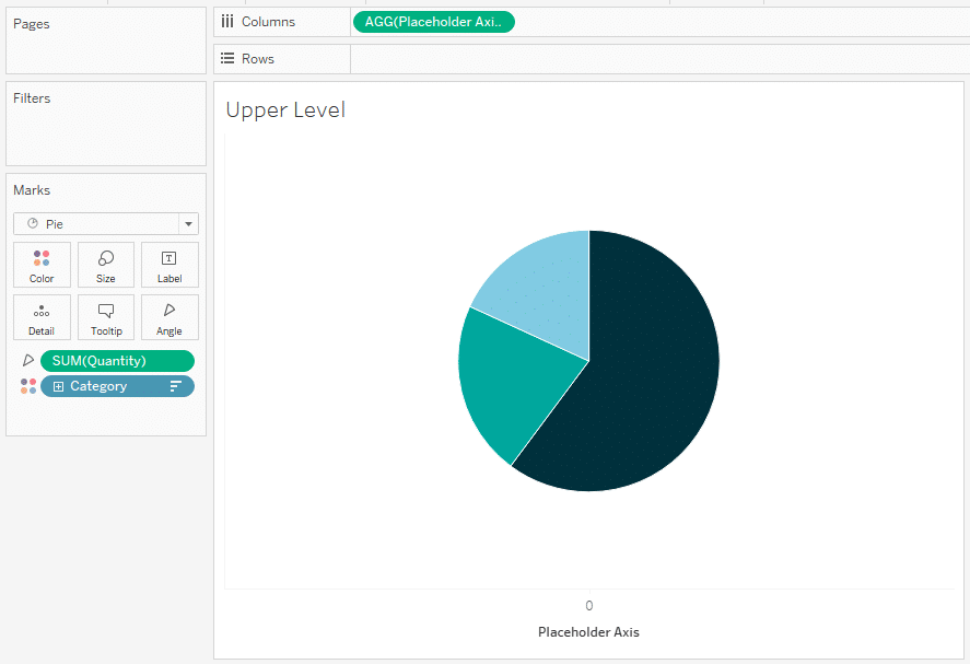
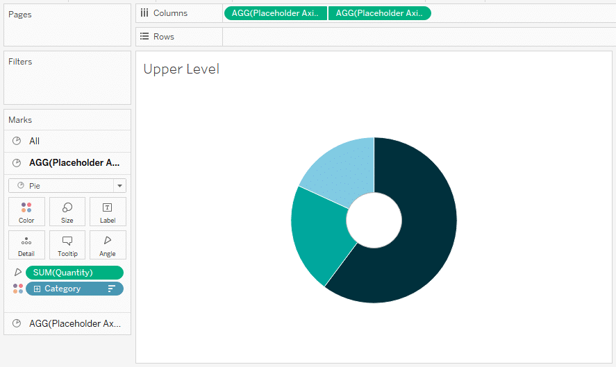
Add the Placeholder Axis field to the Columns shelf, then add a second copy of the same field to create a second axis and Marks card. The second Marks card will form the hole of the donut. Remove all dimensions and measures from the second Marks card, change the color to white, and reduce the size.
Create the dual axis and synchronize it. Then, format the worksheet to remove all gridlines, zero lines, axis rulers, and borders. Now we have a standard donut chart!
Tableau Formatting Series: How to Use Lines and Borders
Cutting the donut in half
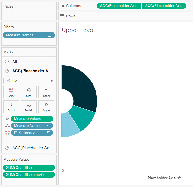
To create a half donut without losing any measures, we need a second copy of the measure used for the donut angle. Copy the measure, and replace it on the Angle property with the Measure Values measure. In the Measure Names filter, select the original measure and the new copy. Set the Measure Names dimension as the first dimension on the Marks card. This should result in a pie where each arc appears twice, once on the right half and again on the left.
Next, set your axis to start at the Placeholder Axis value. Since my placeholder axis is set to zero, I adjust the axis range to (0,1). Now the left half of the chart is hidden. This sheet will be the top layer of your pie chart.
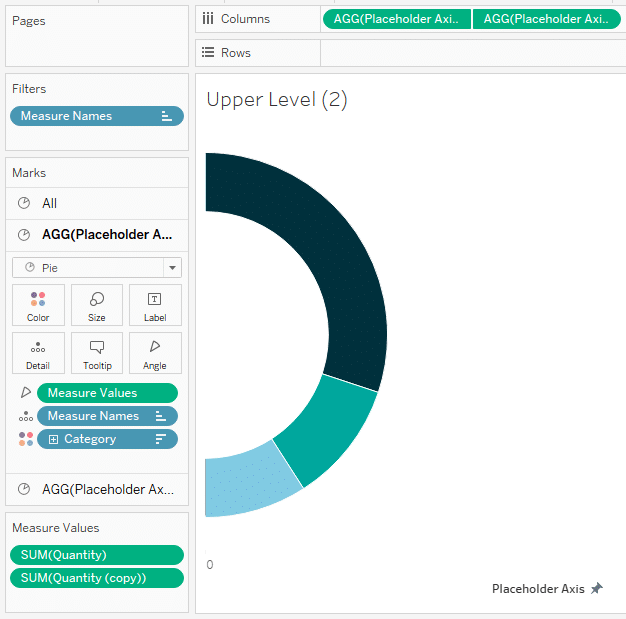
Making the second layer
Duplicate the worksheet to create a base for the outer layer. First, increase the size of the white center until it exactly covers the entire donut, then increase it a bit more. Now, increase the size of the outer layer until it becomes visible again.
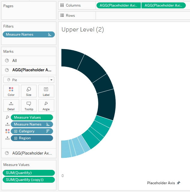
Add the second dimension to the bottom of the Marks card. I’m using Region as my second dimension. Order is important here: the Measure Names dimension must appear first, followed by the dimension from the inner layer, and then the new dimension should be last. This arrangement ensures that each value appears on the left side of the circle and that values are grouped by the original dimension values.
Assembling the Semi-Sunburst chart
Place the bottom layer onto the dashboard and position it as desired. Resize to fill the space if needed. Note the Layout coordinates and size.
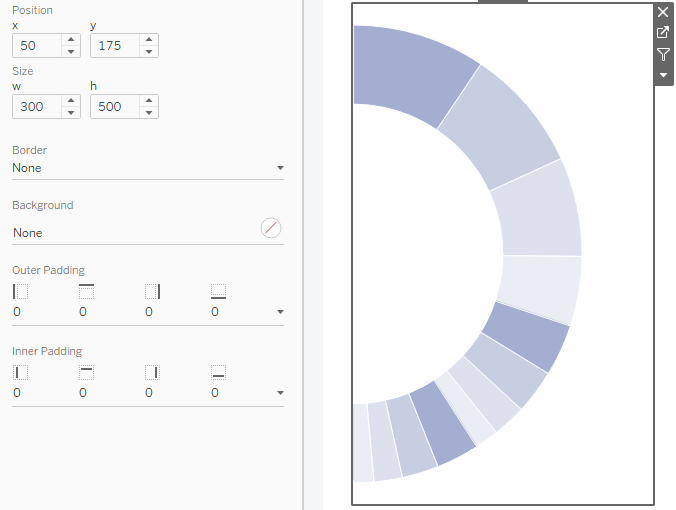
Bring the upper layer onto the dashboard and use the Layout menu to precisely position it on top of the lower layer. Now you have assembled the semi sunburst chart!
![]()
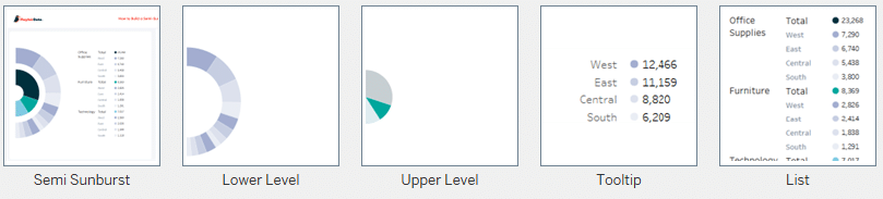
Depending on your use case, consider adding a Viz in Tooltip to display the values in the outer ring, along with a table or list to be displayed alongside the semi sunburst chart.
How to Show Top 10 Lists in Tableau Tooltips
Here’s a screenshot of the result.
Visit Playfair’s Tableau Public page to interact with the viz and download a copy for yourself!
Thanks for reading,
Felicia

Written By
Felicia Styer

Peer Review
Rafael Simancas
Sr. Manager, Brand Strategy
Related Content
How to Make a Radar Chart in Tableau
Radar charts are great for catching attention! However, keep in mind that they are difficult to interpret. So combining a…

Ryan Sleeper
Separate overlapping marks to reveal more underlying data Learn how to improve charts like box-and-whisker plots that have lots of…
How to Make an Expanding Donut Chart in Tableau

Did you know that pie charts have been around for over 220 years?! They first appeared in 1801 in William…