How to Create Balance Scale Charts in Power BI

The Balance Scale chart is a Playfair Data innovation that was originally created for our Financial Analysis Swift in Tableau. Recently, we were able to recreate it for our newest offering, the Financial Analysis Swift in Power BI. While it was originally meant to compare the two sides of a balance sheet (assets vs. liabilities/equities), the Balance Scale chart in Power BI can be applied in any situation where you want to compare groups against one another.
Connecting to data
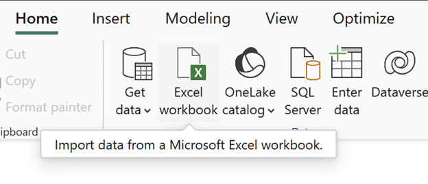
To follow this tutorial, download the AdventureWorks dataset. Open a new report in Power BI Desktop, click Excel Workbook, find the data in your files, and click Open.
In the Navigator window, select the Reseller, SalesTerritory, and Sales tables.
Continue reading with a free account, or login.
Unlock this tutorial and hundreds of other free visual analytics resources from our expert team.
Already have an account? Sign In
By continuing, you agree to our Terms of Use and Privacy Policy.
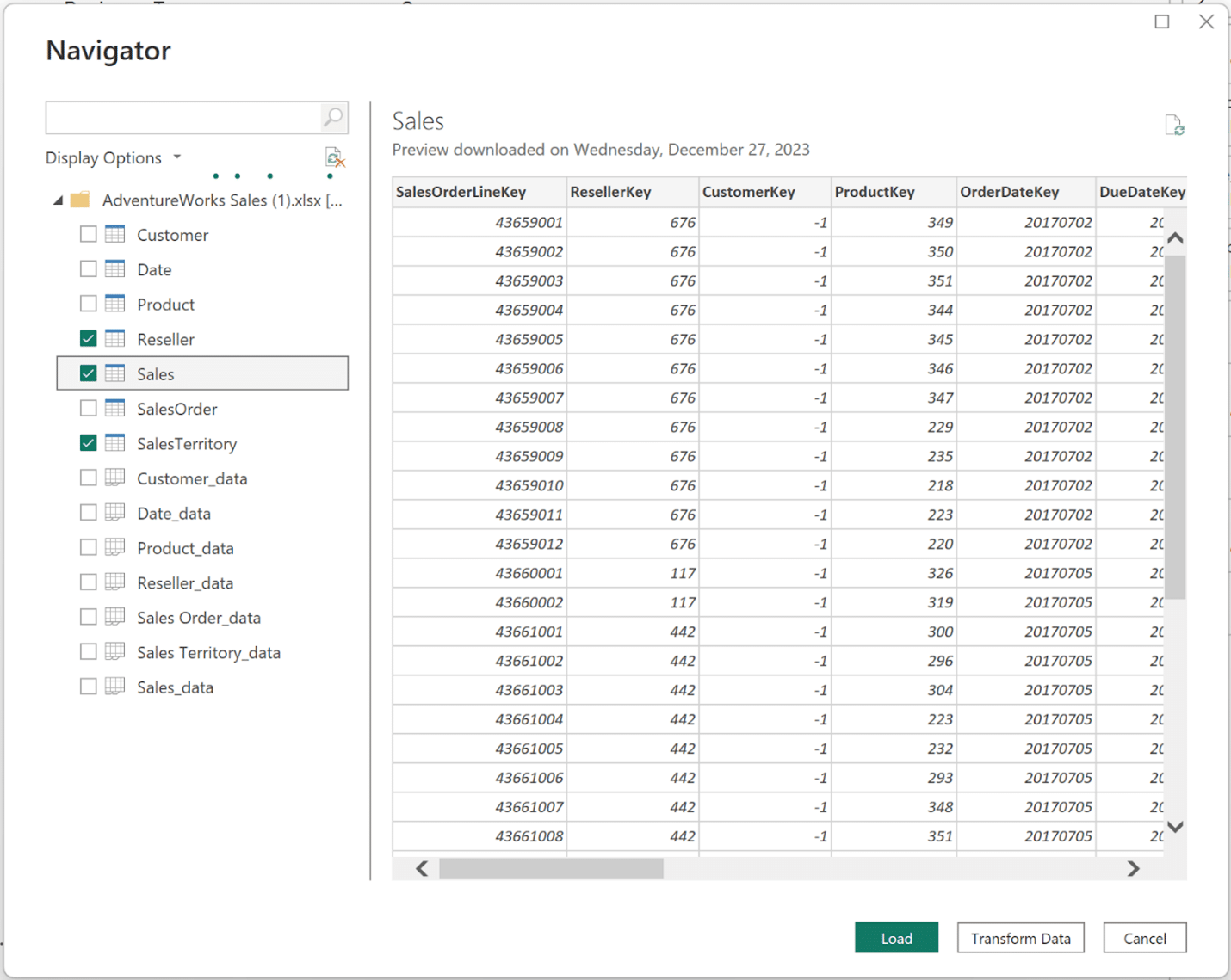
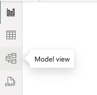
Click Load to add the data to Power BI Desktop. If relationships are not automatically created between the ‘…Key’ fields in the three tables, navigate to the Model view to create them.
In the Model view, drag the matching ‘…Key’ field in the SalesTerritory table to the ‘…Key’ field in the Sales table. Do the same to connect the Reseller and Sales tables. Both relationships to the Sales table will have cardinality many-to-one, and both will be active relationships with the cross-filter direction set to Single. These are represented by a line connecting the tables.
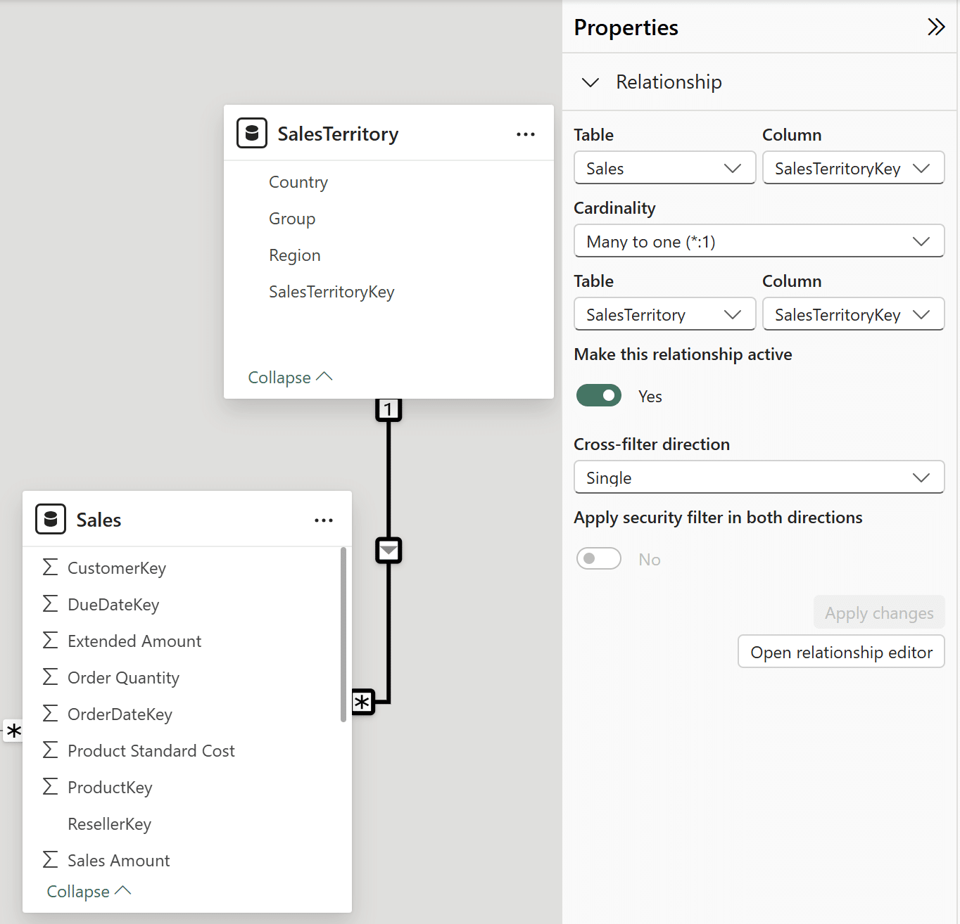
Once you have confirmed a relationship between the Reseller and Sales tables and a relationship between the SalesTerritory and Sales tables, navigate back to the Report view.
Creating a measures table
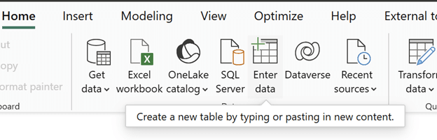
Multiple measures are needed to create a Balance Scale chart in Power BI Desktop, so before creating them, create a table to hold the measures. In the Home tab, click on Enter data. Rename this table as ‘Measures Table’.
This table is intentionally left blank. Do not add any rows or columns to it.
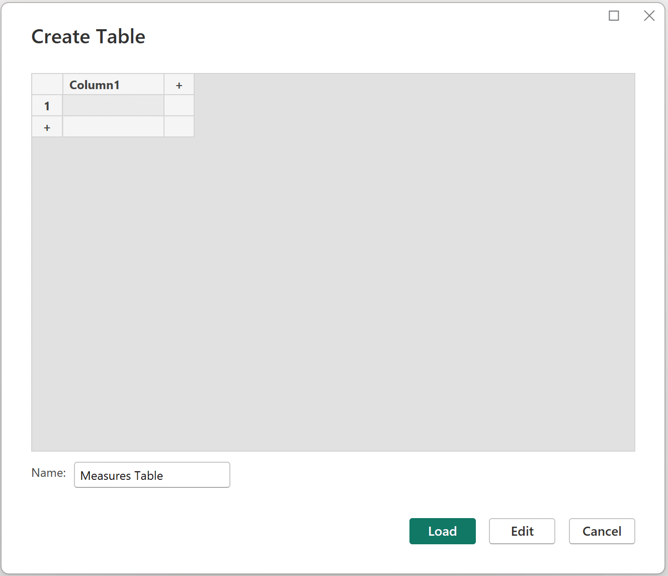
Click Load to create the new table.
Beginner’s Guide to DAX: Creating Calculated Columns and Measures in Power BI
Creating measures
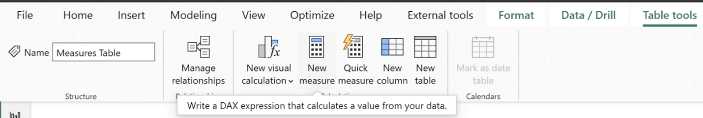
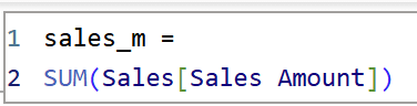
This Balance Scale chart will use the ‘Group’ column from the SalesTerritory Table on one side and the ‘Business Type’ column from the Reseller table on the other side. It will compare sales data between the different groups and business types. First, create an explicit measure for the total sales. In the Measures Table, click on New measure.
Wrap the ‘Sales Amount’ column with the SUM() function to create a total sum of sales measure in the measures table. This sales measure will be continually referenced in the following measures built for the Balance Scale chart.
sales_m =
SUM(Sales[Sales Amount])
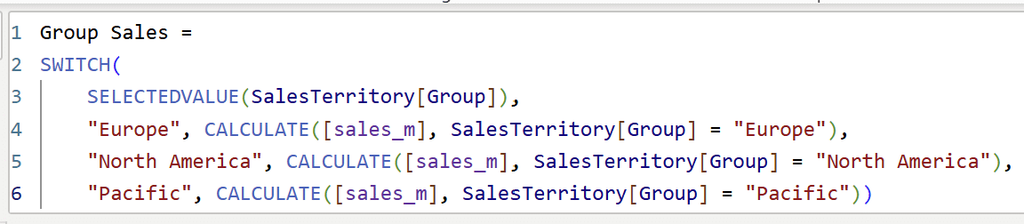
Since the final product will be controlled with slicer visuals, the next step is to create measures to calculate sales based on the current slicer selections. Start by creating a measure called ‘Group Sales’ for the ‘Group’ column, which calculates sales for each selection in the column. Click on New measure in the measures table and copy the following syntax in your DAX window.
Note: I did not add ‘Corporate HQ’ here because it has no sales.
Group Sales =
SWITCH(
SELECTEDVALUE(SalesTerritory[Group]),
“Europe”, CALCULATE([sales_m], SalesTerritory[Group] = “Europe”),
“North America”, CALCULATE([sales_m], SalesTerritory[Group] = “North America”),
“Pacific”, CALCULATE([sales_m], SalesTerritory[Group] = “Pacific”))
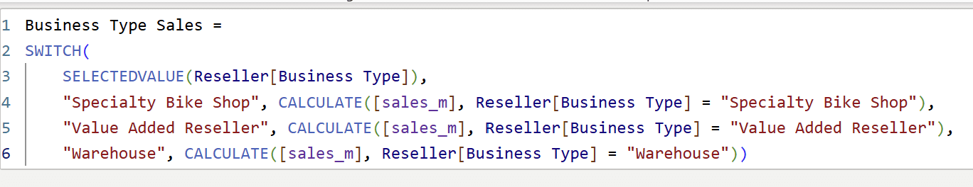
Now, create a measure to do the exact same as above for the ‘Business Type’ column. This will be called ‘Business Type Sales’. The syntax is exactly the same as the ‘Group Sales’ measure, except that you will swap ‘Group’ for ‘Business Type Sales’.

Business Type Sales =
SWITCH(
SELECTEDVALUE(Reseller[Business Type]),
“Specialty Bike Shop”, CALCULATE([sales_m], Reseller[Business Type] = “Specialty Bike Shop”),
“Value Added Reseller”, CALCULATE([sales_m], Reseller[Business Type] = “Value Added Reseller”),
“Warehouse”, CALCULATE([sales_m], Reseller[Business Type] = “Warehouse”))
Building the first side of the Balance Scale chart in Power BI
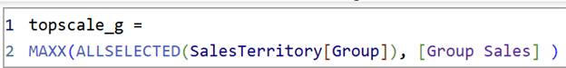
With the two sales measures built, I am ready to create the three measures needed to construct the first side of the Balance Scale chart in Power BI Desktop. Each measure corresponds with the top, middle, and bottom of the stacked column chart.
The measure for the top of the Balance Scale chart, called ‘topscale_g’, uses ALLSELECTED() to calculate the sales corresponding to the current selection from the ‘Group’ column. The syntax is as follows:
topscale_g =
MAXX(ALLSELECTED(SalesTerritory[Group]), [Group Sales] )
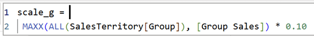
The middle of the scale measure, ‘scale_g’, uses ALL() in place of ALLSELECTED() to calculate the largest sales value for the entire ‘Group’ column. I multiplied it by 10% to size the stacked column chart.
The syntax is as follows:
scale_g =
MAXX(ALL(SalesTerritory[Group]), [Group Sales]) * 0.10
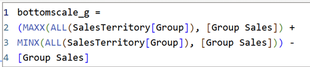
The bottom measure, ‘bottomscale_g’, adds up the largest sales value of the ‘Group’ column with the smallest sales value of the ‘Group’ column and subtracts the sales value for the current selection. The syntax is as follows:
bottomscale_g =
(MAXX(ALL(SalesTerritory[Group]), [Group Sales]) +
MINX(ALL(SalesTerritory[Group]), [Group Sales])) –
[Group Sales]
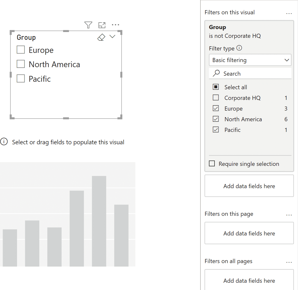
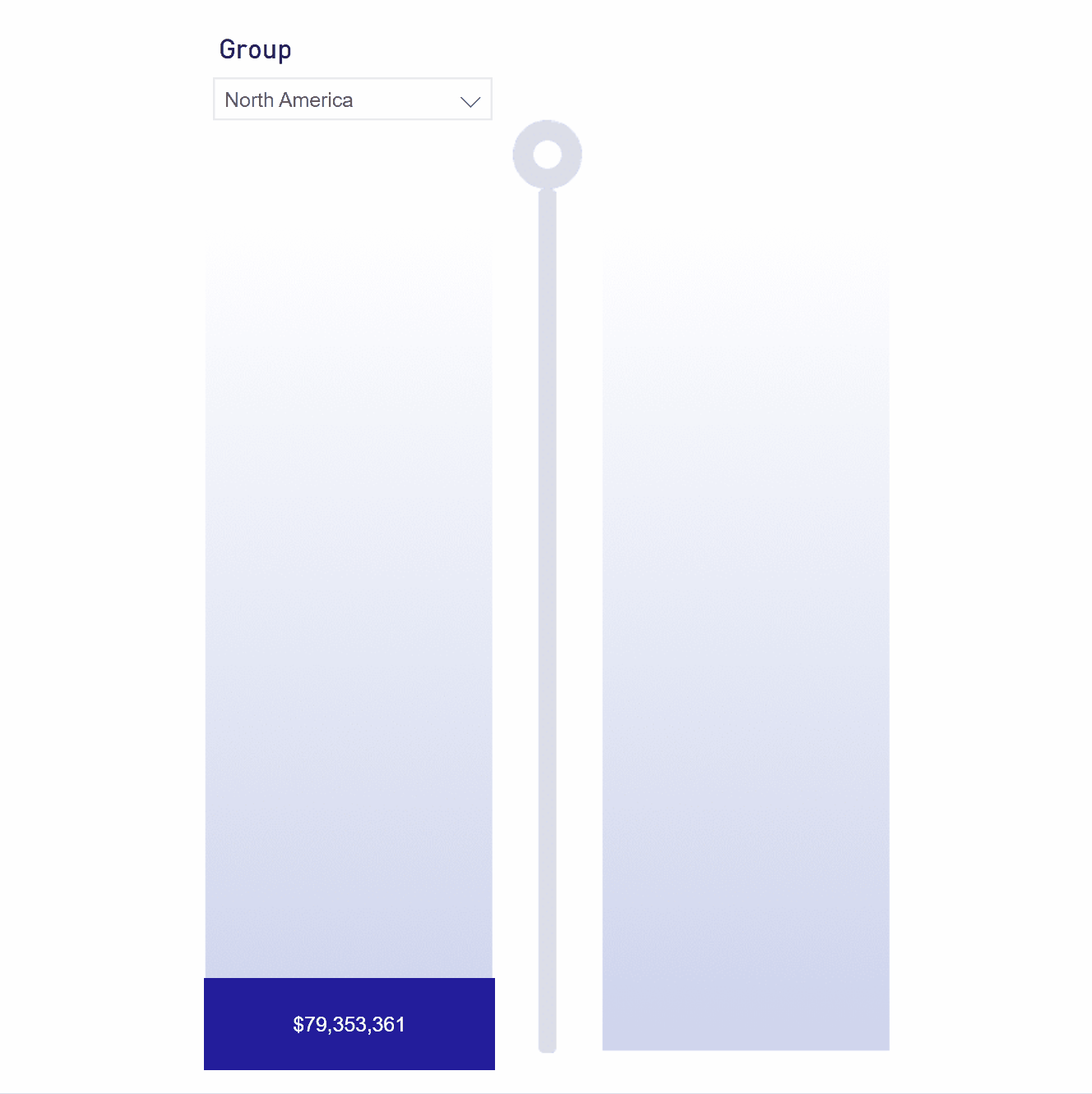
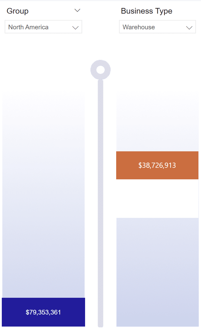
Begin constructing the first side of the Balance Scale chart by adding a slicer to your page and add the ‘Group’ column from the SalesTerritory table. In the Filters pane, remove the ‘Corporate HQ’ value since it has no sales. Add a stacked column chart under the slicer visual.
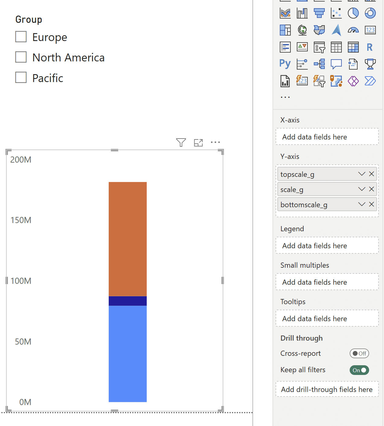
Now, add the three measures to the stacked column chart in this order: First ‘topscale_g’, then ‘scale_g’, and finally, ‘bottomscale_g’. In the Formatting pane, remove the axes titles, the visual title, the legend, and the gridlines. Turn the tooltips off, and under General → Effects, toggle the visual background off.
Next, increase the width of the stacked bar chart. Under ‘Layout’, increase the ‘Minimum category width’ to the maximum.
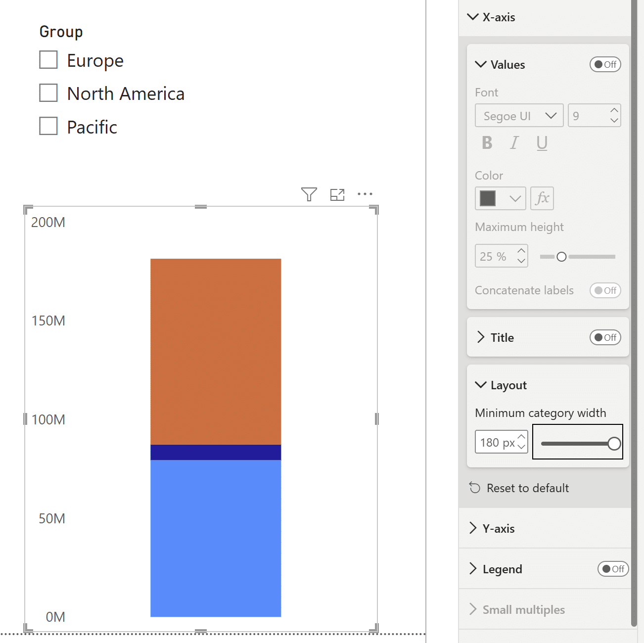
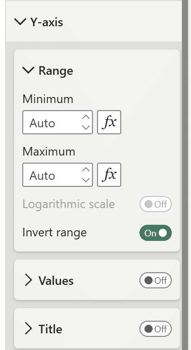
To add additional width to the columns, under Columns → Layout, decrease the space between categories to 0%. The last step before changing the colors of the stacked column chart is to invert the y-Axis range to make the Balance Scale chart behave like a weight scale, with the largest, or heaviest sales values towards the bottom, and the lighter, or smallest sales values at the top. Invert the range and turn the y-Axis values off.
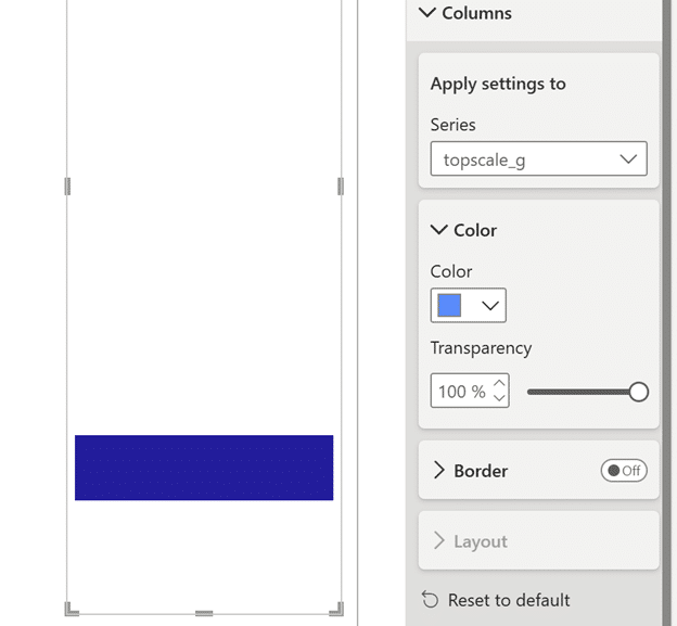
Adjust the column colors so that the middle measure ‘scale_g’ is visible, the ‘topscale_g’ measure is fully transparent, and the color of ‘bottomscale_g’ is white.
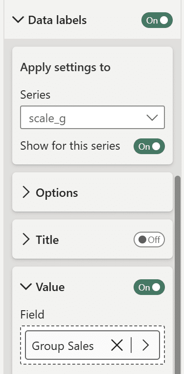
Turn on data labels. Under ‘Apply settings to’, toggle the ‘Show for this series’ button to ‘Off’ for every measure in the Series dropdown except the ‘scale_g’ measure. Open up the ‘Value’ dropdown and replace the current measure in the ‘Field’ section with the ‘Group Sales’ measure. Format this label however you like.
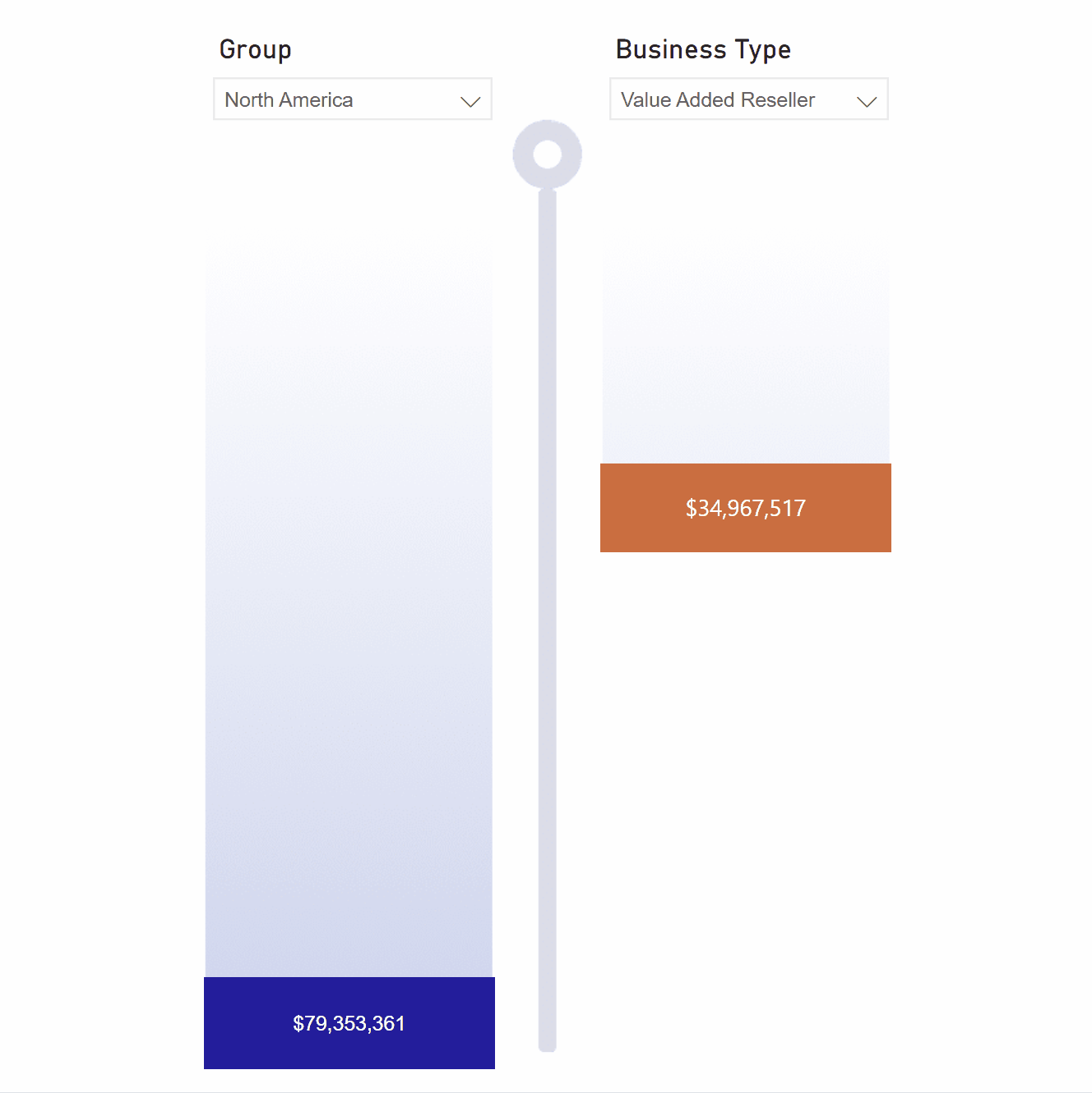
Right-click the below image and save it to your desktop. Bring it into the Power BI report by using Insert → Image. Float the first side of the Balance Scale chart over the left side of this image. Using the Selection pane, ensure that the below image is layered under the left side of the Balance Scale chart.

Now select different values in the ‘Group’ slicer and watch your Balance Scale chart come to life!
Building the second side of the Balance Scale chart in Power BI
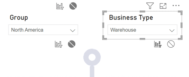
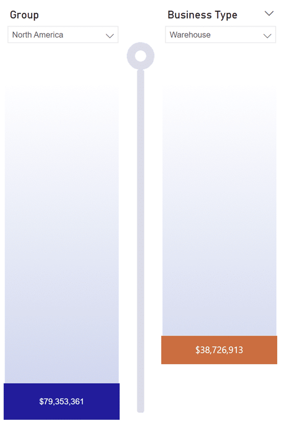
The second side of the Balance Scale is built with three new measures called ‘topcale_bt’, scale_bt’, and ‘bottomscale_bt’. Copy and paste the DAX from the ‘topscale_g’, ‘scale_g’, and ‘bottomscale_g’ measures used for the first side of the Balance Scale, substituting any reference to the ‘SalesTerritory[Group]’ column with the ‘Reseller[Business Type]’ column and substituting any reference to the ‘Group sales’ measure with the ‘Business Type sales’ measure. Float the right side of the Balance Scale chart over the gradient image. If necessary, use the Selection pane to ensure both the left and right sides of the Balance Scale chart are above the gradient image. Add in the ‘Business Type’ slicer and ensure there is no interaction between the left and right sides of the Balance Scale chart. To do so, select a visual on the report page. Click on Format → Edit interactions.
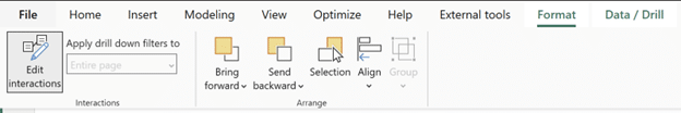
Turn off interactions for the slicers on the left and right sides, ensuring that the slicer visuals only affect their corresponding stacked column chart. Select the ‘Group’ slicer. While it is selected, turn off interactions for the right side of the Balance Scale chart. You want to turn off interactions for both the ‘Business Type’ slicer and the stacked column chart on the right. When the ‘Business Type’ slicer is selected, turn off interactions for the ‘Group’ slicer and the corresponding stacked column chart. You don’t want the slicer on the left to filter the stacked column chart on the right and vice versa.
The Balance Scale chart is almost complete! In the next section, I will create a measure that calculates the smallest global sales value, ‘Min’, and a measure that calculates the largest global sales value, ‘Max’, to ensure both sides of the Balance Scale chart share the same axis.
3 Ways to Make Beautiful Bar Charts in Power BI
Synchronizing the Balance Scale chart axes
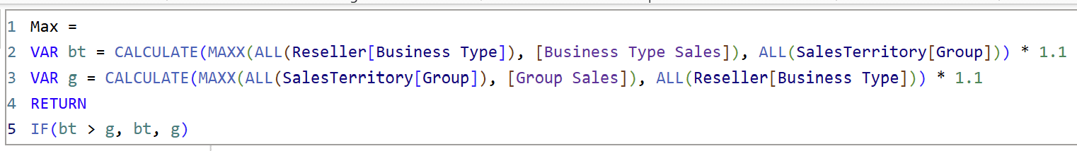
First, create a measure called ‘Max’, which will return the largest sales value between the ‘Group’ and the ‘Business Type’ sides by first calculating the largest sales for each side, using ALL(), and comparing the largest sales value with an IF() statement. I will also multiply it by 1.1 so the visible bars on the Balance Scale chart are not cut off. The syntax is as follows:
Max =
VAR bt = CALCULATE(MAXX(ALL(Reseller[Business Type]), [Business Type Sales]), ALL(SalesTerritory[Group])) * 1.1
VAR g = CALCULATE(MAXX(ALL(SalesTerritory[Group]), [Group Sales]), ALL(Reseller[Business Type])) * 1.1
RETURN
IF(bt > g, bt, g)
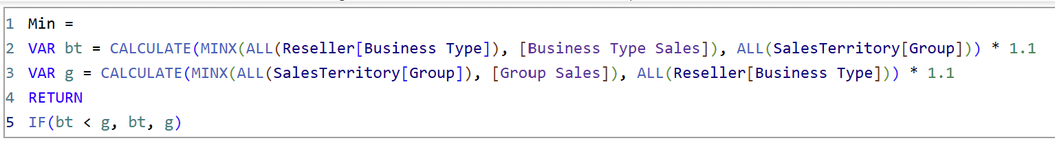
The syntax for the minimum measure ‘Min’ is the same, but the logic is reversed, and MAXX() is replaced with MINX().
Min =
VAR bt = CALCULATE(MINX(ALL(Reseller[Business Type]), [Business Type Sales]), ALL(SalesTerritory[Group])) * 1.1
VAR g = CALCULATE(MINX(ALL(SalesTerritory[Group]), [Group Sales]), ALL(Reseller[Business Type])) * 1.1
RETURN
IF(bt < g, bt, g)
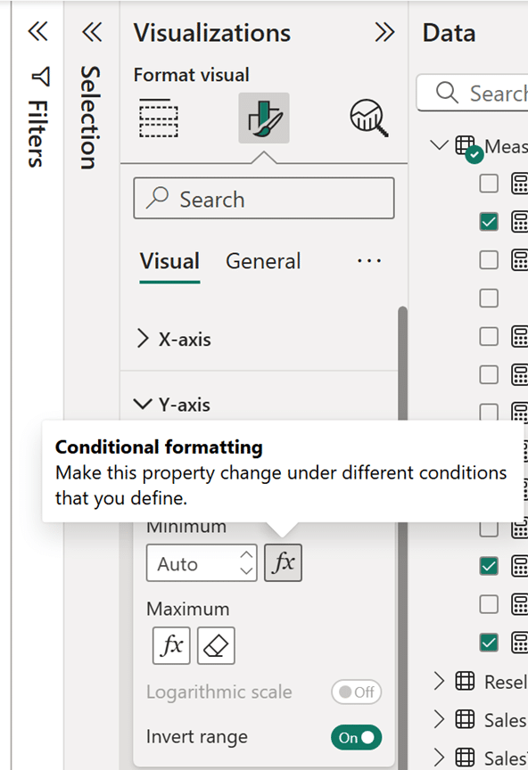
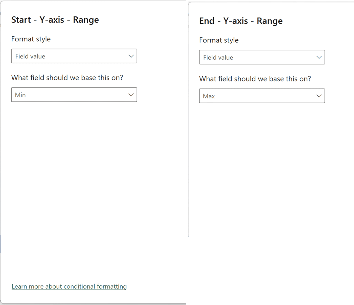
Using these two measures, I’ll conditionally format the y-Axis for both sides of the Balance Scale chart by adding the ‘Max’ and ‘Min’ measures to the y-Axis range. Do this on both sides of the Balance Scale chart.
This scale looks much better. Next, I’ll fix the bottom of the scales to fill the white to the global maximum.
Adjusting the scale measures
Now I have to adjust the ‘bottomscale_g’ and ‘bottomscale_bt’ measures to reference the global minimum and maximum sale values, using the same logic as the ‘Min’ and ‘Max’ measures I just created. If you look closely, the new ‘bottomscale_’ measures are actually the same calculation as before with IF() conditions. Below is the syntax for the new ‘bottomscale_g’ measure:
bottomscale_g =
VAR bt_max = CALCULATE(MAXX(ALL(Reseller[Business Type]), [Business Type Sales]), ALL(SalesTerritory[Group])) * 1.1
VAR g_max = CALCULATE(MAXX(ALL(SalesTerritory[Group]), [Group Sales]), ALL(Reseller[Business Type])) * 1.1
VAR bt_min = CALCULATE(MINX(ALL(Reseller[Business Type]), [Business Type Sales]), ALL(SalesTerritory[Group]))
VAR g_min= CALCULATE(MINX(ALL(SalesTerritory[Group]), [Group Sales]), ALL(Reseller[Business Type]))
RETURN
(IF(bt_max>g_max, bt_max,g_max) + IF(bt_min < g_min, bt_min, g_min)) – [Group Sales]
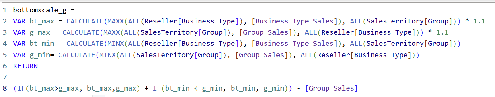
The ‘bottomscale_bt’ measure is exactly the same, except I replaced [Group Sales] in the last line with [Business Type Sales].
Lastly, I’ll multiply the ‘scale_bt’ measure by 20% instead of 10% to match the column height on the left side. That’s it!
The Balance Scale chart is a worthwhile addition to any Power BI report that shows the differences between the values of two groups. It is a great alternative to any comparative set of column charts in a Power BI report and also adds an interactive UX for your users.
Thanks for reading,
Juan Carlos Guzman

Written By
Juan Carlos Guzman

Peer Review
Dan Bunker
Manager, Decision Engineering
Related Content
How to Make 80/20 Pareto Charts in Power BI
Pareto charts are powerful visualizations that help determine your business’ best performers. In this tutorial, I’ll create a Pareto chart…
Icon-Based Navigation in Power BI
Icon-based navigation in Power BI is one of the most effective ways to improve the user experience of your reports.…
An Introduction to Parameters in Power BI
Parameters are user-generated values that define how a system can operate. We can use parameters in Power BI to grant…