How to Make a Diverging Bar Chart in Tableau

A diverging bar chart is a bar chart that has the marks for some dimension members pointing up or right, and the marks for other dimension members pointing in the opposite direction (down or left, respectively). What’s unique about a diverging bar chart is the marks flowing down or left do not necessarily represent negative values. The divergent line can represent zero, but it can also be used to simply separate the marks for two dimension members, to represent a goal, or – as often seen with survey data – to show the break between desired and undesired responses.
The drawback to using diverging bar charts is that it’s not as easy to compare the values across dimension members as it is with a grouped bar chart. If, on the other hand, your primary objective is to compare the trend of each individual dimension member, a divergent bar chart is a good option. I also feel that this chart type helps declutter a grouped bar chart, making the data more engaging and easier to understand. In this post, we will reverse engineer my viz, 50 Years of AFC vs. NFC Matchups, to show you two different approaches to creating diverging bar charts in Tableau.
This content is excerpted from my book, Innovative Tableau: 100 More Tips, Tutorials, and Strategies, published by O’Reilly Media Inc., 2020, ISBN: 978-1492075653. Get the book at Amazon.
Video complement: Two Ways to Make a Diverging Bar Chart in Tableau
FAQs answered in this post:
What is a diverging bar chart and when should I use it?
A diverging bar chart displays bars flowing in opposite directions from a central line, with some dimension members pointing right or up and others pointing left or down. Use diverging bar charts to compare trends of individual dimension members, show survey responses splitting between positive and negative, or represent performance against a goal or baseline. The center line can represent zero, a tie, a goal, or the break between desired and undesired responses.
How do I create a diverging bar chart using two sheets in Tableau?
Create a bar chart for each side of the diverging visualization, then reverse the axis scale on one sheet by right-clicking the axis and selecting Edit Axis to enable the reverse scale option. Hide the year numbers on the reversed sheet by right-clicking the header and deselecting Show Header, then align both sheets on a dashboard. This approach provides clear separation and is straightforward to implement for side-by-side comparisons.
How do I create a diverging bar chart on a single sheet in Tableau?
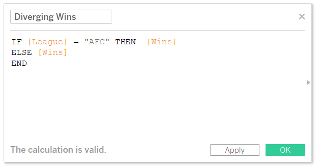
Create a calculated field that multiplies values for specific dimension members by negative one using an IF statement like “IF [Conference] = ‘AFC’ THEN -[Wins] ELSE [Wins] END”. Replace your original measure with this calculated field to make bars extend in opposite directions from zero. For multiple dimension members going left, use OR statements in your formula to specify all members that should display as negative values.
How do I center axis labels in a diverging bar chart?
Create a placeholder calculated field with the formula MIN(0), place it on the same shelf as your diverging measure, then convert it to a dual-axis chart and synchronize the axes. Change the placeholder marks to Text and add your dimension labels to the Text property. This positions labels at the center of the chart rather than along the left edge, improving readability and visual balance between the diverging bars.
Why should I hide or relabel axes when using diverging bar charts with positive values?
The left or downward side of diverging bar charts created with the negative multiplication technique displays negative axis labels even though the underlying values are positive. Hide the axis entirely or add positive value labels to the marks to prevent misleading viewers about the actual data values. This clarification is essential because the negative representation is a visual technique, not a reflection of negative performance or measurements.
How can Playfair Data help implement advanced chart types like diverging bar charts?
Playfair Data specializes in Tableau engineering including dual-axis techniques, calculated fields, and creative chart types that enhance data storytelling and comparison visualization. Our experts teach advanced methods for chart customization and visual clarity techniques. Schedule a strategy call to learn how our Flagship Tableau training can help your team master diverging bar charts, combination charts, and other advanced visualization techniques that engage stakeholders.
How to make a diverging bar chart in Tableau
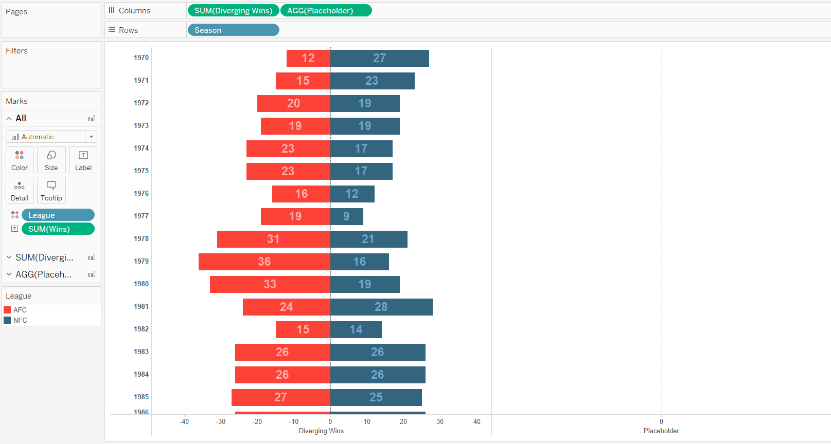
Note that if the measure you’re visualizing has both positive and negative values for dimension members within the same stacked bar, a diverging bar chart with a divergent line of zero will be created automatically. The following techniques are required when you’re trying to create a diverging bar chart with positive values. The first approach to creating a diverging bar chart in Tableau involves using two different sheets. For this first example, we will recreate a chart similar to this:
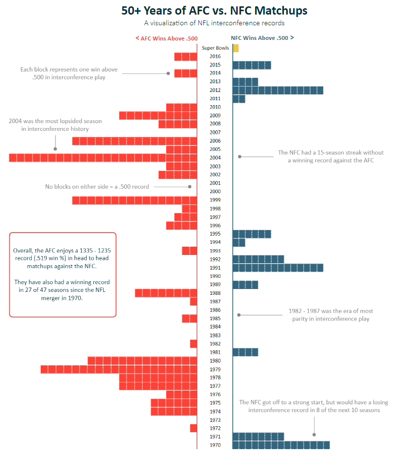
In addition to the clarity provided when trying to view the trend of each individual conference, I thought diverging bars were a good choice for this visualization because the center represents a tie, or a record of .500. This creates kind of a ‘tug of war’ between the dimension members; every block to the left represents one win better than a tie for the AFC and every block to the right represents one win better than a tie for the NFC. This is just one application, but you may also have values that always start at 0 and/or stacked bars.
![]()
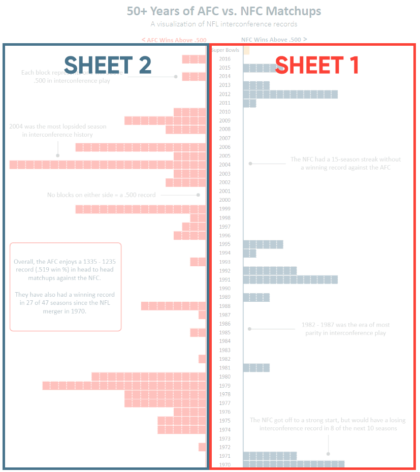
The trick to the first approach is to simply make a bar chart for each side of the diverging bar chart and reverse the axis scale for one of the charts so the bars point left or down (based on whether your measure is on the Rows Shelf or Columns Shelf). In this example, the right side of the chart is the primary view and the left side is a second view with the axis reversed and the year numbers hidden (because they are already represented in the first chart). You can hide the header by right-clicking on the header for the second sheet and deselecting “Show Header”. I then lined up the two sheets on a dashboard.
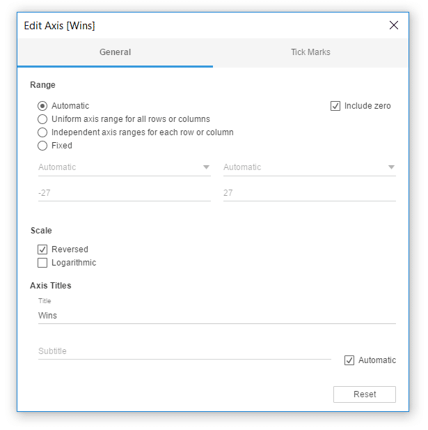
To reverse an axis, right-click on the axis and choose “Edit Axis…”. This will open a dialog box where you can choose to reverse the scale.
Making a diverging bar chart on a single sheet
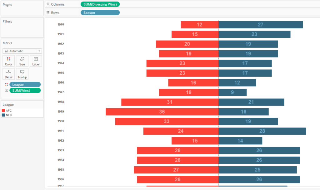
It’s often best practice to consolidate sheets when possible which will give you a slight bump in efficiency but also make your workbook easier to manage. For this second approach, we will create a new diverging bar chart using a calculated field. To start, I’ll make a stacked bar chart showing wins per conference per season.
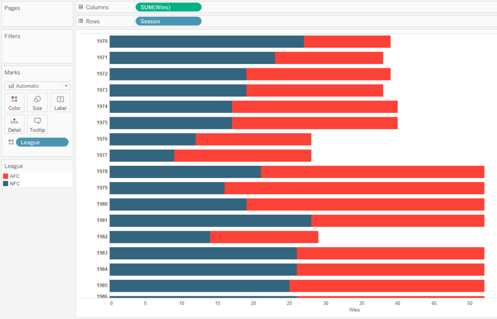
The trick to creating a diverging bar chart on a single sheet is to create a calculated field that multiplies the values for some of the dimension members by negative one. Here’s how my calculated field looks to make the values for the AFC go to the left.
Note I’m only using two dimension members in this example so I’m only making one go left, but you could make the marks go left for as many dimension members as you want through the use of OR statements. For example, if I was using the Sample – Superstore dataset to make the Sales values for the East and Central dimension members of the Region dimension go left, my calculated field would be:
IF [Region] = “East” OR [Region] = “Central” THEN –[Sales]
ELSE [Sales]
END
After replacing the original Wins measure with my newly created Diverging Wins calculated field, my chart looks like this:
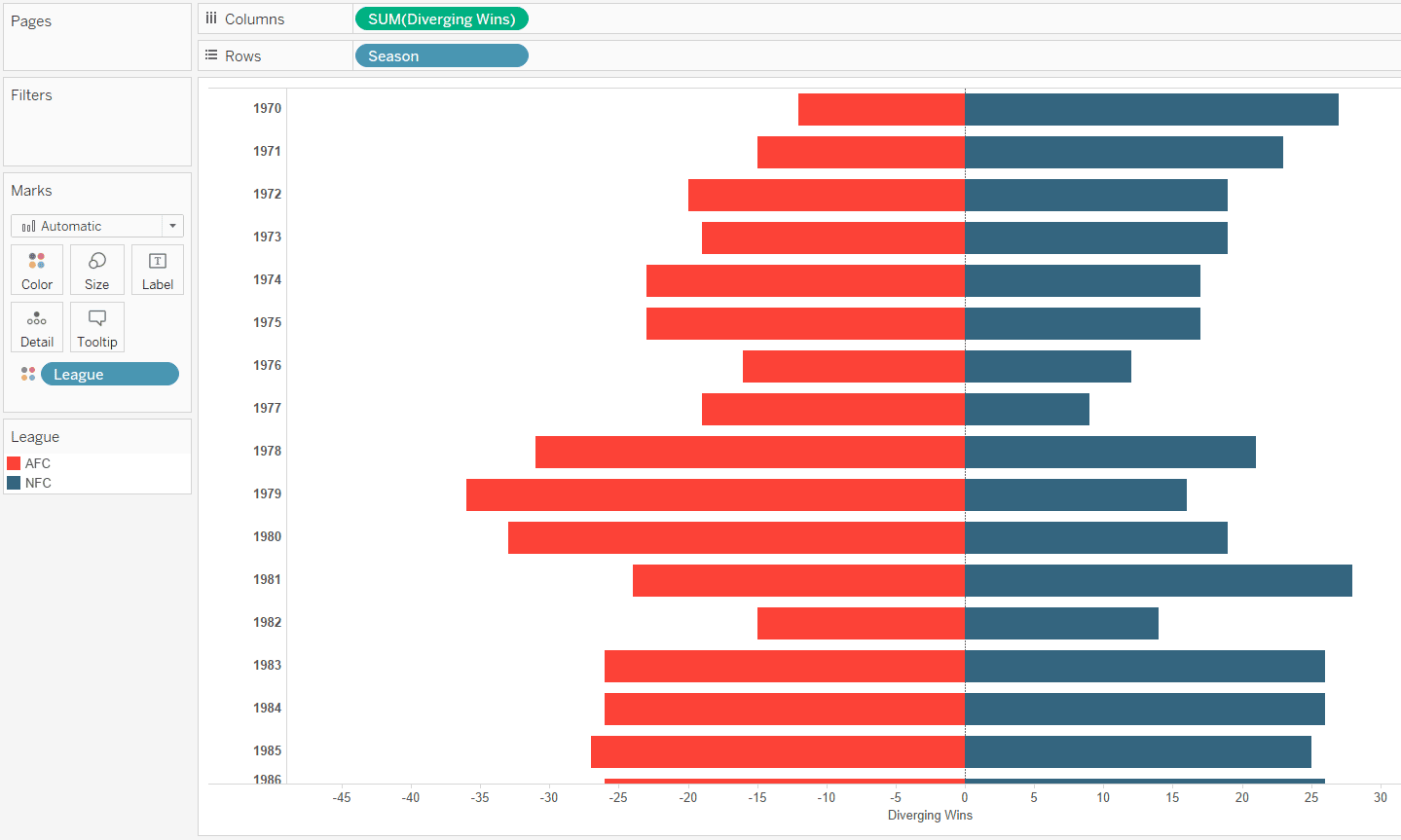
One word of caution with this chart type which I hope you find obvious; the left side of this chart implies the values are negative. If you are creating a diverging bar chart with positive values on both sides, I encourage you to at least hide the axis and consider adding the positive values to the Label Marks Card.
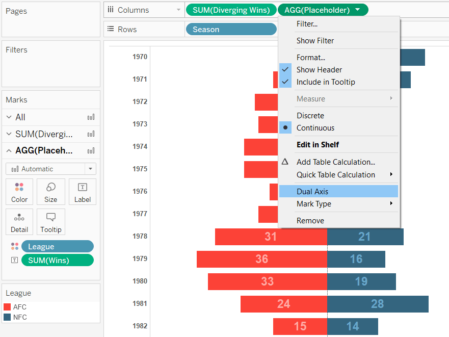
As you can see, one drawback with consolidating both sides of the diverging bar chart into a single sheet is that the years are listed down the left side instead of the center. There is a hack to improve this that involves a calculated field I often set up called “Placeholder”. The entire formula is MIN(0).
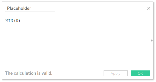
Once you have the placeholder calculated field, place it on the same shelf as your existing measure.
Turn the chart into a dual-axis chart by clicking on the Placeholder pill and choosing “Dual Axis”.
By default, this changes my mark type to Circle, but we’ll discuss that in a moment.
Continue reading with a free account, or login.
Unlock this tutorial and hundreds of other free visual analytics resources from our expert team.
Already have an account? Sign In
By continuing, you agree to our Terms of Use and Privacy Policy.
The most important thing to get the Placeholder measure to line up in the center is to synchronize the axes. You can accomplish this by right-clicking on either axis and choosing “Synchronize Axis”.
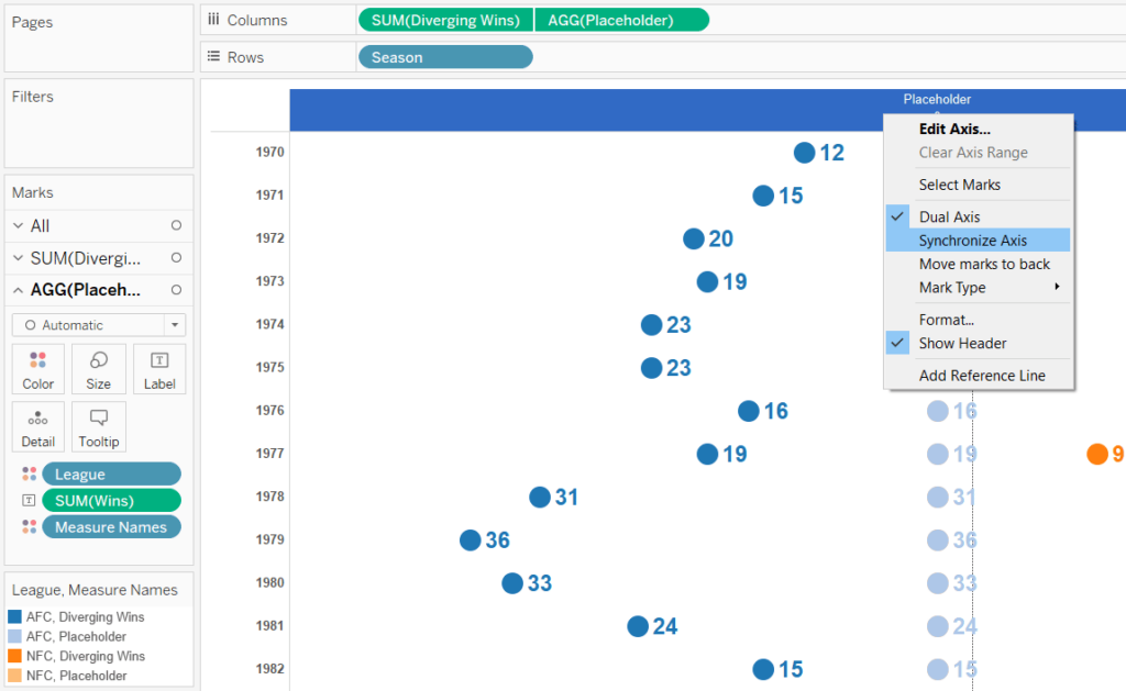
What’s important about this is now that there are two measures on the Columns Shelf, they each get their own set of Marks Cards that can be edited independently of each other.
![]()
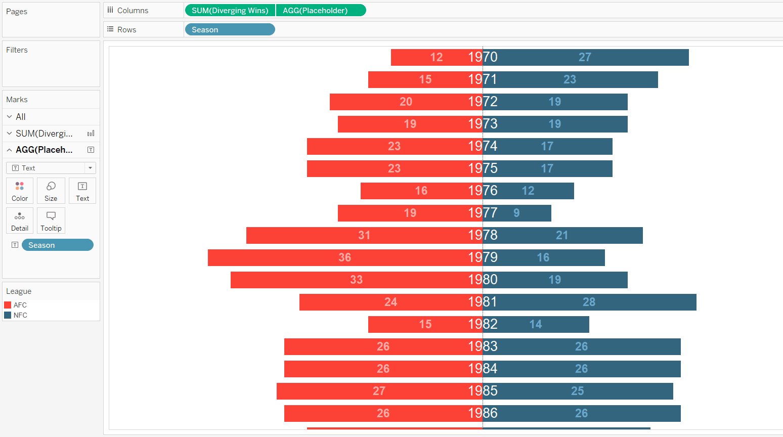
This means that I can change the color and mark type of the bars back to the way they were and change the mark type for the Placeholder measure to Text. Here’s how my final view looks after making these changes, hiding all of the headers, and adding the Season (Year) dimension to the Text Marks Card for the Placeholder measure.
Again, this is just one example for illustration purposes, but there are several possible applications for the second axis. One common alternative is to create a dual-axis combination chart like we’ve done, but change the mark type for the second axis to Circle and add an informative label. In my case, I could have used the circle to display which conference won that season and/or by how much. You also do not have to lock the primary or secondary axes at zero; unlocking even more possibilities.
Thanks for reading,
– Ryan


Written By
Ryan Sleeper
Related Content
How and Why to Use Diverging Unit Charts in Tableau

A diverging unit chart acts in the same fashion as a normal unit chart but adds another layer of insight…
How to Make Unit Charts with Continuous Measures in Tableau
Unit charts – or stacked bar charts made up of equal-sized marks – take the benefits of the bar chart…
How to Create Engaging Soundwave Charts in Tableau
A soundwave chart, which gets its name for its resemblance to a soundwave (shocking, I know), is excellent for measuring…