How to Make Unit Histograms / Wilkinson Dot Plots in Tableau
Unit histograms, or Wilkinson dot plots, show distributions of individual data points instead of bucketing them into bins like traditional histograms. My friend and Tableau Zen Master Hall of Famer, Steve Wexler, recently suggested this as an alternative on one of my visualizations, and I liked the idea so much that I wanted to show you how to build it in Tableau.
I’ve shown you in the past how to make one-dimensional unit charts in Tableau, which are similar, but unit histograms are slightly more flexible because you can use a mark type other than bar (i.e. circle or shape). By the end of this post you will be able to visualize a distribution of individual items which is effective and engaging. I’ll also show you how to change the mark type so the distribution looks like little men standing on top of each other’s heads which is, well, just for fun.
How to Make Unit Histograms in Tableau
Use COUNTD to count distinct items
By the end of this post, you will be able to make a version of a dot plot that looks like this:
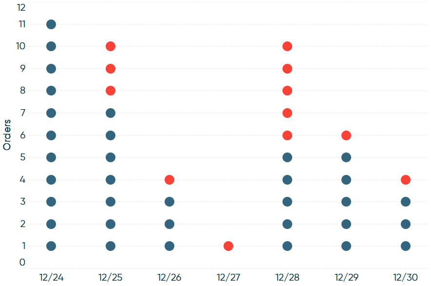
To create this type of chart in Tableau, your dataset must have the dimension members that make up the units on individual rows. To illustrate, I will be using the Order ID dimension from the Sample – Superstore dataset because every order has an individual row in the underlying data.
Continue reading with a free account, or login.
Unlock this tutorial and hundreds of other free visual analytics resources from our expert team.
Already have an account? Sign In
By continuing, you agree to our Terms of Use and Privacy Policy.
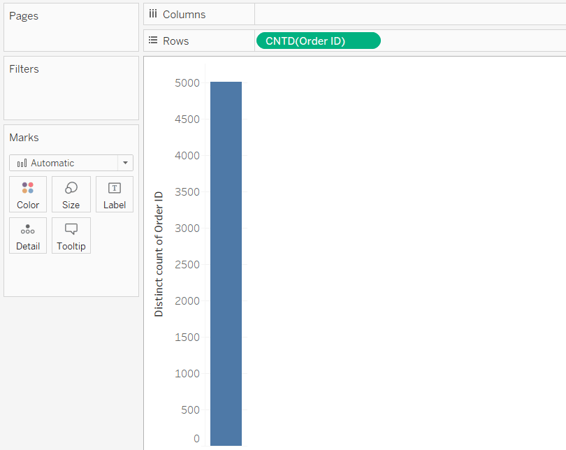
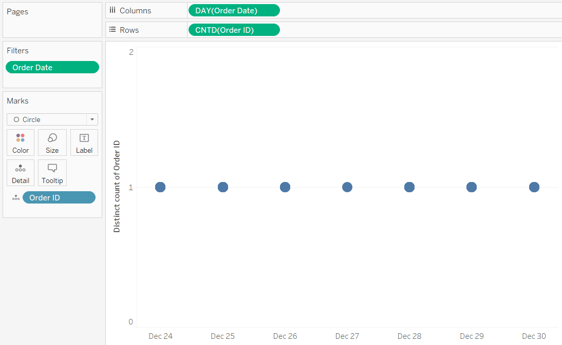
If you want to display a vertical distribution, like a traditional histogram, place the dimension you are using on the Rows Shelf with an aggregation of CNTD (count distinct).
Next, place the dimension you want to compare on the Columns Shelf. This type of chart is technically meant to compare continuous variables, but in Tableau, the following technique can also be used to compare the number of individual units across categorical dimensions. For this example, I’ll use continuous day of date to see how many orders I have per day.
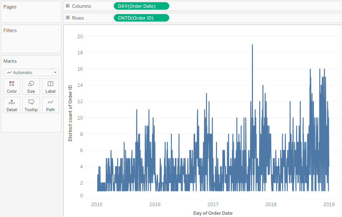
The default mark type for this combination of fields is Line, so the next thing I will do is change the mark type to Bar.
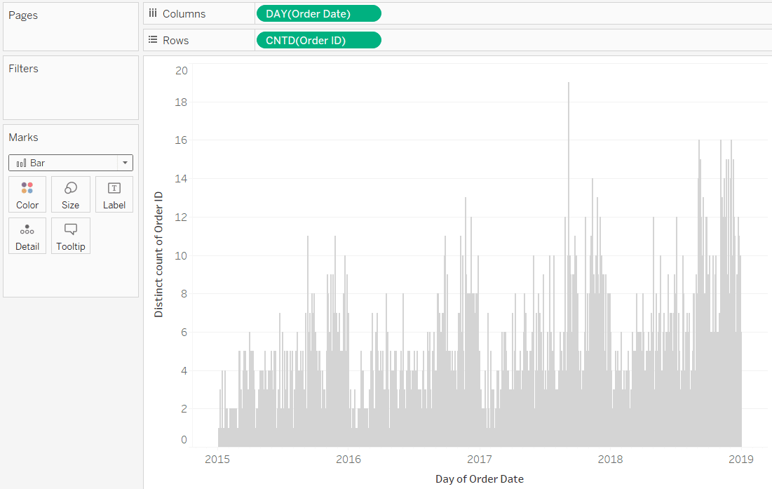
The sample dataset in Tableau has four years of data, which is making our orders by day bar chart very crowded from left to right. To show you the individual days better, I’ll place a date filter on the Filters Shelf that keeps only the last 7 days in the file.
How to Analyze Data Distributions Using Histograms in Tableau

Visualize the distinct elements
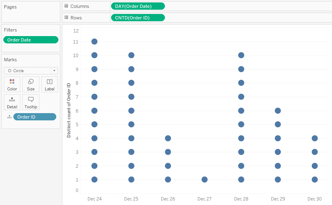
At this point, we technically have a histogram because we are comparing two continuous variables. To see the individual units, place the dimension that you are counting from the Rows Shelf (Order ID in my example) onto the Detail Marks Card.

At this point, we have a unit chart like mentioned in the introduction. This is why it is so important that the dimension you are using has individual rows for each dimension member in the underlying data. When that is the case, and we place the dimension on the Detail Marks Card, it creates equally sized units in our charts. Each block at this point represents an individual order.
Change the mark type
For a better look, in my opinion – and to get this to look like a Wilkinson Dot Plot – change the mark type from Bar to Circle.
By default, the marks for the Circle mark type are not stacked. So while we still have multiple marks in most of our columns, we cannot see the individual units as they are all overlapping on the baseline.
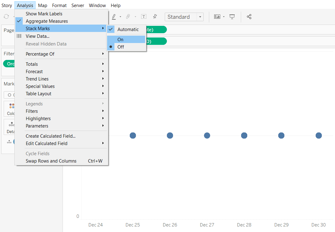
How to stack marks in Tableau
This is the key to creating this type of chart. We have to stack the circles on top of each other by navigating to Analysis > Stack Marks in the top navigation and choosing “On”.
When the marks are stacked, we end up with a unit histogram!
Charts like these that display individual units have been criticized by the likes of Stephen Few because they cause the end user to slow down and count the individual units.
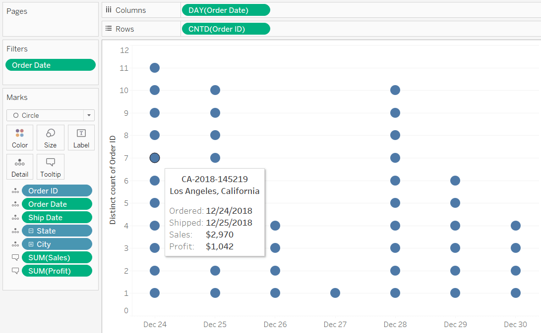
I, however, like the added value that comes in Tableau by adding context via the tooltips.
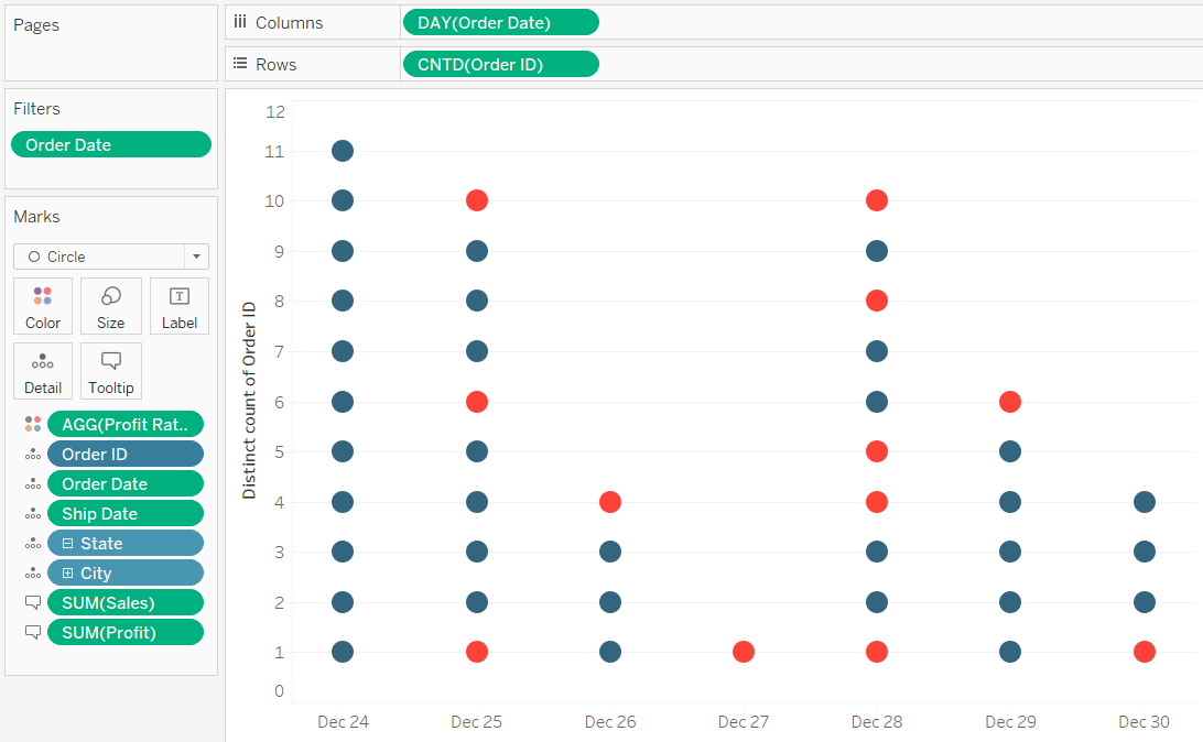
You can also encode the individual marks by color to provide additional context. Here’s how my unit histogram looks after coloring the marks by profit ratio.
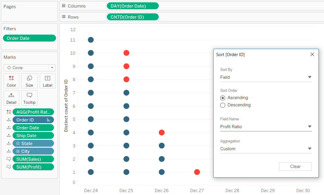
Sort the unit histogram
If you want to sort these units so the profitable and unprofitable orders are grouped together, right-click on the dimension on the Detail Marks Card and choose Sort.
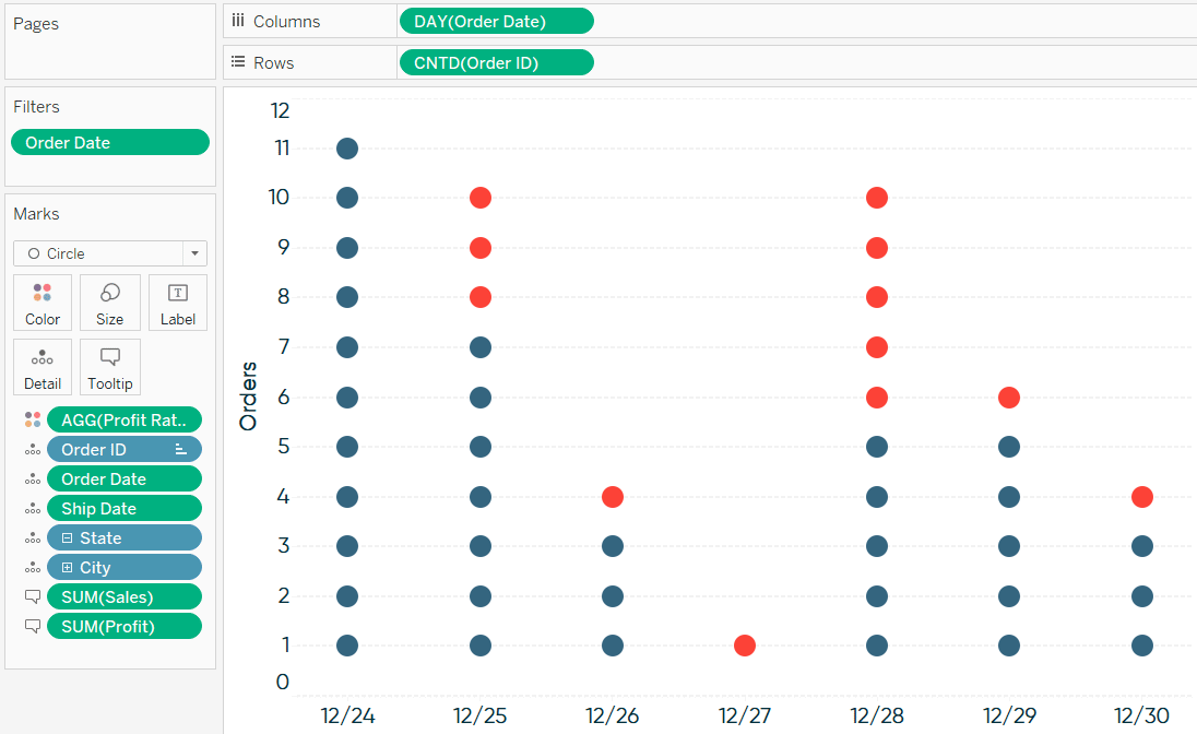
Here’s how my final Wilkinson dot plot / unit histogram looks after formatting.
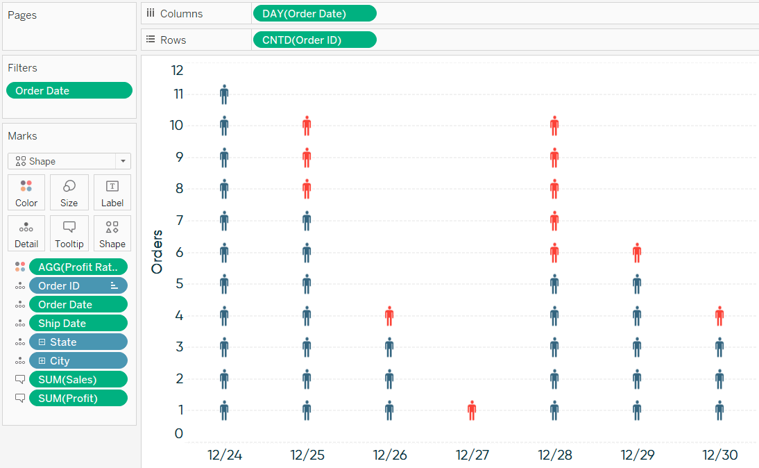
From here, this chart can be used with anything to represent the individual marks! As promised in the introduction, here’s how the view looks if I change the mark type to Shape and choose a person icon from one of the custom shape palettes.
To learn how to use your own custom shapes, see our last post, How to Do Button Swapping in Tableau.
Thanks for reading,
– Ryan


Written By
Ryan Sleeper
Related Content
How to Make Marginal Histograms and Bar Charts in Tableau
As I often discuss, one of my main objectives as a data visualization practitioner is to avoid the question, “So…
Statistical Tableau: How to Analyze Distribution with Histograms

There are many times when performing data analysis when we may want to view the distribution of our data. One…

Ryan Sleeper
Finally View Value Distributions Even When Measures are Ratios By default, Tableau histograms cannot be used with calculated fields such…