3 Creative Ways to Use Tableau Parameter Actions
I have always described Tableau parameters as a Swiss Army knife due to their infinite applications. In case you are not familiar, Tableau parameters are user-generated values that allow you and your audience to choose the inputs of calculated fields. You, as the author, code the allowable values once, but then it’s up to the user which value is selected. This unlocks a higher level of flexibility in Tableau that allows users to manipulate analyses on the fly by using a “parameter control” to change the values populating calculated fields. This post will show you how to use parameter dashboard actions and three applications to improve your users’ experience in Tableau.
This content is excerpted from my book, Innovative Tableau: 100 More Tips, Tutorials, and Strategies, published by O’Reilly Media Inc., 2020, ISBN: 978-1492075653. Get the book at Amazon.
How to use parameter actions
If parameters and/or dashboard actions are new to you, I recommend reviewing the related posts, An Introduction to Parameters in Tableau and Practical Tableau: 3 Creative Ways to Use Dashboard Actions.
As mentioned in the introduction, parameters are values used within calculated fields that can be controlled by a dashboard user. You, as the dashboard developer, get to put some ‘parameters’ around what those values can be, but from then on the end user gets to decide which value populates a calculated field.
Continue reading with a free account, or login.
Unlock this tutorial and hundreds of other free visual analytics resources from our expert team.
Already have an account? Sign In
By continuing, you agree to our Terms of Use and Privacy Policy.
For an introductory example, we will use a sales by month trend in the Sample – Superstore dataset to show you how clicking on it will overwrite the current value of a parameter.
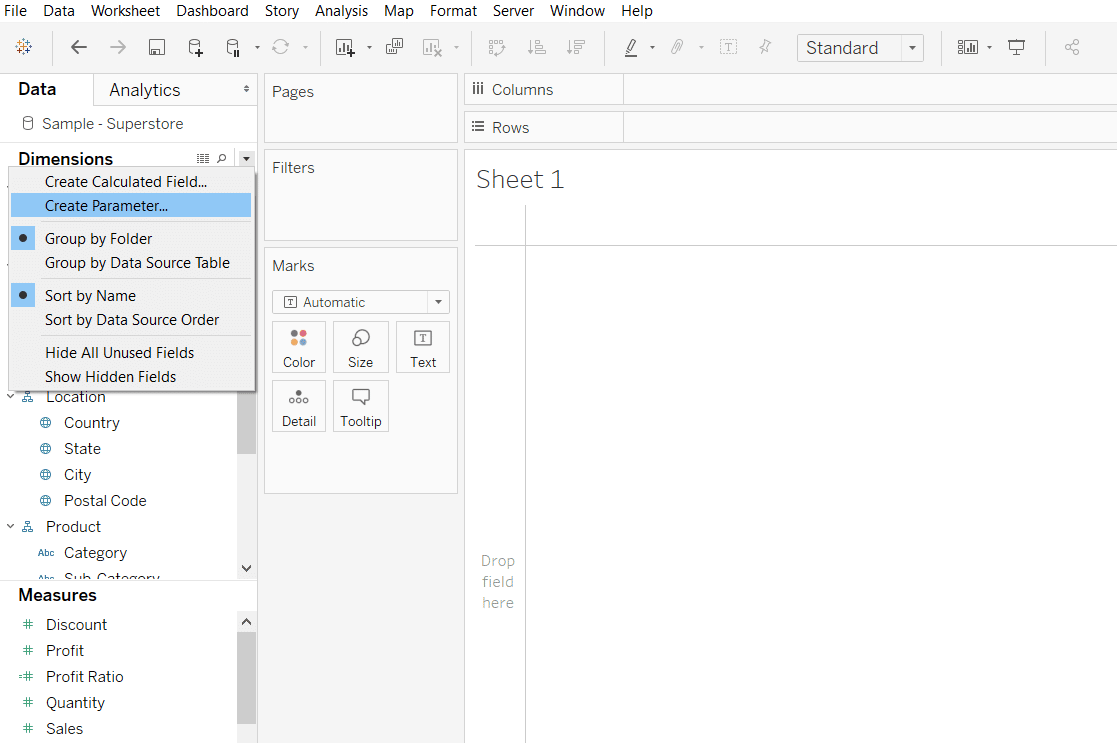
To create a parameter, I like to right-click in any blank space in the Data pane and click “Create Parameter…”. You can also click the down arrow in the top-right corner of the Dimensions area of the Data pane and click “Create Parameter…”. Here’s how it looks if I were to make a new parameter in the Sample – Superstore dataset.
To illustrate how to use the newest type of dashboard action, I will set up a parameter with a data type of Float and allowable values of All.
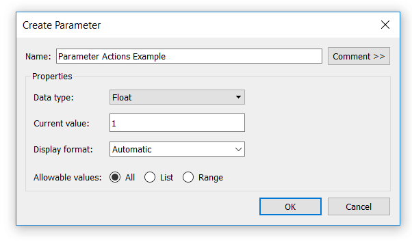
These settings mean that this parameter can be populated with any number including those with decimals. Next, I will set up a simple sheet with a mark type of Text to show you the current value of the new parameter.
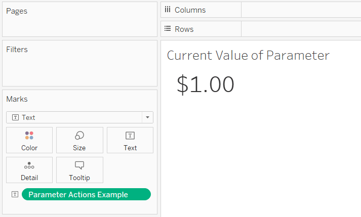
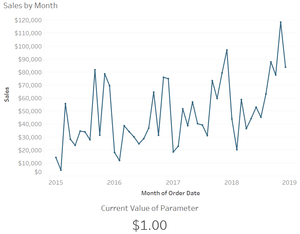
Note that I also changed the format of the number being displayed to Currency (Standard) which has a dollar sign and two decimal places to match the format of the numbers in the next step. Since the default, current value of the Parameter Actions Example parameter is 1, we see a result of $1.00 displayed.
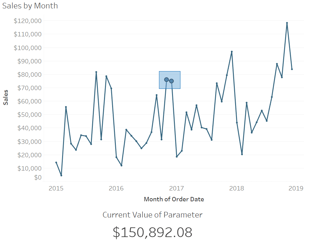
Next, I will set up a line graph that looks at the measure of Sales in the sample data by continuous month of Order Date, and place both sheets onto a dashboard together.
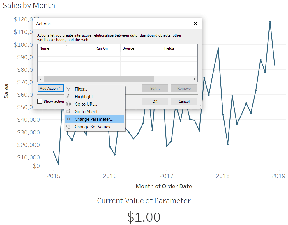
To add a parameter action, click “Dashboard” in the top navigation and then “Actions…”. After clicking the “Add Action” button, you will see six options including the new “Change Parameter…” dashboard action.
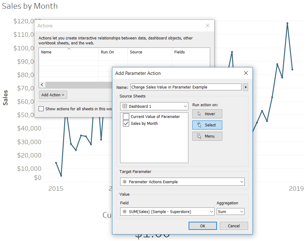
In the dialog box that appears after clicking Change Parameter, you can control the settings such as the source sheet of the action, when you want it to run, which parameter gets overwritten, and based on which value. In this example, let’s say that clicking on the line graph will overwrite the Sales value in the Parameter Actions Example parameter.
Now clicking on any Sales value in the line graph changes the value being displayed on the Current Value of Parameter sheet.
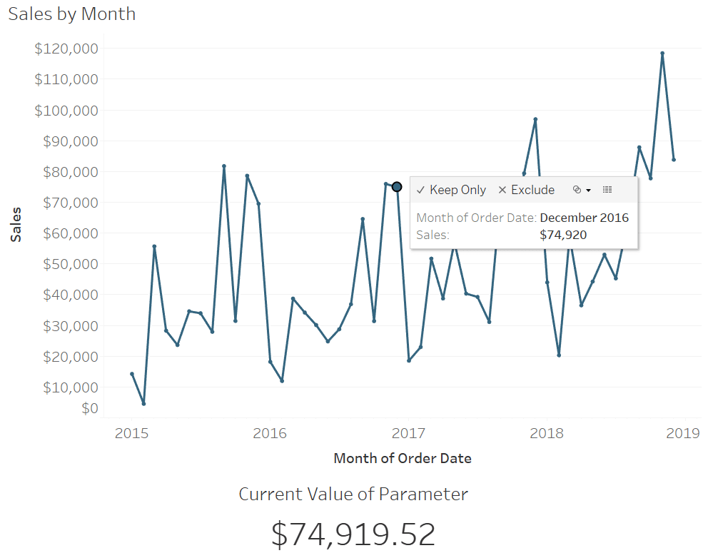
Since we set up a Change Parameter dashboard action, clicking on a value within the line graph is overwriting the current value of the Parameter Actions Example parameter, which is feeding the Current Value of Parameter text sheet.
At this time, you do not have the option to set up what to do when you clear a parameter action, but when the data type is Float like this first example, you can do a multi-select. Since the aggregation of our parameter action is SUM, clicking on more than one data point will add them together.
How to highlight selections
One of my favorite user experiences to provide is a dropdown that allows the audience to choose the dimension member that is most relevant to them. I then highlight their selection on all the charts throughout the dashboard. It’s like a good map that includes a “You Are Here” sticker to help the viewer orient themselves within the context of the rest of the visual.
The tactic is achieved through the use of parameters and a Boolean formula that identifies which dimension member matches the parameter value and which do not. For more, see How to Highlight a Dimension Member on a Minimalist Dot Plot.
Before parameter actions, I would have to display a parameter control to allow the user to select the dimension member to highlight. Not a terrible experience, but one more dropdown taking up valuable real estate on a dashboard. This was the case with my dashboard, Super Sample Superstore, where the user can choose which region to highlight.
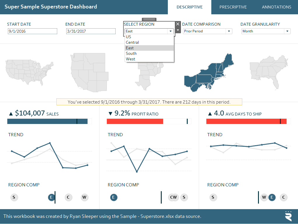
Note that the Region parameter has a data type of String and there is an allowable value for each of the four regions in the Sample – Superstore dataset. This selection highlights the dimension member on the map and dot plots, and filters all the other visuals to that specific dimension member. This experience can be made much more elegant now using parameter actions.
Any time a sheet contains the same dimension members as a parameter’s allowable values, you can use the sheet as a control sheet that overwrites the parameter influencing other views. Due to this new functionality, you can create literal control sheets that are nothing but a text table containing the dimension members you want to overwrite a parameter’s value.
You can also use other visualizations as control sheets. Since every map on the Super Sample Superstore dashboard contains the Region dimension, I can use the maps at the top to overwrite the parameter value that is being used to highlight and filter the other views. If your control sheet does not contain the dimension members in your parameter’s allowable values, simply add the dimension to the Detail Marks Card of the control sheet(s).
Here are how my Change Parameter dashboard action settings look to use my maps at the top as my control sheets.
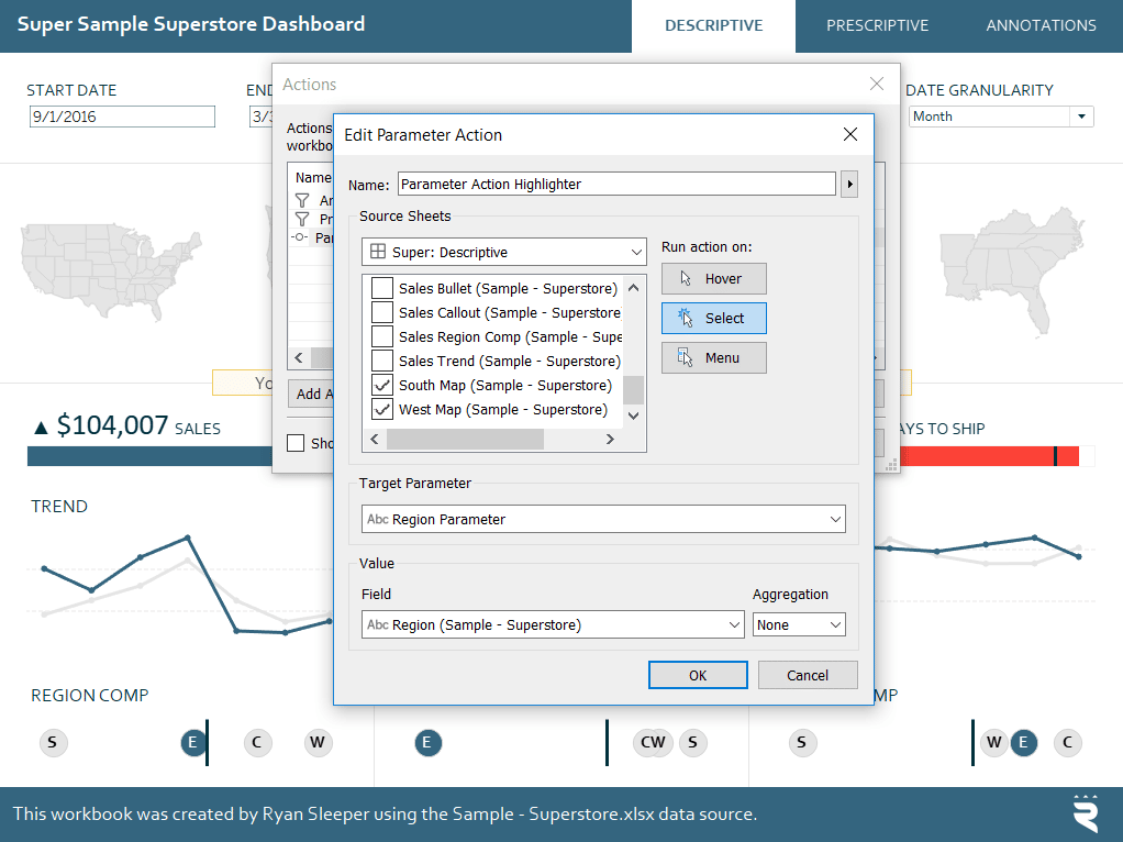
Now simply clicking on a state on the map will populate the parameter value with the region that state is in. The parameter is then being used to filter and highlight all the other views. Here’s how it looks after changing the dashboard’s focus from East to Central by clicking anywhere in the Central region’s map.
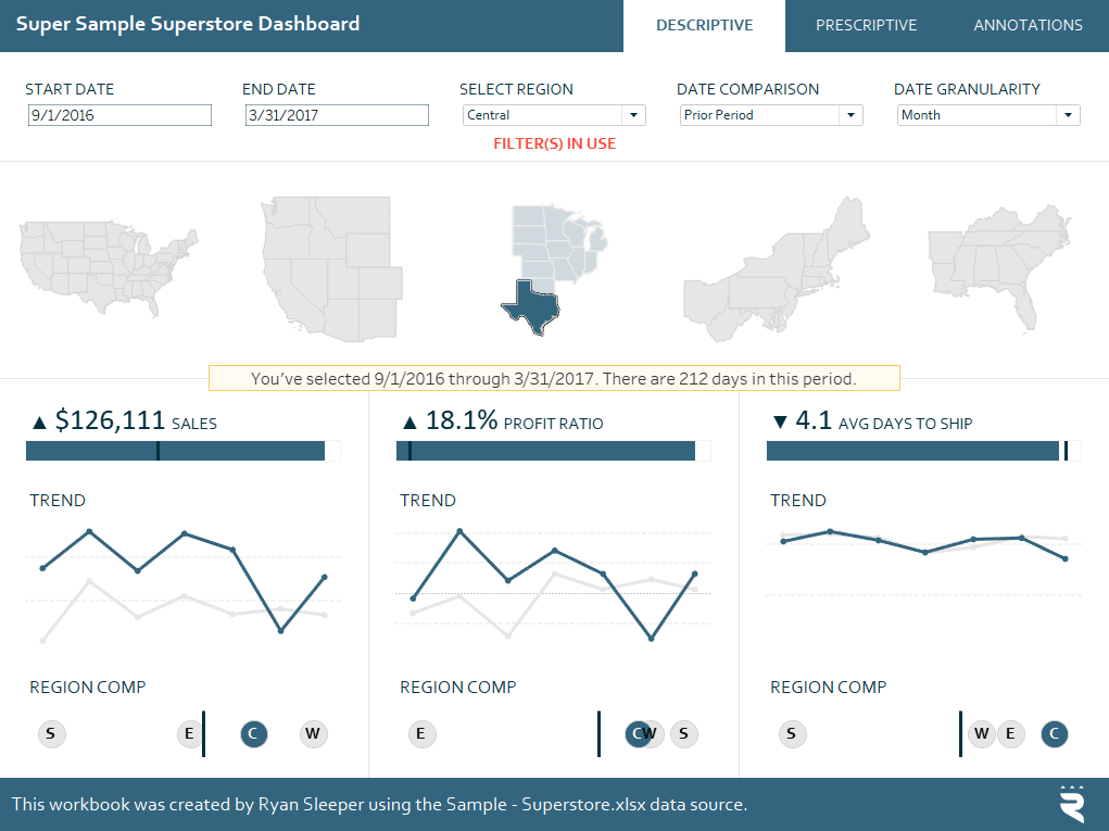
Note that in this example, I am using parameters to filter the views, but the filtering could also be done using the traditional Filter dashboard actions. However, the highlighting user experience is different. This isn’t like a Highlight dashboard action that makes a specific dimension member stand out while everything else is faded out.
We are overwriting the allowable value in the Region parameter. There is then a calculated field with the formula “Region = Region Parameter” placed on the Color Marks Card of all the dot plots. Whenever the Region dimension member matches the allowable value selected in the Region Parameter, it is classified as True and gets a unique color; everything else is classified as False and gets a secondary color. So two different colors instead of a highlight; kind of a more permanent highlighter user experience.
How to Highlight a Dimension Member in Tableau
One last note on this tip. Unfortunately, when the data type of the parameter is String, we cannot do a multi-select like we did in the introductory example above. Tableau will always defer to the last selection when choosing which dimension member is used to overwrite the current value of the parameter. I suppose multi-select, string parameters will have to wait for a future release!
If you need to select more than one dimension member, you may be better off using set actions. There’s an example in the free, full-length video, An Introduction to Dashboard Actions, on Playfair+.
Using parameter actions to change date parts with the click of a button
You can also create control sheets even when your dataset does not contain a dimension with dimension members that match the allowable values of the parameter you want to use to create parameter dashboard actions.
Parameters are unique in that they work across multiple data connections within the same workbook.
This means I can create a control sheet in Excel containing the dimension members that will overwrite a parameter’s value, connect to that Excel sheet as a secondary data source, use it to create a control sheet, and set up a parameter action that works between the newly created control sheet and the other worksheets in the workbook.
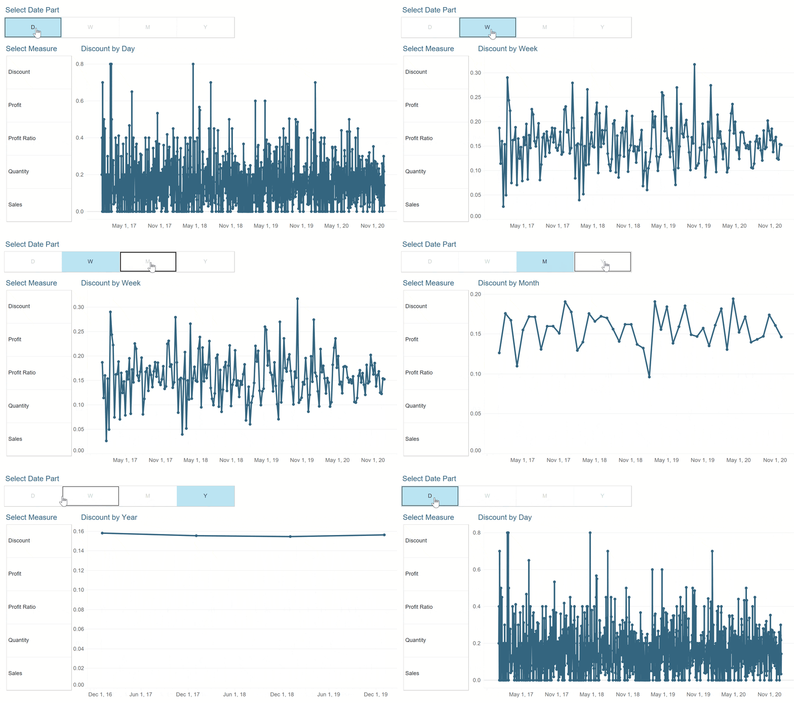
Here’s an example of why you would need to go through the extra step of creating a control sheet from a secondary data source. Another of my favorite user experiences is to provide a means for the audience to toggle the date part of a line graph from day, to week, to month, to year.
However, there is no dimension that I can simply add to the Text Marks Card to create a control sheet with the different date parts. To make matters more difficult, date parts must be lowercase in order to work with certain date functions such as DATETRUNC.
How to Use Parameter Actions to Change Date Parts in Tableau
If you are not familiar with this tactic, you need a parameter with a data type of String, and the allowable values are each of the four date parts. The important thing is to make the values lowercase so they work when integrated with the second step. The Display As values can have whatever casing you prefer.
The next step is to set up a calculated field that truncates the date in the dataset at whatever level is selected in the parameter. The formula for the Order Date field in the Sample – Superstore dataset is:
DATETRUNC([Date Part Example],[Order Date])
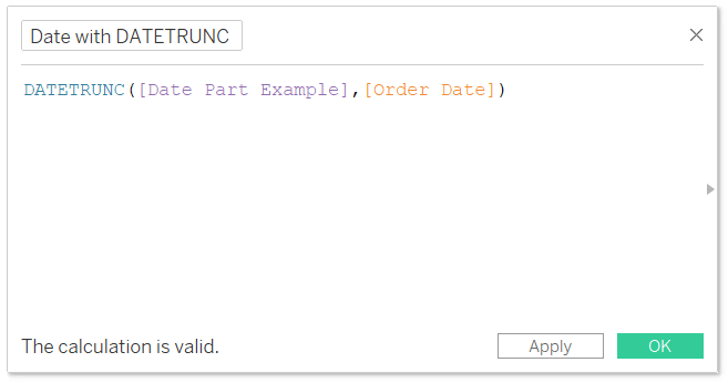
Now if I replace the Order Date dimension in my line graph from the introductory example in this post with the newly created Date with DATETRUNC calculated field, the user can control the granularity of the date via the Date Part Example parameter. For example, if I choose the Year date part from the parameter control, the line graph will update from sales by month to sales by year.
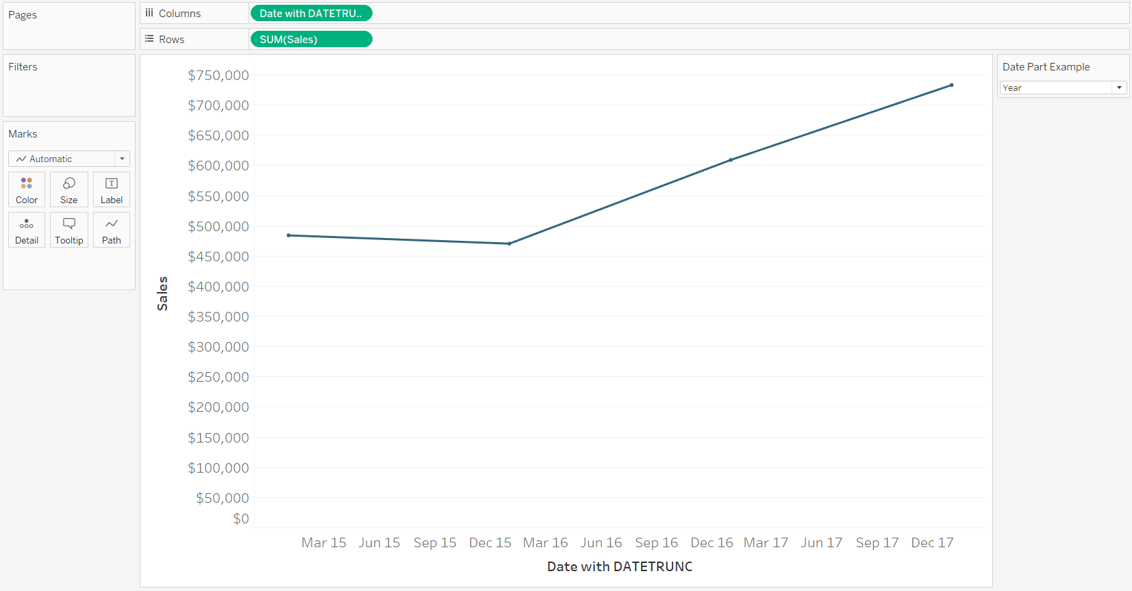
Just like our highlighter example in the first tip, this experience can now be improved with parameter actions and a control sheet.
First, set up a two-column Excel spreadsheet that will be used to create the control sheet in Tableau.

Next, connect to the data source and create a control sheet.
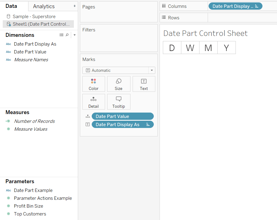
The critical aspect of control sheets is that the dimension containing the dimension members that will overwrite the parameter must exist somewhere on the view. In this example, I used the Display As field to make my buttons look nicer but placed the Value field on the Detail Marks Card so it would be available as an option when I set up my parameter action later.
Now I will place this control sheet on the same dashboard as my line graph and set up a Change Parameter dashboard action that will control the date part selection.
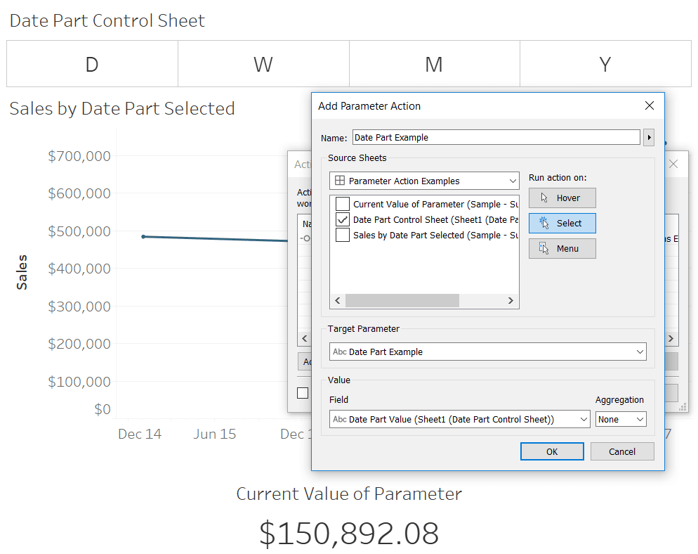
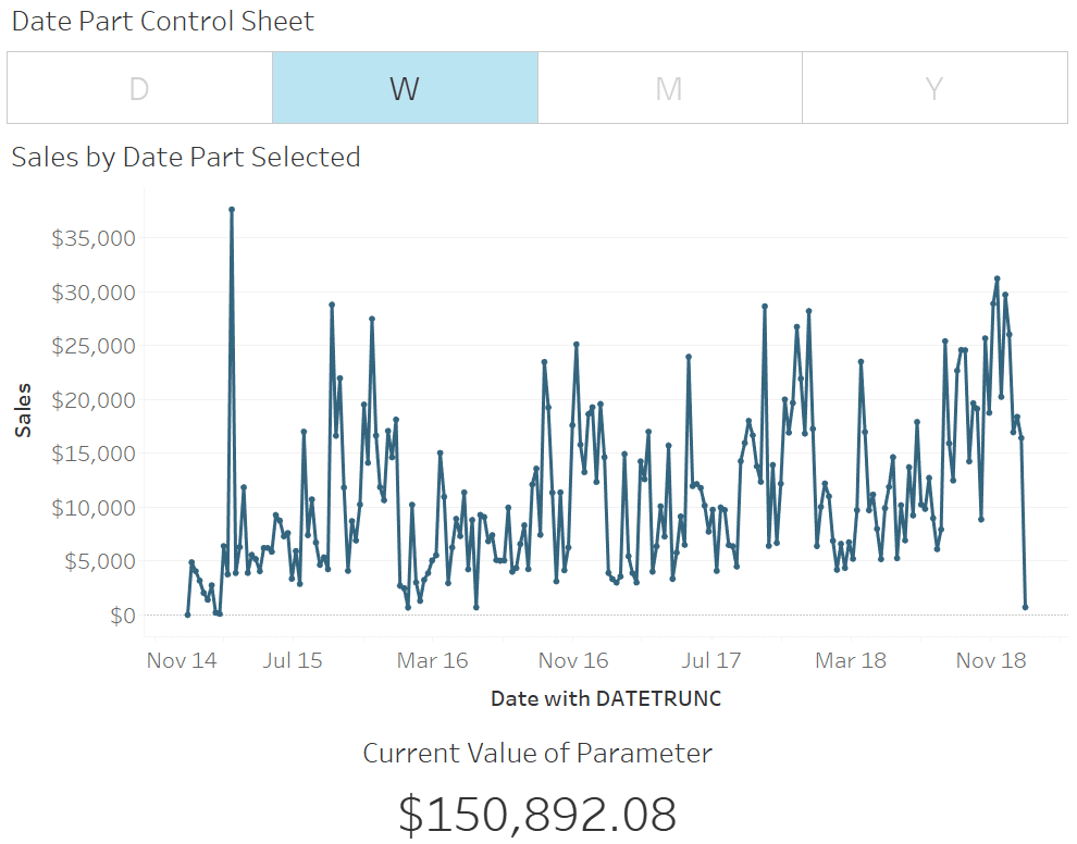
Now simply clicking a button on the control sheet will overwrite the date part in the calculated field that is controlling the truncation of the line graph. Here’s how it looks after clicking on the W button to change the date part from year to week.
Using parameter actions to use measure names in calculated fields
One more of my favorite tactics is to let my users choose which measures are being displayed in a chart. Once again, this tactic is now even better because you can set up a parameter action that changes the measure being displayed by just clicking a dimension member on a control sheet.
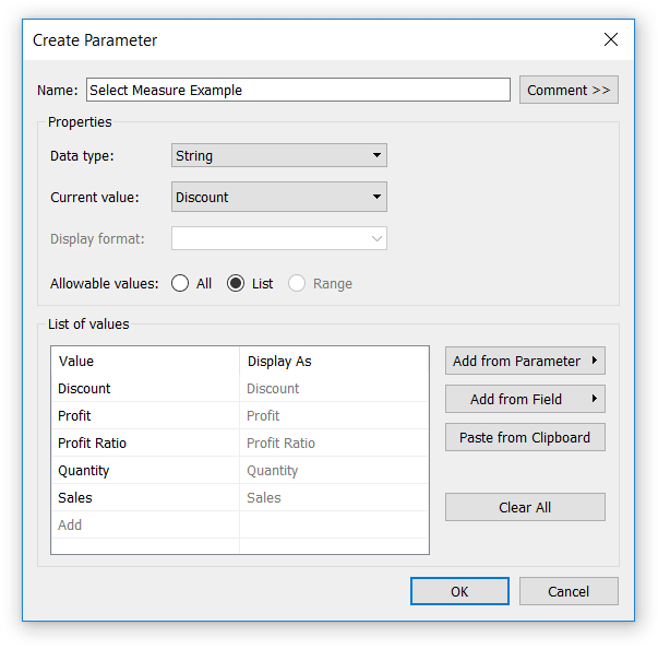
First, set up a parameter containing the names of the measures you want to select from. Here is a parameter built with all the measures that come with the Sample – Superstore dataset.
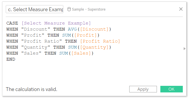
Next, set up a calculated field that gives Tableau instructions for what to display when each parameter value is selected.
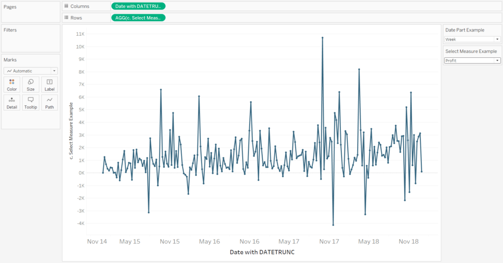
Now create a chart using the newly created calculated measure. To illustrate, I will just replace the Sales measure in the line graph I’ve used in the first examples with the new calculated field that is controlled by the Select Measure Example parameter. If I choose Profit instead of Sales in the parameter control, the line graph updates to display the selected measure.
This time for the control sheet, I will use the special, generated field “Measure Names”. Measure Names must be used with its counterpart, Measure Values. I don’t want any values to be displayed on my control sheet, but I can add the field to the Detail Marks Card to get the measure names to show up.
If there are measure names that you don’t want to be part of your control sheet, simply remove them from the Measure Values Shelf. I’ve removed the Number of Records and Measure Selected fields which created a filter on the Filters Shelf.
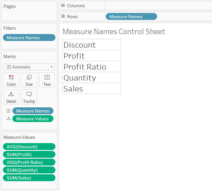
Now we’re ready to add this control sheet to the dashboard and set up the parameter action.
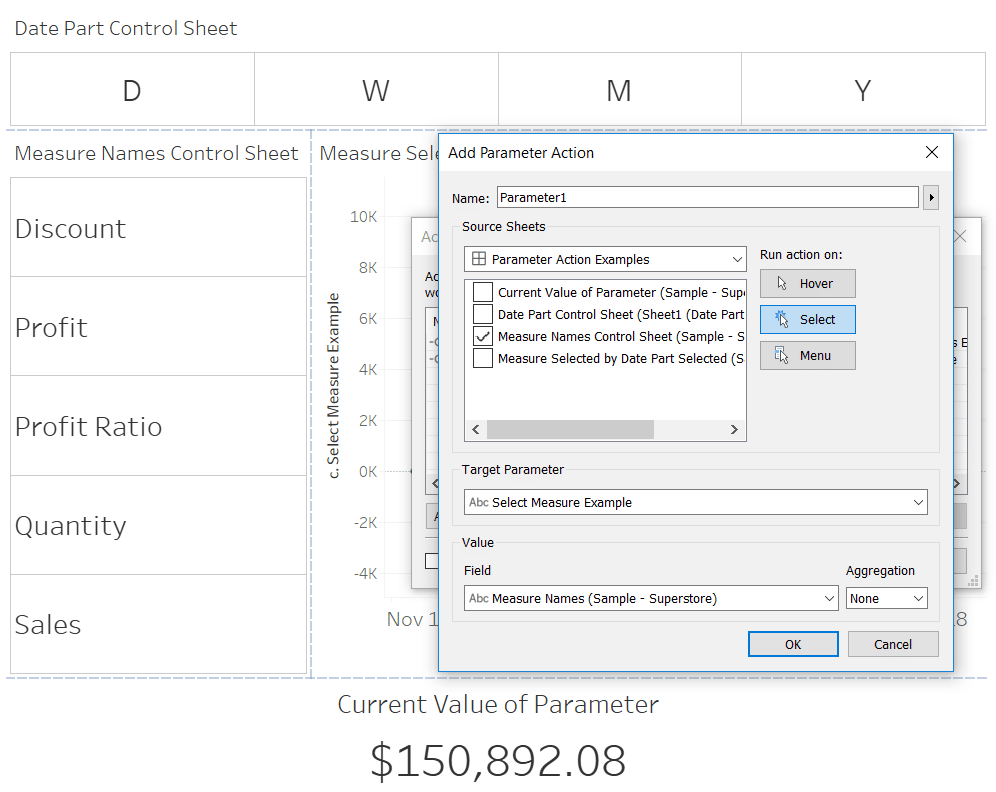
Now clicking a measure name from the control sheet will overwrite the value in the parameter, which populates the calculated field instructing Tableau which measure to display on the graph. Here’s how the view looks after clicking the Sales measure and the Month date part.
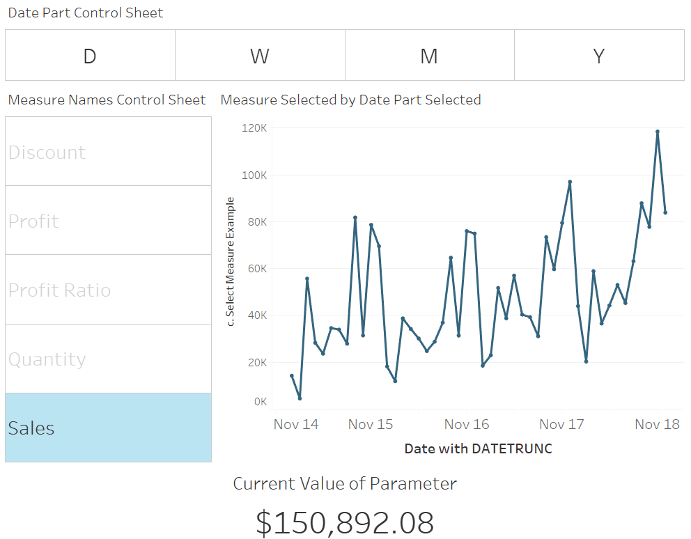
That’s right – we just technically used the Measure Names generated field within a calculated field! That was one of the few things that was impossible in Tableau before the addition of parameter actions.
How to Use Measure Names in Tableau Calculated Fields
I’ve shown you just the bare bones foundation of what parameter actions are and how to use them to implement three of my favorite tactics, but there are so many ways to build from here.
One of my favorite ideas is to use these examples in combination with button swapping to control parameter values. The control sheets would be a series of icons instead of text, and button swapping would allow you to visually indicate which button was clicked on.
These are very exciting possibilities as Tableau continues to move closer and closer to an infinitely flexible, web-like experience.
Thanks for reading,
– Ryan
Related Content
3 Essential Ways to Use Dynamic Parameters in Tableau
Dynamic parameters were introduced with Tableau Desktop version 2020.1 and rightfully created a lot of buzz among Tableau authors due…
Ryan Sleeper
Overwrite parameter values by simply interacting with a dashboard Learn how to add a “Change Parameter” action to a dashboard;…
Ryan Sleeper
Automatically Update Parameter Values and Set Workbooks to Latest Date Learn how to change fixed parameter values to dynamic so…
