Nested Parameters in Power BI Desktop

Parameters are a great way to customize your Power BI Desktop reports. Using parameters in your reports allows users to change their analysis with the click of a button and provides a more interactive experience. If you are new to Power BI parameters, I recommend that you check out An Introduction to Parameters in Power BI, where I explain how to use both numeric and field parameters. This post takes these concepts a level deeper where I’ll show you how to use DAX to create nested parameters to add a second level of control to your Power BI reports.
Apart from improving user experience by making your reports interactive, you can use parameters to reduce report size. Imagine a report with multiple KPIs, but each KPI requires its own visual. The nested parameters technique is a powerful tool that allows you to create this report with just a single visual. Why clutter your report page with multiple bar charts, when you can use just one? By the end of this tutorial, you’ll be able to use nested parameters to create fully interactive reports while decreasing report size.
Setting up the data model in Power BI
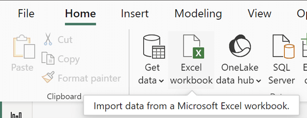
In this tutorial, I’ll be using Microsoft’s AdventureWorks dataset. First, click the ‘Excel workbook’ button and select the AdventureWorks dataset from your file folder.
How to Connect to Data in Power BI Desktop
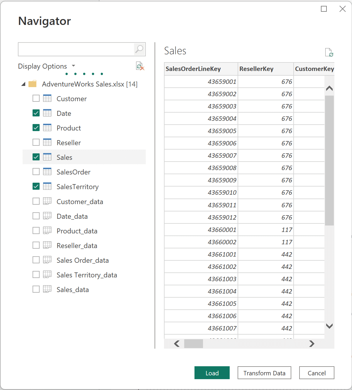
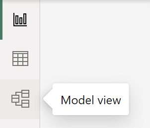
Once the Navigator window opens, click the box next to the Date, Product, Sales, and SalesTerritory tables to select them. Click ‘Load’ to load the data into Power BI Desktop. Next, open the model view by clicking on ‘Model view’ from the navigation on the left side of your screen as shown below.
Continue reading with a free account, or login.
Unlock this tutorial and hundreds of other free visual analytics resources from our expert team.
Already have an account? Sign In
By continuing, you agree to our Terms of Use and Privacy Policy.
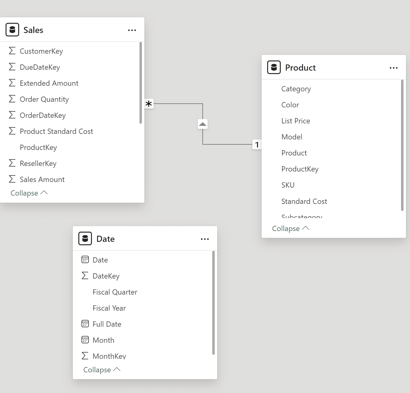
If you have the ‘Import relationships from data sources on first load’ setting toggled, Power BI will automatically detect a relationship between the Product and Sales tables because both tables have a field named “ProductKey”. A relationship will also be detected between the SalesTerritory and Sales tables since both have a field named “SalesTerritoryKey”. These relationships are represented by the lines connecting the tables.
You can check your settings by clicking on File → Options and Settings → Options → Current File → Data Load → Relationships.

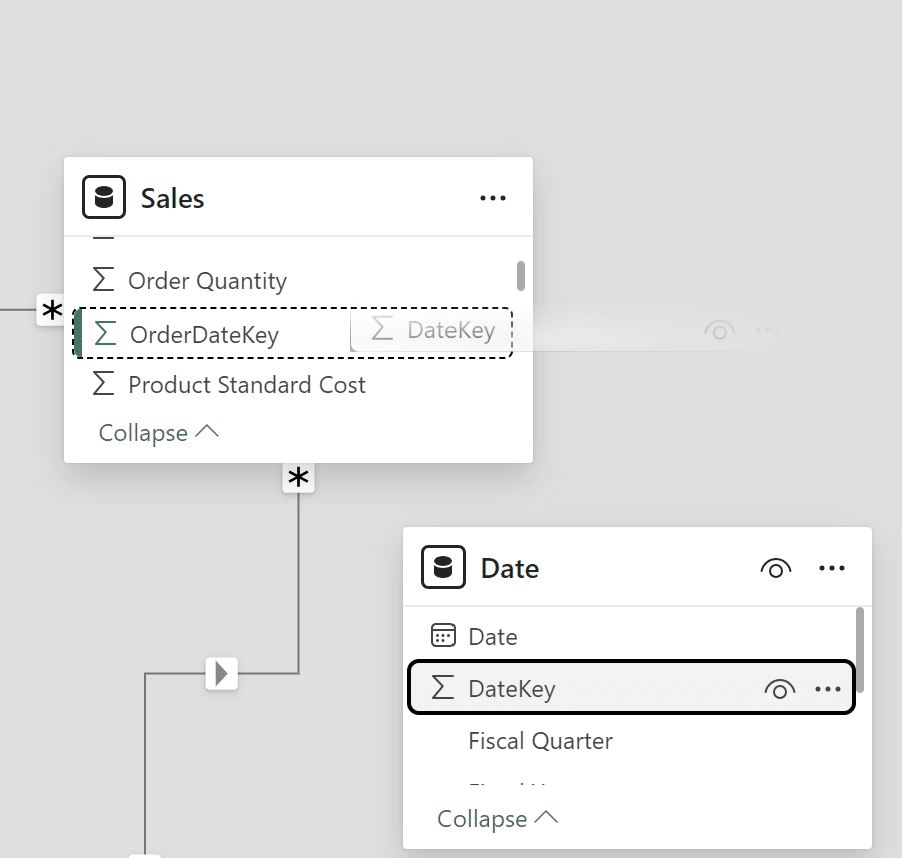
No connecting line between the Date and Sales tables indicates that no relationship between the Sales and Date tables was automatically created. This relationship wasn’t created as there is no exact match between the “…Key” field in the Sales and Date tables. Now I have to create a relationship between these tables.
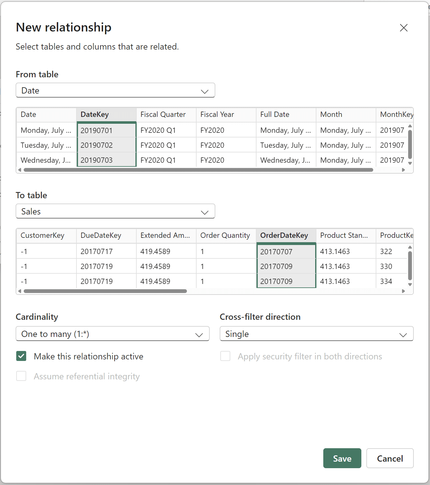
Create a relationship between the “OrderDateKey” in the Sales table and the “DateKey” field in the Date table by clicking and dragging the “DateKey” field from the Date table to the “OrderDateKey” field in the Sales table. Once you do so, the New relationship window will appear.
Confirm that your new relationship window looks like the image below, and click ‘Save’ to confirm the relationship.
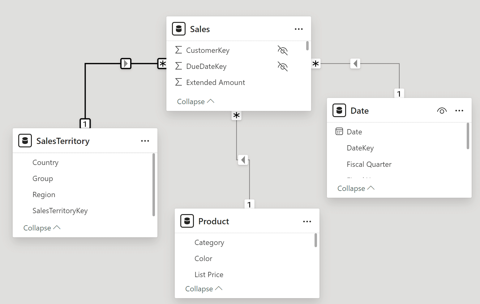
Your model view should look similar to the below image, with relationships between the Sales and Product tables, Sales and Date tables, and Sales and SalesTerritory tables.
Creating the report page for nested parameters in Power BI
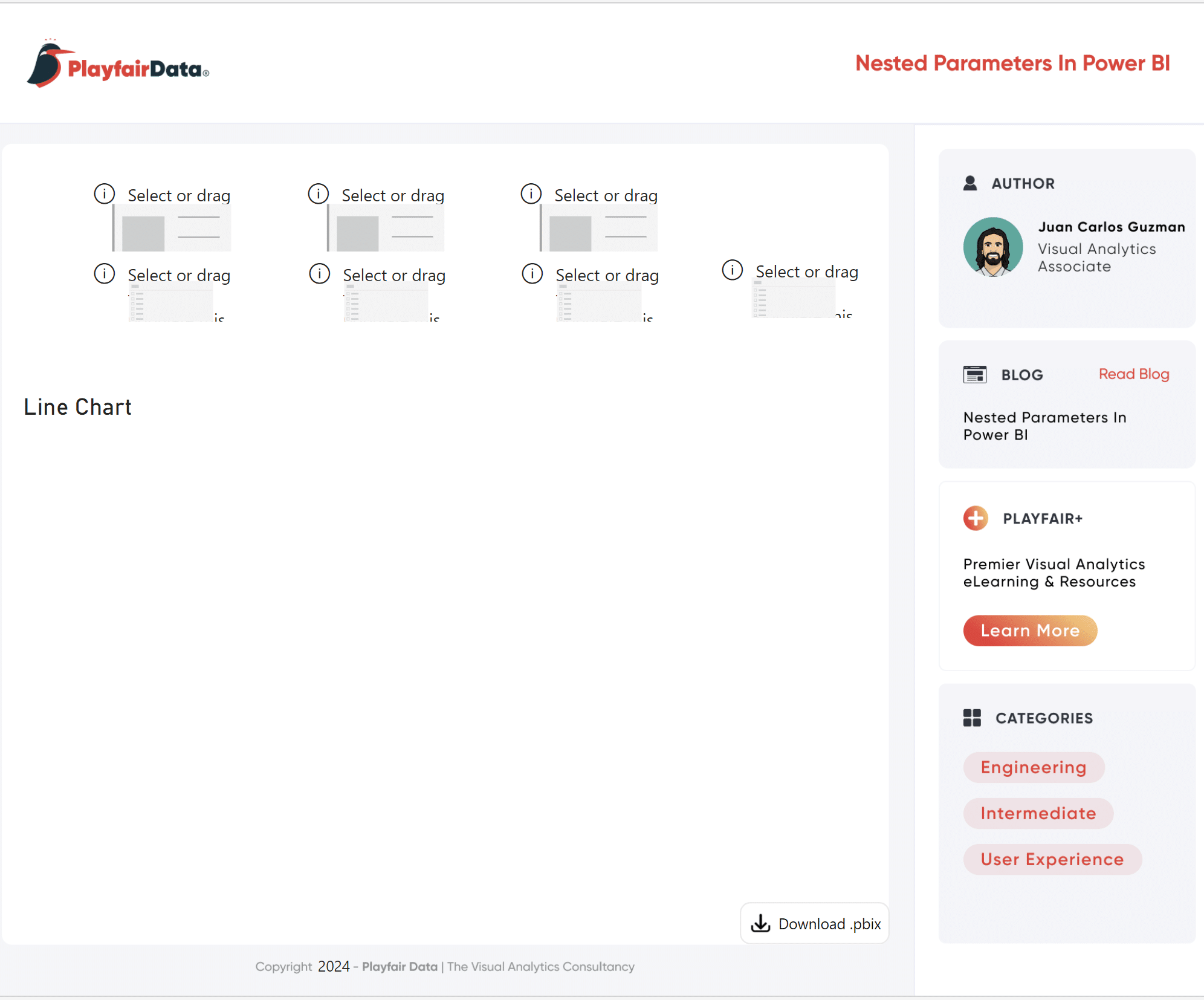
I’ll set up my page with all the necessary components to prepare for creating the nested parameters in Power BI. I find it helpful to set up my report pages with visual placeholders like this to keep the end goal in mind. Setting up the “bones” of a report page before everything else helps me stay organized.
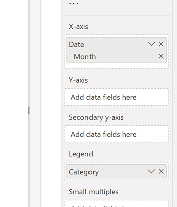
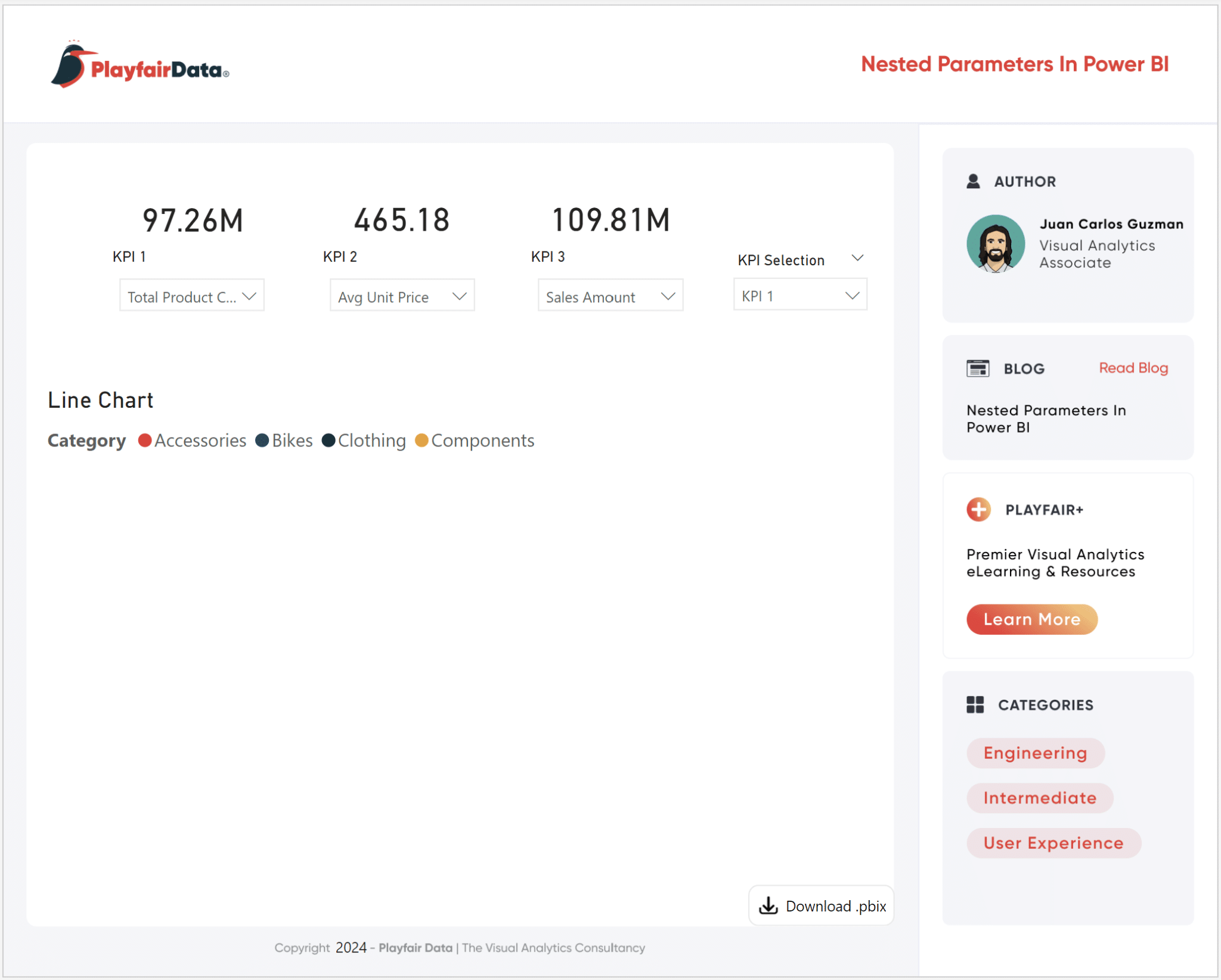
First, I will select and drag three card visuals, one for each KPI, from the Visualizations pane and place them along the top of my page. Next, I’ll place three slicers, one for each card visual. The slicers are placed directly under the card visuals. Next, I’ll add a line chart visual. In the line chart, I’ll add the automatic date hierarchy in the x-Axis and keep the Month field. I’ll also add Category from the Product table to the Legend field. Ultimately, I want the users to control which of the three KPI measures will populate the line chart, so my last step is adding a fourth slicer on the righthand side of my screen. If you’ve been following along, your report should look very similar to the image below.
Step 1: The KPI parameter setup
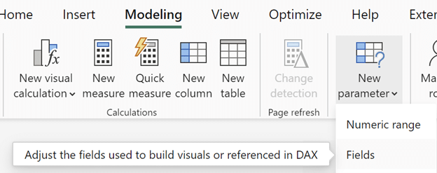
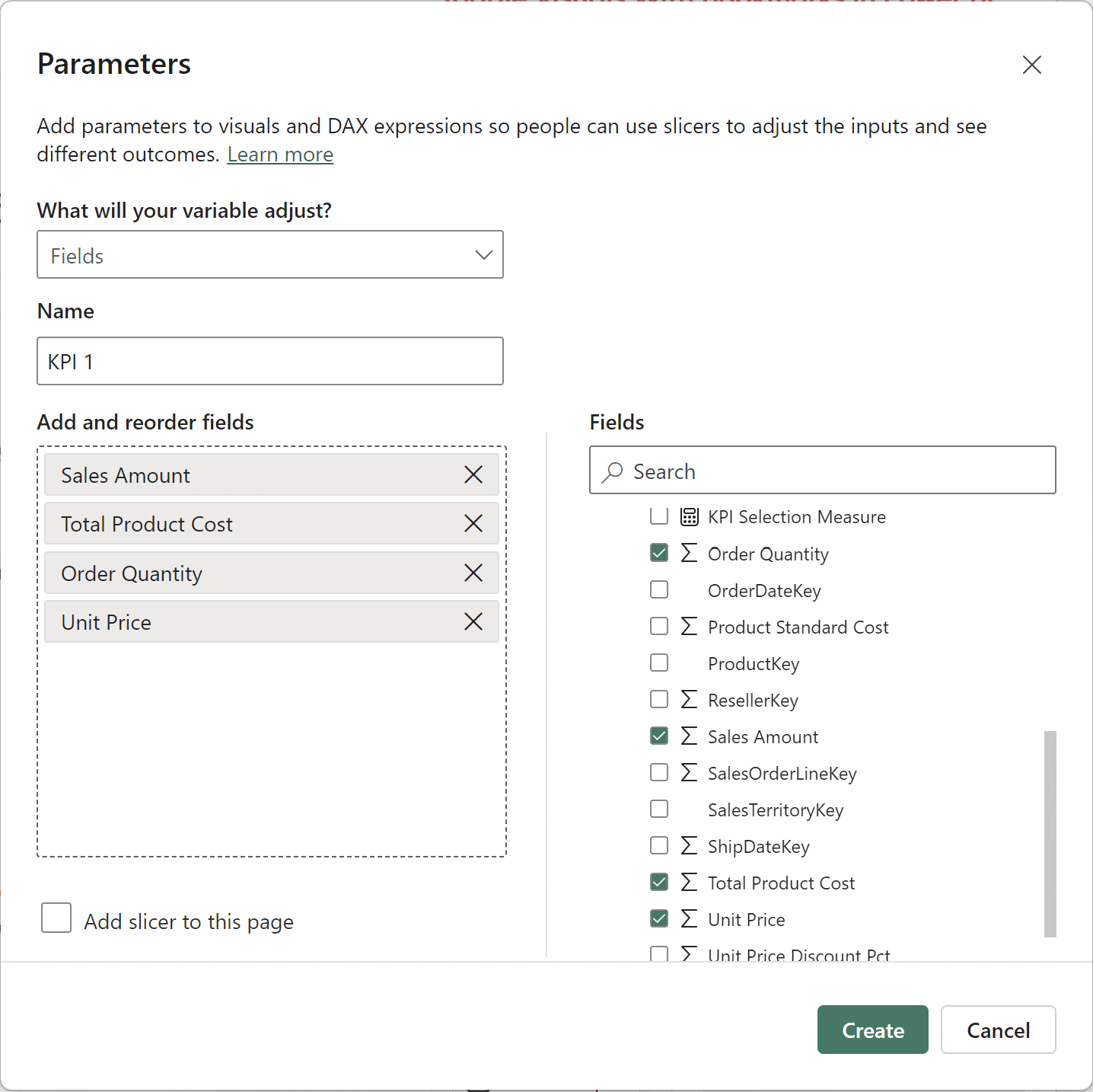
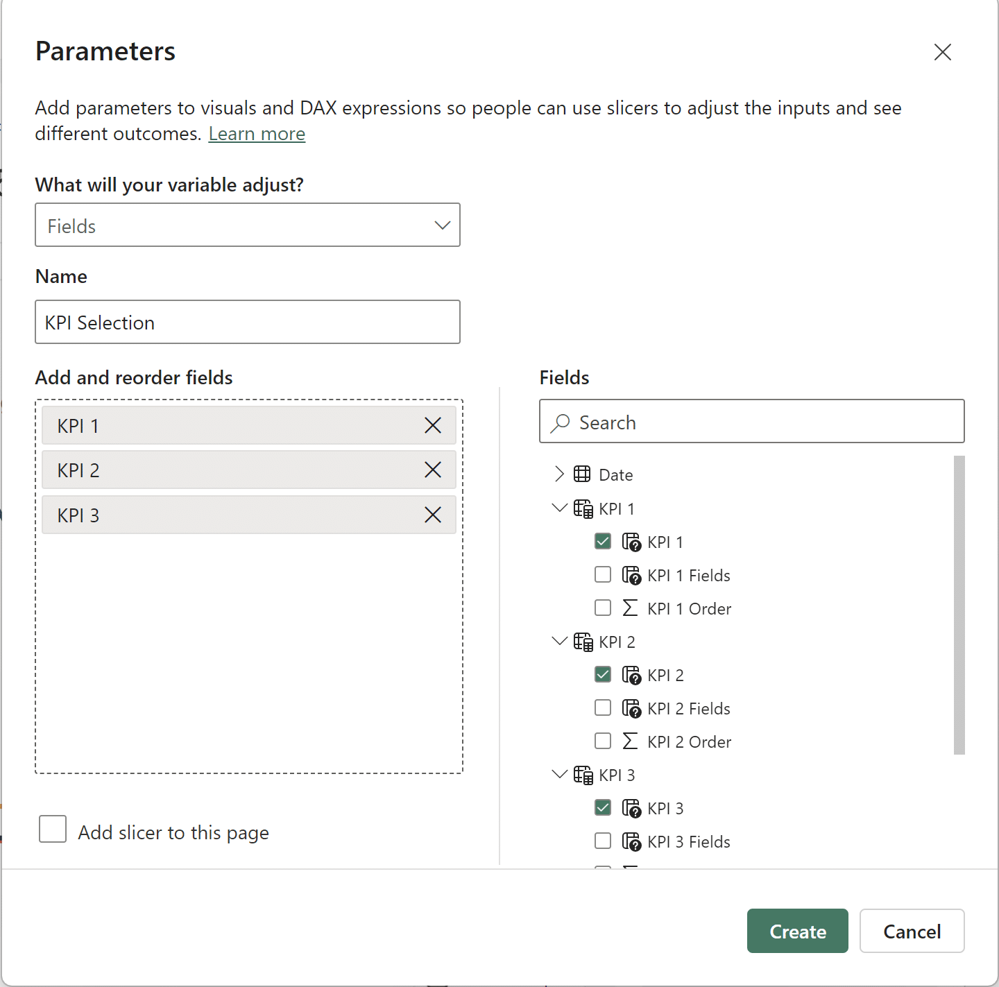
I need four total parameters to make this technique work. One parameter for each of the three KPI card visuals, and one parameter that acts as a wrapper that controls the KPI selection. There are different ways to perform this, but since I want a slicer corresponding to each KPI card visual with the name of the metric displayed, I will use field parameters. To create the KPI parameters, navigate to the Modeling tab, and click on New parameter → Fields.
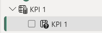
If you accidentally clicked Numeric range instead of Fields, change the “What will your variable adjust?” dropdown, from Numeric range to Fields. If you clicked on Fields, the dropdown will say Fields. Name your field parameter “KPI 1”. Now, you need to add fields to the Add and reorder fields pane. Do this by clicking the checkbox next to the fields you want to use in the Fields window. In this example, I will choose Sales Amount, Total Product Cost, Order Quantity, and Unit Price from the Sales table. Lastly, uncheck the Add slicer to this page checkbox as the empty slicers are already placed on the report page. Now click on the ‘Create’ button.
Once you click ‘Create’, a column with the name of your parameter will automatically generate. I will use this auto-generated column in the first slicer.
To better understand what’s happening behind the scenes, click on the KPI 1 field in the Data pane to open up the DAX window. You will see the following formula:
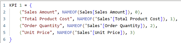
This syntax is important for the measure I’ll create later on. The syntax is {(Name, Field, Order)}. First is the name I give the field in quotation marks, next is the field itself, wrapped in NAMEOF(), and last is the order. I’ll use the Order property when I create the measure.
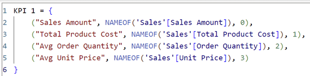
Before moving on, I will change the names of “Order Quantity” and “Unit Price” to “Avg Order Quantity” and “Avg Unit Price” to indicate the aggregation for each of those fields to the user. Click the green checkmark to save your settings. Without an aggregation for the Order Quantity or Unit Price fields, the user is missing critical information for accurate analysis. Without stating the aggregation, you are leaving room for your users to make a critical mistake – they are forced to guess how the fields are aggregated.
KPI 1 =
{
(“Sales Amount”, NAMEOF(‘Sales'[Sales Amount]), 0),
(“Total Product Cost”, NAMEOF(‘Sales'[Total Product Cost]), 1),
(“Avg Order Quantity”, NAMEOF(‘Sales'[Order Quantity]), 2),
(“Avg Unit Price”, NAMEOF(‘Sales'[Unit Price]), 3)
}
Step 2: The KPI measure setup
Now I’ll create the measure for the first KPI card. This measure will be created in the Sales table. To begin, click on ‘New measure’ and name the field “KPI 1 Measure”. Copy and paste the below DAX into the DAX window.
KPI 1 Measure =
SWITCH(SELECTEDVALUE(‘KPI 1 ‘[KPI 1 Order]),
0, SUM(Sales[Sales Amount]),
1, SUM(Sales[Total Product Cost]),
2, AVERAGE(Sales[Order Quantity]),
3, AVERAGE(Sales[Unit Price]),
BLANK())
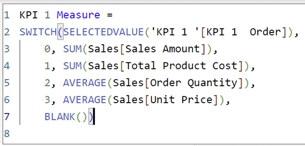
Be careful to match the order from the KPI 1 dropdown column created earlier. This is a dangerous mistake because Power BI will not give you an error message for this. If the order in your measure doesn’t match the order in the KPI 1 dropdown column, your measure will still work. The KPI 1 dropdown column will still display a name, but it will not match the value displayed by the KPI 1 measure. For example, if you accidentally switched the order of Order Quantity and Unit Price, you could end up in a situation where the dropdown displays “Average Order Quantity” but the measure actually shows the value for “Average Unit Price”.
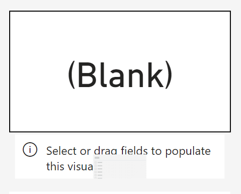
Now add this to the first card visual. Your card visual should say ‘(Blank)’ since you don’t have a current metric selected.
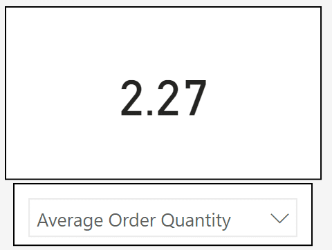
Now I’ll add the KPI 1 parameter to the first slicer. Once I add it to the slicer for KPI 1, the value appears corresponding to the current selection.
Repeat “Step 1: The KPI parameter setup” and “Step 2: The KPI measure setup” for the other two card visuals and slicers. You’ll have to create the parameters in the same way (New parameter → Fields → etc.) but you can copy and paste your DAX for each measure. This is how your report page should look:
Creating the control parameter
This fourth parameter will instruct the line chart on what KPI to display. This is the outermost layer of this setup, where the nested parameter in Power BI technique is officially created. Start this step by creating a new field parameter. Since this is a parameter that switches between KPIs, I’ll call it “KPI Selection”. Select the KPI 1, KPI 2, and KPI 3 fields from the Fields menu.
An Introduction to Parameters in Power BI
Now add the automatically generated column “KPI Selection” to the slicer on the right side of the page.
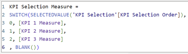
Following the same process as before, I need to create a measure that tells Power BI to switch between selections. This time, before toggling between individual KPI metrics, I will add an outer layer to the DAX formula to instruct Power BI to first switch between the three KPIs before switching between the four metrics in each individual KPI. This layer order to switch between the KPIs before switching between the metrics within each KPI is crucial for the nested parameter to work.
In the final KPI measure, I will repeat the same process as the previous KPI measures, but instead of writing in the aggregated fields I am using after the Order, like SUM(Sales[Sales Amount]), I will simply write the name of the measures I’ve already created.
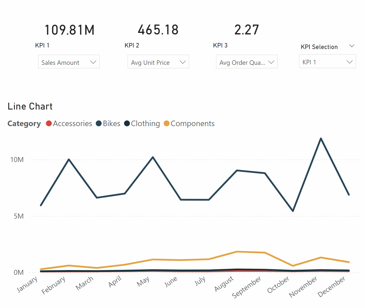
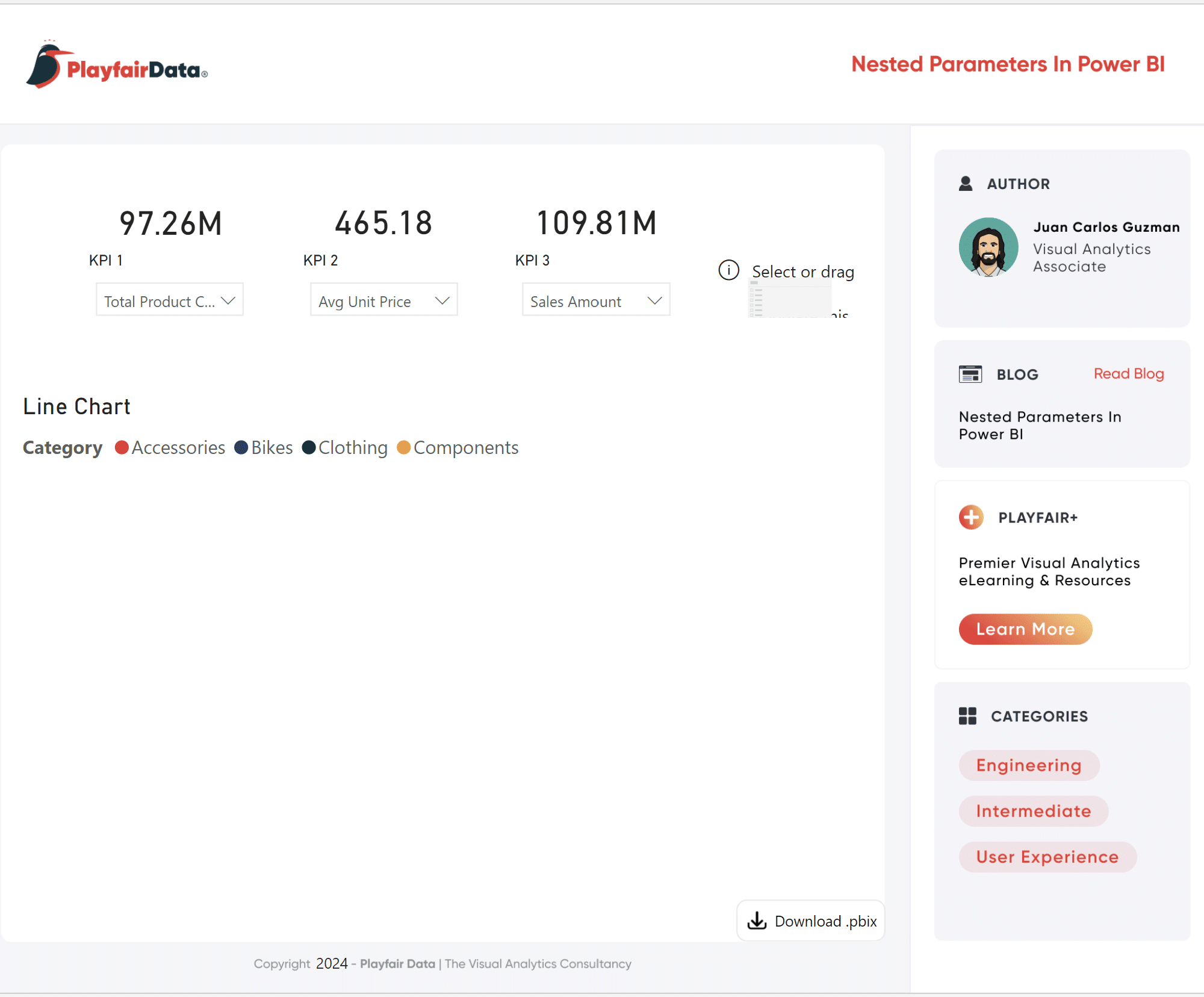
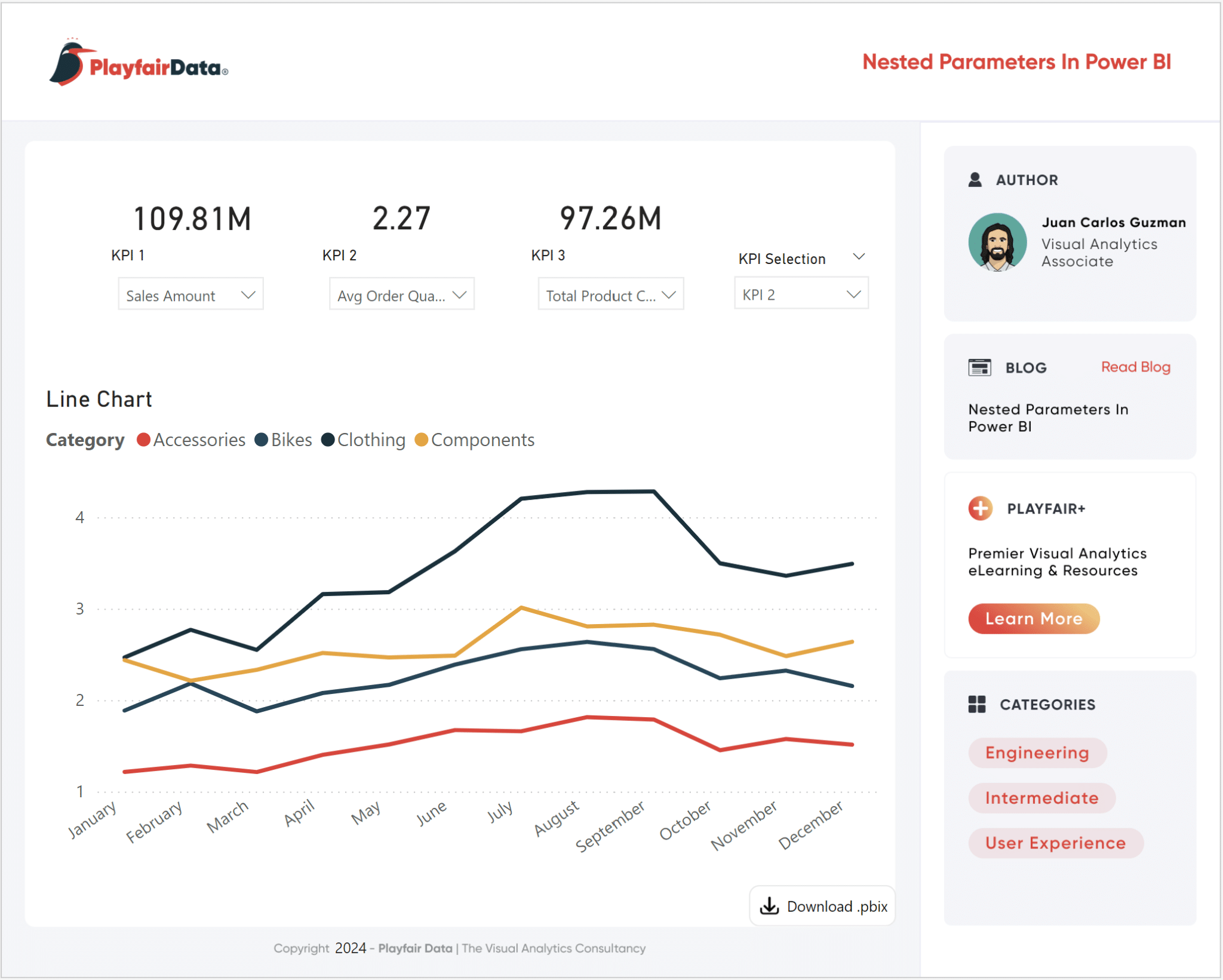
The last step is to place the KPI Selection measure field in the y-Axis of the line chart. Now your line chart populates according to the KPI Selection slicer. Now that the nested parameter technique is fully implemented, you can customize your report at the KPI level and at the individual metric level with ease.
After a bit of formatting, here’s my final Nested Parameters in Power BI report.
The nested parameters technique is a quick way to upgrade your Power BI reports. This setup has the potential to reduce the number of visuals or pages in your report while adding an intuitive and familiar user experience with dropdown slicers. The flexibility that this nested parameter setup provides will allow you to create efficient, dynamic, and easy-to-use reports.
Thanks for reading,
Juan Carlos Guzman

Written By
Juan Carlos Guzman

Peer Review
Felicia Styer
Assoc. Director, Analytics Solutions
Related Content
Beginner’s Guide to DAX: Creating Calculated Columns and Measures in Power BI
When building a report from scratch in Power BI Desktop, one of the most common questions you can ask yourself…
Tableau vs. Power BI: A Quick Start Guide Comparison
As someone who is relatively new to both Tableau and Power BI, having to navigate either platform can feel overwhelming…
3 Ways to Make Lovely Line Graphs in Power BI

If you read the first installation in this series on how to make Power BI bar charts more engaging, this…