5 Reasons to Trade Spreadsheets for Visual Analytics

Data visualization is not about making “pretty charts and graphs;” it’s about communication. There are some who view data visualization as an educational tool but draw the line at utilizing visual analytics in their businesses for decision-making. This has always been a bit backwards to me, as effective data visualization is simply another way to view the exact same datasets but offers contextual comparisons and insights not found when pouring through countless lines on a spreadsheet.
Here are five reasons visual analytics will always run circles around spreadsheets.
1. Speed
Preattentive attributes like color, shape, and motion can be processed in less than 500 milliseconds. This is objectively faster than attempting to interpret a text table of data.
2. Accuracy
The increased efficiency of analyzing visualized data means you can be more confident in your interpretation. Not to mention that spreadsheets alone are rife with human error that can be difficult to identify and correct.
Continue reading with a free account, or login.
Unlock this tutorial and hundreds of other free visual analytics resources from our expert team.
Already have an account? Sign In
By continuing, you agree to our Terms of Use and Privacy Policy.
3. Engagement
Stakeholders aren’t interested in downloading another .xlsx attachment and combing through a wall of data. Data visualization makes analysis more engaging, which drives adoption, which drives action.
4. Storytelling
People remember stories, not statistics. According to Chip and Dan Heath (authors of Made to Stick), stories are more than twelve times more memorable than statistics alone. Visualization provides a platform to create memorable narratives, increasing the chances of your analyses making an impact.
5. Practicality
As if all these reasons were not enough, Excel has a 1,048,576 row limit. This is not enough to keep up with the ever-increasing size and complexity of data.

Making the Switch
With spreadsheet tools like Excel still dominating the data industry in usage, how and when do you make the switch to visual analytics? I’ve realized you can’t go from nothing but text tables to nothing but data visualizations overnight.
There’s a bit of perceived trustworthiness that comes from a text table in some users’ minds. But while they are predictable and follow a familiar format, they are often erroneous and can also leave much to be desired in the way the data is communicated. As organizations grow, there comes a moment when you are faced with a mountain (or lake) of data. It’s collected, it’s accurate, but it’s simply too much information for any one team to tackle and make sense of. When literal billions of rows of data begin to stack up, visual analytics becomes the obvious answer.

By providing efficient, trustworthy visualizations, these massive amounts of data become accessible communications, with actionable insights readily available for those who can (and will) use the data.
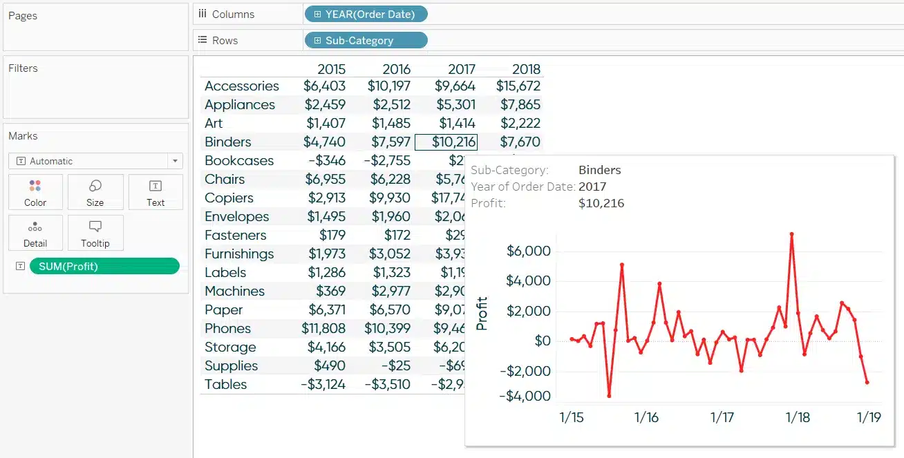
One way I like to ease the transition is by starting with a text table, but sneaking visualizations in as visualizations in tooltips (or in addition to the text table if that’s more practical for the software being used).
How to Show Top 10 Lists in Tableau Tooltips
3 More Ways to Overcome the Excel Barrier to Tableau Adoption
Over time, you can flip this journey to start with the visuals, then provide text tables on hover or click for those who may need to inspect the data for themselves.
Thanks for reading,
– Ryan

Written By
Ryan Sleeper
Related Content
Tableau Tip: How to Make Better Relative Date Filters
Have you ever needed to filter to the last 7 days, 30 days, 90 days, etcetera in Tableau? You’ve likely…
Tableau vs. Power BI: A Quick Start Guide Comparison

As someone who is relatively new to both Tableau and Power BI, having to navigate either platform can feel overwhelming…
5 Lessons Learned While Becoming a Tableau Zen Master
This month I received the news that I had finally reached a career-long goal of being named a Tableau Zen…