Data democratization is dead. Long live data democratization.

This year, I had the opportunity to attend my first Gartner Data & Analytics Summit, one of the leading community events for analytics leaders and practitioners around the world. One of my biggest takeaways from attending sessions and participating in discussions was that there seems to be a consensus that full ‘data democratization’, or making data more accessible regardless of internally defined roles, has been a failure.
As I write now, I’m returning from my first Tableau Conference in three years. Tableau, the software that created its own SQL-like language to allow non-technical users to do their own data analysis, arguably led the revolution from data centralization to data democratization. Among many highlights, I’ve come away inspired by where visual analytics is headed.
This post shares my latest thoughts on the role of visual analytics, reviews the evolution of data democratization, and provides three tips for striking an optimized balance between centralization and decentralization. This, and all written content on our platform, is available for free when you create an account. If you would like access to live training, digital credentials, and hundreds of additional resources to help you get more from data, explore Core or Premium membership.
Continue reading with a free account, or login.
Unlock this tutorial and hundreds of other free visual analytics resources from our expert team.
Already have an account? Sign In
By continuing, you agree to our Terms of Use and Privacy Policy.
A brief history of data democratization
As with any technology, early accessibility is exclusive to the inventor themselves or a small group of users who are aware of the new development. While one could argue William Playfair’s “graphical arithmetic” (now “data visualizations”) democratized economic insights at the turn of the 19th century, here we’re really talking modern business analytics and databases, which began in the 1960s.
Then, in 1986, the American National Standards Institute (ANSI), followed shortly by the International Organization for Standardization (ISO), both adopted Structured Query Language (SQL) as the standard for querying databases. This language provided a way for data users to customize the questions they were asking of data, which helped scale insights and impact along the way.
While relatively simple compared to other coding languages, SQL was still mostly limited to strong technical users, which meant centralized data storage in a database and associated data analysis were exclusive to power users. This approach had several advantages, including standardized methodologies, more reliable data security, and generally more control over data infrastructure, analysis, and decision-making.
I would argue that the first significant step towards data democratization occurred when personal computers (PCs) became widely available in the 1990s. I remember my first access to a PC, for example, being in a fourth-grade classroom in 1993, followed a couple of years later by our very own PC in the home. While everybody’s favorite “BI platform”, Microsoft Excel, was released as an add-on in 1985, the widespread adoption of PCs in offices, homes, and classrooms around the world made it possible for the masses to attempt their own version of data analysis and visualization.
A Spreadsheet is Not a Data Visualization
The next giant leap in data democratization came with the release of Tableau Desktop 1.0 in 2005. Tableau is based on a language called VizQL, a not-so-disguised take on SQL, which made it possible for non-technical users to do SQL-like queries of data just by dragging and dropping fields onto a view. This helped the potential impact of data explode with benefits including the removal of technical bottlenecks, shorter time to insight, and the ability for just about anybody in the organization to do custom ad hoc analyses.
The sweet spot for data democratization
Despite the many benefits of both data centralization and decentralization, the problem is that neither extreme end of the spectrum allows companies to maximize their return on investment in data. Too much centralization and insights aren’t scalable, which in turn limits decision-making and potential positive impacts. What I’ve also realized, though, is that full data democratization results in too much noise and insights not making their way back up the chain to the people who can act on them.
“The rumors of my death have been greatly exaggerated” – Mark Twain (and dashboards around the globe)
Enter dashboards, data products, interactive data interfaces… whatever term you prefer, they still provide tremendous value. To me, visual analytics tools like these provide the perfect balance of a strong, governed data foundation, an intuitive interface that includes relevant data points engineered by power users, and the flexibility to allow stakeholders to conduct ad hoc analyses within the tools.
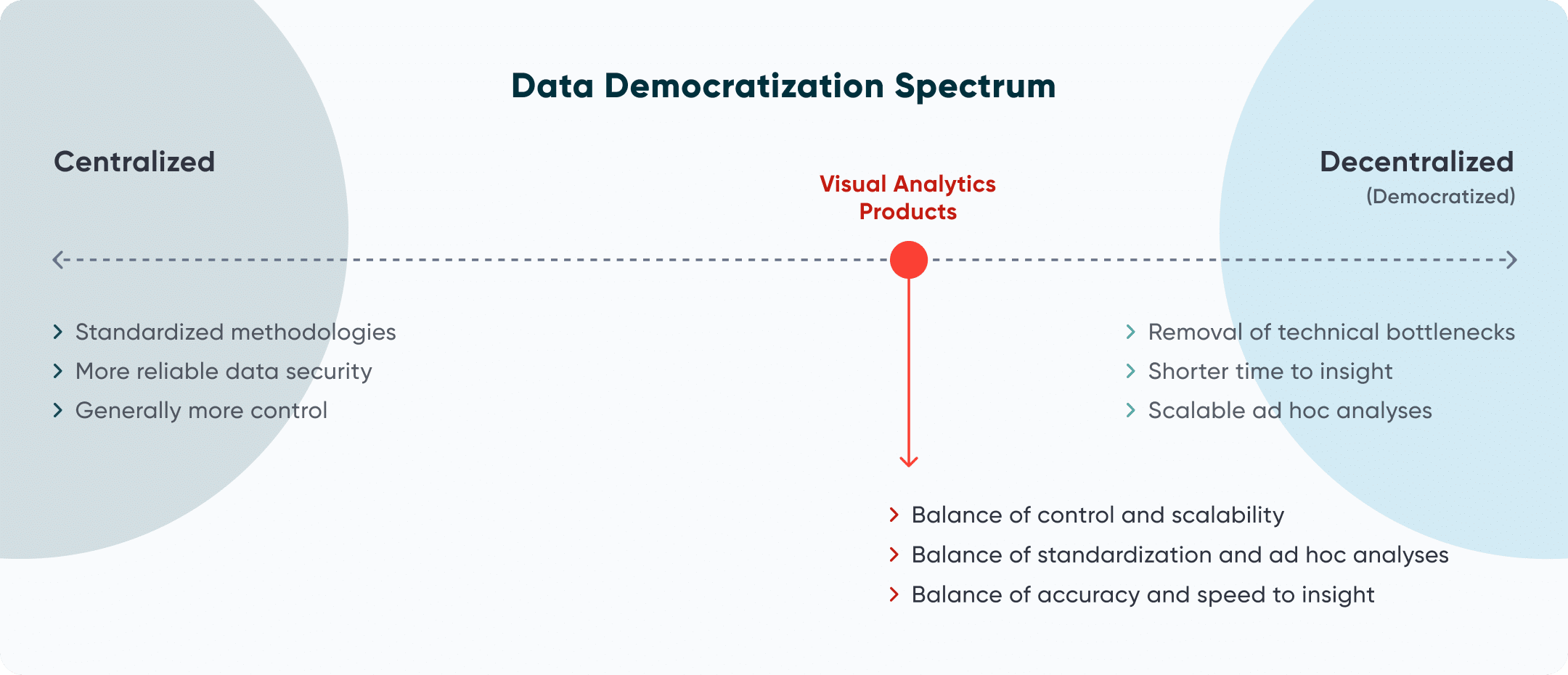
We’ve gone into depth defining visual analytics and explaining its benefits on this platform before. As founder of the visual analytics consultancy, I’m admittedly and unapologetically biased towards the power of the medium in a business environment. That being said, I believe wholeheartedly that visual analytics is the sweet spot for data democracy and thus represents a huge opportunity for anyone reading this.
Tips for data democratization with visual analytics
So, how exactly should you capitalize on this opportunity that’s presented itself? Here are three tips to get you started.
Don’t forget report governance. I’ve speculated before that one of the reasons data visualization desire paths form in an organization, with stakeholders reverting back to the familiarity of Excel despite its limitations, is because they don’t trust the underlying data feeding the dashboards. They need to see for themselves where the numbers came from and how they were calculated. This is why data governance is critical to building trust and authority with stakeholders to increase their chances of using data to drive decision-making.
But have you thought about report governance as well? For visual analytics to deliver on its promise of being the sweet spot of data democratization, the same rigor that goes into governing the data itself should also be considered for the reports. Here are just a few options for ensuring quality, availability, and security of your visual analytics products:
- Use consistent calculation methodologies throughout dashboards. Many companies focus on the same key performance indicators and categorical filters throughout their reporting ecosystem. If you are in this same position, have your strongest engineer team up with your strongest business analyst to create the calculations in a workbook that can be used as a templated starting point for any new report. Here’s a downloadable template for dynamic date ranges in Tableau to get you started.
- If you’re using consistent methodologies, why not explain them to your end users? Sharing where data was sourced and how calculated fields were computed not only makes results more consistent, it also has a knack for building authority and driving adoption. Here are some tips on providing instructions and methodologies to your audience.
- Document security policies to remain in compliance and improve your user experience by showing them reports / data that are relevant to them. Here’s how to protect row level data and/or column level data in Tableau.
- Document your policies that help move reports from a sandbox environment, to production, to eventually sunsetting, which will help protect data and improve user experience by reducing the amount of noise in your reporting portal of choice. One good way to determine if a report should be sunset or consolidated with another is to review usage reporting like the Tableau Cloud Usage Swift.
Adopt a franchise model. Another of my biggest takeaways from the Gartner Data & Analytics Summit, which was mentioned in multiple sessions, is that there are no unicorns. Gone are the days when a single resource can be an expert in everything that is needed to get the most out of data. That’s why at Playfair Data, we support every project with a team that spans what we call the Playfair Venn, which is also what we consider the four tenets of visual analytics: Strategy, Data Prep, Design & UX, and Engineering.
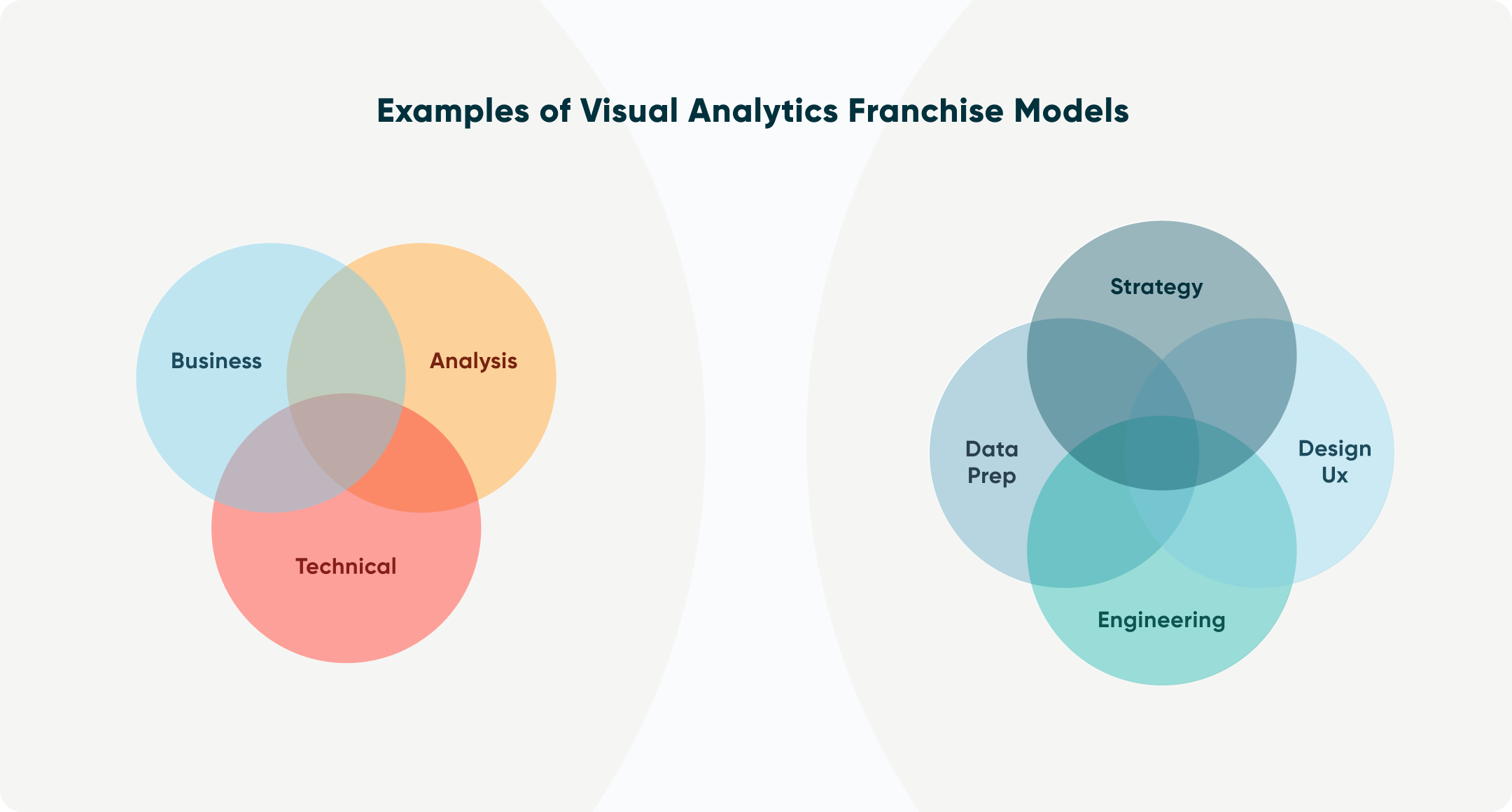
At Gartner, they suggested pairing team members with roles spanning business, analysis, and technical users. However you like to think about combining the strengths of your team, it’s the practice of “combining superpowers” that will unlock visual analytics’ greatest potential.
Embrace bounded rationality. I’ll close with a friendly reminder that no approach is perfect and everything comes with its own pros and cons. Whether you are on Team Centralization, Team Data Democratization, or want to adopt the visual analytics sweet spot I am advocating for, you will be constrained by the concept of bounded rationality.
This means that you will never have enough information to make a perfectly optimal decision. When you embrace this concept and instill it in your culture, you increase the likelihood of people making good enough decisions and making a positive impact with data. This is much better than analysis paralysis, which often results in no decisions being made at all. For context, I always advocate that you aim to be 80% right – which, if attained, would give you a huge advantage in your career, over the competition, and towards helping your stakeholders.
Thanks for reading,
– Ryan

Written By
Ryan Sleeper
Related Content
3 Ways to Avoid Data Visualization Desire Paths
Desire paths are unplanned trails that form when users circumvent the carefully constructed paths before them in favor of routes…
The Parallels Between Storytelling and Data Visualization
Think of the lyrics from your favorite song – or any song for that matter. I guarantee it contains the…
5 Reasons to Trade Spreadsheets for Visual Analytics
Data visualization is not about making “pretty charts and graphs;” it’s about communication. There are some who view data visualization…