Introducing a New Highlighting User Experience in Tableau
Data visualization is much more than “making pretty charts”. Valuable decision-making tools require strategic planning to identify objectives and business questions that will cause action, technical expertise to build the visualizations, design and/or storytelling techniques to make insights engaging and understandable, and a user experience that helps stakeholders navigate, just to name a few aspects. That is why at Playfair Data we start every visualization outside of Tableau with an initial wireframe. Creating these mock-ups with different tools – that have different features than Tableau – often lead to the challenge of translating aspirational design requirements into something useful within the engineering capabilities of Tableau. Sometimes this process leads to an innovation that I just have to share here at the blog. This post shows you how to highlight selected dimension members in Tableau with a modern, web-like user experience.
Learn more advanced techniques with Playfair+
An innovative way to highlight a dimension member within a Tableau navigation
By the end of this post, you will be able to highlight a selected dimension member, color the highlight based on the selection’s latest performance, and draw a line across the navigation that connects with the selection.
First, create the primary navigation by starting a new worksheet, changing the mark type to Square, and dragging the dimension containing your filter options to the Columns Shelf. If you prefer a vertical navigation, place the dimension on the Rows Shelf instead.
![]()
For my example, I’ll allow the user to select dimension members from the Sub-Category dimension in the Sample – Superstore dataset that comes with Tableau Desktop. However, instead of providing links to all seventeen sub-categories, I will filter the view to just the first 10.
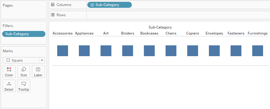
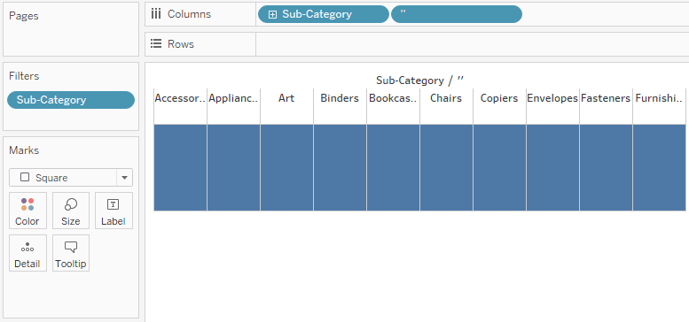
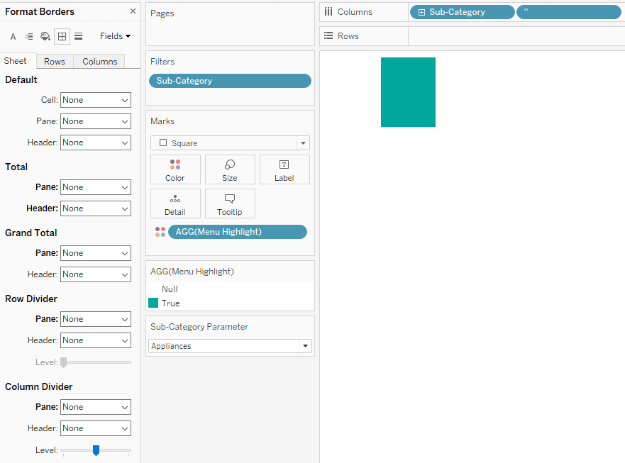
Next, make the size of the squares as large as possible by clicking on the Size Marks Card and dragging the slider all the way to the right. You will notice that this will make the squares spill over into neighboring cells. The trick to correcting that so that each sub-category’s square fits cleanly into its respective cell is to double-click next to the dimension already on the Columns (or Rows) Shelf, type two tick marks (i.e. ‘’), and hit the Enter key.
The two tick marks act as a second dimension that add confining column lines to the highlight table.
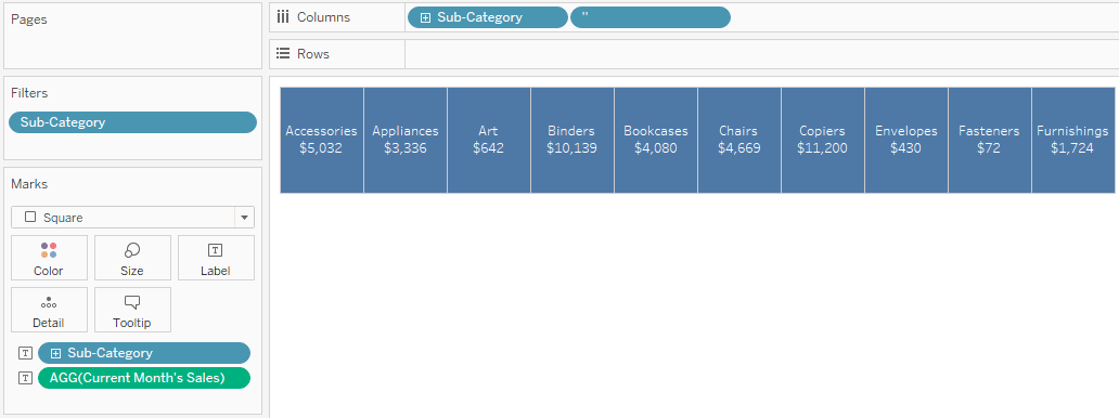
Now we’re going to add labels so the user knows what they’re clicking on. What you add to the labels is optional, but at a minimum, place the same dimension that is on the Columns Shelf onto the Label Marks Card as well. To spruce my label up a bit, I’ll also place a measure called Current Month’s Sales on the Label Marks Card and hide the redundant table header by right-clicking any of the headers and deselecting “Show Header”.
How to Isolate Comparison Date Ranges in Tableau
Continue reading with a free account, or login.
Unlock this tutorial and hundreds of other free visual analytics resources from our expert team.
Already have an account? Sign In
By continuing, you agree to our Terms of Use and Privacy Policy.
Setting up the parameter selector
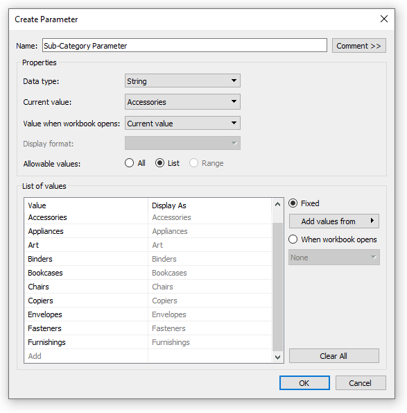
The first feature that really makes this user experience go is a parameter containing a list of the values you want the user to select. This will eventually be used with parameter actions to pass the selections to various calculations which will highlight and filter the selection throughout the view.
The easiest way to create a parameter is to right-click on the dimension containing the selections within the Data pane, hover over Create, and choose “Parameter”. This will automatically create a parameter with the correct data type containing a list of the respective dimension members.
To use this parameter to highlight the selection, you can keep it simple and create a calculated field with the formula [Sub-Category] = [Sub-Category Parameter], and place that field onto the Color Marks Card. Of course, you would replace Sub-Category with the dimension you are using in your business.
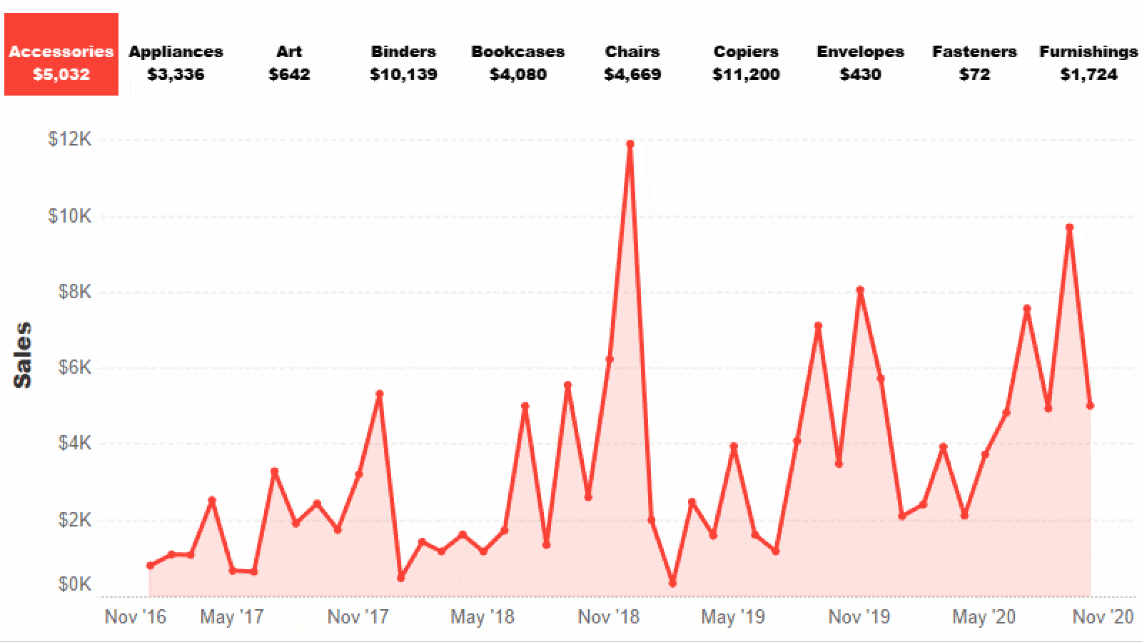
I’m going to make my menu highlight calculation slightly more advanced and color the selection by the month over month performance for the selection.
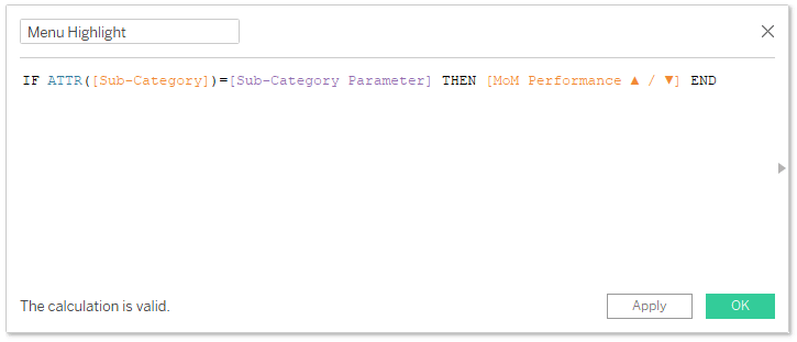
In this example, MoM Performance ▲ / ▼ is another calculated field with this formula:
SUM(IF DATETRUNC(‘month’,TODAY()) = DATETRUNC(‘month’,[Order Date]) THEN [Sales] END)
>
SUM(IF DATEADD(‘month’,-1,DATETRUNC(‘month’,TODAY())) = DATETRUNC(‘month’,[Order Date]) THEN [Sales] END)
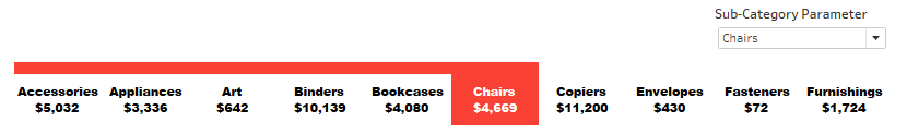
After placing my Menu Highlight calculated field on the Color Marks Card, my navigation looks like this:
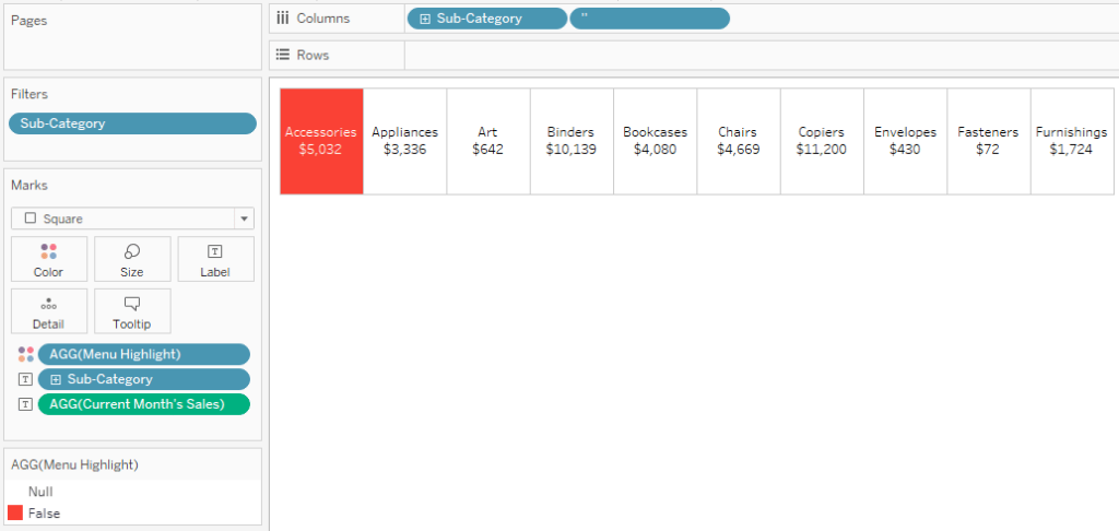
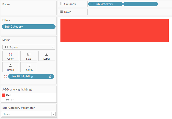
Since Accessories is the current value of my Sub-Category parameter, it is the only dimension member being highlighted, and because it had a negative month-over-month performance, it is colored red. You can remap colors by clicking on the Color Marks Card or double-clicking the color legend that appears after placing the Menu Highlight calculation onto the Color Marks Card.
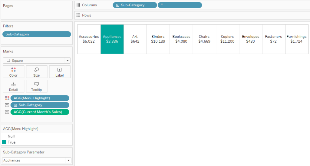
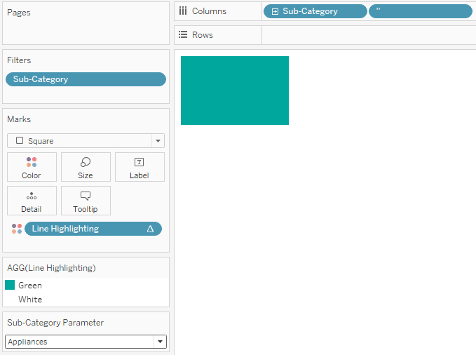
If I were to change the current value of the parameter to a sub-category that had a positive month-over-month change, such as Appliances, that sub-category would be highlighted green in the navigation.
This is already a nice user experience and you could stop here, but the innovation comes by drawing a dynamic line connected to the user’s selection. It’s actually very easy to create from here now that we’ve laid a strong foundation. To begin, duplicate the sheet containing your navigation by right-clicking on its tab at the bottom of the Authoring interface and choosing “Duplicate”.
How to create a dynamic line to highlight a user selection
On the new sheet that appears, remove everything from the Label Marks Card and remove all the lines. For that matter, I almost always recommend removing lines, which you can do by right-clicking anywhere within a view, choosing “Format”, and changing the options on the Borders and/or Lines tabs.
For this sheet, we want to color not only the cell of the selected dimension member, but the cells of everything before it. This will cause the line to be drawn all the way across the navigation including the selection.
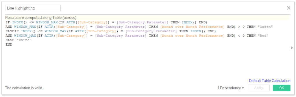
This is the second feature of this user experience that really makes it go. If you are simply coloring the line to show it has been selected, you will need to create a calculated field that colors every cell with an INDEX() at or below the selection. The formula is:
INDEX() <= WINDOW_MAX(IF ATTR([Sub-Category]) = [Sub-Category Parameter] THEN INDEX() END)
Again, my example is more advanced in that it is not only highlighting what has been selected, but also by the month-over-month performance. For my example, the formula is:
IF INDEX() <= WINDOW_MAX(IF ATTR([Sub-Category]) = [Sub-Category Parameter] THEN INDEX() END) AND WINDOW_MAX(IF ATTR([Sub-Category]) = [Sub-Category Parameter] THEN [Month over Month Performance] END) > 0 THEN “Green”
ELSEIF INDEX() <= WINDOW_MAX(IF ATTR([Sub-Category]) = [Sub-Category Parameter] THEN INDEX() END) AND WINDOW_MAX(IF ATTR([Sub-Category]) = [Sub-Category Parameter] THEN [Month over Month Performance] END) < 0 THEN “Red”
ELSE “White”
END
Note if you are going for the more advanced option, the Month over Month Performance in this calculated field is:
SUM(IF DATETRUNC(‘month’,TODAY()) = DATETRUNC(‘month’,[Order Date]) THEN [Sales] END)
–
SUM(IF DATEADD(‘month’,-1,DATETRUNC(‘month’,TODAY())) = DATETRUNC(‘month’,[Order Date]) THEN [Sales] END)
In both cases, we are using the WINDOW_MAX table calculation to have the values for the selection work across the entire view.
An Introduction to Tableau Table Calculations
After placing this calculated field on the Color Marks Card, both the first and second cells are colored by the selection’s month-over-month performance. Note that because this is a different calculated field, you will have to remap your colors.
If I were to choose a sub-category deeper in the table that had a negative month over month performance, the line gets drawn all the way across the table and is colored red.
Now I will line these two sheets up on a dashboard. I’ve also cleaned up the formatting by removing lines and changing fonts on the first sheet. I’ve left the Sub-Category Parameter control in the view to show this is working in the next step.
Finalizing the user experience with dashboard actions
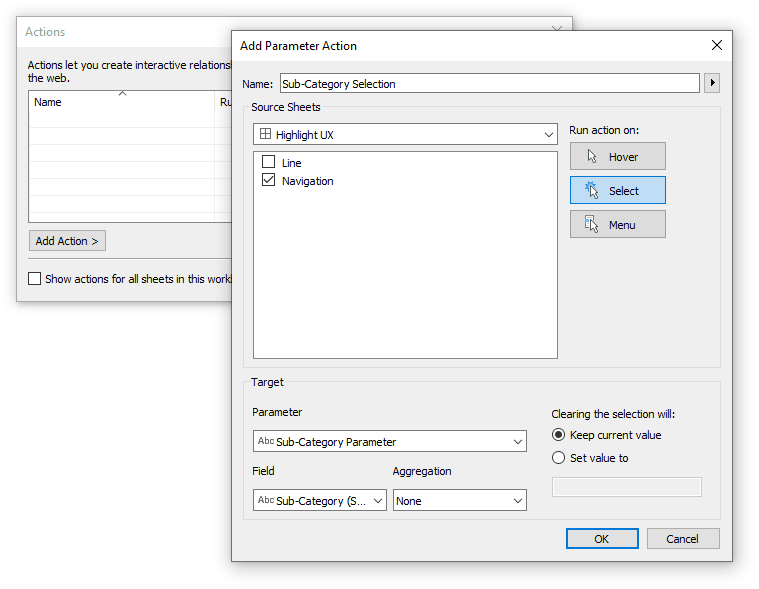
To make this sheet act as a filter / navigation, simply add a parameter action that passes the Sub-Category value to the Sub-Category Parameter. Here are the dashboard action settings:
How to Use Tableau Parameter Dashboard Actions
This parameter action passes whatever sub-category is clicked on to the Sub-Category Parameter. That parameter value then feeds our highlight calculated field to color the selected month by its month-over-month performance. Here’s how the view looks after I click the Bookcases sub-category:
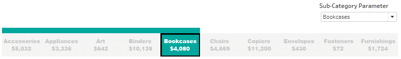
The highlight has moved from Chairs to Bookcases, both the highlight table and the connecting line changed color to reflect a positive month-over-month performance for the selected sub-category, and the value in the parameter control changed to Bookcases to confirm the value was passed.
The only thing I don’t like about this so far is the default way Tableau is graying out the unselected sub-categories and drawing a box around the selection. You can get around the black border by changing the mark type of the navigation from Square to Shape and changing the shape to a closed square. You can get around the highlighting by making a dummy “Don’t Highlight” calculated field and using this trick to avoid highlighting dashboard action selections.
Now that the navigation is working, I can place any other worksheet on the dashboard and link it to the navigation. To filter the dashboard views by the navigation selection, make a calculated field with the formula: [Sub-Category] = [Sub-Category Parameter] (replace sub-category with the dimension being used in your navigation). Then place this calculated field on the Filters Shelf of any sheet you want linked to the navigation and choose True.
![]()
By choosing True in this filter, the view gets filtered to the item selected on the view. Again, this is because the dimension member clicked in the navigation is passed to the Sub-Category parameter because of the parameter action we set up; that parameter selection is then passed to the filter and only the sub-category that matches the parameter is kept on the view.
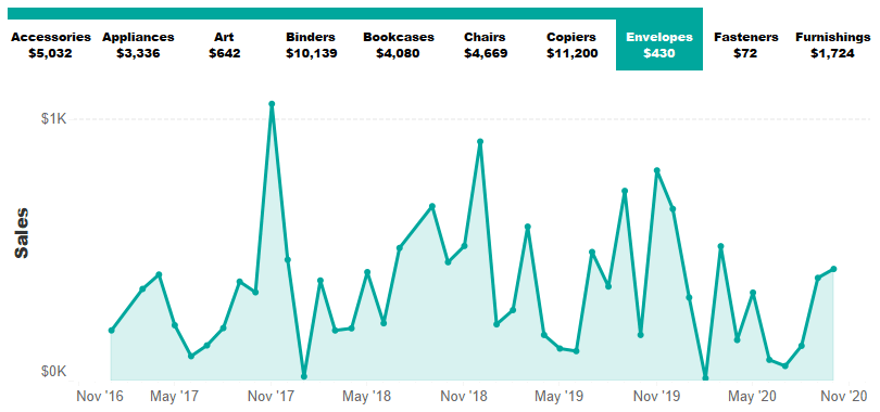
Here is how my final dashboard looks after adding a trend colored by the selection’s latest month-over-month performance and choosing a different sub-category.
Thanks for reading,
– Ryan

Written By
Ryan Sleeper
Related Content
3 Innovative Ways to Highlight Selections in Tableau

In this tutorial I will demonstrate three ways to use different mark types with transparent sheets to highlight a selection…
3 Innovative Ways to Use Figma in Your Visual Analytics Projects


What does design software have to do with visual analytics software like Tableau? At Playfair Data, we approach our visual…

Ryan Sleeper
Create permanent highlights that work across worksheets using parameters Ryan shows you his favorite approach for highlighting specific marks using…