Preattentive Attributes Comparison

Preattentive attributes are something that you most likely encounter unintentionally every day, whether you are browsing the web, navigating an app on your phone, or watching the news. But if you are creating data visualizations, or designs of any kind, they are something you should always employ intentionally. These visual attributes include color, form and motion, and help people process information more efficiently. In this post, I will guide you through the different properties of each attribute and demonstrate how and when to use each attribute.
Preattentive attributes: An overview
Before tackling the how, when and why of utilizing color, form and motion, let’s focus on the what. Preattentive attributes are visual attributes that our brains unconsciously process in less than 500 milliseconds. Basically, these visual properties require minimal cognitive load because our eyes and brains process them automatically. They help us naturally and instantaneously recognize patterns and find insights before our mind slows down for post-attentive processing. Understanding how to use these attributes in your visualizations will significantly increase their effectiveness.
Continue reading with a free account, or login.
Unlock this tutorial and hundreds of other free visual analytics resources from our expert team.
Already have an account? Sign In
By continuing, you agree to our Terms of Use and Privacy Policy.
Color is perhaps the most straightforward visual attribute. An obvious use of color as a cognitive indicator is the general green = good, and red = bad. Color can be used to convey a specific meaning, or simply to differentiate categories. But using color to convey information can also be more complex when you take into account hue and intensity, which are the main properties of this attribute.
![]()
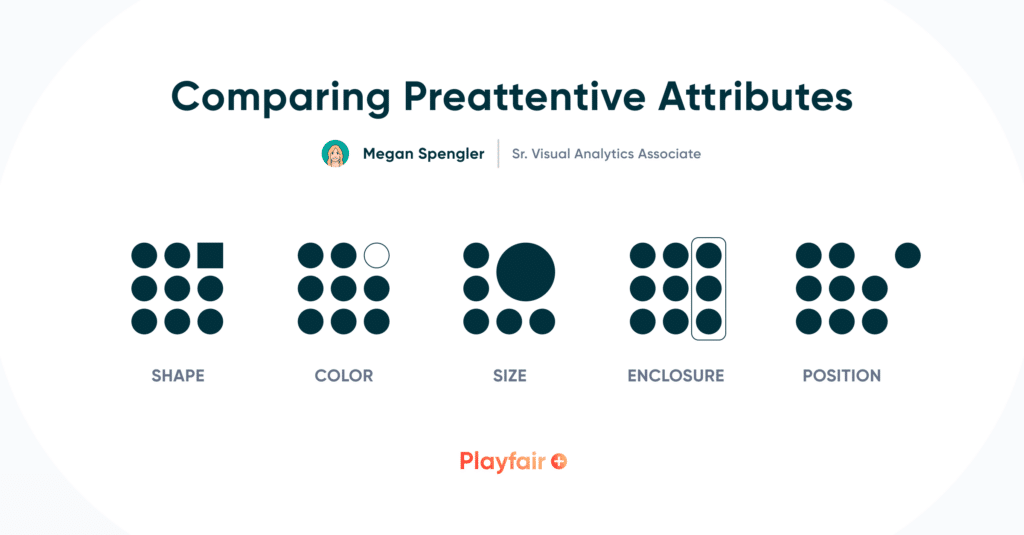
Next up is form, which encompasses a handful of different properties. This attribute can refer to the height, length or width of an object, as well as its shape, size, orientation and position. Enclosure is another property of form, which you can think of as borders or outlines. Think about bolding, underlining or increasing the size of a word for emphasis – this is using the form attribute in a simple manner. Position can address 2-D or spatial positioning. This attribute is extremely helpful in creating groupings or hierarchies in design, as well as highlighting outliers and anomalies.
Playfair Data Presents: Preattentive Attributes
Motion is not used as often in data visualization, especially with static design, but this attribute is often utilized to attract someone’s attention. When I think of the motion attribute, blinking or flickering notifications or alerts on my phone come to mind. The properties of motion include direction and intensity, so think of up vs. down, fast vs. slow. Motion can be distracting when creating data visualizations, so I recommend using it with caution. Because of this, I will be focusing on color and form for the majority of this post.
When to use color
If you choose to only use one preattentive attribute in your visualization, I would make it color. Our founder, Ryan Sleeper, has previously demonstrated how color can lead to instant insights, but I will show you a few more examples of how and why color is important.
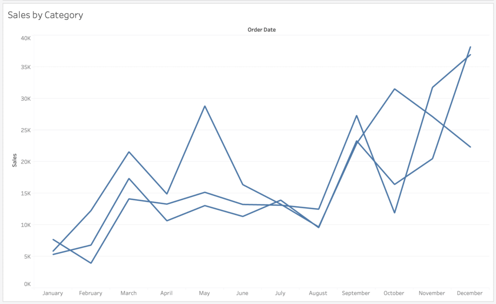
Take a look at this simple line chart showing sales by category over time. Without labels, color, or any attribute to differentiate the categories, this chart is not useful at all.
Now if we assign a color to each category, at least you know what you are looking at here.
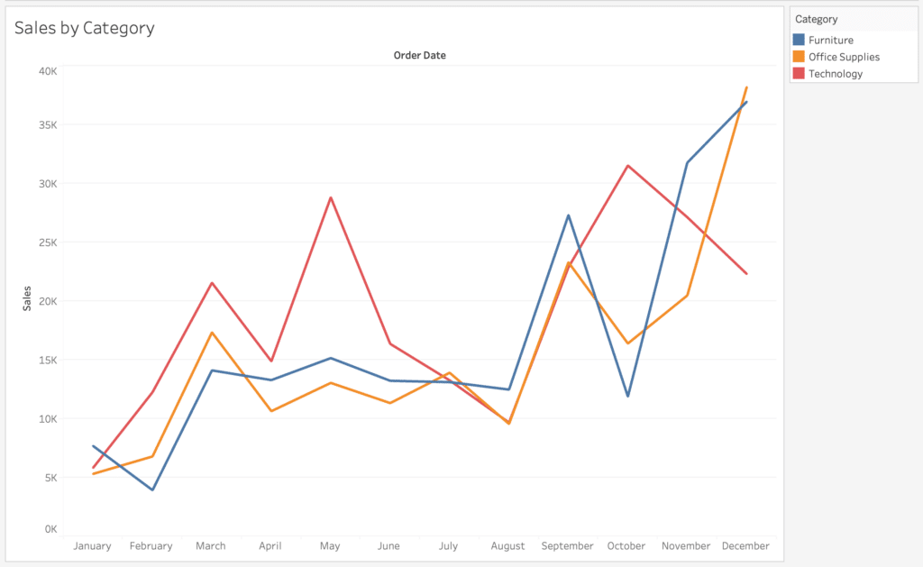
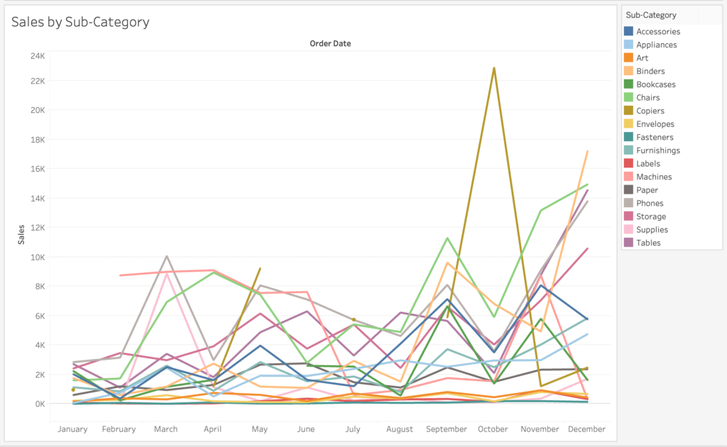
With only three categories, it’s easy enough to identify the category you are looking for with color. But what if you want to look at sales by sub-category, which has over 10 members? It’s kind of a mess, and not fun or easy to read.
By assigning color to a selected sub-category member rather than all members, you can easily isolate and highlight the information you want to display.
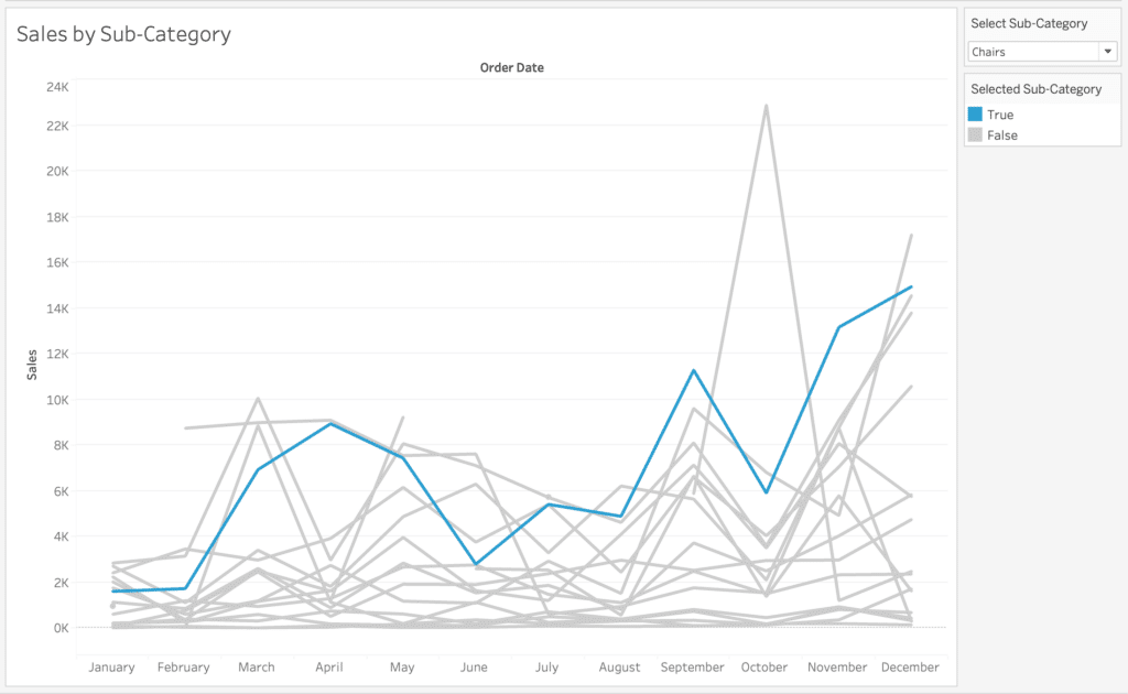
This use of color to highlight selections or categories is not limited to line charts of course; it’s helpful in pretty much any chart type or visual.
How to Highlight a Dimension Member in Tableau
Another application of color to reduce processing time is with outlier detection. One example is the below line chart that displays sales over time, with a distribution band marking +1/-1 standard deviation from the mean sales. By coloring marks that fall above or below this range, you can quickly identify the months with good or bad sales performance.
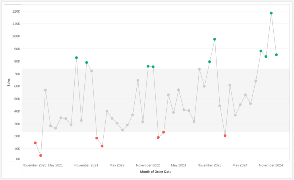
These examples may be simple, but they really demonstrate the power of color in reducing time to insight, and the general idea can be applied to more complex visualizations and designs. Color is also a strong unifier when used to connect categories throughout a dashboard with multiple visuals. It’s important to define what your colors represent, so the end user can quickly find patterns and make conclusions.
When to use form
While I believe color is the most straightforward preattentive attribute, form can be considered the most broad and flexible. The form attribute has quite a few different properties which can help highlight or soften the influence of certain data points. Height, length and width are naturally built into visuals like bar charts, where the longest/largest bar represents the category with the greatest value.

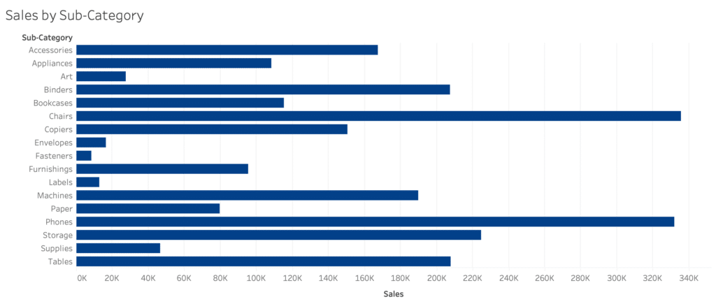
Order also falls under the form attribute umbrella, and the below bar charts demonstrate the importance of sort order. While it’s obvious that Chairs and Phones have the highest sales in this chart, it’s difficult to know which sub-category is actually higher. And what if you want to know the sub-category with the 5th highest sales?
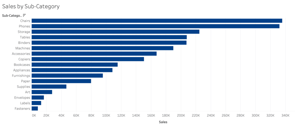
By sorting the bars in descending order by sales, I can compare not only the preattentive attribute of length, but the rank order from top to bottom. Now I can quickly and accurately identify Chairs as the highest category and count Binders as the 5th highest sub-category.
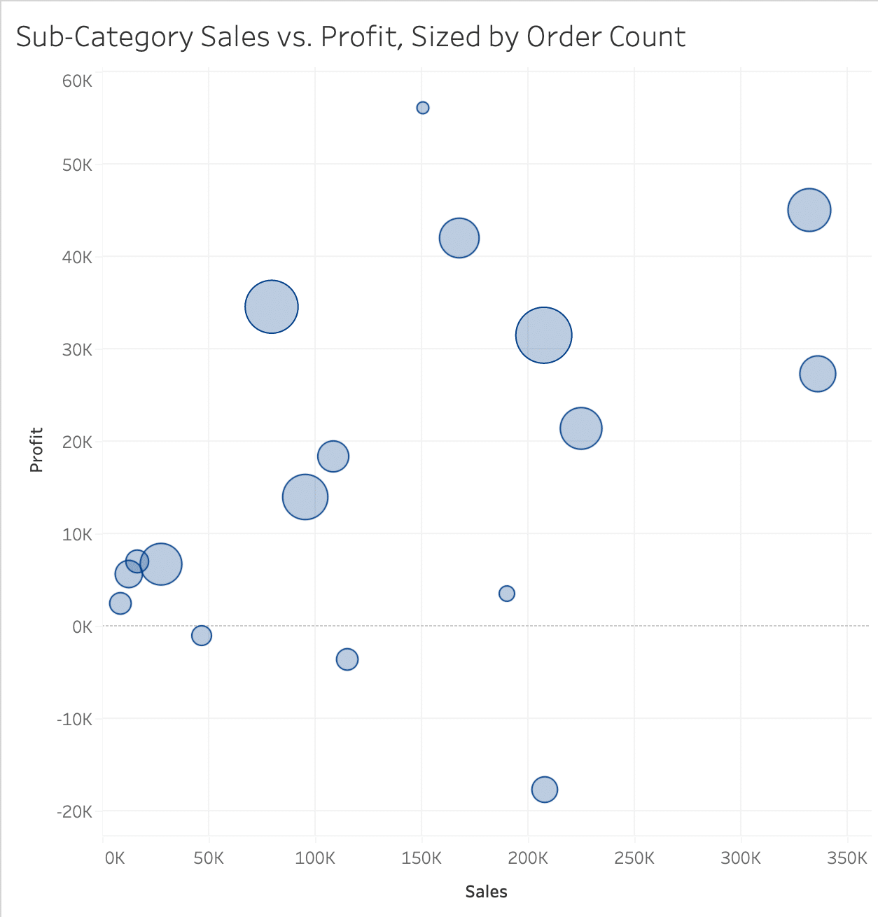
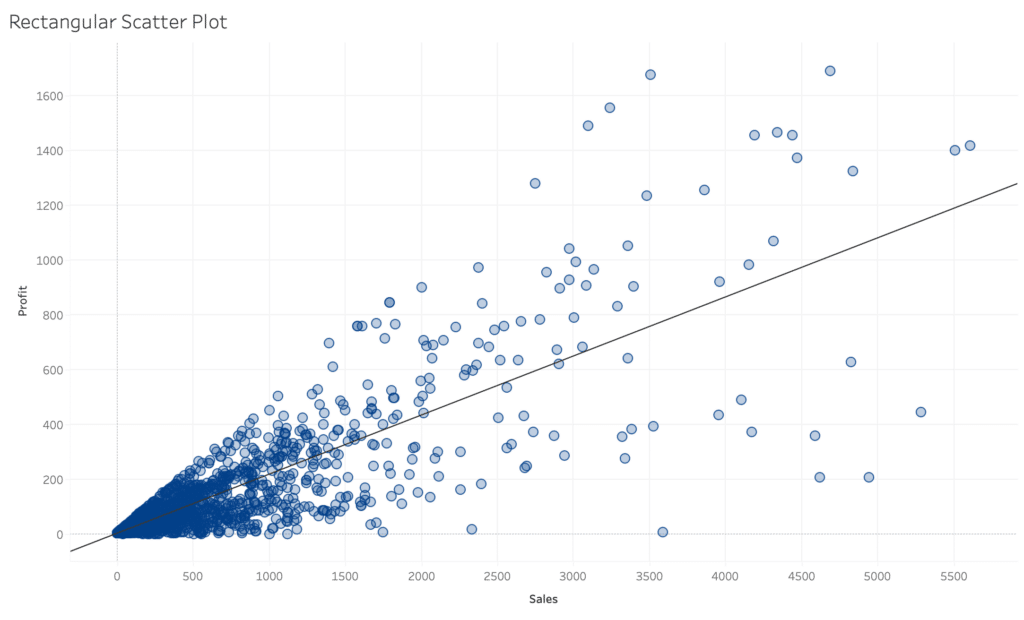
Other form properties, like size, enclosure and shape, can also be used to enhance visuals that don’t initially include them. For example, take these three different scatter plot variations.
First, we have a basic scatter plot comparing profit vs. sales at the sub-category level. But by adding order count to the size attribute, we can easily see the most profitable sub-category actually had the least amount of orders.
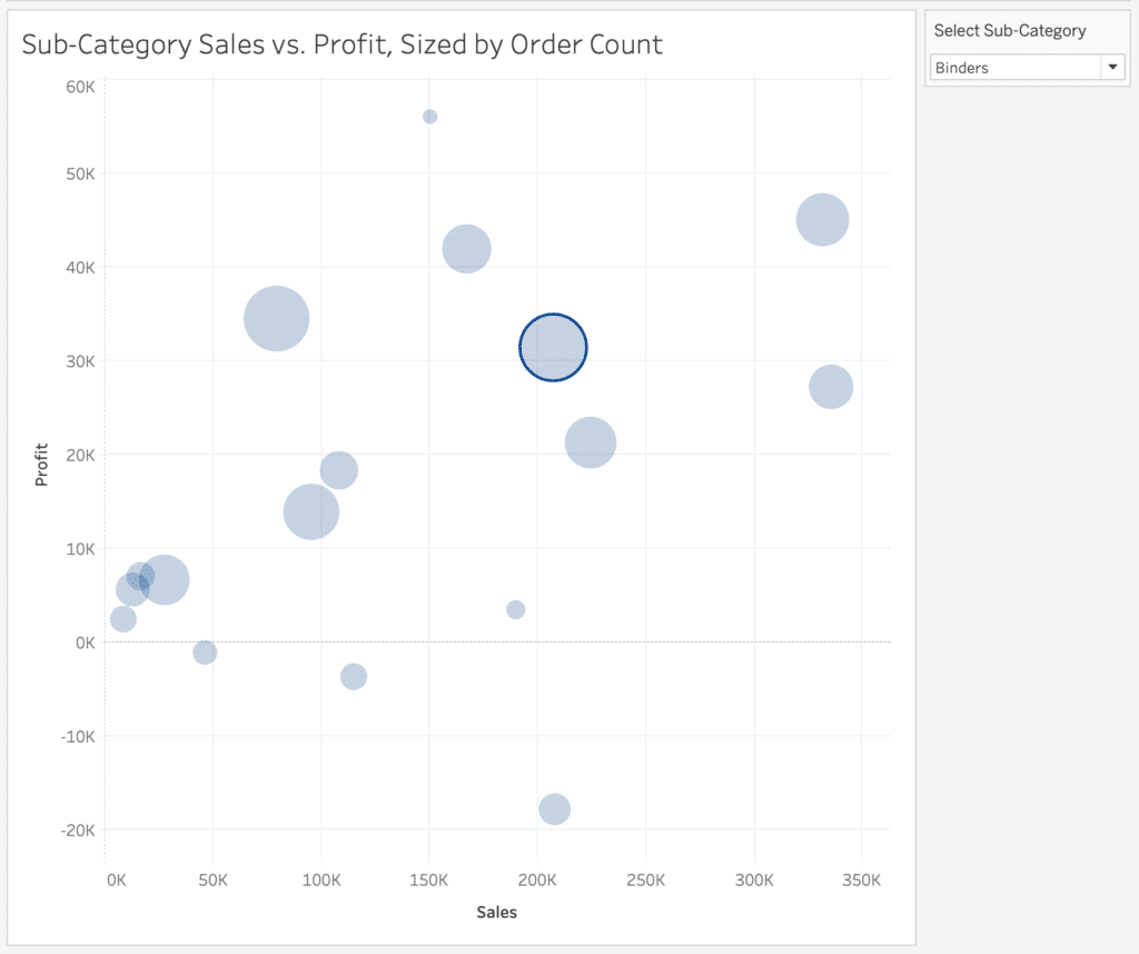
Next, we have the same scatter plot but the enclosure property was added to highlight a selected sub-category. Similar to color, enclosure can be used to quickly spotlight specific dimension members as your eye is naturally drawn to the enclosed mark.
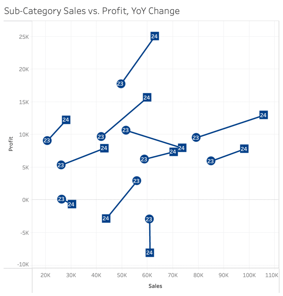
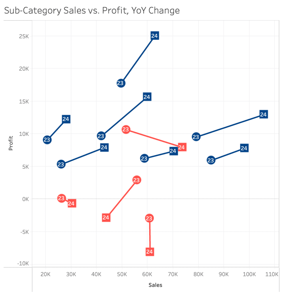
This third plot is a connected scatter plot that still compares profit vs. sales at the sub-category level, but year was added as a shape attribute. By adding this additional form property, we can easily identify which sub-categories had decreased profit YoY, and whether sales increased or decreased as well.
Position, another property of the form attribute, is inherently reflected in all of the above scatter plots. Typically the data being used is what defines this property. For example, you cannot change the x-y coordinate of a point on a scatter plot without changing the underlying data, and oftentimes groups or clusters of points may naturally appear on a scatter plot. These are important insights that are highlighted by form as an attribute, as your eye tends to catch marks with unique positions first, like outliers and concentrated groupings.

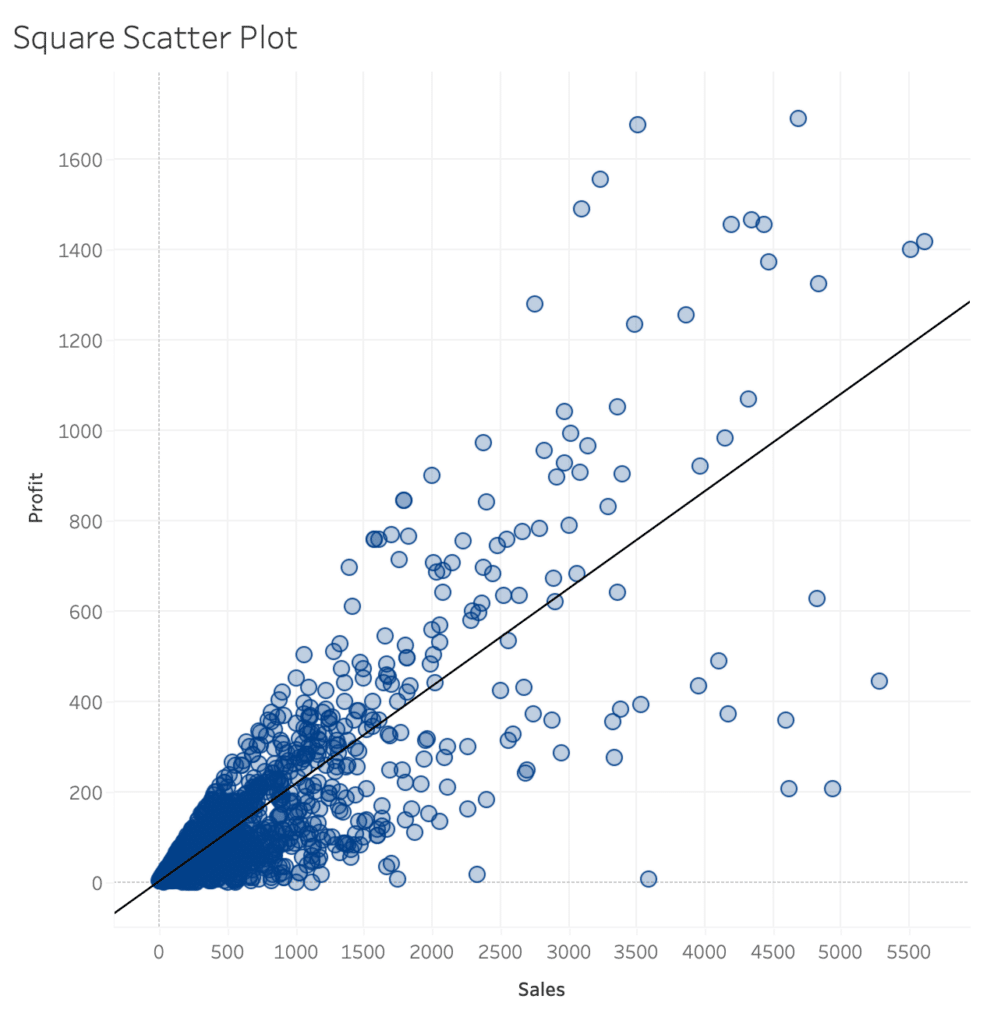
Position can be controlled to ensure these insights are accurate. In general, scatter plots should be square in shape so any correlations are not misrepresented, and it’s important to take axis ranges into consideration with any chart type so trends are not exaggerated. You can see the trend lines appear different on the two below scatter plots, when in reality they are exactly the same.
At a more global level, position is a very important attribute when designing a dashboard, grouping certain visuals together and creating an overall hierarchy for user experience.
Applying Gestalt Principles to Dashboard Design
When to combine preattentive attributes
Now that we have reviewed when and why to use the color and form preattentive attributes, I am going to share a few examples of situations that benefit from combining multiple attributes, or double-encoding. While this can be helpful at times, it’s important not to overload your visuals and detract from the intended message.
Data-Ink Ratio and How to Apply it in Tableau
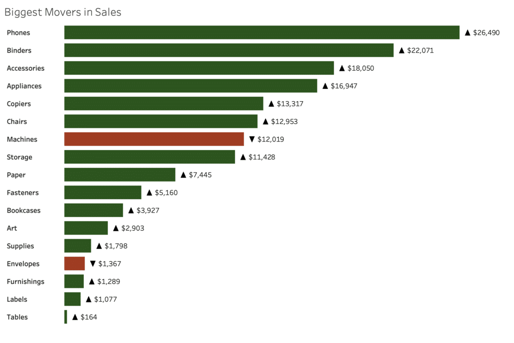
Double-encoding can be a powerful tool when kept simple and used for a specific purpose, such as accessibility. Take the below chart showing the biggest movers in sales, which is colored by positive or negative change value. While red and green are the go-to colors for good/bad respectively, they are also the most common colors affected by color-blindness. But we can still make this chart accessible by double-encoding the change values with an up/down triangle shape in the labels. This combination of color and shape does not overwhelm the viewer, and adds a certain value to the chart.
Now I am going to share how a previous example in this post can also be improved by combining color and shape, but without double-encoding. I have added color to the below connected scatter plot, which was using the shape property of the form attribute. Each sub-category is colored by the YoY change in profit, and you can immediately see which sub-categories had a decrease in profit. Note that I chose to color this plot by profit change, not by year. This way I highlighted new information with the color attribute, rather than double-encoding the shape attribute.
If you are interested in more ways to successfully combine attributes, heat maps and density maps are a great example of combining color and size.
How to Make a Heat Map in Tableau
A note on motion
The third and final major category of preattentive attributes is motion. As with color and form, our brains are wired to identify things that are moving differently from other objects within our view. When applied to data visualization, this means we are able to process even subtle differences in the movement between data points extremely well. You may not always think of motion as an option to help you identify and communicate insights, but animation is becoming a staple in modern visual analytics software like Tableau.
![]()
Similar to color, which has the sub-categories of hue and intensity, motion preattentive attributes can be broken up into the two following sub-categories.
- Intensity: How fast are objects moving in relation to each other. For example, this could be used to show the velocity of sales of a certain product.
- Direction: Are certain objects moving against the grain of other objects (i.e. left instead of right or up instead of down). For example, you could animate a connected scatter plot to really emphasis the positive or negative movement of a specific dimension member.
While motion is limited by what software program you are using and obviously cannot be used in static data visualizations or exports, it is worth keeping it in mind as technology continues to improve.
Conclusion
Understanding how and when to use preattentive attributes can help you effectively communicate your message through data visualization and design. Throughout this post we have covered the basic use cases and strengths of different attribute types, but I encourage you to experiment with this knowledge and take your visualizations to the next level.
Thanks for reading,
Megan

Written By
Megan Spengler

Peer Review
Maddie Dierkes
Manager, Decision Science
Related Content
The Benefits of Data Visualization for Data Scientists
At Playfair Data, we have covered dozens of ways to visualize data, and shared our tips, tricks and best practices,…
3 Storytelling with Color Tips to Improve Your Data Visualization

Color is one of the easiest ways to control the style of your data visualization. A good use of color…
Data-Ink Ratio Animation and How to Apply it in Tableau
In his 1983 book, The Visual Display of Quantitative Information, Edward Tufte introduced the concept of the data-ink ratio in…