Tableau Dashboard Examples by Type

Unlock the power of data storytelling with Tableau! My path to leading a data visualization design team might seem unusual, but it’s these former career experiences that shape my passion for creating dashboards that are as purposeful as they are visually impactful. In this post, I’ll break down the different types of Tableau dashboard examples and illustrate how each can transform data into actionable insights.
Note: We hold our clients’ privacy in the highest regard. Therefore, while some examples showcased here are inspired by our original projects, the data, clients, and exact use cases have been thoughtfully masked. This means we’ve carefully adjusted specific details to safeguard our clients’ confidentiality while still presenting the essence of the work accomplished.
FAQs answered in this post:
What is an analytical dashboard and when should I use it?
An analytical dashboard is designed for in-depth data exploration, enabling users to uncover patterns, compare metrics, and formulate insights. Use analytical dashboards when your audience needs to conduct research or ad-hoc analysis rather than monitor pre-defined KPIs. These dashboards update less frequently (daily, weekly, or monthly) and prioritize flexible exploration over real-time monitoring, making them ideal for analysts and BI teams.
How does an operational dashboard differ from other dashboard types?
Operational dashboards focus on real-time monitoring of core processes, updating in seconds or minutes to enable immediate response to issues. They answer “Is everything running as it should?” through clear visuals highlighting urgent problems and triggering alerts when critical thresholds are exceeded. Unlike analytical dashboards that support exploration or strategic dashboards that track long-term goals, operational dashboards demand high-frequency updates and immediate actionability.
What is a tactical dashboard used for?
Tactical dashboards track progress toward mid-term goals, displaying timelines, milestones, and resource allocation to enable course correction. They provide hourly or daily updates on project status, highlighting deviations and triggering alerts when milestones are missed. Tactical dashboards balance real-time urgency of operational dashboards with strategic planning of executive dashboards, focusing on project execution and resource management.
What makes strategic dashboards different from executive dashboards?
Strategic dashboards provide an overview of strategic health and critical metrics for goal setting and resource allocation, updating weekly or monthly. Executive dashboards pre-digest insights for top-level leaders, presenting only critical information needed for steering organizational direction. Both emphasize high-level KPIs, but executive dashboards prioritize impactful brevity while strategic dashboards may include more detailed metrics for planning teams.
How do update cadences affect dashboard design decisions?
Update cadence determines dashboard complexity, alert configuration, and visual design based on how quickly users need to act. Real-time operational dashboards require simpler layouts with prominent alerts, while weekly or monthly executive dashboards can incorporate sophisticated trend analysis. Matching update frequency to decision-making timelines ensures dashboards provide relevant information when users need it without overwhelming them.
How can Playfair Data help design effective dashboards for different audiences?
Playfair Data specializes in dashboard design, user experience, and visual analytics strategy, helping organizations tailor dashboards to specific user needs. Our experts teach Gestalt principles, information design, and audience-appropriate visualization techniques. Schedule a strategy call to learn how our Design Thinking workshops and Design Fundamentals credentials can help your team create impactful dashboards that drive informed decision-making.
Analytical dashboard
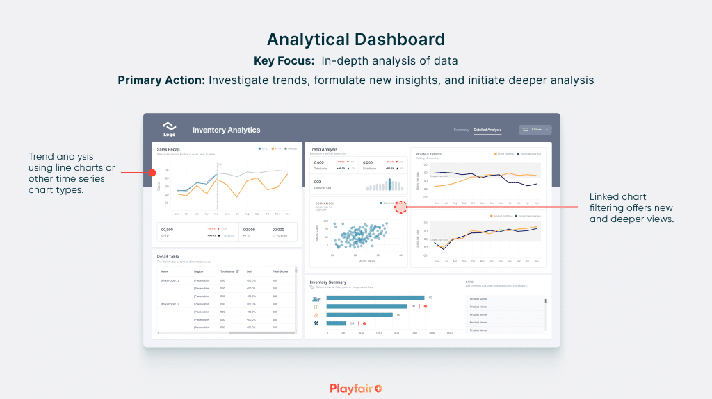
This is the analyst’s workbench, where data transforms into knowledge. My background in architecture taught me the importance of well-structured spaces. To learn about the fundamentals of dashboard design, see our article on Applying Gestalt Principles.
![]()
An analytical Tableau dashboard, like a well-designed room, should allow for exploration and discovery. My product development background drives me to ensure these dashboards aren’t cluttered; they provide the essential tools for analysis without overwhelming the user. Uncover hidden patterns, compare and contrast with precision, and customize to chase down those elusive insights.
- Key Focus: In-depth analysis of data
- Primary Action Focus: Investigate trends, formulate new insights, and initiate deeper analysis
- Update Cadence: Less frequent updates (daily, weekly, or even monthly)
- Alerts & Notifications: May trigger new queries, highlight unexpected findings, or prompt further investigation
Operational dashboard
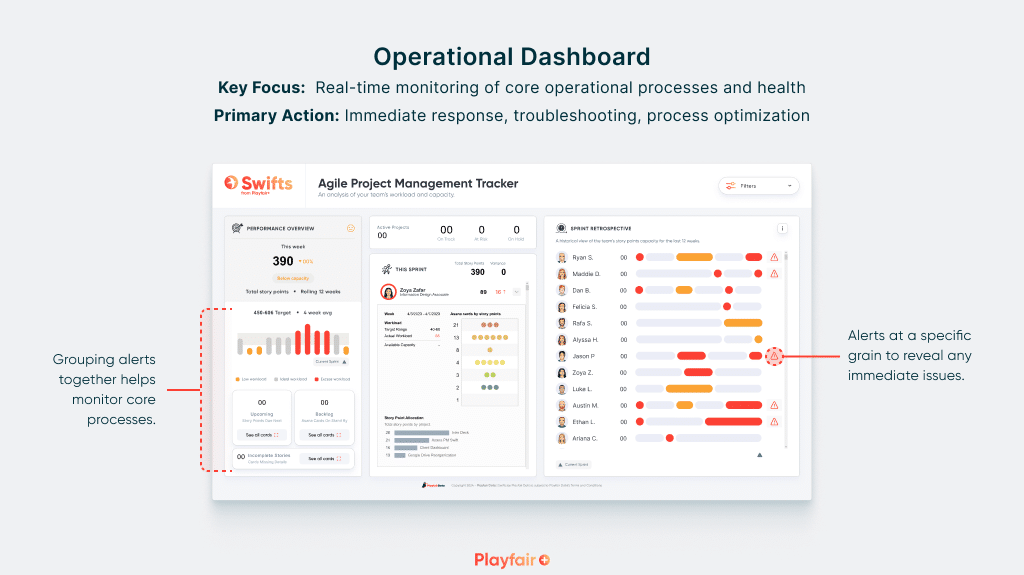
Consider this your central hub for monitoring day-to-day operations. Clear visuals are paired with real-time updates, providing a concise picture of process health. Just like a photographer seeks the perfect focus, an operational dashboard needs to highlight urgent issues with clarity. Check out our article on why dashboard UX matters for more on this concept. Dashboards like these need to immediately answer the question, “Is everything running as it should?”
- Key Focus: Real-time monitoring of core operational processes and health
- Primary Action Focus: Immediate response, troubleshooting, process optimization
- Update Cadence: High-frequency updates (often in seconds or minutes)
- Alerts & Notifications: Critical thresholds exceeded, real-time anomalies detected
Tactical dashboard
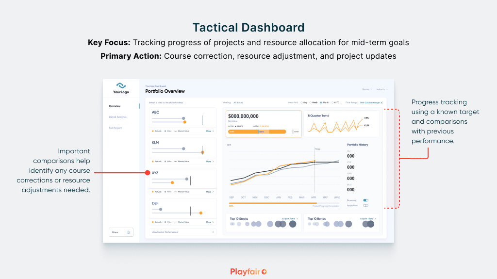
This is the project manager’s compass, charting the course toward successful outcomes. A tactical dashboard should balance visual appeal with intuitive navigation. Timelines, milestones, and resource allocation all find their place here, ensuring insights are readily apparent. Having worked on complex product timelines, I understand that a tactical dashboard must always present the most up-to-date picture of a project’s status. Is your project a well-oiled machine, or are there hidden obstacles ahead? Aspects of this tactical Tableau dashboard example includes:
- Key Focus: Tracking progress of projects and resource allocation for mid-term goals
- Primary Action Focus: Course correction, resource adjustment, and project updates
- Update Cadence: Moderate frequency updates (typically hourly or daily)
- Alerts & Notifications: Milestone alerts, progress-related deviations
Strategic dashboard example
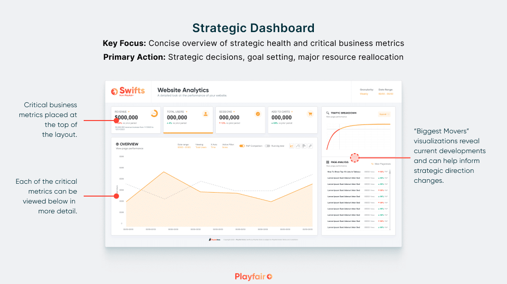
This is where complexity yields to clarity. Distill vital performance metrics into a snapshot that illuminates the path forward for executives. A strategic dashboard should be easily digestible. Trends emerge with sharp focus; those all-important KPIs serve as guideposts for those big-picture decisions.
Continue reading with a free account, or login.
Unlock this tutorial and hundreds of other free visual analytics resources from our expert team.
Already have an account? Sign In
By continuing, you agree to our Terms of Use and Privacy Policy.
- Key Focus: Concise overview of strategic health and critical business metrics
- Primary Action Focus: Strategic decisions, goal setting, major resource reallocation
- Update Cadence: Less frequent updates (typically weekly or monthly)
- Alerts & Notifications: Significant deviations in goal progress or critical KPI thresholds
Streamlining Dashboards: Minimizing Chartjunk with Icon Design
Executive dashboard example
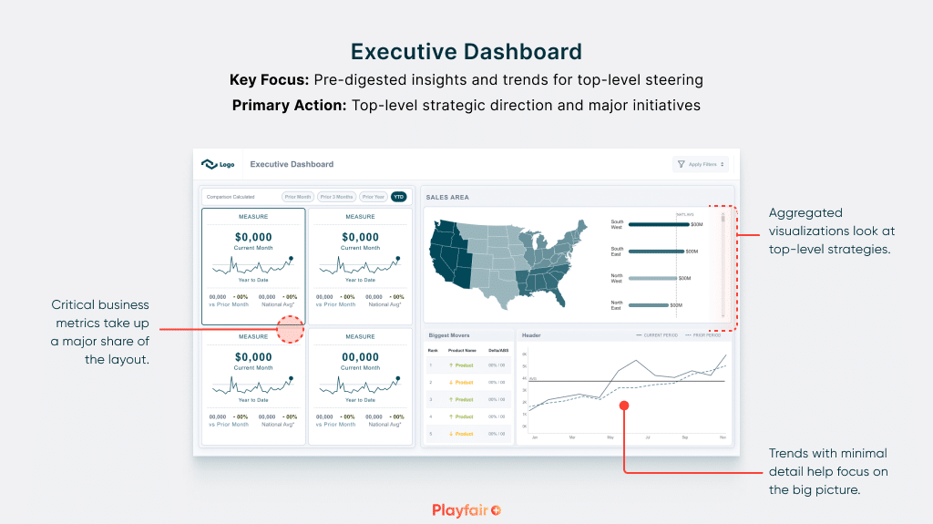
The pinnacle of at-a-glance insights. Finely tailored to display the data that moves the needle for top-level leaders. Each element tells a story, revealing the strategic landscape with impactful brevity – empowering executives to make informed decisions. An executive dashboard must communicate the strategic landscape with immediate impact, empowering leaders to make informed decisions for the organization’s future.
- Key Focus: Pre-digested insights and trends for top-level steering
- Primary Action Focus: Top-level strategic direction and major initiatives
- Update Cadence: Least frequent updates (weekly, monthly)
- Alerts & Notifications: Critical exceptions impacting high-level goals
Whether you’re an analyst seeking hidden trends, a manager ensuring operational health, or an executive steering your company’s future, Tableau dashboards are a powerful tool. By understanding the different dashboard types and tailoring them to your specific needs, you can unlock the full potential of your data and drive informed, impactful decisions.
![]()
I hope my professional learnings and this guide of Tableau dashboard examples empower you to tailor your dashboards for maximum impact within your organization. Remember, the right dashboard can make all the difference in unlocking the power of your data!
Jason

Written By
Jason Penrod

Peer Review
Alyssa Huff
Assoc. Director, Information Design
Related Content
How to Create Better Dashboard Layout Designs with Figma

Being able to apply some basics of dashboard layout design to your visual analytics projects in Figma can bring a…

Ryan Sleeper
Discovery, Descriptive, Prescriptive, and Predictive Analytics Ryan discusses the spectrum of analytics you can do in Tableau, his observations on…
3 Innovative Ways to Use Figma in Your Visual Analytics Projects
What does design software have to do with visual analytics software like Tableau? At Playfair Data, we approach our visual…