3 Creative Ways to Use Transparent Sheets to Add Context in Tableau
As of Tableau Desktop 2018.3, authors can make worksheet backgrounds transparent. This means you can float multiple worksheets on top of each other and still be able to see each individual layer. Transparent sheets in Tableau have unlocked new design possibilities such as floating all worksheets over a custom background image, but they also allow us to improve comparisons and context.
This post will share how to use transparent worksheets in Tableau and three practical applications to help improve your data visualization. You’ll see how to add a trend behind a callout number, a timeline of key events to a line graph, and a custom segmentation to a scatter plot.
This content is excerpted from my book, Innovative Tableau: 100 More Tips, Tutorials, and Strategies, published by O’Reilly Media Inc., 2020, ISBN: 978-1492075653. Get the book at Amazon.
3 Creative Ways to Use Transparent Sheets in Tableau
How to make a Tableau sheet background transparent
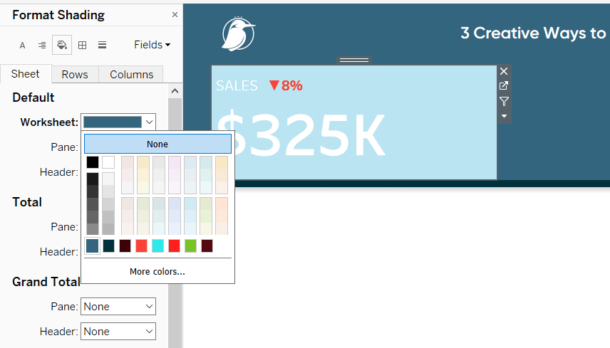
Before I share the three applications, you will need to know how to make worksheets in Tableau transparent so you can see through them to underlying sheets below. By default, Tableau worksheets have a white background, but that white is opaque. So, if you were to float a worksheet with a white, opaque background over a second sheet, you would not be able to see the second sheet.
![]()
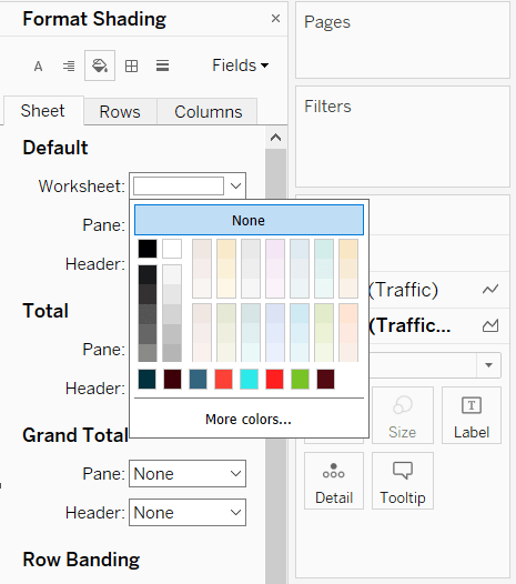
To make any worksheet in Tableau transparent, right-click anywhere within the worksheet and choose “Format”, which will open the Format pane on the left-side of the interface.
Navigate to the tab for shading (the paint bucket icon), then the Sheet tab, and change the first selection which is for the shading of the worksheet. If you choose None instead of the default white, the worksheet will be transparent.
If we were to float this worksheet on top of a second worksheet, we would now be able to see both layers. Note, however, that we would not be able to click or hover over anything on the bottom layer.
I also recommend waiting to make sheets transparent until you are ready to create overlapping layers. Particularly with reverse contrast dashboards (i.e. white on black), the underlying color will help you while you are building the worksheet.
Continue reading with a free account, or login.
Unlock this tutorial and hundreds of other free visual analytics resources from our expert team.
Already have an account? Sign In
By continuing, you agree to our Terms of Use and Privacy Policy.
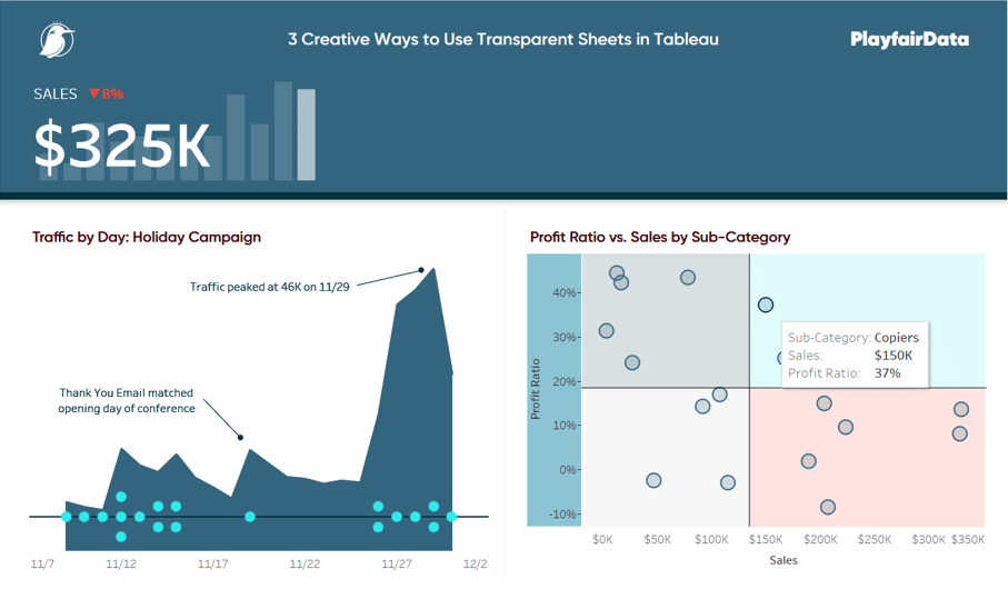
Add context to a callout number by showing a trend in the background
Callout numbers, which are simply key information set with a large font size, are one of my favorite starting points for an analysis. I’ll often list three or four of these along the top or left-side of my dashboard to provide a ‘10,000-foot view’ of what’s happening in the business. My audience can then decide if they want to dig deeper on any of the metrics to find something more actionable.
Transparent sheets allow us to make callout numbers even better by providing a trend in the background.
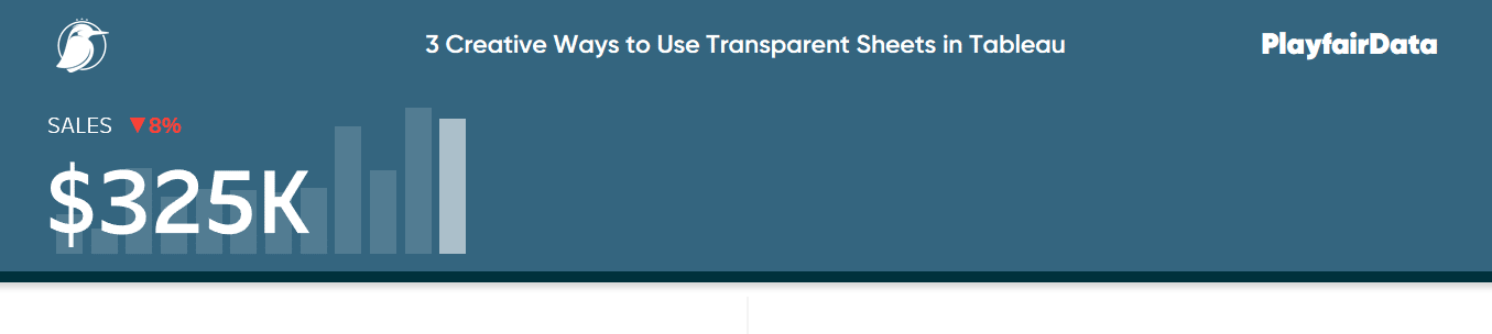
Let’s say that we have this callout number showing the current month’s sales value and the month over month percent change.

For a tutorial on how to make something similar, see Dashboard Element 1: The Current Versus Comparison Index Callout.
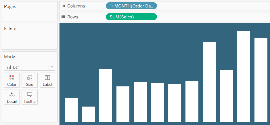
Before we could create transparent worksheets in Tableau, I would put this on a dashboard by itself. While the month over month percent change is helpful, it would be even nicer to see a trend for the last twelve months. Let’s start a second worksheet that looks at sales by month:
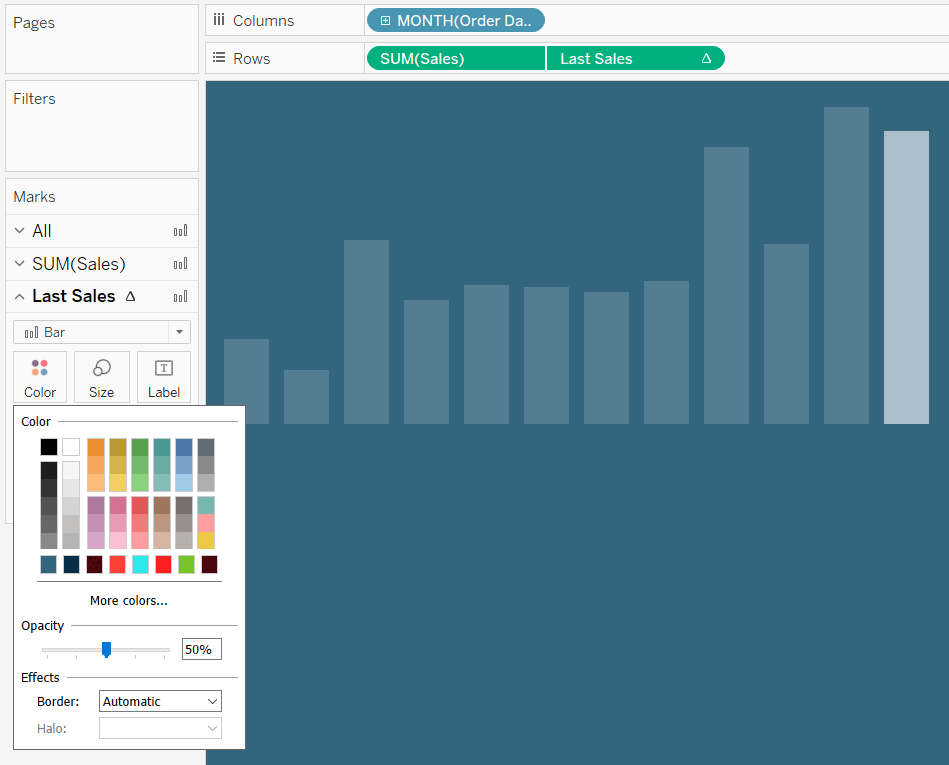
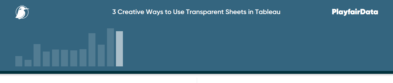
Since this will eventually be behind the Sales callout number, I’ll make the bars just 15% opaque by clicking on the Color Marks Card and dragging the opacity slider to the left:
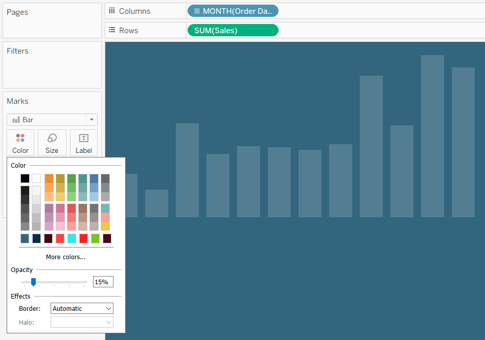
When we changed the opacity, all the bars were updated to the same transparency. It would be a nice touch if we could make the most recent bar highlighted – I’ve got a trick for that!
Create a calculated field to only show the last value on the chart. The formula for Sales would be:
IF LAST() = 0 THEN SUM([Sales]) END
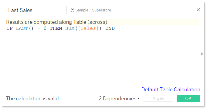
This is a table calculation that says if the difference between the current row and last row in the partition is zero, then show the sales value; everything else will be null.
Tableau Tip: How to Automatically Highlight the Latest Trends
Now that I’ve got the calculated field, I will create a dual-axis combination chart by placing the Last Sales calculated field on the right axis. When there are two measures on the Rows or Columns Shelf, each measure gets its own Marks shelf that can be edited independently of the other. One application of this is I can make the primary bar chart 15% opaque and the last value 50% opaque – creating a highlight effect.
3 Ways to Use Dual-Axis Combination Charts in Tableau
Now we’re ready to put both sheets onto a dashboard. I will put the bottom layer on the ‘canvas’ first:
I will then float the callout number directly over the first layer with the same exact dimensions. You can change the dimensions and X-Y coordinates of a worksheet by navigating to the Layout pane in the Dashboarding interface.
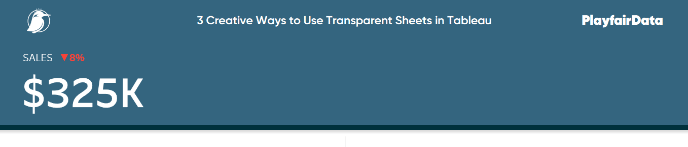
Here’s the issue. When the background of the callout number worksheet is opaque, we cannot see the underlying trend below. As mentioned in the introduction, we now have the ability to make the background of the top layer transparent by right-clicking anywhere within the worksheet and choosing “Format”.
After changing the shading of the Sales callout number to None, we’ve created a nicely designed and practical element at the top of the dashboard!
Transparent sheets in Tableau: Add context to line graphs
I recently shared how to make a timeline in Tableau even when events / marks overlap. One of my favorite applications of a timeline chart is to show my audience when key events occurred in the business that may be impacting performance. As an analyst, I often see large peaks and valleys on trend lines, but they’re rarely accompanied by direct context on what may have caused the changes.
With the ability to make worksheet backgrounds transparent, we can now add a timeline directly to a line graph or area chart to provide that meaningful context. Again, this provides a professional design while also serving a practical purpose.
Let’s say we have added this trend to our dashboard:
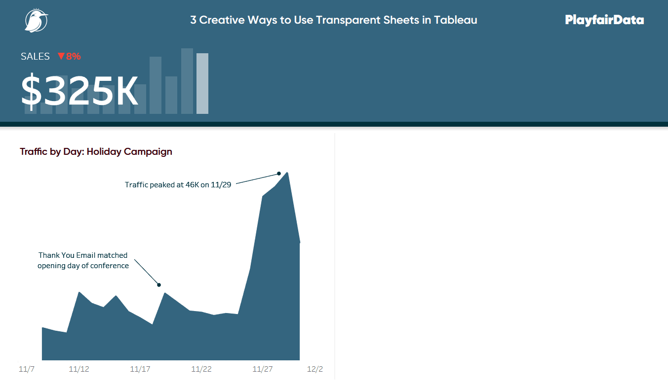
By adding annotations, this trend has already been improved. We see when traffic peaked, which is an alternative way to display the y-axis range, and we also see one bit of marketing context. While this chart is helpful, let’s make it even better by adding a timeline of key events on top of the trend. After all, this chart represents our critical Tableau Conference and Black Friday marketing push, so it makes sense to let our stakeholders know which marketing tactics were in play during this period.
Here’s how the chart looks after adding the jittered timeline view on top of the trend.
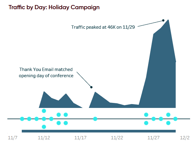
With the timeline layered on top of the trend, my audience can see when key marketing events occurred that may be causing the spikes. Now we can make this more seamless by changing the background of the timeline to None.
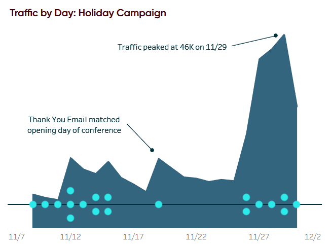
From here, you could color and/or shape the key events by their category and show a guide. But the audience can also get detail about the marketing campaign via the tooltip when hovering over individual marks. The key is they now have context about what’s driving performance directly inline with the traditional chart!
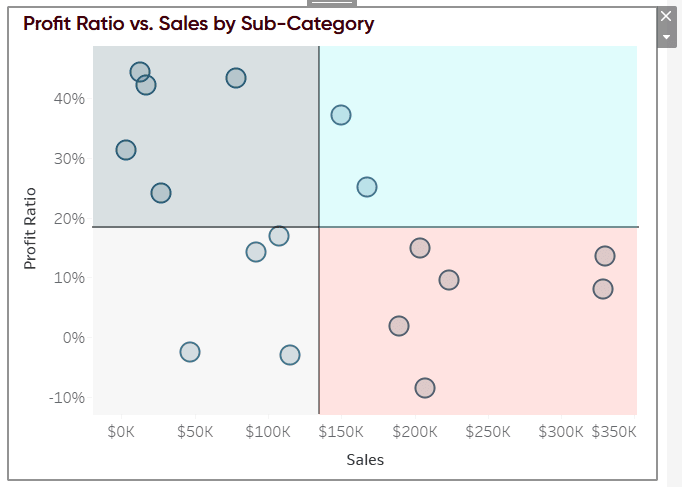
Add context to a scatter plot by coloring quadrants
One of the reasons I like to use scatter plots is they create a natural, four-quadrant segmentation. If you add a reference line on both the y-axis and x-axis, each mark will fall into one of four boxes. This becomes very actionable because each segment has different attributes (i.e. high sales-low profit, high profit-low sales, etc.) which you can treat differently.
I showed you in the post, 3 Ways to Make Stunning Scatter Plots, that you can write a calculated field to color the marks based on which of the four segments they’re in – but what if you want to use the mark color to represent something else? You can change the color above and below a reference line, but you cannot use four different colors.
Now with transparent sheets – we can. This technique works best with fixed size worksheets that have already been added to a dashboard.
First, take a screenshot of the chart and copy and paste the image into PowerPoint or Photoshop.
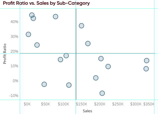
Next, draw a colored square around each area you want represented as a segment. Add transparency to the colors so you can see how they will look on the scatter plot. You can add transparency in Photoshop by clicking on the layer and reducing the opacity of the layer. In PowerPoint, click on the shape and navigate to Format > Shape Fill > More Fill Colors > Transparency.
![]()
Here’s how my image looks after changing the opacity to 15% (or 85% transparency) in Photoshop.
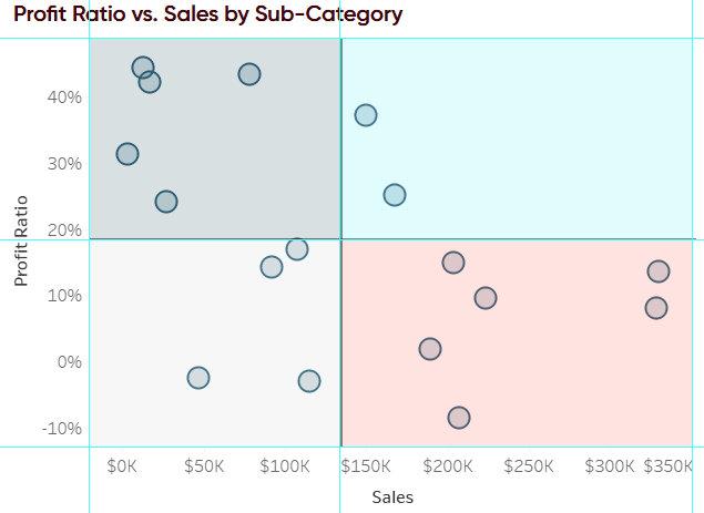
Next, remove the original chart from the view in Photoshop or PowerPoint and save the image. If you save the image as a PNG file type with a transparent background, you can use this image in Tableau as the top layer or bottom layer.
After the image is saved, add it as an Image object to your Tableau dashboard and float it over the scatter plot with its original dimensions. If you saved the image as a PNG file with a transparent background, you will be able to see the underlying scatter plot.
This works visually, but because the image is floating over the scatter plot, you cannot hover over the data points to read their tooltips. If you want to be able to use the tooltips, there are two last steps. First, move the Image object to the bottom layer by selecting the object, clicking the down arrow in the top-right corner of the object, hovering over “Floating Order”, and choosing “Send to Back”.
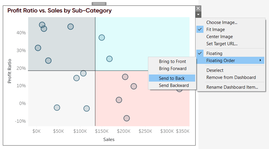
Lastly, as with the first two applications of transparent sheets shared above, make the scatter plot worksheet transparent so you can see the image file that is now below. Now in my final view, I can see my four different segments and hover over marks to read their tooltips.
If you would prefer to make the image a permanent part of the scatter plot, check out 2 Ways to Map a Custom Background Image in Tableau.
Thanks for reading,
– Ryan

Written By
Ryan Sleeper
Related Content
3 Creative Ways to Add Instructions for Your Users in Tableau


When you publish a Tableau dashboard, you want to ensure that every user, regardless of their data literacy, can easily…
3 Ways to Wow Stakeholders with Figma

When it comes to demonstrations, it goes without saying that you want your stakeholders to walk away “wowed.” But what…

Ryan Sleeper
Tips for making Tableau scatter plots more beautiful and functional How to make a scatter plot in Tableau, formatting tips…