Tableau UI Tip 1: How to Create a Custom Top Navigation
In my data visualization mission statement, I mentioned that I constantly try to (1) reduce the time to insight (2) improve the accuracy of insights and (3) increase engagement. Engagement is more than making pretty charts. It is also about providing an intuitive user experience to help your end users find additional value-adding insights. This series aims to provide several ideas and inspiration for improving your Tableau workbooks. These tips will be applicable for Tableau Desktop, Tableau Public, Tableau Online, and Tableau Server. The first tip in this series will show you how to recreate something similar to the Tableau Online / Server interface within your own Tableau workbook by utilizing custom navigation buttons. This is a great technique any time you need to provide an intuitive and professional-looking interface for your end users to navigate between multiple dashboards.
This content is excerpted from my book, Innovative Tableau: 100 More Tips, Tutorials, and Strategies, published by O’Reilly Media Inc., 2020, ISBN: 978-1492075653. Get the book at Amazon.
How to Make a Navigation Bar with Buttons in Tableau
8 characteristics of successful user interfaces
All of the user interface tips in this series attempt to follow the guidelines of Dmitry Fadeyev’s, 8 Characteristics of Successful User Interfaces:
1. Clear – it should be apparent to the end user how the interface will behave.
2. Concise – the data visualization equivalent of removing chartjunk; keep explanations succinct and to the point.
3. Familiar – leverage schemas to make it easier for your users to understand what to do.
4. Responsive – The interface should react quickly / provide feedback when users interact.
5. Consistent – Coach your users through repetitive use of similar elements.
6. Attractive – Balance some design aspects to improve engagement.
7. Efficient – Design the interface in a way that makes it as efficient as possible to achieve the objective.
8. Forgiving – There should be feedback or a means of undoing mistakes made by the end user.
Continue reading with a free account, or login.
Unlock this tutorial and hundreds of other free visual analytics resources from our expert team.
Already have an account? Sign In
By continuing, you agree to our Terms of Use and Privacy Policy.
How to create a custom top navigation in a Tableau workbook
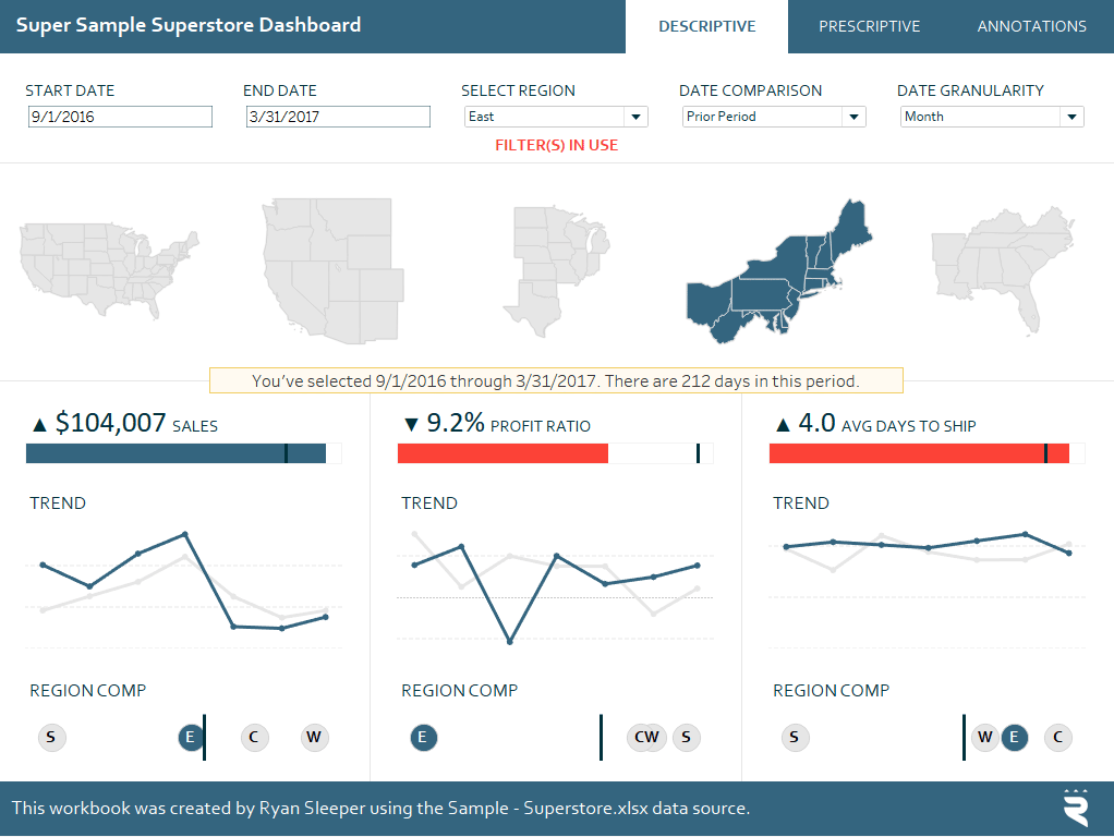
To illustrate the following tip, we will recreate the top navigation pictured in the Super Sample Superstore dashboard:
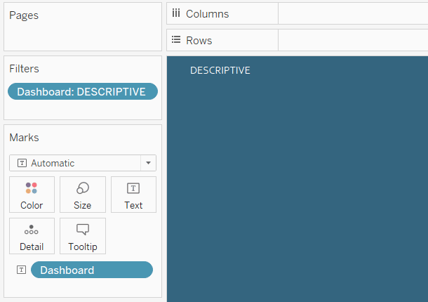
Note that the top navigation is seamlessly integrated with the rest of the dashboard with the active tab turning white, and links to the other dashboards matching the rest of the blue header. This was all created within Tableau Desktop. Most of this technique was done following this approach to making a button in Tableau. The two big differences are that (1) I made an active (colored white) and inactive (colored blue) version of each button and (2) the links are to other dashboards (not an external webpage).
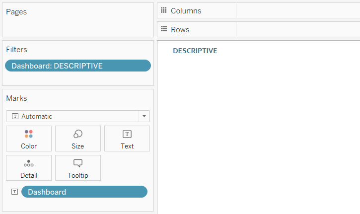
The link in the preceding paragraph shows you how to make a button using a calculated dimension with whatever text you want to display on the button, so I will show you a slightly different approach now. The Super Sample Superstore dashboard has a dataset for the table of contents. The dataset started with one column for “Dashboard”, with the dimension members being the names of the dashboards (Annotations, Descriptive, Prescriptive, Predictive).
In this case, I set up a separate data source to keep elements not tied to the main data source in a non-cluttered place of their own. While I gain some clarity while I’m authoring in Tableau, it may be considered a drawback to some to have these multiple data sources. This approach works whether you build the buttons in one data source or have a data source that includes the table of contents. If using the latter approach, you can make a button by (1) dragging the dimension that contains the dashboard names to the Text Mark Card and (2) filtering the view (using the same dimension) to only the name you want included on the button.

From here, format the button to your liking. As you can see in the image above, I chose blue text and a white background for the active version of the button. You can change the formatting via the Text Marks Card and by right-clicking on the view and choosing “Format…”.
Repeat these steps to make an inactive version of the same button.

Once you have created an active and inactive button for each dashboard you want to link to, you are ready to place the buttons. I’m on Team Floating because I prefer the precision it provides, but you could also tile the buttons or put them in a floating layout container. Whatever your approach, you should end up with one active button on each dashboard, and inactive buttons for the remaining links.

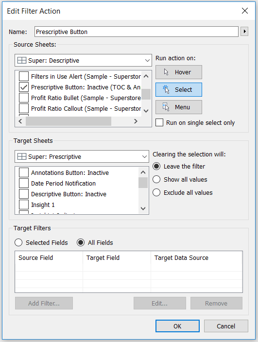
From here, it’s simply a matter of adding the links, which is accomplished with Tableau dashboard actions. The active button on each dashboard will not have any action added to it because it won’t do anything if clicked (i.e. you’re already on the active dashboard). The remaining buttons should get a Filter dashboard action added to them. The trick with these dashboard action is that you will change the target sheet to the destination dashboard and uncheck all the sheets on the target sheet. Here’s how the dashboard action looks for the inactive “Prescriptive” button.

By unchecking all the individual sheets on the destination dashboard, clicking this “filter” link will simply bring the user from the active dashboard to the target dashboard without changing anything on the view. After adding these buttons in a consistent manner at the top of every dashboard and adding the respective dashboard actions, you will have a seamless, professional-looking interface in your own Tableau workbook.
An interface like this works in Tableau Desktop, Tableau Reader, Tableau Public, Tableau Online, or Tableau Server. When publishing to Public, Online, or Server, be sure to “Show sheets as tabs” or the cross-dashboard links will not work.
Thanks for reading,
– Ryan
Related Content
The Definitive Guide to Buttons in Tableau
The Button. Seemingly simple — yet so powerful. As humans, we are well versed in buttons and have been trained…
Ryan Sleeper
Multiple Options for Navigating Users Between Dashboards and Webpages How to (1) use the Button or Navigation dashboard object introduced…
Ryan Sleeper
Dynamically change images in a navigation to highlight choices Ryan shares an innovative technique for highlighting dashboard selections in Tableau.…


