Year in Review / Top 10 Tableau Tutorials of 2018

Thank you for your support in 2018. This time of year is always a time of reflection for me, and one consistent theme I’m grateful for – and which I’ve come to realize is the single biggest-driving force behind my career – is you: the community. Your support has not only inspired me, it has made it possible for me to grow personally. You have forced me to sharpen my skills by teaching and challenged me to provide better solutions. So Thank You.
Each year, I ask how could the next possibly be better, but 2018 included more huge updates: (1) I rebranded my analytics consulting agency, Ryan Sleeper LLC, to Playfair Data, (2) we launched Playfair Data TV (later updated to Playfair+), a premium online Tableau video training resource, (3) my book Practical Tableau was published, and (4) I had the opportunity to speak at 8 Tableau user groups across the US, Canada, and England. And, of course, I released more content! 41 blog posts and 50 videos to be exact.
As a small token of my appreciation, I’m sharing my top ten posts and some statistics from my blog. My hope is that this content helps you in your Tableau journey, and that my observations provide some insight into the current state of the Tableau / analytics community. I’ll close the post by previewing even more announcements coming in 2019.
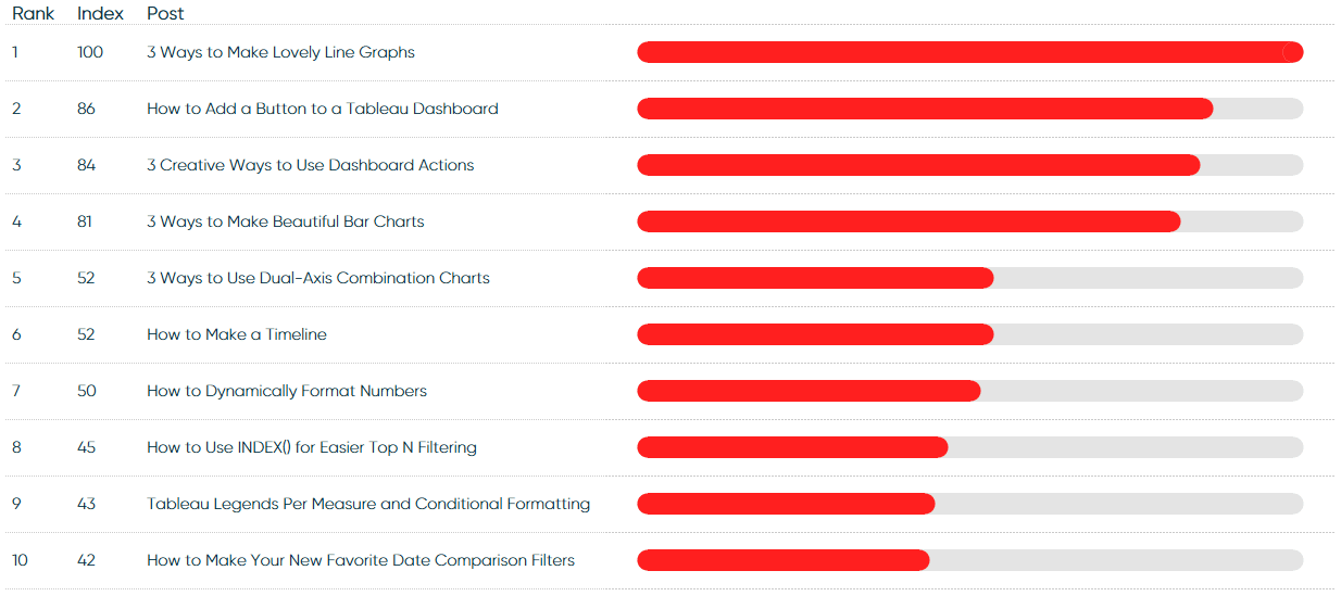
Top 10 overall posts of 2018
The following were my ten most viewed blog posts of 2018 (Jan 1 – Dec 13). They are sorted based on a 100-point index scale. The top post receives a score of 100; the formula for the number next to each post is: (the number of reads of the post / the number of reads of the most-read post) * 100.
3 Ways to Make Lovely Line Graphs 100
This post shares three ideas for making your Tableau line graphs more engaging including formatting tips and two ways to use a dual-axis.
How to Add a Button to a Tableau Dashboard 86
This post shares a simple way to improve your end user’s experience by adding a button to a Tableau dashboard. This button can link anywhere on the web.
3 Creative Ways to Use Dashboard Actions 84
How to use sheets as filters, embed videos in dashboards, and do Google searches from dashboards – all using Tableau dashboard actions.
3 Ways to Make Beautiful Bar Charts 81
This post shows how to make bar charts more engaging by using Tableau formatting, axis rulers to set a baseline, and a tutorial for making capped bars.
3 Ways to Use Dual-Axis Combination Charts 52
This post will show you how to make dual-axis combination charts – or combo charts – in Tableau and three different ways to use them.
How to Make a Timeline 52
This tutorial shares how to make a timeline in Tableau and how to add an optional reference line to display the current day.
How to Dynamically Format Numbers 50
This post shares a way to dynamically display an integer, percentage, or currency format based on what measure is being displayed on a view.
How to Use INDEX() for Easier Top N Filtering 45
This post provides a very quick tip that I sometimes use to make my filters easier to manage and more predictable.
Tableau Legends Per Measure and Conditional Formatting 43
This post discusses the legends per measure feature in Tableau and how to conditionally format in Tableau like you can in Excel.
How to Make Your New Favorite Date Comparison Filters 42
This post shows you how to compare two date ranges on one axis in Tableau and toggle the date range comparison between prior period and prior year.
Top 10 Overall Posts of 2018 (Visuals)
Top 10 Overall Posts by Pageviews (Jan 1 – Dec 13)
An index score of 100 is given to the most popular post
Learn How to Make Rounded Gauges in Tableau
![]()
Year over Year Change in Top 10 Posts (Jan 1 – Dec 13)
2017 is on the left; 2018 is on the right; the rank corresponds with the rank in the previous chart
![]()
Learn How to Make Dynamic Slope Graphs in Tableau
Top 10 Overall Posts of 2018 (Observations)
- 3 Ways to Make Lovely Line Graphs maintained its position as the number one post year over year. 3 Ways to Make Beautiful Bar Charts, the second most popular post in 2017, fell to fourth. I was encouraged to see both these posts which cover fundamental concepts were in the top five for two consecutive years.
- For the nine of the top ten posts that existed last year, every single one experienced year over year growth of at least 72%. This means that a drop in ranking is reflective of slower growth relative to the other posts, but not reduced interest.
- There was more parity between the posts this year. Last year, the gap between the most popular tutorial and tenth most popular tutorial was 79%; this year that gap was reduced to 58%.
- Only one post published in 2018, How to Use INDEX() for Easier Top N Filtering, cracked the top 10 overall. This is a huge indicator that most views happen after the initial social and email spike (due to ongoing Google searches and improved search engine rankings that come with time).
- How to Add a Button to a Tableau Dashboard was ranked second and had the largest climb within the top 10, even though this workaround has become largely obsolete with the release of the Button dashboard object and Go to Sheet dashboard action released this year in Tableau version 2018.3. I address this new feature in the free, full-length video An Introduction to Tableau Dashboard Actions on Playfair+.
- How to Make Your New Favorite Date Comparison Filters maintained its top 10 ranking even though I released a better approach, How to Normalize Current Dates and Prior Dates on the Same Axis, in 2018. It will be interesting to watch this in 2019 to see if relevancy outperforms post age and the new post is able to pass the older version.
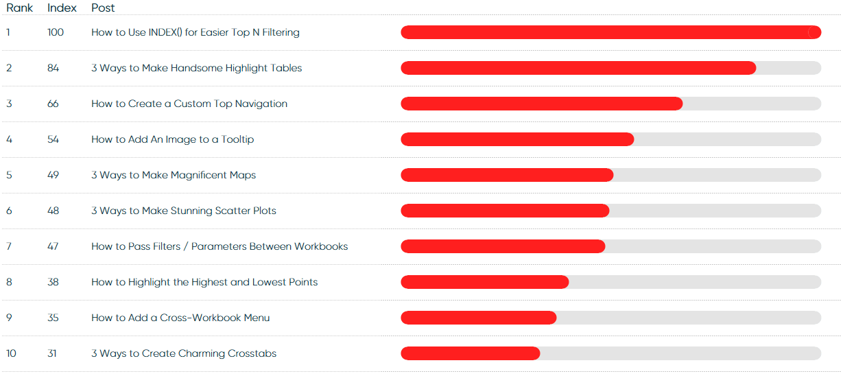
Top 10 new posts of 2018
Being that the Top 10 Overall was largely unchanged and included just one post from this year, here’s a breakdown of only posts that were published this year (Jan 1 – Dec 13).
How to Use INDEX() for Easier Top N Filtering 100
The only post published in 2018 to make it into the top 10 overall.
3 Ways to Make Handsome Highlight Tables 84
Highlight tables are already more engaging and effective than a text table / crosstab view, but this post aims to provide three more ways to make your highlight tables even better in Tableau.
How to Create a Custom Top Navigation 66
The first tip in this series will show you how to recreate something similar to the Tableau Online / Server interface within your own Tableau workbook.
How to Add an Image to a Tableau Tooltip 54
This post shares how to use Tableau’s Viz in Tooltip and how to use this feature to add an image to a tooltip.
3 Ways to Make Magnificent Maps 49
This post will use a map of my top 10 favorite barbecue restaurants to share three ways to take your Tableau maps to the next level. Tips include a formatting trick, instructions for how to unlock additional map styles, and how to create a dual-axis map using a combination of generated and custom coordinates.
3 Ways to Make Stunning Scatter Plots 48
This post will show you how to make scatter plots and we’ll cover (1) a formatting trick to make your scatter plots stand out, (2) the data-ink ratio in the context of scatter plots, and (3) a calculated field that will automatically break your dimension members into four usable segments.
How to Pass Filters and Parameters Between Workbooks 47
This post shows you how to pass filters and parameters between Tableau workbooks on Tableau Public, Tableau Online, or Tableau Server through URL dashboard actions and query strings.
How to Highlight the Highest and Lowest Points 38
This post shows you how to highlight the highest data point and lowest data point on a view using table calculations. This is as much about sharing some technical know how as it is about introducing the important concept of using Tableau to answer business questions automatically for you.
How to Add a Cross-Workbook Menu 35
Sometimes separate dashboards warrant their own workbooks, and your user interface should provide an intuitive way to link those workbooks together. This post shows you how to use dashboard actions to add a cross-workbook menu to a Tableau dashboard.
3 Ways to Create Charming Crosstabs 31
In this post, we’ll cover how to increase the number of columns in a Tableau crosstab, how to make your text tables as flexible as possible, thoughts on maximizing the data-ink ratio, and how to make custom table headers.
Top 10 New Posts of 2018 (Visual)
Top 10 New Posts by Pageviews (Jan 1 – Dec 13)
An index score of 100 is given to the most popular post
Top 10 New Posts of 2018 (Observations)
- There was slightly less parity (a gap of 69% between the top and tenth post) in my posts this year compared to the top 10 overall (a gap of 58% between the top and tenth post).
- All four posts from my “3 Ways” series made it into the top 10, and their rankings go in order from oldest to newest (the older the post the better the rank). This is another indicator of how many of my views come from Google and how big of a factor age is in Google rankings. With three tips in each post, these were also among my longest posts, which is another often-cited major ranking factor for Google.
- Three of the top 10 posts were from my five-part series on user experience. This is indicative of the number of authors creating dashboards for other users, and I take this as a very promising sign.
- The biggest surprise on either list for me is the appearance of How to Pass Filters and Parameters Between Workbooks. This is a user experience I love, but I thought it was much more of a niche use case than it turned out to be.
- Only one tutorial (out of three) covering a new feature, How to Add an Image to a Tooltip, made it into the top 10. I’ve got two ideas on why this is the case: (1) The two posts covering new features that didn’t make it into the top 10 were released later in the year, so didn’t have as much time to build a view count. (2) This provides some support to my theory that the mainstream Tableau author is more interested in fundamentals and/or it takes time for their companies to upgrade the software to access the newest features.
- Out of six strategy posts published in 2018, not one cracked the top 10. This is disappointing as I believe these are my most valuable posts, but people do not know to search for these, and like it or not, Google is my largest traffic-driver. My best-performing strategy post was My Data Visualization Mission Statement.
Coming in 2019
For the last four months I have been working on an overhaul of playfairdata.com, and plan to provide a public update in early 2019. My objective with the new site is to do a better job making all my content and business offerings more cohesive. I will continue to blog, but expect the focus to shift to posts about data visualization strategy and videos that complement the written tactics I’ve shared over the years. I’m also excited to bring in thought leadership and approaches from Playfair Data partner consultants and possibly guest bloggers for the first time.
I’ll also continue to be out on the road hosting public training events and speaking at conferences and user groups. I hope to see you next year – please say Hi!
Thanks for reading,
– Ryan

Written By
Ryan Sleeper
Related Content
Year in Review / Top 10 Blog Posts of 2022


What an exciting year 2022 has been! As we reflect on our top 10 blog posts, it’s difficult not to…
Year in Review / Top 10 Tableau Tutorials of 2021
As we welcome 2022, it is a great time to reflect on the past year. From doubling the size of…
Year in Review / Top 10 Posts of 2017
Thank you for reading this year. Your support means a great deal to me and keeps me more motivated than…