Year in Review / Top 10 Blog Posts of 2022


What an exciting year 2022 has been! As we reflect on our top 10 blog posts, it’s difficult not to also reminisce on the other incredible milestones and memories our Playfair Data team has experienced this year. From continuing to grow our team to beginning construction on our new office in the heart of Lake Nona, FL. It’s been a very exciting year!
As our team continues to experience growth, our individual members also continue to stand out in their own regard as well. From drawing national attention within the data analytics community to maxing out the capacity at the Orlando Tableau User Group’s talk specifically about visual design principles, we have been given some incredible opportunities, all thanks to our diverse and talented team. Along with expanding our team, we have also been hard at work to develop not only new training and dynamic learning content within Playfair+, but we have also been working on some game-changing tools which will soon be available to all active Playfair+ members… But more on that later.
As tradition holds, we will be sharing our top ten posts of the past year along with some observations to provide insight into what the Tableau community has found valuable and where current trends might be heading. To analyze and rank the most popular posts of 2022, we will be following last year’s scoring system, the blog scorecard. Now that we’ve developed this process, just by way of reminder, here is how we measured the performance of this year’s top-10 blog posts:
The blog scorecard explained
The blog scorecard this year consists of three metrics including entrances, sessions, and pageviews. It takes all three metrics into account through the use of Tableau’s native Rank table calculation. Each blog’s rank amongst its peers is summed across each metric into what is called the ‘Blog Score’. The blog with the lowest ‘Blog Score’ is considered to be the best-performing blog.
The top 10 blogs of 2022
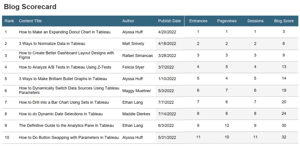
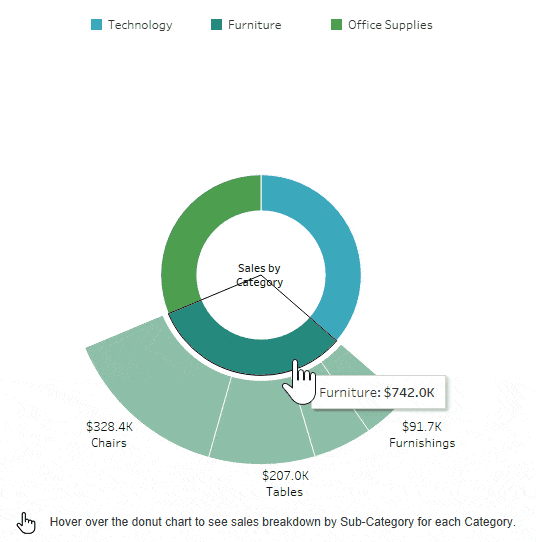
#1 – How to Make an Expanding Donut Chart in Tableau
Author: Alyssa Huff, Sr. Manager, Information Design
Did you know that pie charts have been around for over 220 years?! They first appeared in 1801 in William Playfair’s The Statistical Breviary. (The name Playfair might sound familiar…) While a debate can certainly be had about the merits of pie charts and the donut chart variation, Alyssa shares a fantastic take on an interactive version of a donut chart. By the end of this blog, you’ll be able to create an interactive donut chart that expands to show more detail when a user hovers over one of the slices.
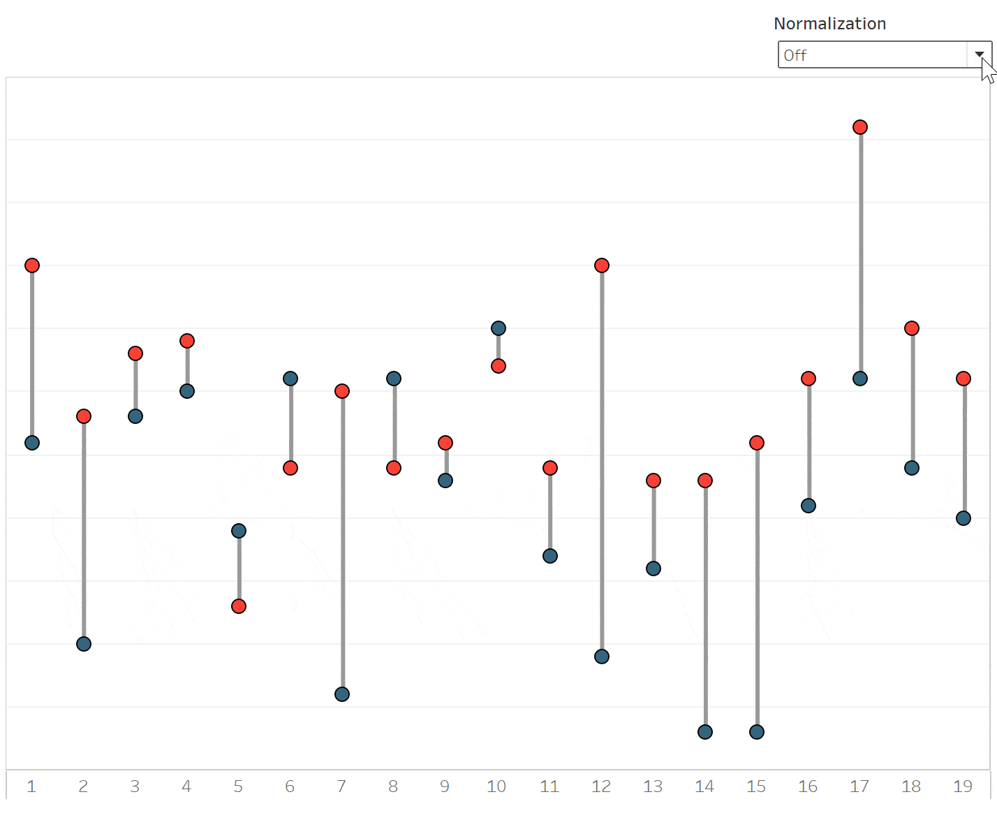
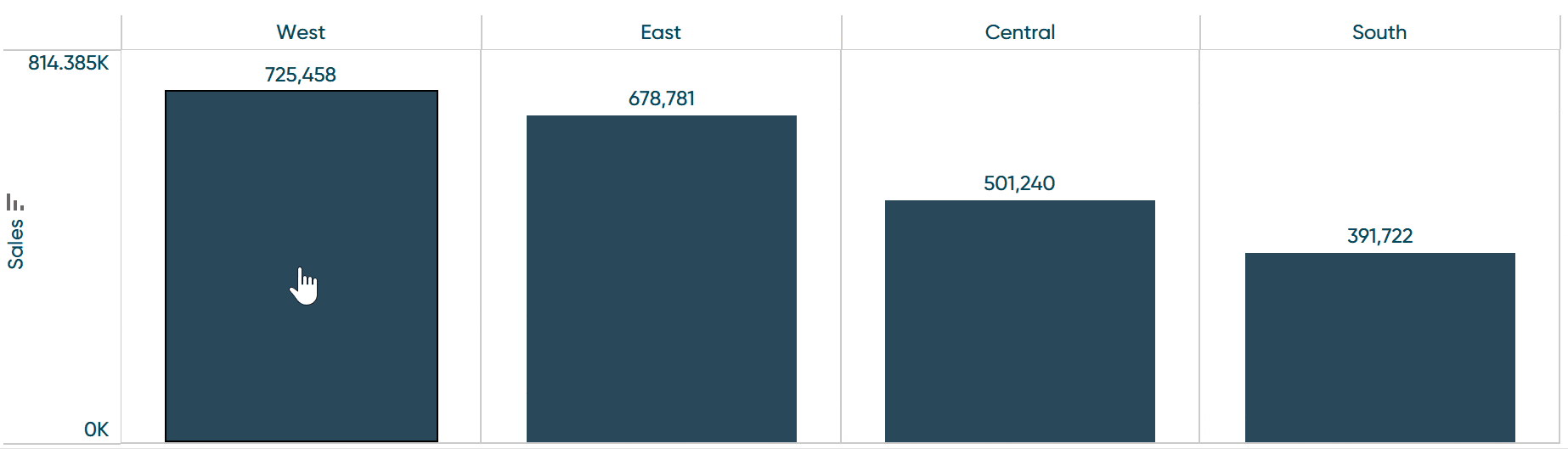
#2 – 3 Ways to Normalize Data in Tableau
Co-Author: Matt Snively, Sr. Manager, Analytics Engineering
Co-Author: Ethan Lang, Assc. Director, Analytics Engineering
![]()
While performing data analysis, you might find yourself needing to transform your data to further unlock some insight. One way to do that is through data normalization, but don’t worry, normalization is just another way of saying standardization. When you’re normalizing data, you’re making an “apples-to-apples” comparison. This can make your data easier to understand, give you more relevant analysis, or sometimes both!
#3 – How to Create Better Dashboard Layout Designs with Figma
Co-Author: Rafael Simancas, Sr. Visual Analytics Architect
Co-Author: Jason Penrod, Director, Information Design
As we look at trends in the visual analytics community, there has never been more emphasis on the user experience than now. A dashboard that is visually appealing but not easy to understand will not perform to its greatest potential. Our job in designing data-rich interfaces is to present the information in a way that expedites the user’s understanding of the data and provides enough interaction to reveal insights that can be acted upon. At the same time, we should strive to create a visually pleasing interface that instills confidence in the information being presented. In this blog, Jason and Rafael share valuable actionables for creating a well-designed user experience.
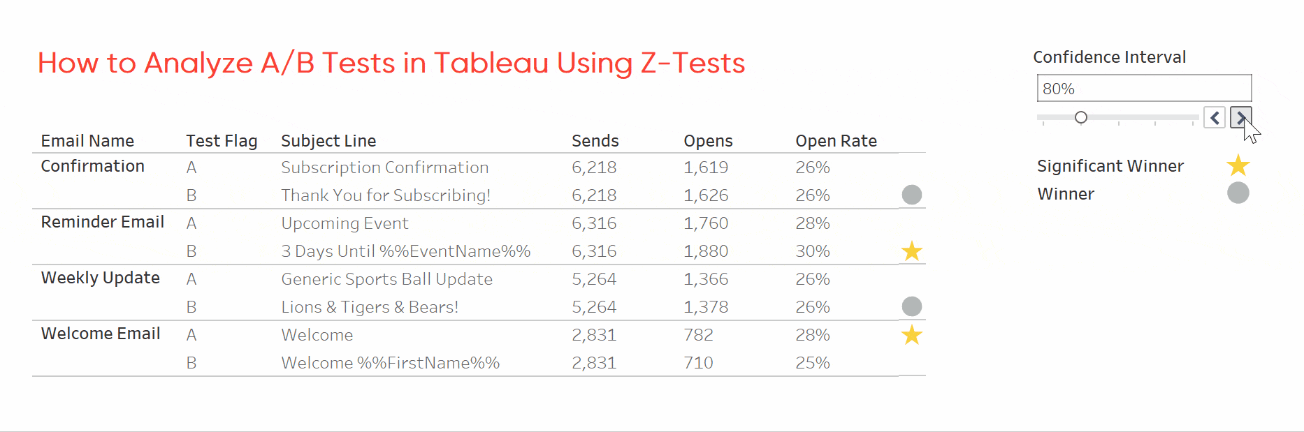
#4 – How to Analyze A/B Tests in Tableau Using Z-Tests
Author: Felicia Styer, Assoc. Director, Analytics Engineering
So, you’ve completed an A/B test; now what? It’s easy to determine which version performed better, but is the outcome statistically significant? In this entry, Felicia lays out how to optimize your workflow beyond calculator testing. When you analyze just a few tests, these calculators will work well. But this method becomes tedious, invites typos, and limits choice as you increase the number of tests to analyze. Building the statistical test in Tableau takes more time upfront but eliminates the tedium and risk of manual entry.
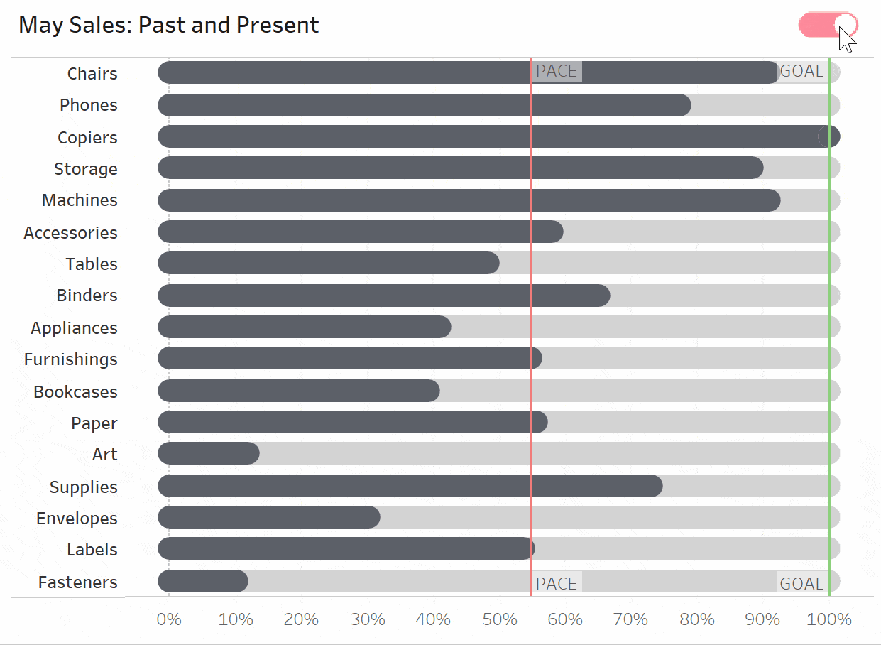
#5 – 3 Ways to Make Brilliant Bullet Graphs in Tableau
Author: Alyssa Huff, Sr. Manager, Information Design
Do you have any goals in mind going into the new year? Maybe someone wants to read 25 books, travel to 5 new places, or learn 10 more Tableau techniques. From a business perspective, this might mean setting sales quotas, app download totals, or ad click-through rate benchmarks. Since we’re talking about setting goals, it’s only appropriate to dive into the ways we can visualize progress throughout the month, year, or beyond. Bullet graphs, pioneered by Stephen Few, offer an easy-to-read way to make comparisons to prior periods or goals.
#6 – How to Dynamically Switch Data Sources Using Tableau Parameters
Author: Maggy Muellner, Sr. Visual Analytics Associate
As an analyst, dashboard engineer, or even data engineer, we are generating more and more data that needs to be analyzed, and sometimes the data can grow to a point where the file size is harming our performance in the Tableau dashboard. In this tutorial, learn how to use parameters to trick Tableau to switch out data sources in the background without the user even noticing the difference. If “optimization” is your word for 2023, this is the blog tutorial for you.
#7 – How to Drill into a Bar Chart Using Sets in Tableau
Author: Ethan Lang, Assoc. Director, Analytics Engineering
There are many instances when we create a dashboard view that makes our users want to dive deeper into the data for more insight. Getting to the level of detail they want can sometimes lead to an overload of information. In this entry, Ethan Lang explains an innovative way to change the level of detail of the analysis while maintaining a friendly user-experience.
#8 – How to do Dynamic Date Selections in Tableau
Author: Maddie Dierkes, Sr. Visual Analytics Associate
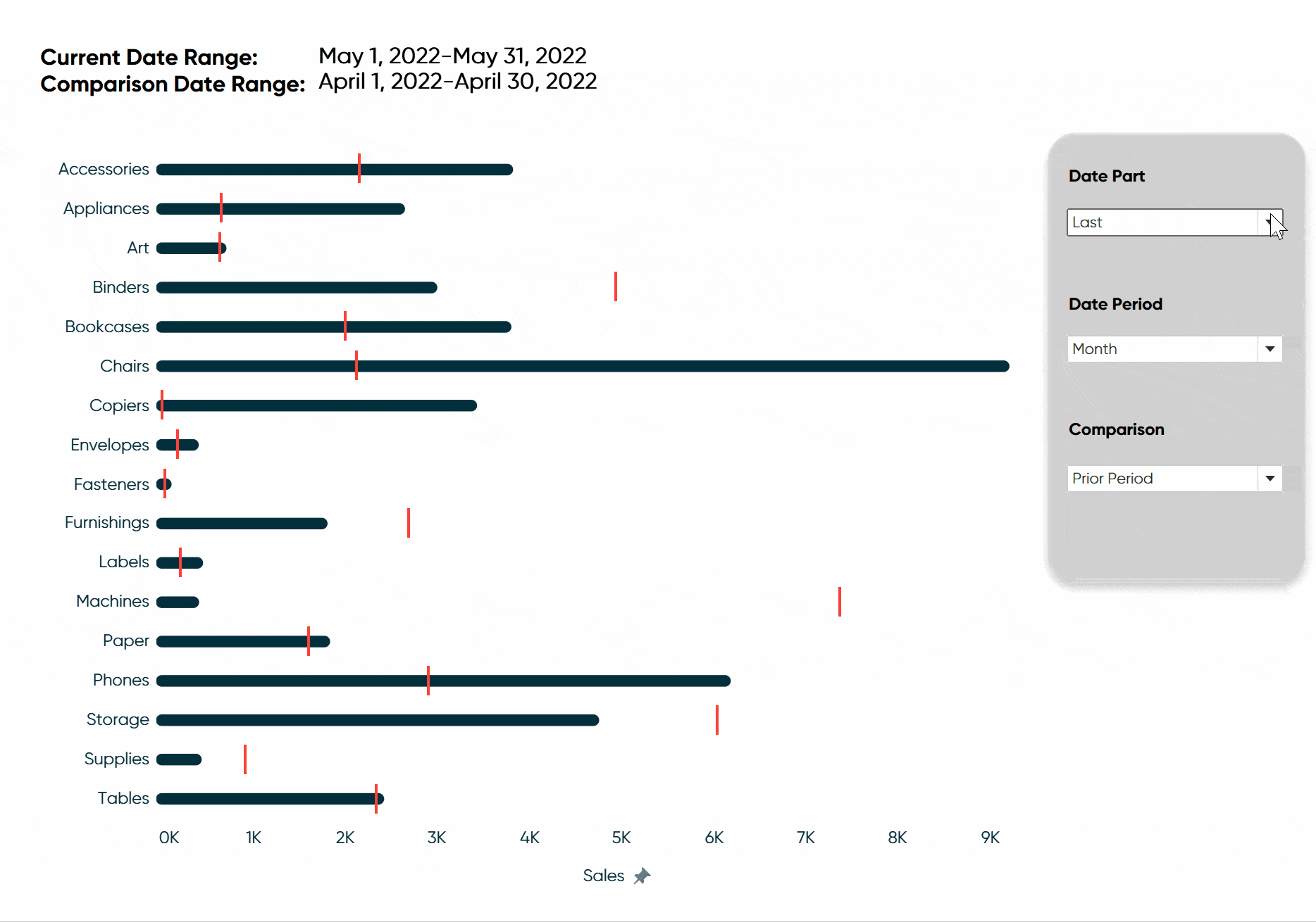
In most business cases, analysis is based on common units of time such as weeks, months, quarters, and years. You may also be asked to compare its performance from previous periods. For example, you may need to analyze the current quarter’s performance compared to the previous. Or possibly you might want to see a year-over-year comparison for the month of July. In this blog, Maddie shares how to create dynamic date selections to help create ease when switching common date units while also giving you flexibility in choosing to compare to the previous period or the same period last year.
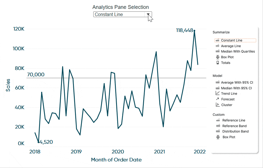
#9 – The Definitive Guide to the Analytics Pane in Tableau
Author: Ethan Lang, Assoc. Director, Analytics Engineering
![]()
Adding statistics to visual analytics can be an extremely powerful way to give our audience more insight into the data and make better decisions. Tableau makes this very easy for us through the Analytics pane. In this tutorial, you’ll find out how to master this tool and learn ways to add visual summarizations or models directly to our data visualizations without a single drop of code.
#10 – How to Do Button Swapping with Parameters in Tableau
Author: Alyssa Huff, Sr. Manager, Information Design
One of the best ways to take a dashboard to the next level is to incorporate interactivity beyond what’s available out of the box in Tableau. One example of this is button swapping, which allows the use of images to filter marks on a view with separate images for the selected and unselected states of each button. If you want to take your user experience skills to the next level in Tableau, this is a great place to start.
Observations of the 2022 blogs
- Ironically one of the most controversial chart types, the pie chart, was far and away the number one blog post. This shows that the Tableau community is still very hungry for more chart type innovation and creativity.
- As usual, our ‘3 Ways to…’ themed blogs posted in 2022 performed exceptionally well with two out of four making it into the top five.
- ‘How to Create Better Dashboard Layout Designs with Figma’ made it into the top 3, which is interesting because this post is all about UI/UX and has nothing to do with technical expertise in Tableau, which leads into our next observation.
- Four blogs that relate to creating a better dashboard user experience made it into the top ten including ‘How to Create Better Dashboard Layout Designs with Figma’, ‘How to Dynamically Switch Data Sources Using Tableau Parameters’, ‘How to Drill into a Bar Chart Using Sets in Tableau’, and ‘How to Do Button Swapping with Parameters in Tableau’. Could this be a sign of what the Tableau community is seeking more of? Should Tableau’s future releases be just as focused on its flexibility with UX/UI as it is with creating technical analysis?
Closing statements for 2022
After such an exciting year, we cannot wait to see what 2023 holds for Playfair Data! Early in 2022, our team began to work on a game-changing set of tools that we can’t wait to share with you! This tool will be available within the next few weeks. To stay up on the latest news, sign up to receive our weekly emails and follow us on LinkedIn, Twitter, Tableau Public, and Instagram for daily updates.
Thanks for coming alongside our team on the journey in 2022, and we will see you in the new year!
– Austin, Dan, and the rest of the team at Playfair Data

Written By
Austin Meyer

Written By
Dan Bunker
Related Content
Year in Review / Top 10 Tableau Tutorials of 2021
As we welcome 2022, it is a great time to reflect on the past year. From doubling the size of…
Year in Review / Top 10 Tableau Tutorials of 2018

Thank you for your support in 2018. This time of year is always a time of reflection for me, and…
Year in Review / Top 10 Posts of 2017
Thank you for reading this year. Your support means a great deal to me and keeps me more motivated than…