Ten Tableau Text Tips in Ten Minutes
This is the fifth and final post in a series about getting the most out of text in Tableau. For earlier installments, see An Introduction to String Calculations, How to Make Automatic Insights, 3 Ways to Create Charming Crosstabs, and How to Show Top 10 Lists in Tooltips.
Got about 10 minutes? I’ve got ten more ideas to share on getting the most out of text in Tableau. As I brainstormed ideas for what to include in this series about using text in Tableau, I was reminded what a powerful role text plays in the practice of data visualization. While I strongly believe that visualization is the most effective way to understand data, text can complement your analyses, provide context, add branding, and much more.
In this post, I’ll share how to incorporate custom fonts, how to align table text like traditional financial reporting, build better callout numbers, conditionally format text, display vertical axis labels, and more. As my favorite clickbait headlines say – you won’t believe number 8 – keep reading! 🙂
Tips for Formatting Text Tables in Tableau
1 – How to install custom fonts in Tableau
While Tableau comes out of the box with tens of dozens of fonts, you can add your own within both Tableau Desktop and Tableau Server. This is a very easy way to set your visualizations apart and/or create your Tableau dashboards within your company’s brand guidelines.
To install custom fonts, simply download and install them onto every computer at your company that has Tableau Desktop installed. The next time you open Tableau Desktop, you will see the newly installed fonts under your text formatting options. If you are using Tableau Server, also install the fonts on the machine running Tableau Server to ensure Tableau can recognize and render the appropriate fonts within published workbooks.
Note that it’s not necessarily Tableau’s fault if newly installed fonts are not rendering properly on Tableau Server. Tableau relies on different browsers to render text properly, and browsers don’t recognize every font. For this reason, it is best practice to pick web safe fonts to better the chances that your end users all have a consistent experience.
If you must get your brand’s font into the dashboard and have it render the same for every user, one sneaky way to accomplish this is to type the text in a different program such as Word or PowerPoint, take a screenshot of the text, and add it as an image within the dashboard. It’s difficult to make this text dynamic (i.e. change based on a selection), but it’s useful in small doses such as adding custom titles to dashboards.
2 – Don’t neglect the set-up
Sometimes we as analysts are so close to the data that we feel the insights we’ve discovered should be apparent to our audience. For this reason, I’ve noticed that dashboard authors occasionally forget to provide context that will help their end users understand how the dashboard will lead to an action. I’m guilty of this myself in much of my earliest work – at times even forgetting to title the dashboard!
I recommend you use the prime real estate at the top of a dashboard to title the dashboard, add some context about what the audience is looking at, communicate the methodology that went into the work, and/or explain how to read the dashboard. These all have their own advantages including engaging the audience, explaining what the audience should be looking for even if you aren’t there to explain it to them, adding credibility, and improving accessibility, respectively.
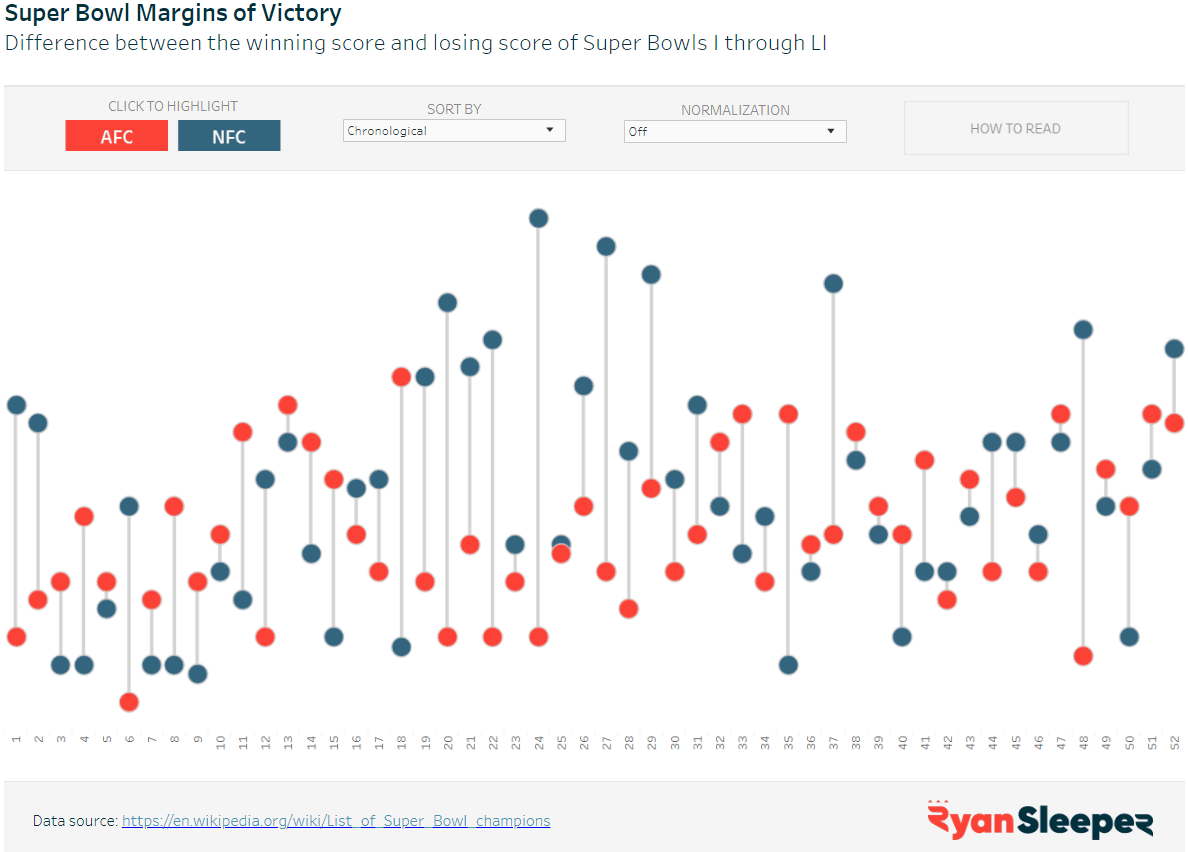
Here’s an example from my portfolio that includes several of these components of a set-up. The title brings the audience in, the sub-title explains what the visualization is about, and the ‘HOW TO READ’ button displays instructions when hovered over. I opted not to include the methodology with this dashboard because I was simply looking at historical Super Bowl scores.
Storytelling Tip: Don’t Neglect the Set-Up
3 – Use font to guide the flow of the analysis
One of the tactics I use to guide my end users through a visualization – even if I’m not there to explain it to them – is font. More specifically, font selection, size, and formatting. For font selection, I try to limit the number of fonts to one or two, and a second font is typically only used if the font selected for the words on the view does not look good when applied to the numbers on the view. Occasionally, I will use a secondary or even tertiary font if there is a special section on the dashboard where I want to call attention.
For font size, I use a hierarchy with larger or smaller sizes to help denote where new sections begin and/or to communicate the relative importance of sections. For example, the title font may be 18 pt; section-headers 14 pt; and annotations or tooltips 10 pt.
The font format is another way to explain how sections are broken up and can also be used to provide instructions. For example, I may bold titles and section headers, but use italic lettering to communicate that the user can use a filter or dashboard action. When you consistently use the same formats as a subtle way to explain the user experience of your dashboards, your users will become conditioned to know how to use them.
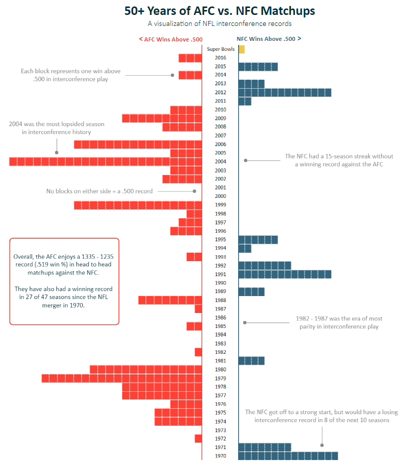
Here’s another example from my Tableau Public portfolio to show how different font sizes and formats were used to help guide the audience. The title was used to immediately engage the audience and let them know what the dashboard was about; the colored chart headers were used to explain how to read the dashboard and doubled as a color legend; and the smaller font was used throughout to annotate different insights.
Continue reading with a free account, or login.
Unlock this tutorial and hundreds of other free visual analytics resources from our expert team.
Already have an account? Sign In
By continuing, you agree to our Terms of Use and Privacy Policy.
4 – How to make callout numbers
Another tactic I like to use to guide the audience is callout numbers – the large numbers that are typically found along the top or left-side of a dashboard. Callout numbers are a great way to share the overall descriptive story in your dashboard, and one of the only reasons you’ll ever find a text table on one of my dashboards. Another benefit is that they are very easy to set up. Simply drag a measure from the Measures area of the Data pane to the Text Marks Card, click on the Text Marks Card and increase the size to something large such as 28 or 36, and ensure all the filters you’re using on the rest of the dashboard are being applied to the callout number’s sheet.
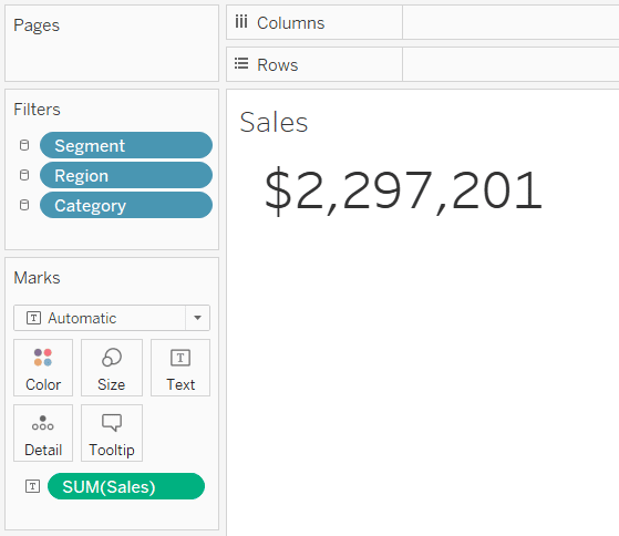
I personally like to build these as individual sheets because it gives me flexibility in how they’re formatted and laid out on a dashboard. However, you can also put multiple measures onto one sheet.
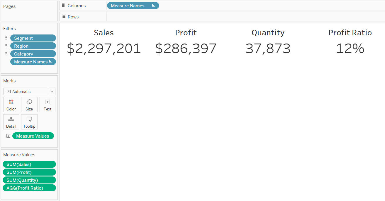
Here’s an example of callout numbers on a live dashboard. Again, the numbers at the top are just describing the situation at a high level; the rest of the dashboard aims to explain why something is happening.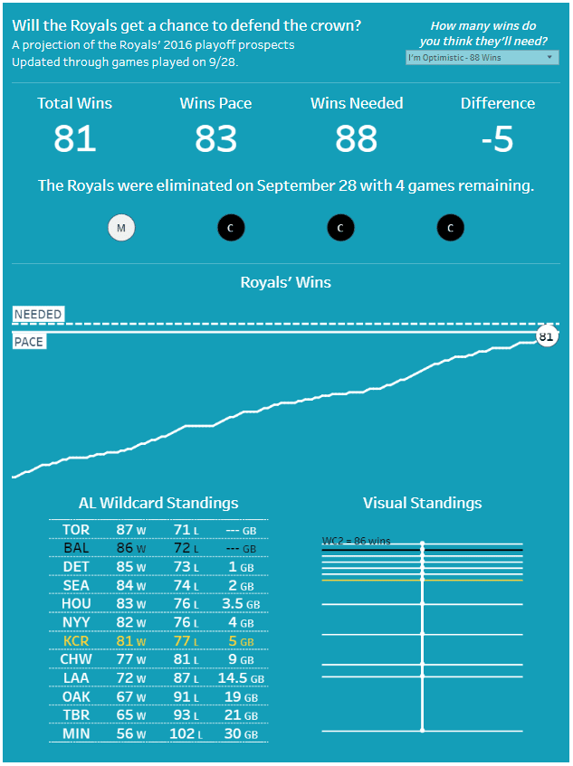
Tableau Dashboard Element: The Current Versus Comparison Callout
5 – How to conditionally format text in Tableau
In corporate dashboards, I typically like to enhance callout numbers with a comparison to either a goal or past performance. I show the callout number, followed by an up or down triangle, followed by the percentage or percentage point change. The tricky part is I will color the triangle and change based on whether it was positive or negative. Here’s an example comparing the current month’s sales (October) to the prior month’s sales (September).

One way to achieve this is to have the text of the callout number on one sheet and the up / down triangle and % change on a second sheet. You would then color the marks of the second sheet by whether the change was positive or negative. But I’ve got a more elegant solution for you that allows you to conditionally format like this within a single sheet and also works to conditionally format tooltips.
First, you have to set up calculated fields for both positive changes and negative changes. I like to make my triangles and percent changes their own measures so I can have different font sizes for each one. This means that I end up with four formulas:
Up triangle
Down triangle
Percent change when positive
Percent change when negative
I use the IIF function within these calculated fields to display the triangle or percent change when the argument within the calculated fields is true; otherwise it displays NULL. The reason we want to display NULL when the argument is false is because we only want the positive or negative calculations to show up one at a time; never both at the same time. The formulas are:
Up triangle
IIF([Report Month Sales]>[Comparison Month Sales],’▲’,NULL)
Down triangle
IIF([Report Month Sales]<[Comparison Month Sales],’▼’,NULL)
Percent change when positive
IIF([Report Month Sales]>[Comparison Month Sales],([Report Month Sales]/[Comparison Month Sales])-1,NULL)
Percent change when negative
IIF([Report Month Sales]<[Comparison Month Sales],([Report Month Sales]/[Comparison Month Sales])-1,NULL)
Once you’ve got the calculated fields, drag all of them to the Text Marks Card of the sheet with your callout number. Then click on the Text Marks Card to format the text. Put the elements in order (up triangle, down triangle, positive percent change, negative percent change), and format them to your liking. I’ve made the positive calculations blue and the negative calculations red.
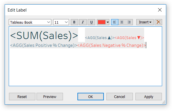
Because of the way we set up our IIF calculations above, only the negative calculations will show up in red when the sales comparison is negative, and only the positive calculations will show up in blue when the sales comparison is positive!
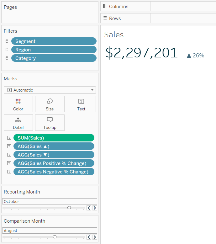
Here’s how the same callout number looks when I compare October to August.
How to Dynamically Format Numbers in Tableau
6 – Format text tables like traditional finance reports by editing aliases
I often get asked to format text tables in Tableau with different levels of indention for certain rows like you might see in an accounting report. It’s important to remember that Tableau does not make spreadsheets; even its crosstabs are ‘visual’ representations of the underlying table of data. This is why you can’t simply click into a cell and modify the value or the formatting for that cell.
If you need to have multiple alignments for your table headers, I have two simple tricks for you. For demonstration purposes, let’s say we want to indent the sub-categories in the Sample Superstore dataset alphabetically. ‘A’ sub-categories won’t have any indention; ‘B’ sub-categories should be indented one tab or about 5 spaces; ‘C’ sub-categories should be indented two tabs or about 10 spaces.
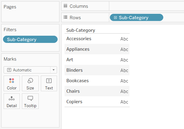
I’ll also filter out the other sub-categories to simplify my table. Please excuse my terrible example here, but imagine the sub-categories are different sub-totals or callouts within your finance table. Here’s what the table looks like by default:
The trick to changing the alignment is to simply right-click on each dimension member, choose “Edit Alias…” and add your leading spaces.
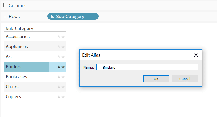
Note this will change the sort order as spaces come before letters when sorting in alphabetical order. This can be updated by clicking on each dimension member and dragging it to the proper row. Here’s how my table looks after changing all the aliases and reordering my dimension members to get my desired alignment.
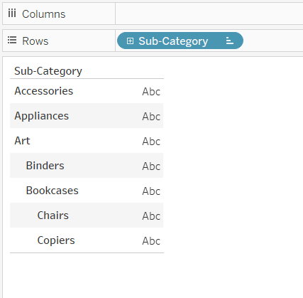
If you are worried about these new aliases showing up on other views within your workbook, you can duplicate dimensions by right-clicking on them in the Dimensions area of the Data pane and choosing “Duplicate”. This will give you two copies of the same dimension, and now you can change the aliases of one but not the other!
The second approach to aligning headers is to add the leading spaces in the underlying dataset. Here’s how an underlying table could look in Excel:
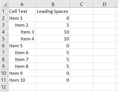
When you create the table in Tableau, the dimension members including the leading zeroes used to align them will be in the table.
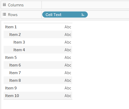
How to Align Text Like Finance Reports in Tableau
7 – How to make vertical axis labels in Tableau
My friends over at Workout Wednesday recently had a weekly Tableau challenge that included rotating the labels of a y-axis on a Tableau chart. By default, axis labels are vertical and must be read from bottom to top as you can see with the word “Sales” in the following sales by category bar chart.
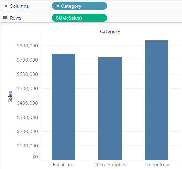
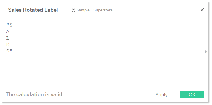
What I liked about the approach I saw in the Workout Wednesday challenge was that the word was still laid out vertically, saving horizontal real estate, but each individual letter was rotated – making it easier to read. To accomplish this, create a calculated field and type out the axis label with hard breaks between each letter.
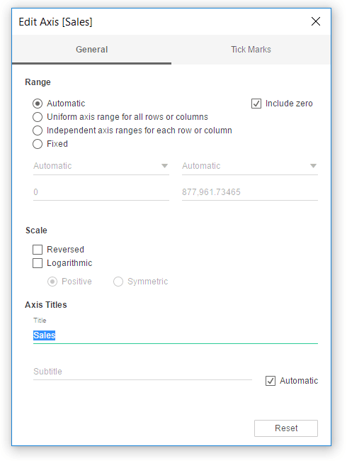
Next, hide the existing axis label by right-clicking on the axis, choosing “Edit axis…”, and clearing out the title.
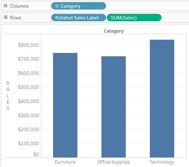
To add the new title with the horizontal letters, place the newly created calculated field on the Rows Shelf.
8 – How to display methodology on a tooltip when the column header is a dimension
One tactic I implement to help build credibility with my audience is sharing the methodology behind an analysis such as how calculations were computed or where the dataset comes from. In my opinion, the best place to display this is directly on a field itself via a tooltip, but Tableau does not allow you to add tooltips to dimensions in a text table. Well, there’s a hack for that.
First, create a placeholder calculated field. It doesn’t matter what number you use, but I always make my placeholders equal MIN(0). The aggregation MIN guarantees that the number won’t be duplicated should you choose to use a number other than zero.
Then make a chart with the dimensional breakdowns you want, but instead of using measures, use the newly created calculated field. To illustrate how this allows you to add a tooltip to a dimension, here’s a table that looks at the Sub-Category dimension by the Placeholder measure.
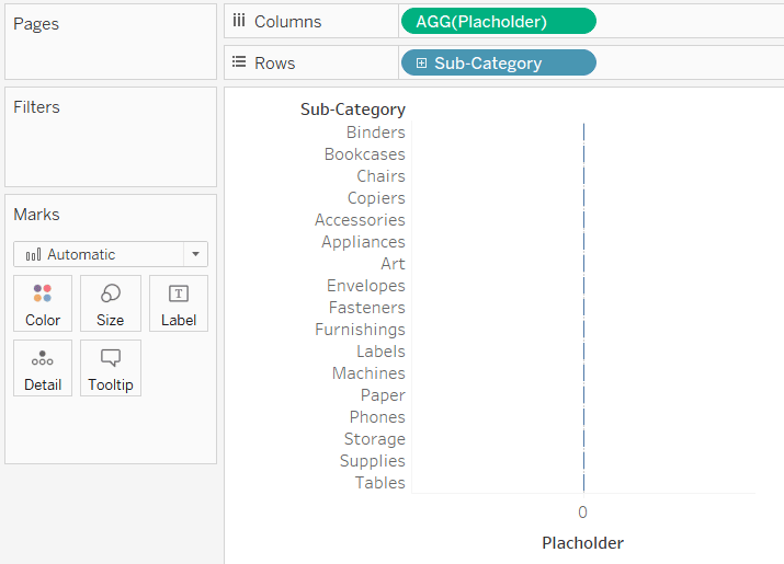
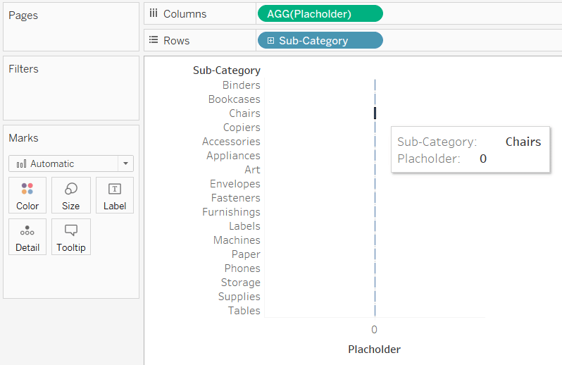
Here’s what I was talking about. If I hover over the sub-category headers, no tooltip is displayed. If I hover over the placeholders (which are measures), I see the default tooltips. Again, you can add tooltips to measures but not dimensions.
Here’s the trick. Now that there is a measure on the view, that measure gets its own set of Marks Cards. I can switch the mark type to Text and place the Sub-Category dimension on the Text Marks Card.
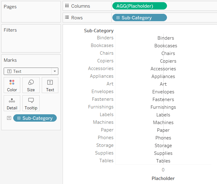
Now the names of the sub-categories are listed even though there is technically a measure of zero displayed on the view. This means we can click the Tooltip Marks Card and add whatever information we want.
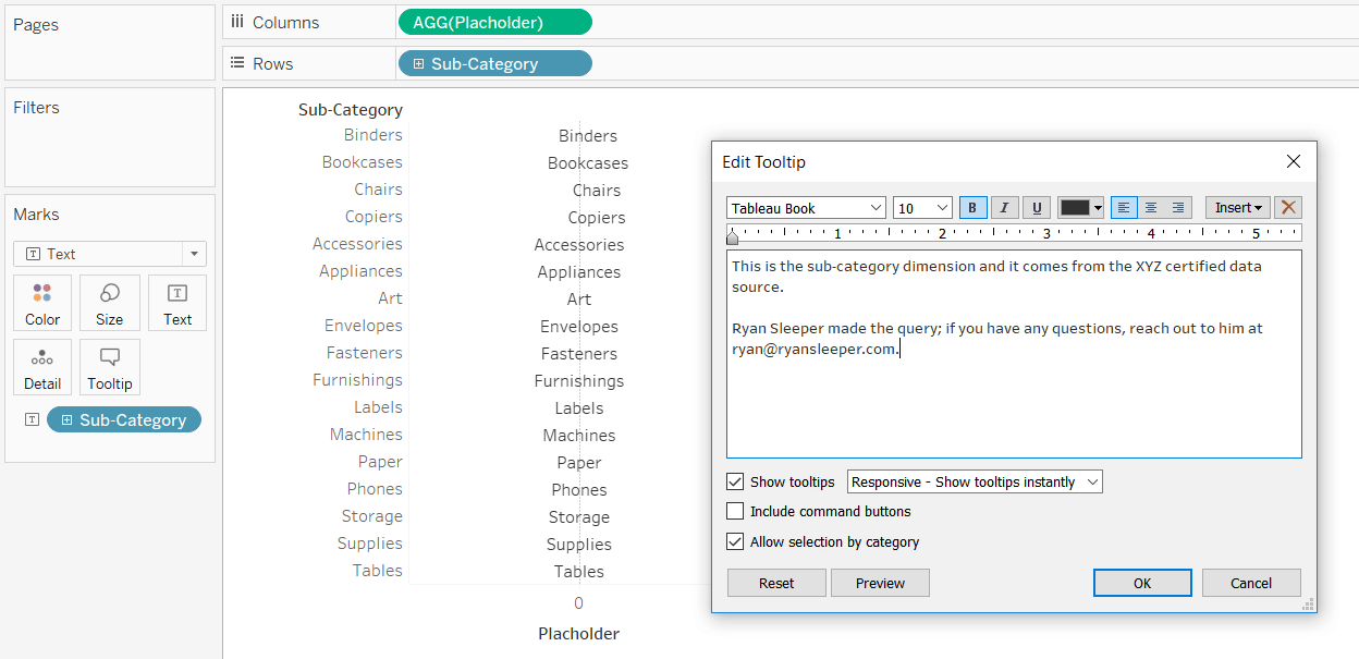
These tooltips can even be dynamic if you want to provide different information for each dimension member. For even better results, change the mark type to Gantt Bar, change the color of the bars to white so they disappear, and use the dimension members as labels. This will help give the text better alignment.
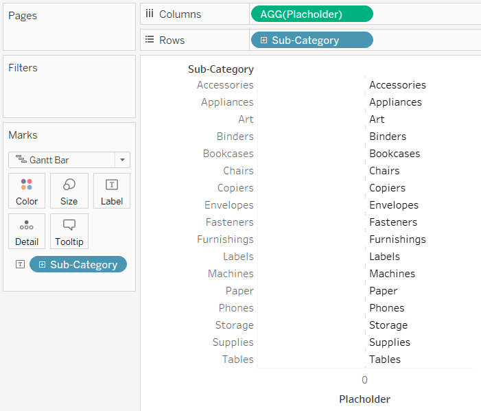
To finalize the table, hide the first column by right-clicking on the dimension on the Rows Shelf and de-selecting “Show Header”. I’ll also hide zero lines, hide the placeholder x-axis, and add another measure to the view to make a bar chart.
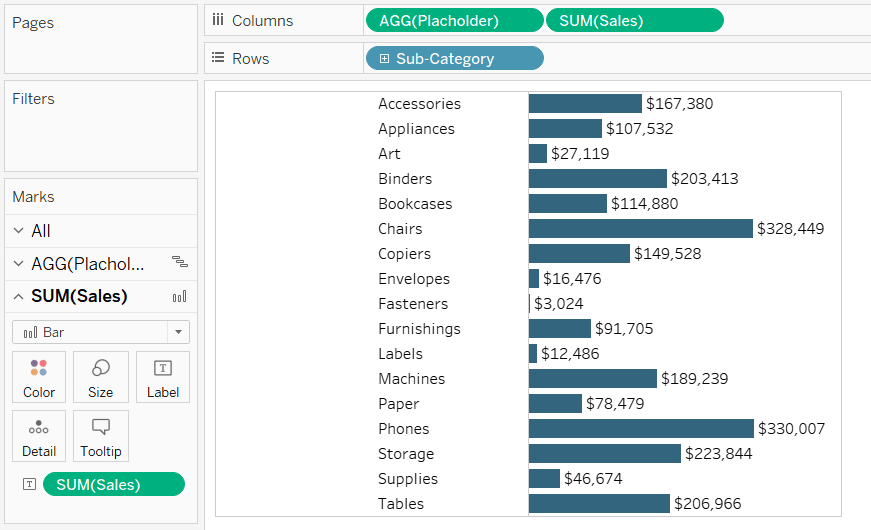
How to Add a Tooltip to a Dimension in Tableau
9 – Don’t neglect the sign-off
Just like the set-up mentioned in the second tip above, the dashboard ‘sign-off’ is an easy opportunity to provide context and add value. I typically leave 75 – 100 pixels at the bottom of a dashboard that can be used to provide links to data sources, add credits, provide information for getting in touch with the author, and/or company branding. All of these help build credibility with your audience and provide a means of support should they have questions.
For an example of a dashboard sign-off, see tip 3 in my series on Tableau dashboard elements, The Signature Line with Data Status Alert.
10 – Don’t use text tables 🙂
I feel I would be remiss if I didn’t close out a series on using text without giving one last plug for the power of data visualization. This series has provided many ideas for leveraging text to provide context, add branding, do string calculations, automate insights, and more – but there is still nothing like preattentive attributes to help us translate complex data to make it actionable.
I hope you’ve enjoyed this series, and remember: A Spreadsheet is Not a Data Visualization and Why You Visualize Data.
Thanks for reading,
– Ryan
Related Content
Ryan Sleeper
Help your audience evolve from spreadsheets to data visualizations How to convert a text table to a highlight table, leverage…
3 More Ways to Overcome the Excel Barrier to Tableau Adoption
Yikes – I’m getting old in Tableau years. This week I clicked on a Tableau Public post I thought sounded…
Ryan Sleeper
Ever wanted to use Tableau like Excel by modifying individual cells on a spreadsheet? This video explains the difference between…
