Year in Review / Top 10 Tableau Tutorials of 2021

As we welcome 2022, it is a great time to reflect on the past year. From doubling the size of our team, moving to a new office in Kansas City, and hosting our first-ever Team Summit, 2021 brought many positive milestones for Playfair Data.
The expansion of our team has given us the ability to continue authoring world-class Tableau blog tutorials and has provided us with new perspectives, a wider variety of expertise, and varying skill levels which has resulted in some of Playfair Data’s best blog tutorials to date. Using Tableau and some of Playfair Data’s own tips and tricks, this post analyzes our most popular blog tutorials published in 2021.
See all new tutorials with Playfair+
The first problem I ran into when starting this 2021 blog analysis was determining which metric would be measured as the most important. Should the blog post that received the most views be considered the best performer, which would lead me to use the Pageviews metric. But would if a blog had the most pageviews while at the same time having the lowest average time on page? That blog couldn’t be considered the most popular because although it received the most overall traffic, it did not retain the attention of the reader. I concluded that when analyzing the performance of these blog posts, there are a handful of different metrics that should be taken into account, all of which are important, none of which should be ignored. My solution to this problem was developing a ‘Blog Scorecard’.
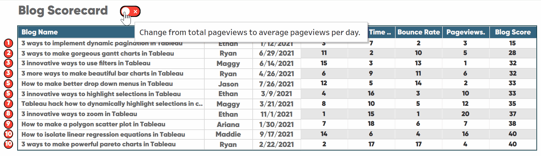
The blog scorecard
The blog scorecard consists of four metrics including exit percentage, average time on page, bounce rate, and pageviews. It takes all four metrics into account through the use of Tableau’s table calculation, Rank Order. Each blog published in 2021 is given a rank for exit percentage, average time on page, bounce rate, and pageviews. The blog’s rank in each metric is then summed into what is called the ‘Blog Score’. The blog with the lowest ‘Blog Score’ is considered to be the best-performing blog.
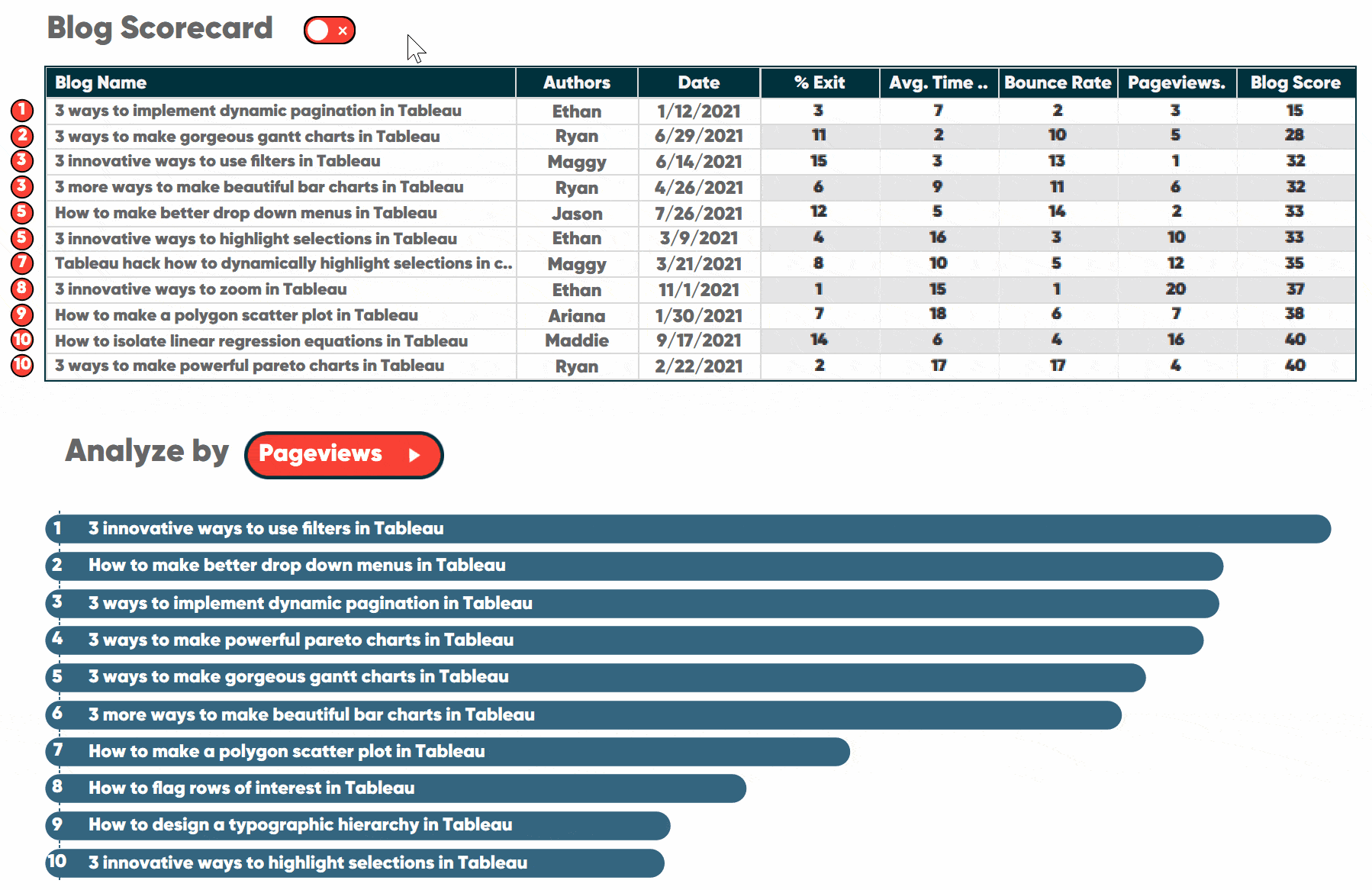
Top 10 overall blogs of 2021
Out of 21 blog posts published in 2021, the following were considered the most popular, according to blog score.
1. 3 Ways to Implement Dynamic Pagination in Tableau
Blog Score = 15
![]()
Ethan shares three different pagination styles, each listed with their own pros and cons as well as some great ideas to improve the UX of a dashboard.
2. 3 Ways to Make Gorgeous Gantt Charts in Tableau
Blog Score = 28
Ryan shares three ways to make Gantt charts more engaging and effective in Tableau.
T-3. 3 Innovative Ways to Use Filters in Tableau
Blog Score = 32
Maggy shares three tricks for using filters in Tableau that will make the dashboard engineering process much easier.
T-3. 3 More Ways to Make Beautiful Bar Charts in Tableau
Blog Score = 32
Ryan shares whether your bar charts should be vertical or horizontal, the easiest way possible to round the ends of bars, and how to make dynamic axes for direct labeling.
T-5. How to Make Better Drop-Down Menus in Tableau
Blog Score = 33
Jason shares how to create drop-down menus that have infinite formatting options and can take on the look of any interface out there.
T-5. 3 Innovative Ways to Highlight Selections in Tableau
Blog Score = 33
Ethan shares how to (1) create a simulated check box using the default shapes provided in Tableau, (2) create a single selection highlight using a bar chart, and (3) highlight multiple rows based on a selection using Gantt marks.
7. Tableau Hack: How to Dynamically Highlight Selections in Connected Scatter Plots
Blog Score = 35
Maggy shares how to create a dual-axis scatter plot that compares a single selected dimension member to a previous time period as well as some helpful design tips that will take this tactic and others to the next level.
8. 3 Innovative Ways to Zoom in Tableau
Blog Score = 37
Ethan shares three ways to incorporate zoom functionality in Tableau as well as an introduction to formatting tips that add professional polish to these techniques.
9. How to Make a Polygon Scatter Plot in Tableau
Blog Score = 38
Ariana shares how to build a Polygon Scatter Plot in Tableau, including how to structure your data and how to develop the chart in your workbook.
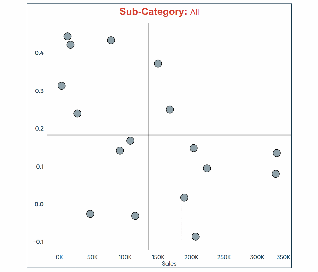
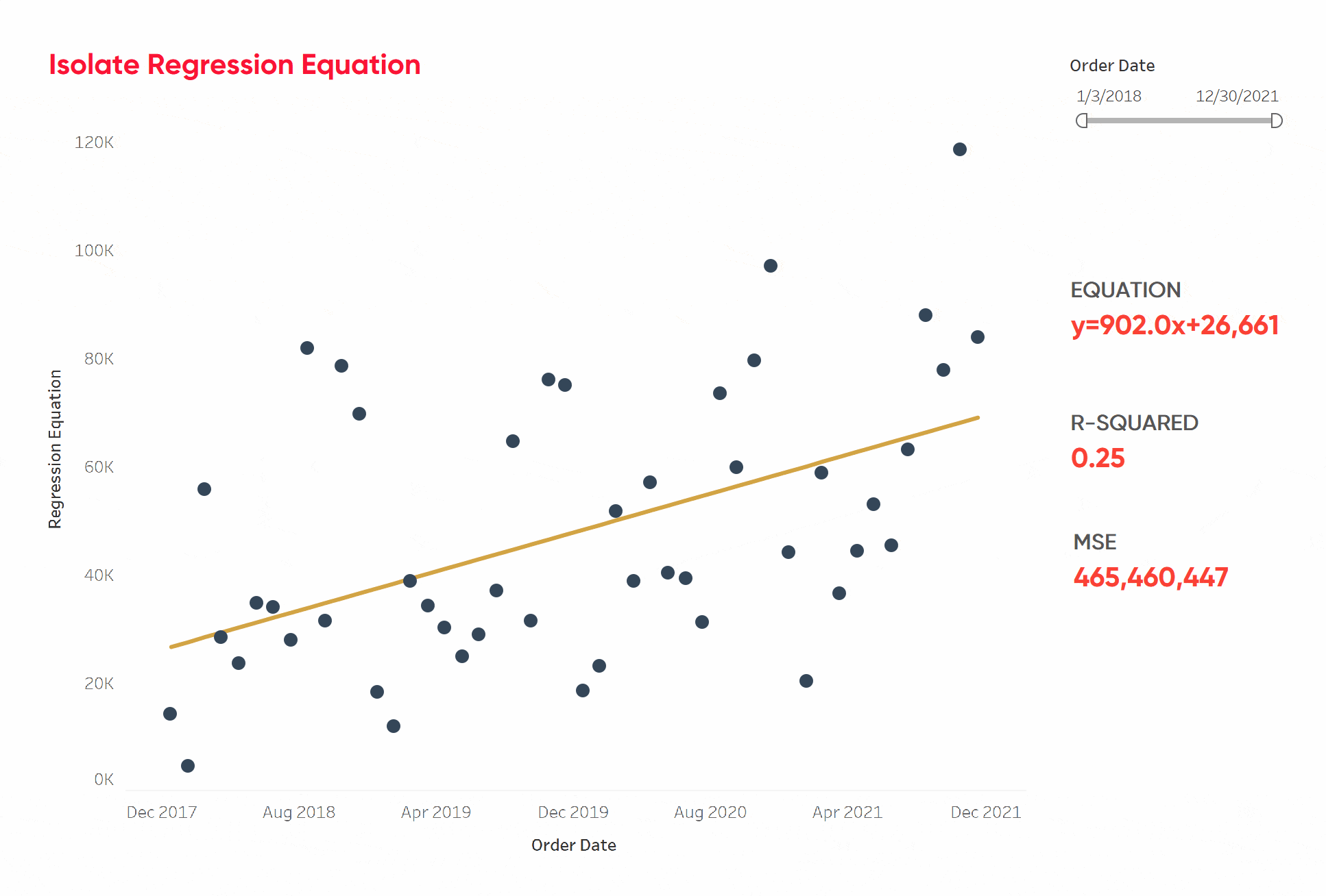
T-10. How to Isolate Linear Regression Equations in Tableau
Blog Score = 40
Maddie shares her tips on how to isolate the trend line equation that Tableau generates to use in other calculations as well as explain some of the metrics used to evaluate the performance of the line.
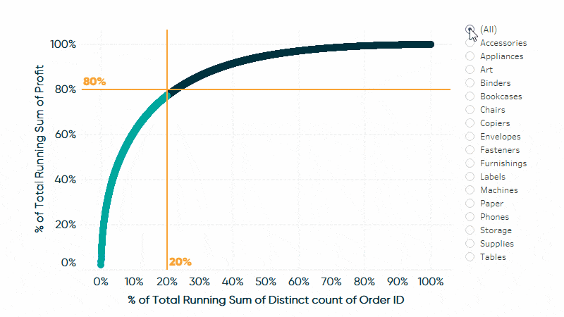
T-10. 3 Ways to Make Powerful Pareto Charts in Tableau
Blog Score = 40
![]()
Ryan shares how to: (1) visualize the 80/20 rule by converting axes into percent of total calculations, (2) isolate the best-performing segment for further analysis, and (3) export the best-performing segment for use in real-world applications.
Changing the analysis from total pageviews to average pageviews per day
Although the blog score analysis is a balanced approach, taking each metric into account to determine the best performer, an argument could be made that this analysis is biased toward older blog posts because they have had more time to accumulate views. For this reason, I added a toggle to the blog score dashboard which provides the user with the capability to change the Pageviews metric from total pageviews since the publish date to average pageviews per day since the publish date. When the toggle is switched on, the following changes occur to our analysis.
How to Make an Integrated Toggle Switch in Tableau
Updated Blog Scores with Average Pageview per Day
1. 3 Ways to Implement Dynamic Pagination in Tableau
Blog Score = 21
Rank Change: —
Ethan shares three different pagination styles, each listed with their own pros and cons as well as some great ideas to improve the UX of a dashboard.
2. 3 Ways to Make Gorgeous Gantt Charts in Tableau
Blog Score = 26
Rank Change: —
Ryan shares three ways to make Gantt charts more engaging and effective in Tableau.
3. 3 More Ways to Make Beautiful Bar Charts in Tableau
Blog Score = 31
Rank Change: —
Ryan shares whether your bar charts should be vertical or horizontal, the easiest way possible to round the ends of bars, and how to make dynamic axes for direct labeling.
T-4. How to Isolate Linear Regression Equations in Tableau
Blog Score = 32
Rank Change: +6
Maddie shares her tips on how to isolate the trend line equation that Tableau generates to use in other calculations as well as explain some of the metrics used to evaluate the performance of the line.
T-4. How to Make Better Drop-Down Menus in Tableau
Blog Score = 32
Rank Change: +1
Jason shares how to create drop-down menus that have infinite formatting options and can take on the look of any interface out there.
6. 3 Innovative Ways to Use Filters in Tableau
Blog Score = 33
Rank Change: -3
Maggy shares three tricks for using filters in Tableau that will make the dashboard engineering process much easier.
7. 3 Innovative Ways to Zoom in Tableau
Blog Score = 37
Rank Change: +1
Ethan shares three ways to incorporate zoom functionality in Tableau as well as an introduction to formatting tips that add professional polish to these techniques.
8. 3 Innovative Ways to Highlight Selections in Tableau
Blog Score = 38
Rank Change: -3
Ethan shares how to (1) create a simulated check box using the default shapes provided in Tableau, (2) create a single selection highlight using a bar chart, and (3) highlight multiple rows based on a selection using Gantt marks.
T-9. Tableau Hack: How to Dynamically Highlight Selections in Connected Scatter Plots
Blog Score = 40
Rank Change: -2
Maggy shares how to create a dual-axis scatter plot that compares a single selected dimension member to a previous time period as well as some helpful design tips that will take this tactic and others to the next level.
T-9. How and Why to Make Box Plots in Tableau
Blog Score = 40
Rank Change: +4
Maggy gives you an introduction to statistical visualizations and measures that will allow you to understand your data better and also draw conclusions from it.
Observations of the 2021 blogs
– This year we introduced a new blog post series on formatting in Tableau authored by Felicia Styer. The tutorial, Tableau Formatting Series: How to Use Shading & Backgrounds performed exceptionally well by pageviews, receiving a rank of 6 in the Average Pageviews per Day metric.
– Out of 21 blogs published, seven were “3 Ways To” blogs and all seven made it into the top 10.
– Because the “How to Isolate Linear Regression Equations in Tableau” blog requires knowledge in statistics, it was surprising to see that it made it into the top 10. This surprising result may have been because Tableau featured the blog in a Data Fam Roundup, giving it extra exposure and a different cohort of readers from what the blogs normally attract.
– “How to Isolate Linear Regression Equations in Tableau” makes the largest climb up the ranks from #10 to #3 when toggled from total pageviews to average pageviews per day.
– “Tableau Hack: How to Dynamically Highlight Selections in Connected Scatter Plots” was published on 3/21/21, but because of a re-featuring on social media six months later, it received a second wave of attention and was featured in Tableau’s Data Fam Roundup on 9/24/21.
What tutorial would like to see in 2022? Email your request to me, [email protected].
Thank you,
Dan

Written By
Dan Bunker
Related Content
Year in Review / Top 10 Blog Posts of 2022

What an exciting year 2022 has been! As we reflect on our top 10 blog posts, it’s difficult not to…
Year in Review / Top 10 Tableau Tutorials of 2018

Thank you for your support in 2018. This time of year is always a time of reflection for me, and…
Year in Review / Top 10 Posts of 2017
Thank you for reading this year. Your support means a great deal to me and keeps me more motivated than…